


 Description
Transition effects on different plugins and components can be offered by Bootstrap Transition Plugin. To implement this plugin functionality individually, include transition.js file with other JavaScript files. Otherwise, bootstrap.js or the minified bootstrap.min.js can also be used.
CSS transition emulator and transition End events take the help of Transition.js. Other plugins also use transition plug-in to check CSS transition support and catch hanging transitions.
Description
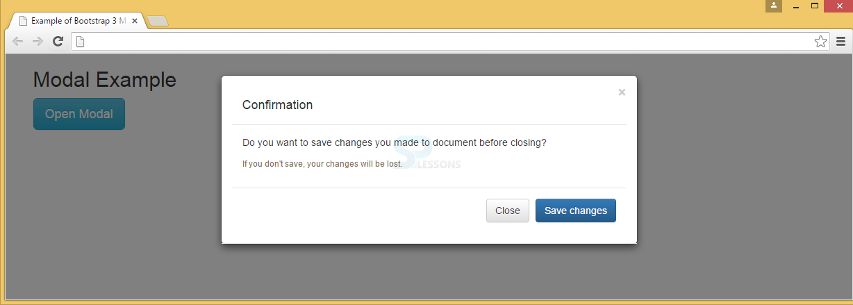
Modal is similar to that of an alert message or a dialog box which gives an important information to the end user to respond promptly to the message.
Example
In the below example,
Trigger : The modal window is triggered with a button or a link and adds two data-* attributes.
data-toggle="modal" : Modal window is opened by using this window.
data-target="#myModal" : Modal id is pointed by using this window.
Modal : The modal ID in <div> should be equal to the data-target attribute value, which is used to trigger the modal ("myModal").
.modal class : This identifies the <div> content as a modal and focuses on it.
.fade class : Bootstrap Transition effect to modal is applied by using this class which fades the modal in and out.
Attribute role="dialog" : This attribute is useful for screen readers to improve accessibility.
.modal-dialog class : Modal width and margin can be set by using this class.
Modal content : The .modal-content class applies styles to modal (border, background-color, etc.). Modal's header, body, and footer can be added to <div>.
.modal-header class : defines header style of the modal.
data-dismiss="modal" attribute has a button that closes the modal when clicked and applies style to the close button by using .close class, and the header line-height is set by using the .modal-title class.
.modal-body : To define the style for the modal body .modal-body class is used.
.modal-footer class : This class is used to define the style for the modal footer. Note that by default this area is right aligned.
[html]
<!DOCTYPE html>
<html lang="en">
<head>
<meta charset="UTF-8">
<title>Example of Bootstrap 3 Media List</title>
<link rel="stylesheet" href="https://maxcdn.bootstrapcdn.com/bootstrap/3.3.6/css/bootstrap.min.css">
<link rel="stylesheet" href="https://maxcdn.bootstrapcdn.com/bootstrap/3.3.6/css/bootstrap-theme.min.css">
<script src="https://ajax.googleapis.com/ajax/libs/jquery/1.11.3/jquery.min.js"></script>
<script src="https://maxcdn.bootstrapcdn.com/bootstrap/3.3.6/js/bootstrap.min.js"></script>
</head>
<body>
<div class="container">
<h2>Modal Example</h2>
<!-- Trigger the modal with a button -->
<button type="button" class="btn btn-info btn-lg" data-toggle="modal" data-target="#myModal">Open Modal</button>
<!-- Modal -->
<div class="modal fade" id="myModal" role="dialog">
<div class="modal-dialog">
<!-- Modal content-->
<div class="modal-content">
<div class="modal-header">
<button type="button" class="close" data-dismiss="modal">×</button>
<div class="modal-header">
<h4 class="modal-title">Confirmation</h4>
</div>
<div class="modal-body">
Do you want to save changes you made to document before closing?
<small>If you don't save, your changes will be lost.</small>
</div>
<div class="modal-footer">
<button type="button" class="btn btn-default" data-dismiss="modal">Close</button>
<button type="button" class="btn btn-primary">Save changes</button>
</div>
</div>
</div>
</div>
</div>
</body>
</html>
[/html]
Output:
Description
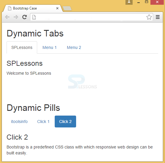
To make the tabs toggleable, add "tab" attribute to data-toggle to each link. Next for every tab add a .tab-pane class with a unique ID and wrap them inside a <div> element with class.tab-content.
To make tabs to fade in and out while clicking on them, add the .fade class to .tab-pane.
This is similar to that of tabs toggleable, only the attribute will be changed to data-toggle="pill".
Example
[html]
<!DOCTYPE html>
<html lang="en">
<head>
<title>Bootstrap Case</title>
<meta charset="utf-8">
<meta name="viewport" content="width=device-width, initial-scale=1">
<link rel="stylesheet" href="http://maxcdn.bootstrapcdn.com/bootstrap/3.3.6/css/bootstrap.min.css">
<script src="https://ajax.googleapis.com/ajax/libs/jquery/1.12.0/jquery.min.js"></script>
<script src="http://maxcdn.bootstrapcdn.com/bootstrap/3.3.6/js/bootstrap.min.js"></script>
</head>
<body>
<!--Toggleable Tabs-->
<div class="container">
<h2>Dynamic Tabs</h2>
<ul class="nav nav-tabs">
<li class="active"><a data-toggle="tab" href="#splessons">SPLessons</a></li>
<li><a data-toggle="tab" href="#menu1">Menu 1</a></li>
<li><a data-toggle="tab" href="#menu2">Menu 2</a></li>
</ul>
<div class="tab-content">
<div id="splessons" class="tab-pane fade in active">
<h3>SPLessons</h3>
<p>Welcome to SPLessons</p>
</div>
<div id="menu1" class="tab-pane fade">
<h3>Menu 1</h3>
<p>Bootstrap Tutorials</p>
</div>
<div id="menu2" class="tab-pane fade">
<h3>Menu 2</h3>
<p>Bootstrap is a predefined CSS class with which responsive web design can be built easily.</p>
</div>
</div>
</div>
<br><br><br>
<!--Toggleable Pills-->
<div class="container">
<h2>Dynamic Pills</h2>
<ul class="nav nav-pills">
<li class="active"><a data-toggle="pill" href="#itools">itoolsinfo</a></li>
<li><a data-toggle="pill" href="#click1">Click 1</a></li>
<li><a data-toggle="pill" href="#click2">Click 2</a></li>
</ul>
<div class="tab-content">
<div id="home" class="tab-pane fade in active">
<h3>itoolsinfo</h3>
<p>Welcome to itoolsinfo</p>
</div>
<div id="click1" class="tab-pane fade">
<h3>Click 1</h3>
<p>Bootstrap Tutorials</p>
</div>
<div id="click2" class="tab-pane fade">
<h3>Click 2</h3>
<p>Bootstrap is a predefined CSS class with which responsive web design can be built easily.</p>
</div>
</div>
</div>
</body>
</html>
[/html]
Output:
Description
A close button to Bootstrap alert class can be added with an optional
.alert-dismissible class and close button. Transition here is done with dismissible class.
Warning! Your data has not saved, please check with Admin.
Example
[html]
<!DOCTYPE html>
<html lang="en">
<head>
<meta charset="utf-8">
<meta http-equiv="X-UA-Compatible" content="IE=edge">
<meta name="viewport" content="width=device-width, initial-scale=1">
<!-- The above 3 meta tags *must* come first in the head; any other head content must come *after* these tags -->
<title>SPLessons - Bootstrap Alert</title>
<!-- Bootstrap -->
<link href="https://maxcdn.bootstrapcdn.com/bootstrap/3.3.4/css/bootstrap.min.css" rel="stylesheet">
<link href="https://maxcdn.bootstrapcdn.com/bootstrap/3.3.4/css/bootstrap-theme.min.css" rel="stylesheet">
</head>
<body>
<div class="container">
<h2> <a href="http://www.splessons.com/lesson/bootstrap-3-tutorial/"> Bootstrap Alert </a> </h2>
<div class="alert alert-warning alert-dismissible" role="alert">
<button type="button" class="close" data-dismiss="alert" aria-label="Close">
<span aria-hidden="true">×</span>
</button>
<strong>Warning!</strong> Your data has not saved, please check with Admin.
</div>
</div>
<!-- jQuery (necessary for Bootstrap's JavaScript plugins) -->
<script src="https://ajax.googleapis.com/ajax/libs/jquery/1.11.2/jquery.min.js"></script>
<!-- Include all compiled plugins (below), or include individual files as needed -->
<script src="https://maxcdn.bootstrapcdn.com/bootstrap/3.3.4/js/bootstrap.min.js"></script>
</body>
</html>
[/html]
Output:

Description
Bootstrap Carousel is a slideshow of text/images and is one of the best ways to display large content in a small space.
Here, Carousel plug presents the images/text and gives accessibility to the user in a cyclic process.
Note: Internet Explorer 9 and earlier versions does not support Carousels properly (as they use CSS3 animations and transitions to achieve the slide effect).
Examples
In the below example, the classes, indicators, wrappers and controls are used which means:

- <div> has id="myCarousel" : checks whether controls are functioning properly. class="carousel" : indicates that div has a carousel. The class .slide is used for animation, CSS transitions and to make the images/text slide while showing. Attributedata-ride="carousel" : starts animation when the page loads.
- Indicators : These are the small dots found at the bottom of every slide which denotes the number of slides in carousel including the current slide. These indicators are done with the class .carousel-indicators. Attribute data-target : points to carousel id. Attribute data-slide-to : gives instruction about which slide to go when a specific dot is clicked.
- Wrappers : The slides are enclosed in wrappers. The <div> element will have a class .carousel-inner, which has the slides in it. The images or the text within the slide is specified using the class .item in <div>. To make a slide active, the class .active has to be used. This is must in a carousel because if no slide is made active, the carousel will not be visible.
Key Points
- Include transition.js file to implement Bootstrap Tranisition plugin.
- Bootstrap Transition plug-in can be used while sliding in Modals and Carousal Panes, Fading Alerts and Tabs.