


 Description
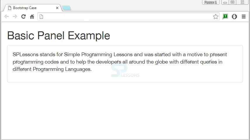
A panel is a way of structuring content with some visible borders, headers and footers that defines and differentiates between logical sections of a page.
To create a panel, add the class .panel and content inside the panel has a class .panel-body.
Example
In the below example panel-body is created under panel class and panel-body has content about the SPLessons.If observed, panel class will have a class panel-default added.This will style the color to panel class.
[html]
<!DOCTYPE html>
<html lang="en">
<head>
<title>Bootstrap Case</title>
<meta charset="utf-8">
<meta name="viewport" content="width=device-width, initial-scale=1">
<link rel="stylesheet" href="http://maxcdn.bootstrapcdn.com/bootstrap/3.3.6/css/bootstrap.min.css">
<script src="https://ajax.googleapis.com/ajax/libs/jquery/1.12.0/jquery.min.js"></script>
<script src="http://maxcdn.bootstrapcdn.com/bootstrap/3.3.6/js/bootstrap.min.js"></script>
</head>
<body>
<div class="container">
<h2>Basic Panel Example</h2>
<div class="panel panel-default">
<div class="panel-body">
<p> SPLessons stands for Simple Programming Lessons and was started with a motive to present programming codes and to help the developers all around the globe with different queries in different Programming Languages.</p>
</div>
</div>
</body>
</html>
[/html]
Output:
Description
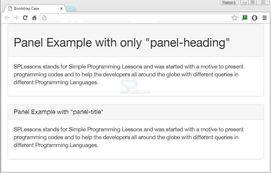
Panel heading can be added to a panel in two ways.
- Add .panel-heading class to panel heading container.
- Add .panel-title class to panel heading.It can take headings from <h1>-<h6> and is a pre-styled heading.
Example
In the below example, two cases are shown.One with panel-heading class and another with panel-title class.
[html]
<!DOCTYPE html>
<html lang="en">
<head>
<title>Bootstrap Case</title>
<meta charset="utf-8">
<meta name="viewport" content="width=device-width, initial-scale=1">
<link rel="stylesheet" href="http://maxcdn.bootstrapcdn.com/bootstrap/3.3.6/css/bootstrap.min.css">
<script src="https://ajax.googleapis.com/ajax/libs/jquery/1.12.0/jquery.min.js"></script>
<script src="http://maxcdn.bootstrapcdn.com/bootstrap/3.3.6/js/bootstrap.min.js"></script>
</head>
<body>
<div class="container">
<div class="panel panel-default">
<div class="panel-heading">
<h2>Panel Example with only "panel-heading"</h2>
</div>
<div class="panel-body">
<p> SPLessons stands for Simple Programming Lessons and was started with a motive to present programming codes and to help the developers all around the globe with different queries in different Programming Languages.</p>
</div>
</div>
</div>
<div class="container">
<div class="panel panel-default">
<div class="panel-heading">
<h2 class="panel-title">Panel Example with "panel-title"</h2>
</div>
<div class="panel-body">
<p> SPLessons stands for Simple Programming Lessons and was started with a motive to present programming codes and to help the developers all around the globe with different queries in different Programming Languages.</p>
</div>
</div>
</div>
</body>
</html>
[/html]
Output:
Description
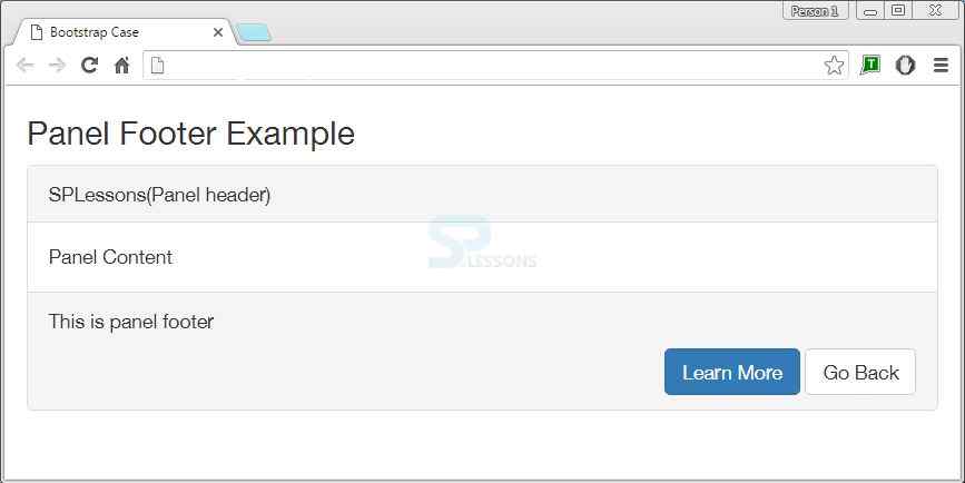
Buttons or secondary text can be wrapped in a <div> by adding a class .panel-footer.As Panel footers are not meant to be in the foreground, they cannot inherit colors and borders while using contextual variations.
Example
Below is an example demonstrating Bootstrap Footer.
[html]
<!DOCTYPE html>
<html lang="en">
<head>
<title>Bootstrap Case</title>
<meta charset="utf-8">
<meta name="viewport" content="width=device-width, initial-scale=1">
<link rel="stylesheet" href="http://maxcdn.bootstrapcdn.com/bootstrap/3.3.6/css/bootstrap.min.css">
<script src="https://ajax.googleapis.com/ajax/libs/jquery/1.12.0/jquery.min.js"></script>
<script src="http://maxcdn.bootstrapcdn.com/bootstrap/3.3.6/js/bootstrap.min.js"></script>
</head>
<body>
<div class="container">
<h3>Panel Footer Example</h3>
<div class="panel panel-default">
<div class="panel-heading">SPLessons(Panel header)</div>
<div class="panel-body">Panel Content</div>
<div class="panel-footer clearfix">
<p>This is panel footer</p>
<div class="pull-right">
<a href="#" class="btn btn-primary">Learn More</a>
<a href="#" class="btn btn-default">Go Back</a>
</div>
</div>
</div>
</div>
</body>
</html>
[/html]
Output:
Description
The class panel-default can be replaced with the contextual classes panel-primary, panel-success, panel-warning, panel-danger and panel-info.
Example
In the below example, Panel with various contextual classes are shown.
[html]
<!DOCTYPE html>
<html lang="en">
<head>
<title>Bootstrap Case</title>
<meta charset="utf-8">
<meta name="viewport" content="width=device-width, initial-scale=1">
<link rel="stylesheet" href="http://maxcdn.bootstrapcdn.com/bootstrap/3.3.6/css/bootstrap.min.css">
<script src="https://ajax.googleapis.com/ajax/libs/jquery/1.12.0/jquery.min.js"></script>
<script src="http://maxcdn.bootstrapcdn.com/bootstrap/3.3.6/js/bootstrap.min.js"></script>
</head>
<body>
<div class="bs-example">
<div class="panel panel-primary">
<div class="panel-heading">
<h3 class="panel-title">Example of panel-primary </h3>
</div>
<div class="panel-body">
<p> Hi !! Welcome to SPLessons world</p>
</div>
</div>
<div class="panel panel-success">
<div class="panel-heading">
<h3 class="panel-title">Example of panel-success</h3>
</div>
<div class="panel-body">
<p>This is SPLessons Bootstrap Tutorial </p>
</div>
</div>
<div class="panel panel-info">
<div class="panel-heading">
<h3 class="panel-title">Example of panel-info</h3>
</div>
<div class="panel-body">
<p>You are learning Panels concept of Bootstrap </p>
</div>
</div>
<div class="panel panel-warning">
<div class="panel-heading">
<h3 class="panel-title">Example of panel-warning</h3>
</div>
<div class="panel-body">
<p>A panel in bootstrap is a bordered box with some padding around its content</p>
</div>
</div>
<div class="panel panel-danger">
<div class="panel-heading">
<h3 class="panel-title">Example of panel-danger</h3>
</div>
<div class="panel-body">
<p>Please Like and follow SPLessons on facebook,twitter and youtube.</p>
</div>
</div>
</div>
</body>
</html>
[/html]
Output:
Example of panel-primary
Hi !! Welcome to SPLessons world
Example of panel-success
This is SPLessons Bootstrap Tutorial
Example of panel-info
You are learning Panels concept of Bootstrap
Example of panel-warning
A panel in bootstrap is a bordered box with some padding around its content
Example of panel-danger
Please Like and follow SPLessons on facebook,twitter and youtube.
Description
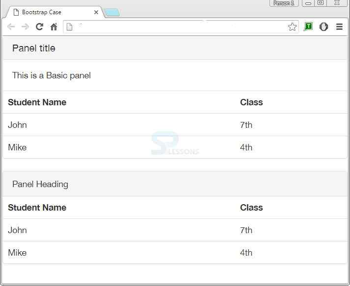
There occurs two conditions while using panels with tables.Panel with non-bordered table uses the class .table within panel.
- If <div> has .panel-body, an extra border has to be added at the top of the table for separation.
- If no <div> has .panel-body, then without any interruption, the component moves from panel header to table class.
Example
Below is an example for Panel with tables.
[html]
<!DOCTYPE html>
<html lang="en">
<head>
<title>Bootstrap Case</title>
<meta charset="utf-8">
<meta name="viewport" content="width=device-width, initial-scale=1">
<link rel="stylesheet" href="http://maxcdn.bootstrapcdn.com/bootstrap/3.3.6/css/bootstrap.min.css">
<script src="https://ajax.googleapis.com/ajax/libs/jquery/1.12.0/jquery.min.js"></script>
<script src="http://maxcdn.bootstrapcdn.com/bootstrap/3.3.6/js/bootstrap.min.js"></script>
</head>
<body>
<div class = "panel panel-default">
<div class = "panel-heading">
<h3 class = "panel-title">Panel title</h3>
</div>
<div class = "panel-body">
This is a Basic panel
</div>
<table class = "table">
<tr>
<th>Student Name</th>
<th>Class</th>
</tr>
<tr>
<td>John</td>
<td>7th</td>
</tr>
<tr>
<td>Mike</td>
<td>4th</td>
</tr>
</table>
</div>
<div class = "panel panel-default">
<div class = "panel-heading">Panel Heading</div>
<table class = "table">
<tr>
<th>Student Name</th>
<th>Class</th>
</tr>
<tr>
<td>John</td>
<td>7th</td>
</tr>
<tr>
<td>Mike</td>
<td>4th</td>
</tr>
</table>
</div>
</body>
</html>
[/html]
Output:
Description
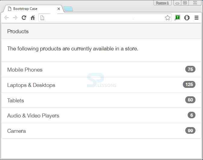
Lists can be included in any panel by placing list-group class in <ul> and the items in list group are created by adding list-group-item class in <li>.
Example
[html]
<!DOCTYPE html>
<html lang="en">
<head>
<title>Bootstrap Case</title>
<meta charset="utf-8">
<meta name="viewport" content="width=device-width, initial-scale=1">
<link rel="stylesheet" href="http://maxcdn.bootstrapcdn.com/bootstrap/3.3.6/css/bootstrap.min.css">
<script src="https://ajax.googleapis.com/ajax/libs/jquery/1.12.0/jquery.min.js"></script>
<script src="http://maxcdn.bootstrapcdn.com/bootstrap/3.3.6/js/bootstrap.min.js"></script>
</head>
<body>
<div class="bs-example">
<div class="panel panel-default">
<!-- Default panel contents -->
<div class="panel-heading">Products</div>
<div class="panel-body">
<p>The following products are currently available in a store.</p>
</div>
<!-- List group -->
<div class="list-group">
<a href="#" class="list-group-item">Mobile Phones <span class="badge">75</span>
</a>
<a href="#" class="list-group-item">Laptops & Desktops <span class="badge">125</span>
</a>
<a href="#" class="list-group-item">Tablets <span class="badge">50</span>
</a>
<a href="#" class="list-group-item">Audio & Video Players <span class="badge">6</span>
</a>
<a href="#" class="list-group-item">Camera <span class="badge">99</span>
</a>
</div>
</div>
</div>
</body>
</html>
[/html]
Output:
Description
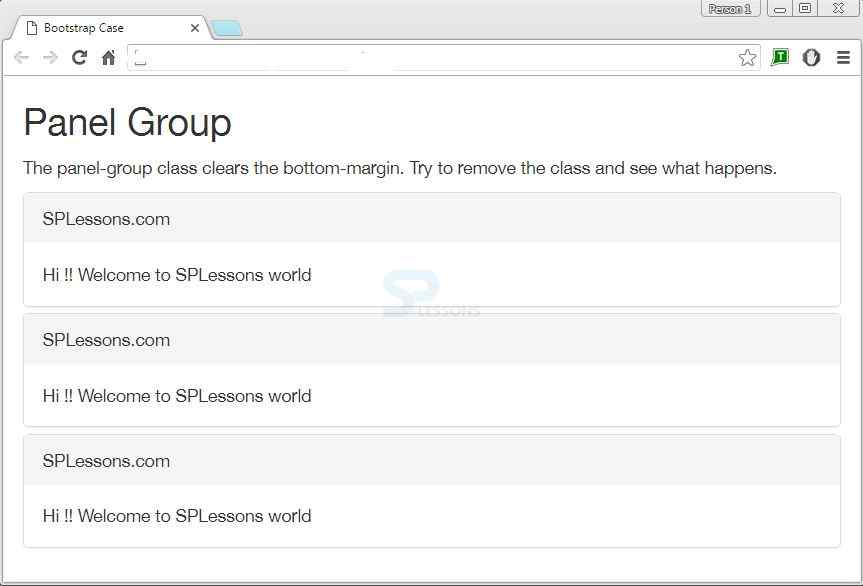
To bring multiple panels together, place the class .panel-group in <div>.This class removes the bottom-margin of each panel.
Example
[html]
<!DOCTYPE html>
<html lang="en">
<head>
<title>Bootstrap Case</title>
<meta charset="utf-8">
<meta name="viewport" content="width=device-width, initial-scale=1">
<link rel="stylesheet" href="http://maxcdn.bootstrapcdn.com/bootstrap/3.3.6/css/bootstrap.min.css">
<script src="https://ajax.googleapis.com/ajax/libs/jquery/1.12.0/jquery.min.js"></script>
<script src="http://maxcdn.bootstrapcdn.com/bootstrap/3.3.6/js/bootstrap.min.js"></script>
</head>
<body>
<div class="container">
<h2>Panel Group</h2>
<p>The panel-group class clears the bottom-margin. Try to remove the class and see what happens.</p>
<div class="panel-group">
<div class="panel panel-default">
<div class="panel-heading">SPLessons.com</div>
<div class="panel-body"> Hi !! Welcome to SPLessons world</div>
</div>
<div class="panel panel-default">
<div class="panel-heading">SPLessons.com</div>
<div class="panel-body"> Hi !! Welcome to SPLessons world</div>
</div>
<div class="panel panel-default">
<div class="panel-heading">SPLessons.com</div>
<div class="panel-body"> Hi !! Welcome to SPLessons world</div>
</div>
</div>
</div>
</body>
</html>
[/html]
Output:
Points
- Panles creates header,footers with class .panel.
- Heading and footer of panel are created by .panel-heading and .panel-footer classes respectively.
- Panel can be of contextual classes also.
- Tables in panels are done with table class .table and lists are created by adding list-group to ul class.
- To group panels, panel-group class is used.
Bootstrap - Related Information
Bootstrap Menus
Bootstrap Examples
Bootstrap Label
Bootstrap Jumbotron
Bootstrap Dropdowns
