


 Description
"Bootstrap Tutorials" chapter gives the users the basic idea about the evolution of Bootstrap and a basic example. Bootstrap is the popular HTML, CSS, and JS framework primarily used for developing responsive, and mobile first projects on the web. Bootstrap makes front-end web development faster and easier. It is made for folks of all skill levels, devices of all shapes, and projects of all sizes. It was developed by the Twitter team and code is licensed under MIT. Users can download Bootstrap for free and can use in any project.
The purpose of Bootstrap is to give great foundation to a responsive website. For example, let there be a website developed for both desktop and mobiles. As the mobile screen size is small, the website developed may not fit into it. So, one should zoom-in, zoom-out and scroll to view the website, which is not a user-friendly approach.
Using Bootstrap is just like a puzzle, all the elements have to be placed in such a way that it suits anywhere, no matter whatever the element is chosen. All the elements are a combination of HTML, CSS and JavaScript.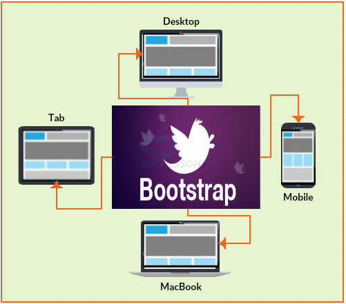
Description
Bootstrap was originally developed by Mark Otto and Jacob Thornton at Twitter in 2010. Hence, it was known as Twitter Blue-print. Bootstrap was released in 2011.
From then, 20 versions were released in which v2 and v3 are the most important ones. BootStrap 2 has come up with a functionality of optional stylesheet in the total framework. Later, Bootstrap 3 was updated with library to make a website responsive.
Example
[html]
<!DOCTYPE html>
<html lang="en">
<head>
<meta charset="utf-8">
<meta http-equiv="X-UA-Compatible" content="IE=edge">
<meta name="viewport" content="width=device-width, initial-scale=1">
<!-- The above 3 meta tags *must* come first in the head; any other head content must come *after* these tags -->
<title>SPLessons - Bootstrp From</title>
<!-- Bootstrap -->
<link href="https://maxcdn.bootstrapcdn.com/bootstrap/3.3.4/css/bootstrap.min.css" rel="stylesheet">
<link href="https://maxcdn.bootstrapcdn.com/bootstrap/3.3.4/css/bootstrap-theme.min.css" rel="stylesheet">
<!-- jQuery (necessary for Bootstrap's JavaScript plugins) -->
<script src="https://ajax.googleapis.com/ajax/libs/jquery/1.11.2/jquery.min.js"></script>
<!-- Include all compiled plugins (below), or include individual files as needed -->
<script src="https://maxcdn.bootstrapcdn.com/bootstrap/3.3.4/js/bootstrap.min.js"></script>
<style>
.starter-template{
padding: 40px 15px;
text-align: center;
}
.navbar-brand, .navbar-nav>li>a{
color: white;
}
.navbar {
background-color: #00A9EC;
border-color: #00A9EC;
}
</style>
</head>
<body>
<nav class="navbar navbar-fixed-top">
<div class="container">
<div class="navbar-header">
<button type="button" class="navbar-toggle collapsed" data-toggle="collapse" data-target="#navbar" aria-expanded="false" aria-controls="navbar">
<span class="sr-only">Toggle navigation</span>
<span class="icon-bar"></span>
<span class="icon-bar"></span>
<span class="icon-bar"></span>
</button>
<a class="navbar-brand" href="http://www.splessons.com/boostrap-3">SPLessons</a>
</div>
<div id="navbar" class="collapse navbar-collapse">
<ul class="nav navbar-nav">
<li class="active"><a href="http://www.splessons.com/boostrap-3">Home</a></li>
<li><a href="#about">About</a></li>
<li><a href="#contact">Contact</a></li>
</ul>
</div><!--/.nav-collapse -->
</div>
</nav>
<div class="container">
<div class="starter-template">
<h1>Welcome to Bootstrap world</h1>
<p class="lead">Use this document as a way to quickly start any new project.<br> All you get is this text and a mostly barebones HTML document.</p>
</div>
</div><!-- /.container -->
</body>
</html>
[/html]
Output:
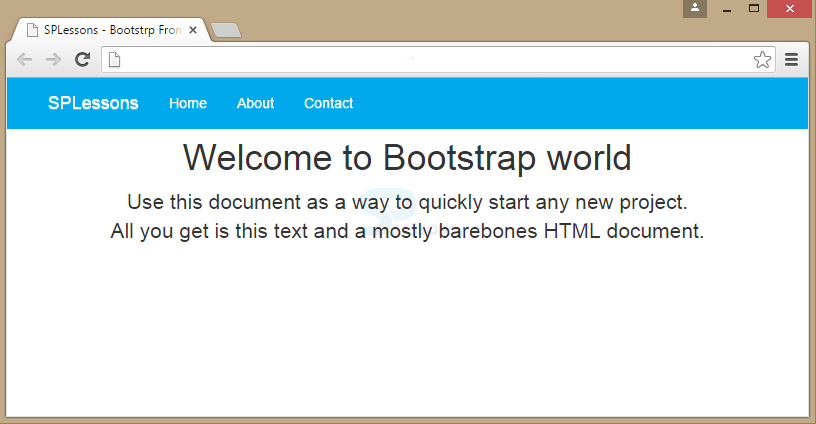
Key Points
- Bootstrap adds responsive feature to a website.
- Bootstrap is HTML, CSS and JS framework.