


 Description
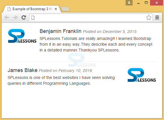
An abstract element that is used to build repetitive components in blogs, and tweets is called as a Bootstrap Media Object. Media object restricts the information block to the small size.
By default, media objects can float to either left or right of the content block.
- To create media element, .media class has to be used. To specify the source, the class .media-object can be used, which is placed in <img>. The image can be of any shape like circle, and rounded, which can be obtained by adding .img-circle to the class .media-object of <img> element
- After creating the Bootstrap Media Object, to write the content into it, class media-body has to be used along with a heading class media-heading.
Example
[html]
<!DOCTYPE html>
<html lang="en">
<head>
<meta charset="UTF-8">
<title>Example of Bootstrap 3 Media Objects</title>
<link rel="stylesheet" href="https://maxcdn.bootstrapcdn.com/bootstrap/3.3.6/css/bootstrap.min.css">
<link rel="stylesheet" href="https://maxcdn.bootstrapcdn.com/bootstrap/3.3.6/css/bootstrap-theme.min.css">
<script src="https://ajax.googleapis.com/ajax/libs/jquery/1.11.3/jquery.min.js"></script>
<script src="https://maxcdn.bootstrapcdn.com/bootstrap/3.3.6/js/bootstrap.min.js"></script>
<style type="text/css">
.bs-example{
margin: 20px;
}
</style>
</head>
<body>
<div class="bs-example">
<div class="media">
<!--Media Object on left of block-->
<div class="media-left">
<a href="#">
<img src="splessons-logo.png" class="media-object" alt="Sample Image">
</a>
</div>
<div class="media-body">
<h4 class="media-heading">Benjamin Franklin <small><i>Posted on December 5, 2015</i></small></h4>
<p>SPLessons Tutorials are really amazing!! I learned Bootstrap from it in an easy way. They describe each and every concept in a detailed manner. Thank you SPLessons.</p>
</div>
</div>
<hr />
<div class="media">
<!--Media Object on right of block-->
<div class="media-body">
<h4 class="media-heading">James Blake<small><i> Posted on February 10, 2016</i></small></h4>
<p>SPLessons is one of the best websites I have ever seen. It solves queries in different programming languages.</p>
</div>
<div class="media-right">
<a href="#">
<img src="splessons-logo.png" class="media-object" alt="Sample Image">
</a>
</div>
</div>
</div>
</body>
</html>
[/html]
Output:
Description
One media object can be nested within the another media object.
Example
[html]
<!DOCTYPE html>
<html lang="en">
<head>
<title>Bootstrap Case</title>
<meta charset="utf-8">
<meta name="viewport" content="width=device-width, initial-scale=1">
<link rel="stylesheet" href="http://maxcdn.bootstrapcdn.com/bootstrap/3.3.6/css/bootstrap.min.css">
<script src="https://ajax.googleapis.com/ajax/libs/jquery/1.12.0/jquery.min.js"></script>
<script src="http://maxcdn.bootstrapcdn.com/bootstrap/3.3.6/js/bootstrap.min.js"></script>
</head>
<body>
<div class="media">
<div class="media-left">
<a href="#">
<img class="media-object" src="splessons-logo.png" alt="Generic placeholder image">
</a>
</div>
<div class="media-body">
<h4 class="media-heading">Media heading</h4>
SPLessons Tutorials are really amazing!! I learned Bootstrap from it in an easy way. They describe each and every concept in a detailed manner. Thank you SPLessons.
<div class="media">
<a class="media-left" href="#">
<img class="media-object" src="splessons-logo.png" alt="Generic placeholder image">
</a>
<div class="media-body">
<h4 class="media-heading">Nested media heading</h4>
SPLessons is one of the best websites I have ever seen. It solves queries in different programming languages.
</div>
</div>
</div>
</div>
</body>
</html>
[/html]
Description
Example
[html]
<!DOCTYPE html>
<html lang="en">
<head>
<title>Bootstrap Case</title>
<meta charset="utf-8">
<meta name="viewport" content="width=device-width, initial-scale=1">
<link rel="stylesheet" href="http://maxcdn.bootstrapcdn.com/bootstrap/3.3.6/css/bootstrap.min.css">
<script src="https://ajax.googleapis.com/ajax/libs/jquery/1.12.0/jquery.min.js"></script>
<script src="http://maxcdn.bootstrapcdn.com/bootstrap/3.3.6/js/bootstrap.min.js"></script>
<style type="text/css">
.bs-example{
margin: 20px;
}
/* Removing default bottom margin from last paragraph to correct media bottom alignment */
.media .media-body p:last-child{
margin-bottom: 0;
}
</style>
</head>
<body>
<div class="bs-example">
<div class="media">
<div class="media-left">
<a href="#">
<img src="splessons-logo.png" class="media-object" alt="Sample Image">
</a>
</div>
<div class="media-body">
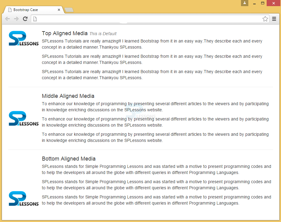
<h4 class="media-heading">Top Aligned Media <small><i>This is Default</i></small></h4>
<p>SPLessons Tutorials are really amazing!! I learned Bootstrap from it in an easy way. They describe each and every concept in a detailed manner. Thank you SPLessons.</p>
<p>SPLessons Tutorials are really amazing!! I learned Bootstrap from it in an easy way. They describe each and every concept in a detailed manner. Thank you SPLessons.</p>
<p>SPLessons Tutorials are really amazing!! I learned Bootstrap from it in an easy way. They describe each and every concept in a detailed manner. Thank you SPLessons.</p>
</div>
</div>
<hr />
<div class="media">
<div class="media-left media-middle">
<a href="#">
<img src="splessons-logo.png" class="media-object" alt="Sample Image">
</a>
</div>
<div class="media-body">
<h4 class="media-heading">Middle Aligned Media</h4>
<p>To enhance our knowledge of programming by explaining several different concepts to the viewers and by participating in knowledge enriching discussions on the SPLessons website.</p>
<p>To enhance our knowledge of programming by explaining several different concepts to the viewers and by participating in knowledge enriching discussions on the SPLessons website.</p>
<p>To enhance our knowledge of programming by explaining several different concepts to the viewers and by participating in knowledge enriching discussions on the SPLessons website.</p>
</div>
</div>
<hr />
<div class="media">
<div class="media-left media-bottom">
<a href="#">
<img src="splessons-logo.png" class="media-object" alt="Sample Image">
</a>
</div>
<div class="media-body">
<h4 class="media-heading">Bottom Aligned Media</h4>
<p> SPLessons stands for Simple Programming Lessons and was started with an intention to help developers all around the globe by presenting programming codes with different queries in different programming languages.</p>
<p> SPLessons stands for Simple Programming Lessons and was started with an intention to help developers all around the globe by presenting programming codes with different queries in different programming languages.</p>
<p> SPLessons stands for Simple Programming Lessons and was started with an intention to help developers all around the globe by presenting programming codes with different queries in different programming languages.</p>
</div>
</div>
</div>
</body>
</html>
[/html]
Output:
Description
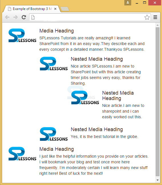
A list of media objects or nested media objects can be created by placing the media-list in <ul> component. It can be useful for article lists or comment threads.
Example
[html]
<!DOCTYPE html>
<html lang="en">
<head>
<meta charset="UTF-8">
<title>Example of Bootstrap 3 Media List</title>
<link rel="stylesheet" href="https://maxcdn.bootstrapcdn.com/bootstrap/3.3.6/css/bootstrap.min.css">
<link rel="stylesheet" href="https://maxcdn.bootstrapcdn.com/bootstrap/3.3.6/css/bootstrap-theme.min.css">
<script src="https://ajax.googleapis.com/ajax/libs/jquery/1.11.3/jquery.min.js"></script>
<script src="https://maxcdn.bootstrapcdn.com/bootstrap/3.3.6/js/bootstrap.min.js"></script>
<style type="text/css">
.bs-example{
margin: 20px;
}
</style>
</head>
<body>
<div class="bs-example">
<ul class="media-list">
<li class="media">
<div class="media-left">
<a href="#">
<img src="splessons-logo.png" class="media-object" alt="Sample Image">
</a>
</div>
<div class="media-body">
<h4 class="media-heading">Media Heading</h4>
<p>SPLessons Tutorials are really amazing!! I learned SharePoint from it in an easy way. They explain each and every concept in a detailed manner. Thank you SPLessons.</p>
<!-- Nested media object -->
<div class="media">
<div class="media-left">
<a href="#">
<img src="splessons-logo.png" class="media-object" alt="Sample Image">
</a>
</div>
<div class="media-body">
<h4 class="media-heading">Nested Media Heading</h4>
<p>Nice article SPLessons. I am new to SharePoint but with this article creating timer jobs seems very easy, thanks for sharing.</p>
<!-- Nested media object -->
<div class="media">
<div class="media-left">
<a href="#">
<img src="splessons-logo.png" class="media-object" alt="Sample Image">
</a>
</div>
<div class="media-body">
<h4 class="media-heading">Nested Media Heading</h4>
<p>Nice article. I am new to sharepoint and now I can easily work out on this.</p>
</div>
</div>
</div>
</div>
<!-- Nested media object -->
<div class="media">
<div class="media-left">
<a href="#">
<img src="splessons-logo.png" class="media-object" alt="Sample Image">
</a>
</div>
<div class="media-body">
<h4 class="media-heading">Nested Media Heading</h4>
<p>Yes, it is the best tutorial in the globe.</p>
</div>
</div>
</div>
</li>
<li class="media">
<div class="media-left">
<a href="#">
<img src="splessons-logo.png" class="media-object" alt="Sample Image">
</a>
</div>
<div class="media-body">
<h4 class="media-heading">Media Heading</h4>
<p>I just like the information you provide on your articles. I will bookmark your blog and test once more here frequently. I will learn many new stuff right here! Best of luck for the next!</p>
</div>
</li>
</ul>
</div>
</body>
</html>
[/html]
Output:
Key Points
- Bootstrap Media object wraps information block by adding media class and placing media-object in the img element.
- Media objects can be aligned on top, middle or bottom. By default, it will be on the top.
- Nested media lists all the media objects by using media-list class.