


 Description
Bootstrap Scrollspy plugin updates nav links in navigation menu automatically depending on the scroll position, to give a confirmation to the user about the page location.
This plugin requires nav component (e.g. navbar, nav pills or tabs) to highlight active links properly.
Example
In the below example, there are two basic components data-target and data-spy in <body> section.
- The data-spy=”scroll” attribute applies on scrollable element, which has been spied.
- The data-target= ".navbar" attribute is added on the scrollable element that has the ID navbar so that the links will be targeted by the scrollspy to highlight.
- The data-offset attribute gives the pixel number of offset while calculating the scroll position from top. This helps to adjust if the links appear too early or too late. By default, the value will be 10pixels.
Description
Bootstrap Scrollspy can be applied vertically which fixes to the page and updates navigation links of the navigation menu at the same time.
Example
[html]
<!DOCTYPE html>
<html lang="en">
<head>
<title>Bootstrap Case</title>
<meta charset="utf-8">
<meta name="viewport" content="width=device-width, initial-scale=1">
<link rel="stylesheet" href="http://maxcdn.bootstrapcdn.com/bootstrap/3.3.6/css/bootstrap.min.css">
<script src="https://ajax.googleapis.com/ajax/libs/jquery/1.12.0/jquery.min.js"></script>
<script src="http://maxcdn.bootstrapcdn.com/bootstrap/3.3.6/js/bootstrap.min.js"></script>
<style>
body {
position: relative;
}
ul.nav-pills {
top: 20px;
position: fixed;
}
div.col-sm-9 div {
height: 250px;
font-size: 28px;
}
#home {padding-top:50px;height:500px;color: #fff; background-color: #1E88E5;}
#aboutus {padding-top:50px;height:500px;color: #fff; background-color: #673ab7;}
#mission {padding-top:50px;height:500px;color: #fff; background-color: #ff9800;}
#bootstrap {padding-top:50px;height:500px;color: #fff; background-color: #00bcd4;}
#javascript {padding-top:50px;height:500px;color: #fff; background-color: #009688;}
@media screen and (max-width: 810px) {
#home, #aboutus, #mission, #bootstrap, #javascript {
margin-left: 150px;
}
}
</style>
</head>
<body data-spy="scroll" data-target="#myScrollspy" data-offset="50">
<div class="container">
<div class="row">
<nav class="col-sm-3" id="myScrollspy">
<ul class="nav nav-pills nav-stacked">
<li class="active"><a href="#home">Home</a></li>
<li><a href="#aboutus">About Us</a></li>
<li><a href="#mission">Mission</a></li>
<li class="dropdown">
<a class="dropdown-toggle" data-toggle="dropdown" href="#">Tutorials<span class="caret"></span></a>
<ul class="dropdown-menu">
<li><a href="#bootstrap">Tutorial-Bootstrap</a></li>
<li><a href="#javascript">Tutorial-Javascript</a></li>
</ul>
</li>
</ul>
</nav>
<div class="col-sm-9">
<div id="home">
<h1>Home</h1>
<h5>Hello!! Welcome to SPLessons World.You are reading Bootstrap Tutorial.</p>
<h5>Try to scroll this section and look at the navigation bar while scrolling! Try to scroll this section and look at the navigation bar while scrolling!</p>
</div>
<div id="aboutus">
<h1>About Us</h1>
<h5> SPLessons stands for Simple Programming Lessons and was started with a motto to help developers all around the globe by presenting programming codes for different queries in different programming languages.</p>
<h5>Try to scroll this section and look at the navigation bar while scrolling! Try to scroll this section and look at the navigation bar while scrolling!</p>
</div>
<div id="mission">
<h1>Mission</h1>
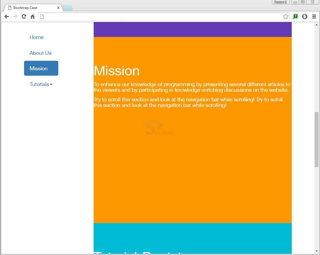
<h5>To enhance our knowledge of programming by presenting several different articles to the viewers and by participating in knowledge enriching discussions on the website.</p>
<h5>Try to scroll this section and look at the navigation bar while scrolling! Try to scroll this section and look at the navigation bar while scrolling!</p>
</div>
<div id="bootstrap">
<h1>Tutorial-Bootstrap</h1>
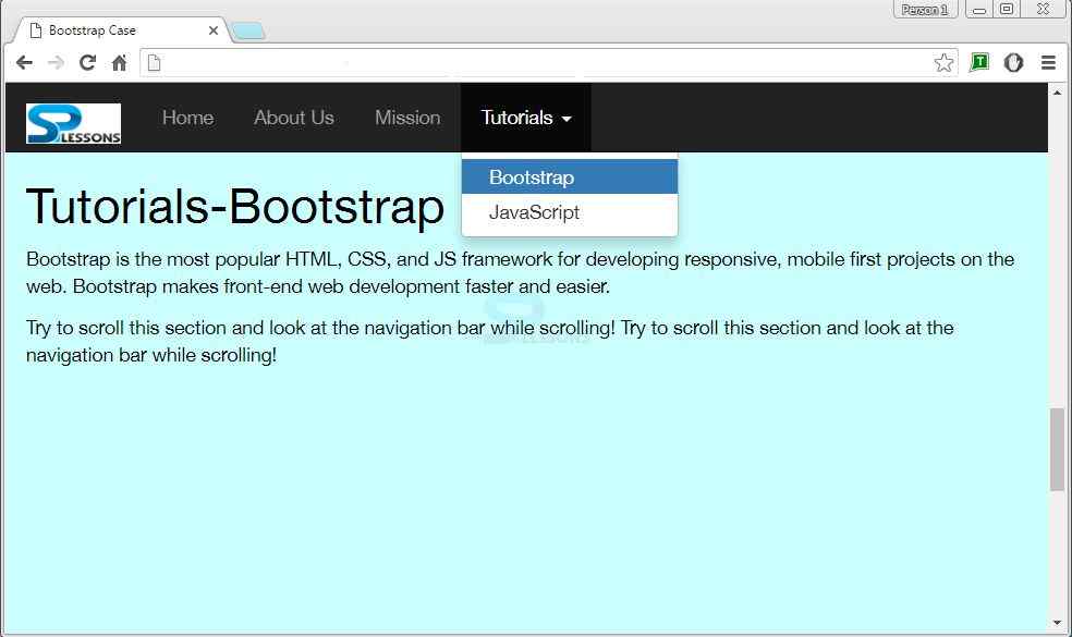
<h5>Bootstrap is the most popular HTML, CSS, and JS framework used for developing responsive, mobile first projects on the web. Bootstrap makes front-end web development faster and easier.</p>
<h5>Try to scroll this section and look at the navigation bar while scrolling! Try to scroll this section and look at the navigation bar while scrolling!</p>
</div>
<div id="javascript">
<h1>Tutorial-Javascript</h1>
<h5>JavaScript is a lightweight scripting language that is used to create network-based applications. It is very easy to implement as it is integrated with Java and HTML programming languages. </p>
<h5>Try to scroll this section and look at the navigation bar while scrolling! Try to scroll this section and look at the navigation bar while scrolling!</p>
</div>
</div>
</div>
</div>
</body>
</html>
[/html]
Output:
Key Points
- Bootstrap Scrollspy plugin updates nav links in navigation menu automatically based on the scroll position.
- data-spy=”scroll” is the attribute to apply scrollspy.
- data-target will be targeted by the scrollspy to highlight.