


 Description
Progress bar is used to display the progress of task completion. Bootstrap Progress Bars are of vertical gradient.
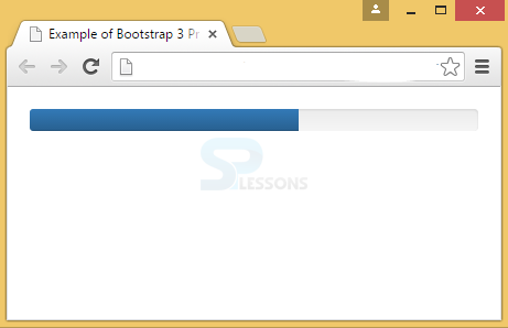
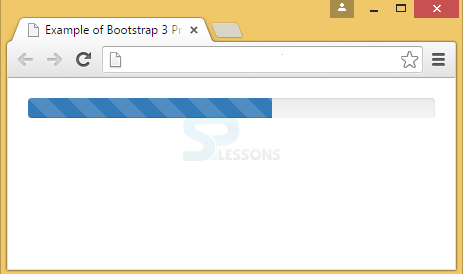
Default progress bar can be created by adding a class .progress to a <div> element.
Example
In the below example, progress class is placed in <div> element with a progress-bar class inside having a width of 60% showing the users that 60% of process is completed.
[html]
<!DOCTYPE html>
<html lang="en">
<head>
<meta charset="UTF-8">
<title>Example of Bootstrap 3 Progress Bar</title>
<link rel="stylesheet" href="https://maxcdn.bootstrapcdn.com/bootstrap/3.3.6/css/bootstrap.min.css">
<link rel="stylesheet" href="https://maxcdn.bootstrapcdn.com/bootstrap/3.3.6/css/bootstrap-theme.min.css">
<script src="https://ajax.googleapis.com/ajax/libs/jquery/1.11.3/jquery.min.js"></script>
<script src="https://maxcdn.bootstrapcdn.com/bootstrap/3.3.6/js/bootstrap.min.js"></script>
<style type="text/css">
.bs-example{
margin: 20px;
}
</style>
</head>
<body>
<div class="bs-example">
<div class="progress">
<div class="progress-bar" style="width: 60%;">
<span class="sr-only">60% Complete</span>
</div>
</div>
</div>
</body>
</html>
[/html]
Output:
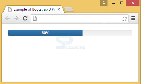
 For showing the task progress in percentages, label has to be used. For that, it is required to remove the .sr-only class in <span> within the progress bar as demonstrated in the above example.
[html]<!DOCTYPE html>
<html lang="en">
<head>
<meta charset="UTF-8">
<title>Example of Bootstrap 3 Progress Bar with Label</title>
<link rel="stylesheet" href="https://maxcdn.bootstrapcdn.com/bootstrap/3.3.6/css/bootstrap.min.css">
<link rel="stylesheet" href="https://maxcdn.bootstrapcdn.com/bootstrap/3.3.6/css/bootstrap-theme.min.css">
<script src="https://ajax.googleapis.com/ajax/libs/jquery/1.11.3/jquery.min.js"></script>
<script src="https://maxcdn.bootstrapcdn.com/bootstrap/3.3.6/js/bootstrap.min.js"></script>
<style type="text/css">
.bs-example{
margin: 20px;
}
</style>
</head>
<body>
<div class="bs-example">
<div class="progress">
<div class="progress-bar" style="width: 60%;">
60%
</div>
</div>
</div>
</body>
</html>
[/html]
Output:
For showing the task progress in percentages, label has to be used. For that, it is required to remove the .sr-only class in <span> within the progress bar as demonstrated in the above example.
[html]<!DOCTYPE html>
<html lang="en">
<head>
<meta charset="UTF-8">
<title>Example of Bootstrap 3 Progress Bar with Label</title>
<link rel="stylesheet" href="https://maxcdn.bootstrapcdn.com/bootstrap/3.3.6/css/bootstrap.min.css">
<link rel="stylesheet" href="https://maxcdn.bootstrapcdn.com/bootstrap/3.3.6/css/bootstrap-theme.min.css">
<script src="https://ajax.googleapis.com/ajax/libs/jquery/1.11.3/jquery.min.js"></script>
<script src="https://maxcdn.bootstrapcdn.com/bootstrap/3.3.6/js/bootstrap.min.js"></script>
<style type="text/css">
.bs-example{
margin: 20px;
}
</style>
</head>
<body>
<div class="bs-example">
<div class="progress">
<div class="progress-bar" style="width: 60%;">
60%
</div>
</div>
</div>
</body>
</html>
[/html]
Output:
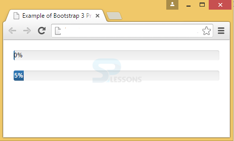
 When showing percentage label, min-width to the progress bar has to be added to confirm that the label text remains readable even for low percentages. Below example demonstrates this concept.
[html]
<!DOCTYPE html>
<html lang="en">
<head>
<meta charset="UTF-8">
<title>Example of Bootstrap 3 Progress Bar with Label and Min-width</title>
<link rel="stylesheet" href="https://maxcdn.bootstrapcdn.com/bootstrap/3.3.6/css/bootstrap.min.css">
<link rel="stylesheet" href="https://maxcdn.bootstrapcdn.com/bootstrap/3.3.6/css/bootstrap-theme.min.css">
<script src="https://ajax.googleapis.com/ajax/libs/jquery/1.11.3/jquery.min.js"></script>
<script src="https://maxcdn.bootstrapcdn.com/bootstrap/3.3.6/js/bootstrap.min.js"></script>
<style type="text/css">
.bs-example{
margin: 20px;
}
.progress-bar{
color: white;
}
</style>
</head>
<body>
<div class="bs-example">
<div class="progress">
<div class="progress-bar" style="min-width: 2px; color:black">
0%
</div>
</div>
<div class="progress">
<div class="progress-bar" style="min-width: 20px; width: 5%;">
5%
</div>
</div>
</div>
</body>
</html>
[/html]
Output:
When showing percentage label, min-width to the progress bar has to be added to confirm that the label text remains readable even for low percentages. Below example demonstrates this concept.
[html]
<!DOCTYPE html>
<html lang="en">
<head>
<meta charset="UTF-8">
<title>Example of Bootstrap 3 Progress Bar with Label and Min-width</title>
<link rel="stylesheet" href="https://maxcdn.bootstrapcdn.com/bootstrap/3.3.6/css/bootstrap.min.css">
<link rel="stylesheet" href="https://maxcdn.bootstrapcdn.com/bootstrap/3.3.6/css/bootstrap-theme.min.css">
<script src="https://ajax.googleapis.com/ajax/libs/jquery/1.11.3/jquery.min.js"></script>
<script src="https://maxcdn.bootstrapcdn.com/bootstrap/3.3.6/js/bootstrap.min.js"></script>
<style type="text/css">
.bs-example{
margin: 20px;
}
.progress-bar{
color: white;
}
</style>
</head>
<body>
<div class="bs-example">
<div class="progress">
<div class="progress-bar" style="min-width: 2px; color:black">
0%
</div>
</div>
<div class="progress">
<div class="progress-bar" style="min-width: 20px; width: 5%;">
5%
</div>
</div>
</div>
</body>
</html>
[/html]
Output:
 A meaning can be assigned to colors for Progress bars using Contextual classes.
The contextual classes that can be used with progress bars are:
A meaning can be assigned to colors for Progress bars using Contextual classes.
The contextual classes that can be used with progress bars are:
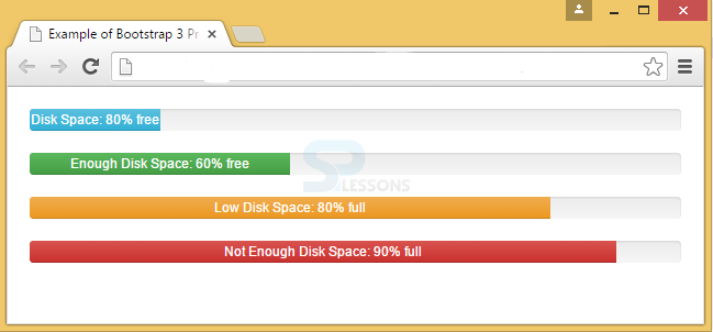
- .progress-bar-success
- .progress-bar-info
- .progress-bar-warning
- .progress-bar-danger
Description
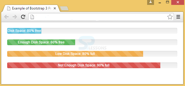
A .progress-striped class has to be added to .progress base class for displaying the progress bar with stripes.
Example
If observed in the below example, an extra class progress-striped is added to the .progress base class in <div>.
[html]
<!DOCTYPE html>
<html lang="en">
<head>
<meta charset="UTF-8">
<title>Example of Bootstrap 3 Progress Bar</title>
<link rel="stylesheet" href="https://maxcdn.bootstrapcdn.com/bootstrap/3.3.6/css/bootstrap.min.css">
<link rel="stylesheet" href="https://maxcdn.bootstrapcdn.com/bootstrap/3.3.6/css/bootstrap-theme.min.css">
<script src="https://ajax.googleapis.com/ajax/libs/jquery/1.11.3/jquery.min.js"></script>
<script src="https://maxcdn.bootstrapcdn.com/bootstrap/3.3.6/js/bootstrap.min.js"></script>
<style type="text/css">
.bs-example{
margin: 20px;
}
</style>
</head>
<body>
<div class="bs-example">
<div class="progress progress-striped">
<div class="progress-bar" style="width: 60%;">
<span class="sr-only">60% Complete</span>
</div>
</div>
</div>
</body>
</html>
[/html]
Output:
 A colored and striped progress bars can be created by using .progress-striped and contextual classes.
[html]
<!DOCTYPE html>
<html lang="en">
<head>
<meta charset="UTF-8">
<title>Example of Bootstrap 3 Progress Bar</title>
<link rel="stylesheet" href="https://maxcdn.bootstrapcdn.com/bootstrap/3.3.6/css/bootstrap.min.css">
<link rel="stylesheet" href="https://maxcdn.bootstrapcdn.com/bootstrap/3.3.6/css/bootstrap-theme.min.css">
<script src="https://ajax.googleapis.com/ajax/libs/jquery/1.11.3/jquery.min.js"></script>
<script src="https://maxcdn.bootstrapcdn.com/bootstrap/3.3.6/js/bootstrap.min.js"></script>
<style type="text/css">
.bs-example{
margin: 20px;
}
</style>
</head>
<body>
<div class="bs-example">
<div class="progress progress-striped">
<div class="progress-bar progress-bar-info" style="width: 20%">
Disk Space: 80% free
</div>
</div>
<div class="progress progress-striped">
<div class="progress-bar progress-bar-success" style="width: 40%">
Enough Disk Space: 60% free
</div>
</div>
<div class="progress progress-striped">
<div class="progress-bar progress-bar-warning" style="width: 80%">
Low Disk Space: 80% full
</div>
</div>
<div class="progress progress-striped">
<div class="progress-bar progress-bar-danger" style="width: 90%">
Not Enough Disk Space: 90% full
</div>
</div>
</div>
</body>
</html>
[/html]
Output:
A colored and striped progress bars can be created by using .progress-striped and contextual classes.
[html]
<!DOCTYPE html>
<html lang="en">
<head>
<meta charset="UTF-8">
<title>Example of Bootstrap 3 Progress Bar</title>
<link rel="stylesheet" href="https://maxcdn.bootstrapcdn.com/bootstrap/3.3.6/css/bootstrap.min.css">
<link rel="stylesheet" href="https://maxcdn.bootstrapcdn.com/bootstrap/3.3.6/css/bootstrap-theme.min.css">
<script src="https://ajax.googleapis.com/ajax/libs/jquery/1.11.3/jquery.min.js"></script>
<script src="https://maxcdn.bootstrapcdn.com/bootstrap/3.3.6/js/bootstrap.min.js"></script>
<style type="text/css">
.bs-example{
margin: 20px;
}
</style>
</head>
<body>
<div class="bs-example">
<div class="progress progress-striped">
<div class="progress-bar progress-bar-info" style="width: 20%">
Disk Space: 80% free
</div>
</div>
<div class="progress progress-striped">
<div class="progress-bar progress-bar-success" style="width: 40%">
Enough Disk Space: 60% free
</div>
</div>
<div class="progress progress-striped">
<div class="progress-bar progress-bar-warning" style="width: 80%">
Low Disk Space: 80% full
</div>
</div>
<div class="progress progress-striped">
<div class="progress-bar progress-bar-danger" style="width: 90%">
Not Enough Disk Space: 90% full
</div>
</div>
</div>
</body>
</html>
[/html]
Output:
Description
To show the striped progress bar animated, the class .active has to be used.
Example
In the below example, the active class is added to class progress inside <div> along with progress-striped.
[html]
<!DOCTYPE html>
<html lang="en">
<head>
<meta charset="UTF-8">
<title>Example of Bootstrap 3 Progress Bar</title>
<link rel="stylesheet" href="https://maxcdn.bootstrapcdn.com/bootstrap/3.3.6/css/bootstrap.min.css">
<link rel="stylesheet" href="https://maxcdn.bootstrapcdn.com/bootstrap/3.3.6/css/bootstrap-theme.min.css">
<script src="https://ajax.googleapis.com/ajax/libs/jquery/1.11.3/jquery.min.js"></script>
<script src="https://maxcdn.bootstrapcdn.com/bootstrap/3.3.6/js/bootstrap.min.js"></script>
<style type="text/css">
.bs-example{
margin: 20px;
}
</style>
</head>
<body>
<div class="bs-example">
<div class="progress progress-striped active">
<div class="progress-bar progress-bar-info" style="width: 20%">
Disk Space: 80% free
</div>
</div>
<div class="progress progress-striped active">
<div class="progress-bar progress-bar-success" style="width: 40%">
Enough Disk Space: 60% free
</div>
</div>
<div class="progress progress-striped active">
<div class="progress-bar progress-bar-warning" style="width: 80%">
Low Disk Space: 80% full
</div>
</div>
<div class="progress progress-striped active">
<div class="progress-bar progress-bar-danger" style="width: 90%">
Not Enough Disk Space: 90% full
</div>
</div>
</div>
</body>
</html>
[/html]
Output:
Description
To display progress bar in stack format, place multiple bars into the same <div class="progress">.
Example
In the below example, three progress-bar classes have been placed in progress class and animation with stripes are also applied to the progress bar.
[html]
<!DOCTYPE html>
<html lang="en">
<head>
<meta charset="UTF-8">
<title>Example of Bootstrap 3 Progress Bar</title>
<link rel="stylesheet" href="https://maxcdn.bootstrapcdn.com/bootstrap/3.3.6/css/bootstrap.min.css">
<link rel="stylesheet" href="https://maxcdn.bootstrapcdn.com/bootstrap/3.3.6/css/bootstrap-theme.min.css">
<script src="https://ajax.googleapis.com/ajax/libs/jquery/1.11.3/jquery.min.js"></script>
<script src="https://maxcdn.bootstrapcdn.com/bootstrap/3.3.6/js/bootstrap.min.js"></script>
<style type="text/css">
.bs-example{
margin: 20px;
}
</style>
</head>
<body>
<div class="bs-example">
<div class="progress progress-striped active">
<div class="progress-bar progress-bar-success" style="width: 40%">
Program Files (40%)
</div>
<div class="progress-bar progress-bar-warning" style="width: 25%">
Residual Files (25%)
</div>
<div class="progress-bar progress-bar-danger" style="width: 15%">
Junk Files (15%)
</div>
</div>
</div>
[/html]
Output:
Key Points
- Bootstrap Progress Bars are used to display the task progress.
- The progress-bar class is placed in the progress class.
- To show labels in progress bar, sr-only has to be removed in span.
- Striped progress bars are created by using .progress-striped class.
- Animation can be applied by using active in progress class.