


 Description
"Bootstrap Getting Started" chapter gives clear introduction of Bootstrap and the basic requirements to execute the code.
- Bootstrap is an open source CSS, JavaScript framework that was developed by the Twitter team for Twitter application.
- The team has released it as open-source under MIT licensed.
- Bootstrap has come up with full stack for web development such as Grid Systems, Typography, Code, Tables, Forms, Buttons, Images, Helper classes, and Responsive utilities.
- Bootstrap is a predefined CSS class with which responsive web design can be built easily.
What is responsive web design?
Responsive web design is the practice of developing a website that will fit for all devices and all kind of screen sizes, no matter how large or small a mobile or desktop. In simple words, responsive web design is a solution to make web pages look great in any screen size. Description
- Bootstrap first started CSS framework for all devices.
- Later in Bootstrap 3.0, the code was customized and minimized to work well with mobiles.
- In Bootstrap 3.0, Mobile First technology was introduced to concentrate on mobile screens while developing the web application.
- With the help of Bootstrap, any developer and designer can develop responsive websites.
- It boosts the development by providing predefined CSS class.
- Code will be well organized and stabilized. For example, to add pagination to an application, a lot of CSS code has to be written to get the best pagination. But, if Bootstrap is used
.pagination classcan be added toulsimply.
- Currently, a huge collection of bootstrap templates are available at free of cost.
- The templates can be downloaded and used in project without building from scratch.
- With Bootstrap, one can increase business logic by leaving UI stuff to Bootstrap framework.
Description
- Bootstrap is available in different downloadable versions.
- Download the source and minified versions from getbootstrap.com and integrate with applications.
- Source Version: In bootstrap.css, source file is human readable and all the functionalities are well commented.
- Minified Version: bootstrap.min.css is production version and also has the same functionality as of original version. However, all the comments and unnecessary spaces are removed, so that it will reduce the file size and loading time in websites.
- Bootstrap is also available in Bower and npm front-end web tools.
- Bower :
$ bower install bootstrap - npm :
$ npm install bootstrap
- Bower :
- Bootstrap is also available in CDN ( Cotent delivery network ) .
- Bootstrap CDN: Deliver content faster on any device no mater the file size.
- When using CDN version, website loads the files from the nearest CDN server, which will reduce the loading time of website and increase the response time.
jQuery required
Please note that bootstrap.js and bootstrap.min.js file requires jQuery to use the predefined bootstrap functionalities like bootstrap modal popup Example
[html]
<nav class="navbar navbar-fixed-top">
<div class="container">
<div class="navbar-header">
<button type="button" class="navbar-toggle collapsed" data-toggle="collapse" data-target="#navbar" aria-expanded="false" aria-controls="navbar">
<span class="sr-only">Toggle navigation</span>
<span class="icon-bar"></span>
<span class="icon-bar"></span>
<span class="icon-bar"></span>
</button>
<a class="navbar-brand" href="http://www.splessons.com/boostrap-3">SPLessons</a>
</div>
<div id="navbar" class="collapse navbar-collapse">
<ul class="nav navbar-nav">
<li class="active"><a href="http://www.splessons.com/boostrap-3">Home</a></li>
<li><a href="#about">About</a></li>
<li><a href="#contact">Contact</a></li>
</ul>
</div><!--/.nav-collapse -->
</div>
</nav>
<div class="container">
<div class="starter-template">
<!-- Button trigger modal -->
<button type="button" class="btn btn-primary btn-lg" data-toggle="modal" data-target="#SPLessonsModal">
Launch demo modal
</button>
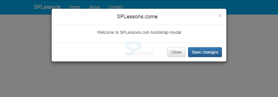
<div class="modal fade" id="SPLessonsModal">
<div class="modal-dialog">
<div class="modal-content">
<div class="modal-header">
<button type="button" class="close" data-dismiss="modal" aria-label="Close"><span aria-hidden="true">×</span></button>
<h4 class="modal-title">SPLessons.come</h4>
</div>
<div class="modal-body">
<p>Welcome to SPLessons.com bootstrap modal</p>
</div>
<div class="modal-footer">
<button type="button" class="btn btn-default" data-dismiss="modal">Close</button>
<button type="button" class="btn btn-primary">Save changes</button>
</div>
</div><!-- /.modal-content -->
</div><!-- /.modal-dialog -->
</div><!-- /.modal -->
</div>
</div><!-- /.container -->
[/html]
Output:
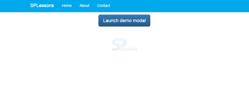 When clicked on the button "Launch demo model" the output will be as follows.
Key Points
Bootstrap Getting Started chapter draws out the following key points.
- Bootstrap supports responsive web design.
- Mobile First technology was introduced in Bootstrap 3.0.
- Number of templates are available in Bootstrap.