 Description
Bootstrap Carousel is one of the best ways to display large content in a small space and displays the slideshow of text/images.
Here, Carousel plug presents the images/text and gives accessibility to the user in a cyclic process.
Note: Internet Explorer 9 and earlier versions does not support Carousels properly (as they use CSS3 animations and transitions to achieve the slide effect).
 Examples
In the below example, the classes, indicators, wrappers and controls are used which means:
- <div> has id="myCarousel" : checks whether the controls are functioning properly. class="carousel" : indicates that div has a carousel. The class .slide is used for animation, CSS transitions and to make the images/text slide while showing. Attributedata-ride="carousel" : starts animation when the page loads.
- Indicators : These are the small dots found at the bottom of every slide which denotes the number of slides in carousel including the current slide. These indicators are done with the class .carousel-indicators. Attribute data-target : points to the carousel id. Attribute data-slide-to : gives instruction about which slide to go when a specific dot is clicked.
- Wrappers : The slides are enclosed in wrappers. The <div> element will have a class .carousel-inner which has the slides in it. The images or the text within the slide is specified using the class .item in <div>. To make a slide active, the class .active has to be used. This is must in a carousel because if no slide is made active, the carousel will not be visible.
 Description
To create a caption for each slide within each <div class="item"> add <div class="carousel-caption">.
 Example
[html]
<!DOCTYPE html>
<html lang="en">
<head>
<meta charset="UTF-8">
<title>Example of Bootstrap 3 Media List</title>
<link rel="stylesheet" href="https://maxcdn.bootstrapcdn.com/bootstrap/3.3.6/css/bootstrap.min.css">
<link rel="stylesheet" href="https://maxcdn.bootstrapcdn.com/bootstrap/3.3.6/css/bootstrap-theme.min.css">
<script src="https://ajax.googleapis.com/ajax/libs/jquery/1.11.3/jquery.min.js"></script>
<script src="https://maxcdn.bootstrapcdn.com/bootstrap/3.3.6/js/bootstrap.min.js"></script>
<style>
.carousel-inner > .item > img,
.carousel-inner > .item > a > img {
width: 70%;
margin: auto;
}
.carousel-inner > .item > .carousel-caption > h3 {
text-align: center;
display: inline; margin: 0%;
}
</style>
</head>
<body>
<div class="container">
<br>
<h1> SPLessons Tutorials</h1>
<div id="spCarousel" class="carousel slide" data-ride="carousel">
<!-- Indicators -->
<ol class="carousel-indicators">
<li data-target="#spCarousel" data-slide-to="0" class="active"></li>
<li data-target="#spCarousel" data-slide-to="1"></li>
<li data-target="#spCarousel" data-slide-to="2"></li>
<li data-target="#spCarousel" data-slide-to="3"></li>
</ol>
<!-- Wrapper for slides -->
<div class="carousel-inner" role="listbox">
<div class="item active">
<img src="c.png" alt="C programming" width="460" height="345">
<div class="carousel-caption" style="display: flex; align-items: center;">
<p>C is a programming language</p>
</div>
</div>
<div class="item">
<img src="c++.png" alt="C++ programming" width="460" height="345">
<div class="carousel-caption" style="display: flex; align-items: center;">
<p>C++ is a high-level programming language</p>
</div>
</div>
<div class="item">
<img src="android.png" alt="Android technology" width="460" height="345">
<div class="carousel-caption" style="display: flex; align-items: center;">
<p>Android offers approach to application development</p>
</div>
</div>
<div class="item">
<img src="html.png" alt="HTML5" width="460" height="345">
<div class="carousel-caption" style="display: flex; align-items: center;">
<p>HTML is "Hyper Text Markup Language"</p>
</div>
</div>
<!-- Left and right controls -->
<a class="left carousel-control" href="#spCarousel" role="button" data-slide="prev">
<span class="glyphicon glyphicon-chevron-left" aria-hidden="true"></span>
<span class="sr-only">Previous</span>
</a>
<a class="right carousel-control" href="#spCarousel" role="button" data-slide="next">
<span class="glyphicon glyphicon-chevron-right" aria-hidden="true"></span>
<span class="sr-only">Next</span>
</a>
</div>
</div>
</body>
</html>
[/html]
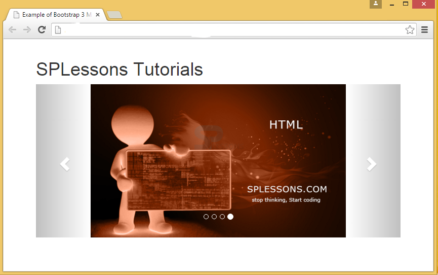
Output:In the below output, the caption of HTML language can be found.
 Key Points
- Carousel is a slideshow of text/images.
- Wrappers are the enclosure of slides and indicators are dots present at the bottom of slide.
- Carousel-caption is used to insert the text into Carousel slides.


