 Description
The current chapter explains about jQuery Mobile Tables. jQuery Mobile provides responsive tables that displays a huge data in the form of rows and columns that will fit to desktops and mobiles.
Basically, responsive tables are of two types.
reflowcolumn toggle
 Description
The table which is developed in reflow mode displays the stacked presentation style by default that fits the widths of all screens. The table data is positioned horizontally by the reflow mode until the size becomes minimum, then all rows are brought together into a vertical position.
Add the
data-role="table" and "ui-responsive" class on the <table> element to create a table.
To make the responsive table to work properly, add the <thead> and <tbody> elements instead of rowspan or colspan.
Eg:
[html]
<table data-role="table" class="ui-responsive">[/html]  Description
The mode column toggle hides the columns when the width is minimum for displaying the data.jQuery Mobile hides the columns by default from the table right side.In order to create a column toggle table, add
data-mode="columntoggle" to the following <table> element.
Eg:
[html]
<table data-role="table" data-mode="columntoggle" class="ui-responsive ui-shadow" data-column-btn-text="Click here!" id="mytable">[/html]
To specify order in which column that should be shown or hidden,add data-priority attribute to <th> and set a number between 1 (highest priority) to 6 (lowest priority).
[html]
<thead>
<tr>
<th data-priority="6">Employee ID</th>
<!--lowest priority -->
<th>Employee Name</th>
<!-- This will never be hidden since you are not setting any priority-->
<th data-priority="1">Employee Email-ID</th>
<!-- highest priority -->
<th data-priority="3">Employee Phone Number</th>
<th data-priority="4">Employee Country</th>
</tr>
</thead>
[/html]
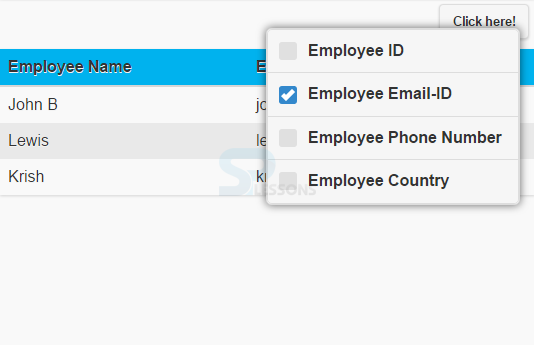
In this JQuery Mobile, a button is added automatically at the top right corner of the table using which user can choose columns to display or hide in the table. To change text add data-column-btn-text="text” to the <table>.
Eg:
[html]
<table data-role="table" data-mode="columntoggle" class="ui-responsive ui-shadow" data-column-btn-text="Click here!" id="mytable">[/html]  Description
For all
<th> elements, add a bottom border and add background color to all even table rows.
[html]
<style>
#mytable th {
border-bottom: 2px solid #d6d6d6;
background: #00B2EE;
}
tr:nth-child(even) {
background: #e9e9e9;
}
</style>
[/html]  Example
[html]
<!DOCTYPE html>
<html lang="en">
<head>
<meta charset="UTF-8">
<title>Table</title>
<meta name="viewport" content="width=device-width, initial-scale=1,maximum-scale=1" />
<!-- jQuery CDN hosted files -->
<link rel="stylesheet" href="http://code.jquery.com/mobile/1.4.5/jquery.mobile-1.4.5.min.css" />
<script src="http://code.jquery.com/jquery-1.11.1.min.js"></script>
<script src="http://code.jquery.com/mobile/1.4.5/jquery.mobile-1.4.5.min.js"></script>
<link rel="stylesheet" type="text/css" href="file:///D:/SPLessons/SPLessonsUploads/jQueryMobile/12/Tables/styles/style.css">
</head>
<body>
<table data-role="table" data-mode="columntoggle" class="ui-responsive ui-shadow" data-column-btn-text="Click here!" id="mytable">
<thead>
<tr>
<th data-priority="6">Employee ID</th>
<!--lowest priority -->
<th>Employee Name</th>
<!-- This will never be hidden -->
<th data-priority="1">Employee Email-ID</th>
<!-- highest priority -->
<th data-priority="3">Employee Phone Number</th>
<th data-priority="4">Employee Country</th>
</tr>
</thead>
<tbody>
<tr>
<td>Ed01</td>
<td>John B</td>
<td>john@gmail.com</td>
<td>0895634231</td>
<td>US</td>
</tr>
<tr>
<td>Ed02</td>
<td>Lewis</td>
<td>lewis@gmail.com</td>
<td>0895894231</td>
<td>Germany</td>
</tr>
<tr>
<td>Ed03</td>
<td>Krish</td>
<td>krish@gmail.com</td>
<td>0892394231</td>
<td>UK</td>
</tr>
</tbody>
</table>
</body>
</html>
[/html]
style.css:
[css]#mytable th {
border-bottom: 2px solid #d6d6d6;
background: #00B2EE;
}
tr:nth-child(even) {
background: #e9e9e9;
}
[/css]
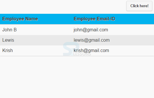
Output:
When selected any category by clicking on "Click here" button, the following output appears.
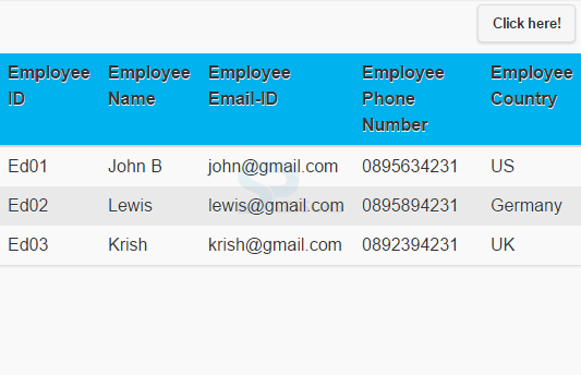
If selected all the categories provided, the output will be as follows.
 Key Points
- Reflow mode table displays the stacked presentation style by default that fits the widths of all screens.
- The mode column toggle hides the columns when the width is minimum for displaying the data.


