


 Introduction
The chapter "jQuery Mobile Form Slider" explains about slider and toggle switch. Slider is the one which moves over values to select an appropriate value and toggle switch can vary between on/off which are mostly used in switches.
Description
To select a value from a number range "Slider" is used which is created using
Any value on slider button is made visible by adding
<input type="range">.
Example:
[html]
<label for="volume1">volume1:</label>
<input type="range" name="volume1" id="volume1" value="50" min="0" max="100">[/html]
Use the following attributes to specify restrictions.
- max - specifies the maximum value allowed
- min - specifies the minimum value allowed
- step - specifies the legal number intervals
- value - specifies the default value
data-show-value="true".
Example:
[html]<input type="range" data-show-value="true">[/html]
To popup a value on the screen while sliding, add data-popup-enabled="true".
Example:
[html]<input type="range" data-popup-enabled="true">[/html]
In order to highlight the track up to the slider value, add data-highlight="true".
Example:
[html]<input type="range" data-highlight="true">[/html] Description
A flip toggle switch is mostly used for true/false or on/off buttons.The flip switch is created using
<input type="checkbox"> and then specifying the attribute data-role="flipswitch".
Example:
[html]
<label for="switch1" toggle="" switch="" checkbox:<="" label="">
<input type="checkbox" data-role="flipswitch" name="switch1" id="switch1">[/html]
The text on the flip switch by default will be "On" and "Off". To on/off the switch, use the attributes data-on-text and data-off-text.
Example:
[html]<label for="switch2">Toggle switch checkbox:</label>
<input type="checkbox" data-role="flipswitch" name="switch2" id="switch2" data-on-text="True" data-off-text="False">[/html]
The attribute "checked" to set one of the options selected by default.
Example:
[html]<label for="switch3">Toggle switch checkbox:</label>
<input type="checkbox" data-role="flipswitch" name="switch3" id="switch3" checked>[/html]
Sliders will do react to the keyboard shortcuts. To increase the current value the Right Arrow, Up Arrow, and Page Up keys can be used. To decrease the current value the Left Arrow, Down Arrow, and Page Down keys can be used. To move the slider to its minimum or maximum value use the Home and End keys respectively. Example
[html]
<!DOCTYPE html>
<html lang="en">
<head>
<meta charset="UTF-8">
<title>Form</title>
<meta name="viewport" content="width=device-width, initial-scale=1,maximum-scale=1" />
<!-- jQuery CDN hosted files -->
<link rel="stylesheet" href="http://code.jquery.com/mobile/1.4.5/jquery.mobile-1.4.5.min.css" />
<script src="http://code.jquery.com/jquery-1.11.1.min.js"></script>
<script src="http://code.jquery.com/mobile/1.4.5/jquery.mobile-1.4.5.min.js"></script>
</head>
<body>
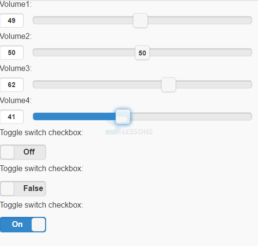
<form method="post" action="form1.asp">
<label for="volume1">Volume1:</label>
<input type="range" name="volume1" id="volume1" value="50" min="0" max="100" >
<label for="volume2">Volume2:</label>
<input type="range" data-show-value="true" name="volume2" id="volume2" value="50" min="0" max="100" >
<label for="points">Volume3:</label>
<input type="range" data-popup-enabled="true" name="volume3" id="volume3" value="50" min="0" max="100" >
<label for="points">Volume4:</label>
<input type="range" data-highlight="true" name="volume4" id="volume4" value="50" min="0" max="100" >
<label for="switch1">Toggle switch checkbox:</label>
<input type="checkbox" data-role="flipswitch" name="switch1" id="switch1">
<label for="switch2">Toggle switch checkbox:</label>
<input type="checkbox" data-role="flipswitch" name="switch2" id="switch2" data-on-text="True" data-off-text="False">
<label for="switch3">Toggle switch checkbox:</label>
<input type="checkbox" data-role="flipswitch" name="switch3" id="switch3" checked>
</form>
</body>
</html>
[/html]
Output:
Key Points
- <input type="range"> is used to create a slider.
- A flip toggle switch is mostly used for true/false or on/off buttons.