


 Description
jQuery Mobile Popup is usually a small window that pops up suddenly in foreground. It can be useful to display text, images or other data.
jQuery Mobile Popup is created in two steps:
- Add attribute
data-rel="popup"to<a>. - Add attribute
data-role="popup"to<div>. - Then define id for
<div>and set this id tohrefof<a> - Add content of popup inside
<div>which pops up when user clicks on the link.
ui-content to <div>.
Eg:
[html]<div data-role="popup" id="popup3" class="ui-content">[/html]
Many settings and styles can be done with popups.For Example, Menu, Nested Menu, Form,Dialog, Tooltip etc. Description
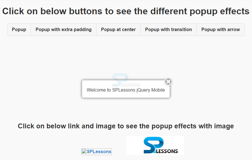
Popups are closed either by clicking out of the popup box or by using the "Esc" key by default. To restrict this default functionality, add the attribute
data-dismissible="false" to the popup. To attach a close button to popup (right or left) button link has to be added with the attribute data-rel="back" into the popup container, and attach the position to the button with CSS classes.
Eg:
[html]<a href="#popup3" data-rel="popup" class="ui-btn ui-btn-inline ui-corner-all" data-position-to="window">Popup at center</a>
<div data-role="popup" id="popup3" class="ui-content">
<a href="#" data-rel="back" class="ui-btn ui-corner-all ui-shadow ui-btn ui-icon-delete ui-btn-icon-notext ui-btn-right">Close</a>
<p>Welcome to SPLessons jQuery Mobile</p>
</div>
[/html] Description
Popups are displayed at center vertically and horizontally by default when the element is clicked. To change the popup position, use the attribute
Eg:
[html]<a href="#popup1" data-rel="popup" class="ui-btn ui-btn-inline" data-position-to="window" data-transition="slide">Popup at Center</a>
<a href="#popup2" data-rel="popup" class="ui-btn ui-btn-inline" data-position-to="#id" data-transition="slide">Popup at #id</a>
<a href="#popup3" data-rel="popup" class="ui-btn ui-btn-inline" data-position-to="origin" data-transition="slide">Popup at Origin</a>
[/html]
data-position-to on the link.
There are three ways of positioning the popup:
| Attribute value | Description |
|---|---|
| data-position-to="window" | Popup is displayed at the center inside the window |
| data-position-to="#mid" | Popup is placed over the element with the given #mid |
| data-position-to="origin" | By default, Popup is placed at the position directly over the clicked element. |
Description
By default, popups have no transition effects. To apply the transition effect add
data-transition="value" attribute to the link.
Eg:
[html]<a href="#popup1" data-rel="popup" class="ui-btn" data-transition="slide">Fade</a>[/html] Description
To add an arrow to the popup's edge, use the
data-arrow attribute, and specify the value "l" for left, "t" for top, "r" for right, and "b" for bottom. True(l,r,b,t) or False (arrow will not appear at the edge) can be specified to use arrows.
Eg:
[html]
<a href="#popup5" data-rel="popup" class="ui-btn ui-btn-inline ui-corner-all" data-position-to="window" data-transition="slide">Popup with arrow</a>
<div data-role="popup" id="popup5" class="ui-content" data-arrow="b">
<p>Welcome to SPLessons jQuery Mobile</p>
</div>
[/html] Description
Images can be displayed in a popup.
Eg:
[html]
<a href="#popup6" data-rel="popup" data-position-to="window">
<img src=" " alt="SPLessons" style="width:200px;"></a>
<div data-role="popup" id="popup6">
<img src="http://www.splessons.com/wp-content/uploads/2014/08/SPLessonsLogo.png" style="width:800px;height:400px;" alt="SPLessons">
</div>
[/html]
Description
Background color can be managed behind the popup with the
data-overlay-theme attribute.
By default, the overlay is transparent. Use data-overlay-theme="a" to add a light overlay and data-overlay-theme="b" to add a dark overlay.
Eg:
[html]
<a href="#popup7" data-rel="popup" data-position-to="window">
<div data-role="popup" id="popup7" data-overlay-theme="b">
<img src="http://www.splessons.com/wp-content/uploads/2014/08/SPLessonsLogo.png" style="width:800px;height:400px;" alt="SPLessons">
</div>
[/html] Example
[html]
<html lang="en">
<head>
<meta charset="UTF-8">
<title>Popup</title>
<meta name="viewport" content="width=device-width, initial-scale=1,maximum-scale=1" />
<!-- jQuery CDN hosted files -->
<link rel="stylesheet" href="http://code.jquery.com/mobile/1.4.5/jquery.mobile-1.4.5.min.css" />
<script src="http://code.jquery.com/jquery-1.11.1.min.js"></script>
<script src="http://code.jquery.com/mobile/1.4.5/jquery.mobile-1.4.5.min.js"></script>
</head>
<body>
<div id="home" data-role="page" align="center">
<h1>Click on below buttons to see the different popup effects</h1>
<div data-role="controlgroup" data-type="horizontal">
<a href="#popup1" data-rel="popup" class="ui-btn ui-btn-inline ui-corner-all">Popup</a>
<div data-role="popup" id="popup1">
<p>Welcome to SPLessons jQuery Mobile</p>
</div>
<a href="#popup2" data-rel="popup" class="ui-btn ui-btn-inline ui-corner-all">Popup with extra padding</a>
<div data-role="popup" id="popup2" class="ui-content">
<p>Welcome to SPLessons jQuery Mobile</p>
</div>
<a href="#popup3" data-rel="popup" class="ui-btn ui-btn-inline ui-corner-all" data-position-to="window">Popup at center</a>
<div data-role="popup" id="popup3" class="ui-content">
<a href="#" data-rel="back" class="ui-btn ui-corner-all ui-shadow ui-btn ui-icon-delete ui-btn-icon-notext ui-btn-right">Close</a>
<p>Welcome to SPLessons jQuery Mobile</p>
</div>
<a href="#popup4" data-rel="popup" class="ui-btn ui-btn-inline ui-corner-all" data-position-to="window" data-transition="slide">Popup with transition</a>
<div data-role="popup" id="popup4" class="ui-content">
<p>Welcome to SPLessons jQuery Mobile</p>
</div>
<a href="#popup5" data-rel="popup" class="ui-btn ui-btn-inline ui-corner-all" data-position-to="window" data-transition="slide">Popup with arrow</a>
<div data-role="popup" id="popup5" class="ui-content" data-arrow="l">
<p>Welcome to SPLessons jQuery Mobile</p>
</div>
</div>
<div id="footer" style="margin-top:300px">
<h2>Click on below link and image to see the popup effects with image</h2>
<a href="#popup6" data-rel="popup" data-position-to="window">
<img src=" " alt="SPLessons" style="width:200px;"></a>
<div data-role="popup" id="popup6">
<img src="http://www.splessons.com/wp-content/uploads/2016/06/jquerytutorial-logo-splessons.jpg" style="width:800px;height:400px;" alt="SPLessons">
</div>
<a href="#popup7" data-rel="popup" data-position-to="window">
<img src="http://www.splessons.com/wp-content/uploads/2016/06/jquerytutorial-logo-splessons.jpg" alt="SPLessons View" style="width:200px;"></a>
<div data-role="popup" id="popup7" data-overlay-theme="b">
<img src="http://www.splessons.com/wp-content/uploads/2016/06/jquerytutorial-logo-splessons.jpg" style="width:800px;height:400px;" alt="SPLessons">
</div>
</div>
</div>
</body>
</html>
[/html]
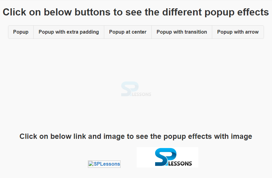
Output: Initial output will be as follows.
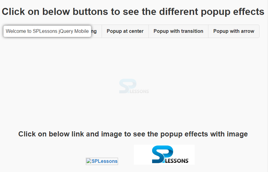
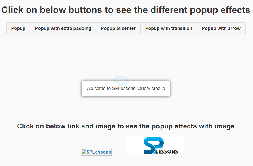
 When clicked on the first button "Popup", the output will be as follows.
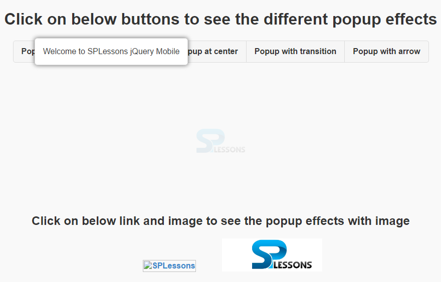
 When clicked on the second button "Popup with extra padding", the output will be as follows.
 When clicked on the third button "Popup at center", the output will be as follows.
 When clicked on the fourth button "Popup with transition", the output will be as follows.
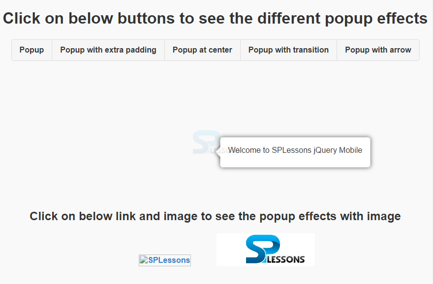
 When clicked on the fifth button "Popup with arrow", the output will be as follows.
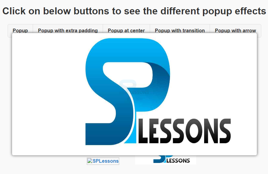
 When clicked on the image-1 with SPLessons as placeholder, the output will be as follows.
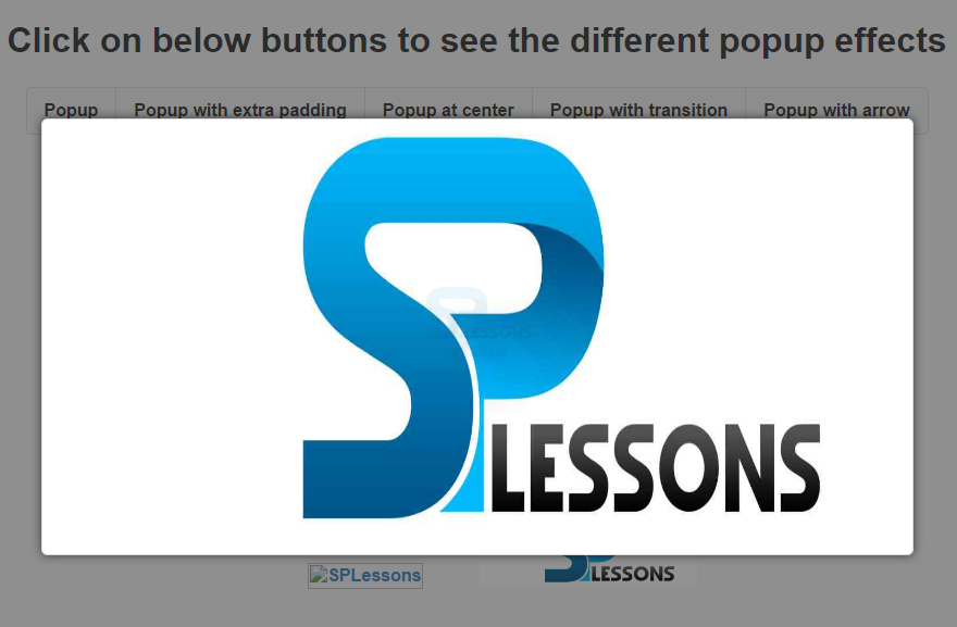
 When clicked on the image-2 with SPLessons as the image, the output will be as follows.
Key Points
- Popup's are ceated by adding data-rel=”popup” to <a> and <div> tags.
- Closing, transition, positioning and overlaying effects can be applied to popup's.