


 Description
jQuery Mobile Grids chapter explains about grid layout. jQuery Mobile provides a responsive column layouts that are based on CSS. But it is not recommended to use normally on a mobile device, due to the mobile's screen width.To position elements like buttons side-by-side, columns is the best choice.Grids are of 100% width, with no background or border(invisible), margin or padding.
There are about five grid layouts that can be used in jQuery Mobile.
The
| Columns | Grid Class | Column Widths |
|---|---|---|
| 1 | ui-grid-solo | 100% |
| 2 | ui-grid-a | 50%/50% |
| 3 | ui-grid-b | 33% / 33% / 33% |
| 4 | ui-grid-c | 25% / 25% / 25% / 25% |
| 5 | ui-grid-d | 20% / 20% / 20% / 20% / 20% |
<div> container should have one of the above Grid Class. The child elements in the container allows to use class ui-block- a|b|c|d|e, based on column number. The columns appears side-by-side.
Eg:
[html]
<div class="ui-grid-b" style="height:40px">
<div class="ui-block-a"><span>Mango</span></div>
<div class="ui-block-b"><span>Orange</span></div>
<div class="ui-block-c"><span>Banana</span></div>
</div>
[/html]
In the above example for the class ui-grid-b (two-column layout), three child elements of ui-block-a and ui-block-b,ui-block-c has to be specified. Description
Customization of column blocks can be done using CSS as shown like below:
Eg:
[html]
<style>
.ui-block-a, .ui-block-b, .ui-block-c {
background-color: red;
border: 1px solid black;
height: 40px;
font-weight: bold;
text-align: left;
padding: 10px;
}
</style>
[/html]
Blocks can also be customized using inline styles.
[html]
<div class="ui-block-a" style="border:1px solid black;">Orange</div>
[/html]
Description
It is also possible to have have multiple rows inside the columns.
Eg:
[html]
<div class="ui-grid-e ">
<div class="ui-block-a">
<div class="ui-body ui-body-a">A</div>
</div>
<div class="ui-block-b">
<div class="ui-body ui-body-a">B</div>
</div>
<div class="ui-block-c">
<div class="ui-body ui-body-a">C</div>
</div>
<div class="ui-block-a">
<div class="ui-body ui-body-a">D</div>
</div>
<div class="ui-block-e">
<div class="ui-body ui-body-a">E</div>
</div>
</div>
[/html]
The ui-block-a-class will always create a new line.In the above example after “C”, ”D” comes to next line because for “D” we have ui-block-a class.
Description
On Small Screens like mobile screens many buttons cannot be placed with text side by side, on a single row. So the grid has to be made responsive. Add the
ui-responsive class to apply responsiveness to the container.
Eg:
[html]
<div class="ui-grid-b ui-responsive">[/html]
If done so, Grid layout will set according to screen size. Example - 1
[html]
<html lang="en">
<head>
<meta charset="UTF-8">
<title>Grid</title>
<meta name="viewport" content="width=device-width, initial-scale=1,maximum-scale=1" />
<!-- jQuery CDN hosted files -->
<link rel="stylesheet" href="http://code.jquery.com/mobile/1.4.5/jquery.mobile-1.4.5.min.css" />
<script src="http://code.jquery.com/jquery-1.11.1.min.js"></script>
<script src="http://code.jquery.com/mobile/1.4.5/jquery.mobile-1.4.5.min.js"></script>
</head>
<body>
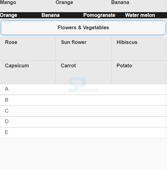
<div class="ui-grid-b ui-bar-a" style="height:40px">
<div class="ui-block-a"><span>Mango</span></div>
<div class="ui-block-b"><span>Orange</span></div>
<div class="ui-block-c"><span>Banana</span></div>
</div>
<fieldset class="ui-grid-c ui-bar-b ui-block">
<div class="ui-block-b"><span>Orange</span></div>
<div class="ui-block-c"><span>Banana</span></div>
<div class="ui-block-d"><span>Pomogranate</span></div>
<div class="ui-block-e"><span>Water melon</span></div>
</fieldset>
<div class="ui-grid-b">
<div class="ui-grid-solo">
<div class="ui-block-a"><input value="Flowers & Vegetables" type="button"></div>
</div>
<div class="ui-block-a">
<div class="ui-bar ui-bar-a" style="height:60px">Rose</div>
</div>
<div class="ui-block-b">
<div class="ui-bar ui-bar-a" style="height:60px">Sun flower</div>
</div>
<div class="ui-block-c">
<div class="ui-bar ui-bar-a" style="height:60px">Hibiscus</div>
</div>
<div class="ui-block-a">
<div class="ui-bar ui-bar-a" style="height:60px">Capsicum</div>
</div>
<div class="ui-block-b">
<div class="ui-bar ui-bar-a" style="height:60px">Carrot</div>
</div>
<div class="ui-block-c">
<div class="ui-bar ui-bar-a" style="height:60px">Potato</div>
</div>
<div class="ui-grid-e ui-responsive">
<div class="ui-block-a">
<div class="ui-body ui-body-a">A</div>
</div>
<div class="ui-block-b">
<div class="ui-body ui-body-a">B</div>
</div>
<div class="ui-block-c">
<div class="ui-body ui-body-a">C</div>
</div>
<div class="ui-block-a">
<div class="ui-body ui-body-a">D</div>
</div>
<div class="ui-block-e">
<div class="ui-body ui-body-a">E</div>
</div>
</body>
</html>
[/html]
Output:
Example - 2
[html]
<!DOCTYPE html>
<html lang="en">
<head>
<meta charset="UTF-8">
<title>Grid</title>
<meta name="viewport" content="width=device-width, initial-scale=1,maximum-scale=1" />
<!-- jQuery CDN hosted files -->
<link rel="stylesheet" href="http://code.jquery.com/mobile/1.4.5/jquery.mobile-1.4.5.min.css" />
<script src="http://code.jquery.com/jquery-1.11.1.min.js"></script>
<script src="http://code.jquery.com/mobile/1.4.5/jquery.mobile-1.4.5.min.js"></script>
</head>
<body>
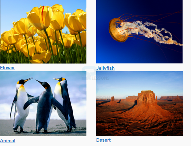
<div class="ui-grid-a" id="#image">
<div class="ui-block-b">
<img src="images/flower.jpg" alt="Flower">
<a href="#">Flower</a>
</div>
<div class="ui-block-b">
<img src="images/sea.jpg" alt="Sea">
<a href="#">Jellyfish</a>
</div>
<div class="ui-block-b">
<img src="images/animal.jpg" alt="Animal">
<a href="#">Animal</a>
</div>
<div class="ui-block-b">
<img src="images/desert.jpg" alt="Desert">
<a href="#">Desert</a>
</div>
<style type="text/css">
img
{
width:90%;
}
</style>
</body>
</html>
[/html]
Output:
Key Points
- To position elements like buttons side-by-side, columns/grids are used.
- Customization of column blocks can be done using CSS.
- Add the ui-responsive class to apply responsiveness to the grid.