


 Introduction
A Pie Charts is a circular chart divided into pies that are proportional to the quantity it represents. This chapter explains about Highcharts Pie Charts and its types.
Description
Highcharts Pie type charts are used to represent the statistical information graphically in a pie-based format which is easy to read. Various properties like label content, starting angle, color, etc., can be easily customized in pie charts.
Conceptual
figure
Following images demonstrates representing some data in the pie chart.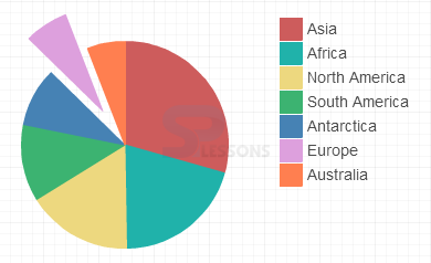
Null Tag
The pie charts can be represented easily. You need to have the data categorized to create a pie chart. The pie charts can be used to represent one or more data series.
Pie charts are mainly used to compare one with another data i.e. a user can easily compare the data by looking the pie-slice size.
Description
The following are a few types of pie charts that can be represented using Highcharts.
- Basic Pie chart
- Pie with legend
- Donut charts
- Semi-circle donut charts
- Pie chart with drilldown
- Pie chart with gradient fill
Description
The basic pie chart is represented in a graphical format and is used to represent the data in a circle divided into different sectors based on the values given.
Example
Below example demonstrates how to create a basic pie chart using CDN access for both Highcharts and jQuery.
[c]
<!DOCTYPE html>
<html>
<head>
<title>Basic pie chart</title>
<script src="https://ajax.googleapis.com/ajax/libs/jquery/2.2.0/jquery.min.js"></script>
<script src="http://code.highcharts.com/highcharts.js"></script>
</head>
<body>
<div id="container" style="width: 600px; height: 500px; margin: 0 auto"></div>
<script language="JavaScript">
$(function () {
$('#container').highcharts({
chart: {
plotBackgroundColor: null,
plotBorderWidth: null,
plotShadow: false,
type: 'pie'
},
title: {
text: 'Social Login Preference 2015'
},
tooltip: {
pointFormat: '{series.name}: <b>{point.percentage:.1f}%</b>'
},
plotOptions: {
pie: {
allowPointSelect: true,
cursor: 'pointer',
dataLabels: {
enabled: true,
format: '<b>{point.name}</b>: {point.percentage:.1f} %',
style: {
color: (Highcharts.theme && Highcharts.theme.contrastTextColor) || 'black'
}
}
}
},
series: [{
name: 'Brands',
colorByPoint: true,
data: [{
name: 'Facebook',
y: 44
}, {
name: 'Twitter',
y: 5
}, {
name: 'Linkedin',
y: 3
}, {
name: 'Yahoo',
y: 5
}, {
name: 'Google plus',
y: 37
}, {
name: 'Others',
y: 4,
sliced: true,
selected: true
}]
}]
});
});
</script>
</body>
</html>
[/c]
Description
Users may confuse if the given values are too big, so in order to overcome this issue, one can use the legend box for each label by setting the value of
showInLegend object to true in the plotOptions. Example
Below example demonstrates how to create a pie chart with legend box using CDN access for both the Highcharts and jQuery.
[c]
<!DOCTYPE html>
<html>
<head>
<title>Pie with legend</title>
<script src="https://ajax.googleapis.com/ajax/libs/jquery/2.2.0/jquery.min.js"></script>
<script src="http://code.highcharts.com/highcharts.js"></script>
</head>
<body>
<div id="container" style="width: 600px; height: 500px; margin: 0 auto"></div>
<script language="JavaScript">
$(function () {
$(document).ready(function () {
// Build the chart
$('#container').highcharts({
chart: {
plotBackgroundColor: null,
plotBorderWidth: null,
plotShadow: false,
type: 'pie'
},
title: {
text: 'Social Login Preference 2015'
},
tooltip: {
pointFormat: '{series.name}: <b>{point.percentage:.1f}%</b>'
},
plotOptions: {
pie: {
allowPointSelect: true,
cursor: 'pointer',
dataLabels: {
enabled: false
},
showInLegend: true
}
},
series: [{
name: 'Brands',
colorByPoint: true,
data: [{
name: 'Facebook',
y: 44
}, {
name: 'Twitter',
y: 5
}, {
name: 'Linkedin',
y: 3
}, {
name: 'Yahoo',
y: 5
}, {
name: 'Google plus',
y: 37,
sliced: true,
selected: true,
}, {
name: 'Others',
y: 4
}]
}]
});
});
});
</script>
</body>
</html>
[/c]
Description
A Donut chart is a type of pie chart that represents the data by dividing into categories. The drill-down effect is used by donut charts for dividing a particular category into sub-categories.
Example
Below example demonstrates how to create a Donut Pie chart using the CDN access for both Highcharts and jQuery.
[c]
<!DOCTYPE html>
<html>
<head>
<title>Donut pie charts</title>
<script src="https://ajax.googleapis.com/ajax/libs/jquery/2.2.0/jquery.min.js"></script>
<script src="http://code.highcharts.com/highcharts.js"></script>
</head>
<body>
<div id="container" style="width: 600px; height: 400px; margin: 0 auto"></div>
<script language="JavaScript">
$(function () {
var colors = Highcharts.getOptions().colors,
categories = ['MSIE', 'Firefox', 'Chrome', 'Safari', 'Opera'],
data = [{
y: 56.33,
color: colors[0],
drilldown: {
name: 'MSIE versions',
categories: ['MSIE 6.0', 'MSIE 7.0', 'MSIE 8.0', 'MSIE 9.0', 'MSIE 10.0', 'MSIE 11.0'],
data: [1.06, 0.5, 17.2, 8.11, 5.33, 24.13],
color: colors[0]
}
}, {
y: 10.38,
color: colors[1],
drilldown: {
name: 'Firefox versions',
categories: ['Firefox v31', 'Firefox v32', 'Firefox v33', 'Firefox v35', 'Firefox v36', 'Firefox v37', 'Firefox v38'],
data: [0.33, 0.15, 0.22, 1.27, 2.76, 2.32, 2.31, 1.02],
color: colors[1]
}
}, {
y: 24.03,
color: colors[2],
drilldown: {
name: 'Chrome versions',
categories: ['Chrome v30.0', 'Chrome v31.0', 'Chrome v32.0', 'Chrome v33.0', 'Chrome v34.0',
'Chrome v35.0', 'Chrome v36.0', 'Chrome v37.0', 'Chrome v38.0', 'Chrome v39.0', 'Chrome v40.0', 'Chrome v41.0', 'Chrome v42.0', 'Chrome v43.0'
],
data: [0.14, 1.24, 0.55, 0.19, 0.14, 0.85, 2.53, 0.38, 0.6, 2.96, 5, 4.32, 3.68, 1.45],
color: colors[2]
}
}, {
y: 4.77,
color: colors[3],
drilldown: {
name: 'Safari versions',
categories: ['Safari v5.0', 'Safari v5.1', 'Safari v6.1', 'Safari v6.2', 'Safari v7.0', 'Safari v7.1', 'Safari v8.0'],
data: [0.3, 0.42, 0.29, 0.17, 0.26, 0.77, 2.56],
color: colors[3]
}
}, {
y: 0.91,
color: colors[4],
drilldown: {
name: 'Opera versions',
categories: ['Opera v12.x', 'Opera v27', 'Opera v28', 'Opera v29'],
data: [0.34, 0.17, 0.24, 0.16],
color: colors[4]
}
}, {
y: 0.2,
color: colors[5],
drilldown: {
name: 'Proprietary or Undetectable',
categories: [],
data: [],
color: colors[5]
}
}],
browserData = [],
versionsData = [],
i,
j,
dataLen = data.length,
drillDataLen,
brightness;
// Build the data arrays
for (i = 0; i < dataLen; i += 1) {
// add browser data
browserData.push({
name: categories[i],
y: data[i].y,
color: data[i].color
});
// add version data
drillDataLen = data[i].drilldown.data.length;
for (j = 0; j < drillDataLen; j += 1) {
brightness = 0.2 - (j / drillDataLen) / 5;
versionsData.push({
name: data[i].drilldown.categories[j],
y: data[i].drilldown.data[j],
color: Highcharts.Color(data[i].color).brighten(brightness).get()
});
}
}
// Create the chart
$('#container').highcharts({
chart: {
type: 'pie'
},
title: {
text: 'Browser market share'
},
subtitle: {
text: ' From January, 2015 to May, 2015'
},
yAxis: {
title: {
text: 'Total percent market share'
}
},
plotOptions: {
pie: {
shadow: false,
center: ['50%', '50%']
}
},
tooltip: {
valueSuffix: '%'
},
series: [{
name: 'Browsers',
data: browserData,
size: '60%',
dataLabels: {
formatter: function () {
return this.y > 5 ? this.point.name : null;
},
color: '#ffffff',
distance: -30
}
}, {
name: 'Versions',
data: versionsData,
size: '80%',
innerSize: '60%',
dataLabels: {
formatter: function () {
// display only if larger than 1
return this.y > 1 ? '<b>' + this.point.name + ':</b> ' + this.y + '%' : null;
}
}
}]
});
});
</script>
</body>
</html>
[/c]
Description
The semi-circle donut chart represents the data in a semi-circular format and the data is divided into different sectors based on the values given.
Example
Below example demonstrates how to create a semi-circle donut chart using the CDN access for both Highcharts and jQuery.
[c]
<!DOCTYPE html>
<html>
<head>
<title>Semi circle donut charts</title>
<script src="https://ajax.googleapis.com/ajax/libs/jquery/2.2.0/jquery.min.js"></script>
<script src="http://code.highcharts.com/highcharts.js"></script>
</head>
<body>
<div id="container" style="width: 600px; height: 500px; margin: 0 auto"></div>
<script language="JavaScript">
$(function () {
$('#container').highcharts({
chart: {
plotBackgroundColor: null,
plotBorderWidth: 0,
plotShadow: false
},
title: {
text: 'Social <br>Login Preference<br>2015',
align: 'center',
verticalAlign: 'middle',
y: 40
},
tooltip: {
pointFormat: '{series.name}: <b>{point.percentage:.1f}%</b>'
},
plotOptions: {
pie: {
dataLabels: {
enabled: true,
distance: -50,
style: {
fontWeight: 'bold',
color: 'white',
textShadow: '0px 1px 2px black'
}
},
startAngle: -90,
endAngle: 90,
center: ['50%', '75%']
}
},
series: [{
type: 'pie',
name: 'Social Login Preference 2015',
innerSize: '50%',
data: [
['Facebook', 44],
['Yahoo', 5],
['Google plus', 37],
['Twitter', 5],
['Linkedin', 3],
{
name: 'Others',
y: 4,
dataLabels: {
enabled: false
}
}
]
}]
});
});
</script>
</body>
</html>
[/c]
Description
The drill down effect is used by pie charts to represent the data from increasing to decreasing order in the clockwise direction.
Example
Below example demonstrates how to create a pie chart with drill down effect using the CDN access for both the Highcharts and jQuery.
[c]
<!DOCTYPE html>
<html>
<head>
<title>Pie chart drill down chart</title>
<script src="https://ajax.googleapis.com/ajax/libs/jquery/2.2.0/jquery.min.js"></script>
<script src="http://code.highcharts.com/highcharts.js"></script>
</head>
<body>
<div id="container" style="width: 600px; height: 500px; margin: 0 auto"></div>
<script language="JavaScript">
$(function () {
$('#container').highcharts({
chart: {
type: 'pie'
},
title: {
text: 'Browser market shares'
},
subtitle: {
text: 'From January, 2015 to May, 2015'
},
plotOptions: {
series: {
dataLabels: {
enabled: true,
format: '{point.name}: {point.y:.1f}%'
}
}
},
tooltip: {
headerFormat: '<span style="font-size:11px">{series.name}</span><br>',
pointFormat: '<span style="color:{point.color}">{point.name}</span>: <b>{point.y:.2f}%</b> of total<br/>'
},
series: [{
name: 'Brands',
colorByPoint: true,
data: [{
name: 'Microsoft Internet Explorer',
y: 56.33,
drilldown: 'Microsoft Internet Explorer'
}, {
name: 'Chrome',
y: 24.03,
drilldown: 'Chrome'
}, {
name: 'Firefox',
y: 10.38,
drilldown: 'Firefox'
}, {
name: 'Safari',
y: 4.77,
drilldown: 'Safari'
}, {
name: 'Opera',
y: 0.91,
drilldown: 'Opera'
}, {
name: 'Proprietary or Undetectable',
y: 0.2,
drilldown: null
}]
}],
drilldown: {
series: [{
name: 'Microsoft Internet Explorer',
id: 'Microsoft Internet Explorer',
data: [
['v11.0', 24.13],
['v8.0', 17.2],
['v9.0', 8.11],
['v10.0', 5.33],
['v6.0', 1.06],
['v7.0', 0.5]
]
}, {
name: 'Chrome',
id: 'Chrome',
data: [
['v40.0', 5],
['v41.0', 4.32],
['v42.0', 3.68],
['v39.0', 2.96],
['v36.0', 2.53],
['v43.0', 1.45],
['v31.0', 1.24],
['v35.0', 0.85],
['v38.0', 0.6],
['v32.0', 0.55],
['v37.0', 0.38],
['v33.0', 0.19],
['v34.0', 0.14],
['v30.0', 0.14]
]
}, {
name: 'Firefox',
id: 'Firefox',
data: [
['v35', 2.76],
['v36', 2.32],
['v37', 2.31],
['v34', 1.27],
['v38', 1.02],
['v31', 0.33],
['v33', 0.22],
['v32', 0.15]
]
}, {
name: 'Safari',
id: 'Safari',
data: [
['v8.0', 2.56],
['v7.1', 0.77],
['v5.1', 0.42],
['v5.0', 0.3],
['v6.1', 0.29],
['v7.0', 0.26],
['v6.2', 0.17]
]
}, {
name: 'Opera',
id: 'Opera',
data: [
['v12.x', 0.34],
['v28', 0.24],
['v27', 0.17],
['v29', 0.16]
]
}]
}
});
});
</script>
</body>
</html>
[/c]
Description
Gradient effect can be used in pie charts by setting
Highcharts.getOptions().colors property. Example
Below example demonstrates how to create a pie chart with gradient effect using the CDN access for both Highcharts and jQuery.
[c]
<!DOCTYPE html>
<html>
<head>
<title>Pie chart gradient fill</title>
<script src="https://ajax.googleapis.com/ajax/libs/jquery/2.2.0/jquery.min.js"></script>
<script src="http://code.highcharts.com/highcharts.js"></script>
</head>
<body>
<div id="container" style="width: 600px; height: 500px; margin: 0 auto"></div>
<script language="JavaScript">
$(function () {
// Radialize the colors
Highcharts.getOptions().colors = Highcharts.map(Highcharts.getOptions().colors, function (color) {
return {
radialGradient: {
cx: 0.5,
cy: 0.3,
r: 0.7
},
stops: [
[0, color],
[1, Highcharts.Color(color).brighten(-0.3).get('rgb')] // darken
]
};
});
// Build the chart
$('#container').highcharts({
chart: {
plotBackgroundColor: null,
plotBorderWidth: null,
plotShadow: false,
type: 'pie'
},
title: {
text: 'Social Login Preference 2015'
},
tooltip: {
pointFormat: '{series.name}: <b>{point.percentage:.1f}%</b>'
},
plotOptions: {
pie: {
allowPointSelect: true,
cursor: 'pointer',
dataLabels: {
enabled: true,
format: '<b>{point.name}</b>: {point.percentage:.1f} %',
style: {
color: (Highcharts.theme && Highcharts.theme.contrastTextColor) || 'black'
},
connectorColor: 'silver'
}
}
},
series: [{
name: 'Brands',
data: [
{ name: 'Facebook', y: 44},
{
name: 'Twitter',
y: 5,
sliced: true,
selected: true
},
{ name: 'Yahoo', y: 5 },
{ name: 'Google plus', y: 37 }, { name: 'Linkedin', y: 3 },
{ name: 'Other', y: 4 }
]
}]
});
});
</script>
</body>
</html>
[/c]
Description
The monochrome fill effect can be used in pie charts by setting the property
Highcharts.getOptions().plotOptions.pie.colors. Example
Below example demonstrates how to create a pie chart with monochromatic effect using CDN access for both Highcharts and jQuery.
[c]
<!DOCTYPE html>
<html>
<head>
<title>Pie charts monochromatic fill</title>
<script src="https://ajax.googleapis.com/ajax/libs/jquery/2.2.0/jquery.min.js"></script>
<script src="http://code.highcharts.com/highcharts.js"></script>
</head>
<body>
<div id="container" style="width: 600px; height: 500px; margin: 0 auto"></div>
<script language="JavaScript">
$(function () {
Highcharts.getOptions().plotOptions.pie.colors = (function () {
var colors = [],
base = Highcharts.getOptions().colors[0], i;
for (i = 0; i < 10; i += 1) {
colors.push(Highcharts.Color(base).brighten((i - 4) / 6).get());
}
return colors;
}());
$('#container').highcharts({
chart: {
plotBackgroundColor: null,
plotBorderWidth: null,
plotShadow: false,
type: 'pie'
},
title: {
text: 'Social Login Preference 2015'
},
tooltip: {
pointFormat: '{series.name}: <b>{point.percentage:.1f}%</b>'
},
plotOptions: {
pie: {
allowPointSelect: true,
cursor: 'pointer',
dataLabels: {
enabled: true,
format: '<b>{point.name}</b>: {point.percentage:.1f} %',
style: {
color: (Highcharts.theme && Highcharts.theme.contrastTextColor) || 'black'
}
}
}
},
series: [{
name: 'Brands',
data: [
{ name: 'Fcebook', y: 44 },
{ name: 'Twitter', y: 5 },
{ name: 'Google plus', y: 37},
{ name: 'Yahoo', y: 5},
{ name: 'Linkedin', y: 3 },
{ name: 'Others', y: 4 }
]
}]
});
});
</script>
</body>
</html>
[/c]
Key Points
- The Highcharts Pie Charts do not have axis to configure data, so the major requirement for creating a pie chart is data with categories
- Highcharts Pie Charts can handle multiple data series
- Highcharts Pie Charts are mainly used to compare the data of different variable.
Programming
Tips
- Add the JavaScript file to the head section of HTML page for creating a chart
- Make sure that all the chart options or setting is correct before running the application
- Give the chart type as pie in the
chart.typeoption - Using CDN access for both jQuery and Highcharts is an easy way for end-user to create Highcharts.