


 Introduction
Highcharts Bar charts are used to represent data horizontally. This chapter explains about how to create Bar charts and its types.
Description
Similar to column charts, the Bar type charts can also represent one or more data series differentiated by colors. The only difference between column and bar charts is-the column chart represents the data vertically and the bar chart represents the data horizontally.
In Highcharts, the bar charts can be represented in two ways, such as:
- Setting series type to Highcharts Bar Charts.
- Setting
chart.invertedoption totruewith column series.
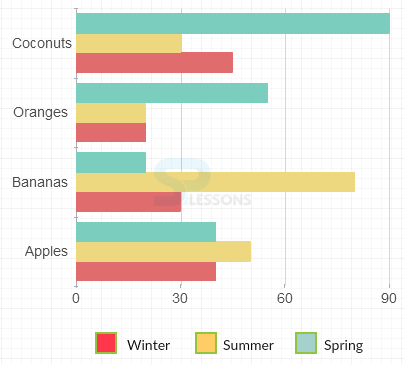
Conceptual
figure
Below picture represents some data in the Highcharts Bar Charts.
Description
Following are some types of Highcharts Bar Charts, which can be represented using Highcharts.
- Basic bar charts
- Stacked bar charts
- Bar charts with negative stack
Description
A basic Highcharts Bar Charts is used to represent the quantitative data. Basic bar chart consists of some horizontal columns and a grid.
Example
Below example demonstrates how to create a Basic Bar chart using CDN access for both Highcharts and jQuery.
[c]
<!DOCTYPE html>
<html>
<head>
<title>Basic bar charts</title>
<script src="https://ajax.googleapis.com/ajax/libs/jquery/2.2.0/jquery.min.js"></script>
<script src="http://code.highcharts.com/highcharts.js"></script>
</head>
<body>
<div id="container" style="width: 600px; height: 500px; margin: 0 auto"></div>
<script language="JavaScript">
$(function () {
$('#container').highcharts({
chart: {
type: 'bar'
},
title: {
text: 'List of Top 10 Countries by past and future population'
},
subtitle: {
text: 'Population in Millions'
},
xAxis: {
categories: ['China', 'India', 'United States', 'Brazil', 'Pakistan', 'Indonesia', 'Bangladesh', 'Nigeria', 'Russia', 'Japan'],
title: {
text: null,
},
labels: {
rotation: -45,
style: {
fontSize: '10px',
fontFamily: 'Verdana, sans-serif'
}
}
},
yAxis: {
min: 0,
title: {
text: 'Population (millions)',
align: 'high'
},
labels: {
overflow: 'justify'
}
},
tooltip: {
valueSuffix: ' millions'
},
plotOptions: {
bar: {
dataLabels: {
enabled: true
}
}
},
legend: {
layout: 'vertical',
align: 'right',
verticalAlign: 'bottom',
x: -50,
y: -80,
floating: true,
borderWidth: 1,
backgroundColor: ((Highcharts.theme && Highcharts.theme.legendBackgroundColor) || '#FFFFFF'),
shadow: true
},
credits: {
enabled: false
},
series: [{
name: 'Year 1990',
data: [1141, 849, 250, 150, 108, 178, 116, 94, 149, 124]
}, {
name: 'Year 2008',
data: [1333, 1140, 304, 192, 166, 228, 160, 151, 143, 128]
}, {
name: 'Year 2025',
data: [1458, 1398, 352, 223, 226, 273, 198, 208, 137, 126]
}]
});
});
</script>
</body>
</html>
[/c]
Description
Instead of placing the data points side-by-side, the stacked bar charts stack the data points on the top. The stacked bar charts are useful for calculating the total values when multiple data series are given.
Example
Below example demonstrates how to create a stacked bar chart using CDN access for both Highcharts and jQuery.
[c]
<!DOCTYPE html>
<html>
<head>
<title>Stacked bar charts</title>
<script src="https://ajax.googleapis.com/ajax/libs/jquery/2.2.0/jquery.min.js"></script>
<script src="http://code.highcharts.com/highcharts.js"></script>
</head>
<body>
<div id="container" style="width: 600px; height: 500px; margin: 0 auto"></div>
<script language="JavaScript">
$(function () {
$('#container').highcharts({
chart: {
type: 'bar'
},
title: {
text: 'Product sales by region'
},
xAxis: {
categories: ['Hyderabad', 'Chennai', 'Bangalore', 'Delhi', 'Mumbai'],
labels: {
rotation: -45,
style: {
fontSize: '11px',
fontFamily: 'Verdana, sans-serif'
}
}
},
yAxis: {
min: 0,
title: {
text: 'Sales'
}
},
legend: {
reversed: true
},
plotOptions: {
series: {
stacking: 'normal',
}
},
series: [{
name: 'Cricket bat',
data: [20, 15, 25, 35, 40]
}, {
name: 'Rackets',
data: [15, 20, 15, 10, 30]
}, {
name: 'Sports shoe',
data: [45, 30, 20, 50, 40]
}, {
name: 'Footbal',
data: [25, 30, 15, 40, 35]
}]
});
});
</script>
</body>
</html>
[/c]
Description
If the data is set to positive and negative values, then the bar chart gets displayed with two scales for both the values.
Example
The following example demonstrates how to create a Bar chart with negative stack using CDN access for both Highcharts and jQuery.
[c]
<!DOCTYPE html>
<html>
<head>
<title>Bar charts with negative stack</title>
<script src="https://ajax.googleapis.com/ajax/libs/jquery/2.2.0/jquery.min.js"></script>
<script src="http://code.highcharts.com/highcharts.js"></script>
</head>
<body>
<div id="container" style="width: 600px; height: 500px; margin: 0 auto"></div>
<script language="JavaScript">
$(function () {
// Age categories
var categories = ['0-4', '5-9', '10-14', '15-19',
'20-24', '25-29', '30-34', '35-39', '40-44',
'45-49', '50-54', '55-59', '60-64', '65-69',
'70-74', '75-79', '80-84', '85-89', '90-94',
'95-99', '100 + '];
$(document).ready(function () {
$('#container').highcharts({
chart: {
type: 'bar'
},
title: {
text: 'Population pyramid for India, 2015'
},
subtitle: {
text: 'From 1950 to 2100'
},
xAxis: [{
categories: categories,
reversed: false,
labels: {
step: 1
}
}, { // mirror axis on right side
opposite: true,
reversed: false,
categories: categories,
linkedTo: 0,
labels: {
step: 1
}
}],
yAxis: {
title: {
text: null
},
labels: {
formatter: function () {
return Math.abs(this.value) + '%';
}
}
},
plotOptions: {
series: {
stacking: 'normal'
}
},
tooltip: {
formatter: function () {
return '<b>' + this.series.name + ', age ' + this.point.category + '</b><br/>' +
'Population: ' + Highcharts.numberFormat(Math.abs(this.point.y), 0);
}
},
series: [{
name: 'Male',
data: [-2.5, -2.5, -2.6, -2.7, -2.8, -2.9, -3.0,
-3.0, -3.1, -3.2, -3.2, -3.2, -3.2, -3.1,
-2.8, -2.2, -1.6, -0.9, -0.3, -0.1, -0.0]
}, {
name: 'Female',
data: [2.3, 2.4, 2.4, 2.5, 2.5, 2.6, 2.7, 2.7,
2.8, 2.9, 2.9, 3.0, 3.0, 3.0, 2.9, 2.6,
2.2, 1.6, 1.0, 0.4, 0.1, 0.0]
}]
});
});
});
</script>
</body>
</html>
[/c]
Key Points
- The bar type charts represent the data horizontally.
- Highcharts bar type charts can represent one or more data series.
- Bar charts do not support ranges and alerts.
Programming
Tips
- Add the JavaScript file to the head section of HTML page to create a chart.
- Ensure that all the chart options or settings are correct before running the application.
- Using CDN access for both jQuery and Highcharts is an easy way for end-user to create Highcharts.