


 Introduction
Column charts are used to represent data vertically. This chapter demonstrates how to create Highcharts column charts and explains about column charts and its types.
Description
Highcharts Column Charts can be represented in one or more data series. In single data series, each data point is represented with different colors, whereas, in multiple data series, each series data points are placed next to one another and separated with different color.
Conceptual
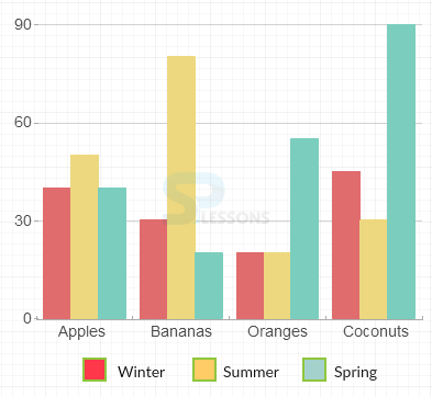
figure
Below image represents some data in column chart. Depending on the left side axis value, the column chart displays the vertical bars as shown.
Description
Following are a few types of Highcharts column.
- Basic column
- Stacked column
- Stacked and grouped column
- Stacked percentage column
- Column with negative values
- Column with rotated labels
- Column with drilldown
- Fixed placement columns
- Data defined in an html table
- Column range
Description
The Highcharts Column Charts represent the data graphically. One or more data series points can be displayed using column charts. The column charts are mainly useful for comparing multiple series of data.
Example
Below code explains the creation of a Basic Column chart using CDN access for both Highcharts and jQuery.
[c]
<!DOCTYPE html>
<html>
<head>
<title>Highcharts</title>
<script src="https://ajax.googleapis.com/ajax/libs/jquery/2.2.0/jquery.min.js"></script>
<script src="http://code.highcharts.com/highcharts.js"></script>
</head>
<body>
<div id="container" style="width: 600px; height: 00px; margin: 0 auto"></div>
<script language="JavaScript">
$(function () {
$('#container').highcharts({
chart: {
type: 'column'
},
title: {
text: 'Monthly Average Rainfall'
},
subtitle: {
text: 'Jan to Dec'
},
xAxis: {
categories: ['Jan', 'Feb', 'Mar', 'Apr', 'May', 'Jun', 'Jul', 'Aug', 'Sep', 'Oct', 'Nov', 'Dec'],
crosshair: true
},
yAxis: {
min: 0,
title: {
text: 'Rainfall (mm)'
}
},
tooltip: {
headerFormat: '<span style="font-size:10px">{point.key}</span><table>',
pointFormat: '<tr><td style="color:{series.color};padding:0">{series.name}: </td>' +
'<td style="padding:0"><b>{point.y:.1f} mm</b></td></tr>',
footerFormat: '</table>',
shared: true,
useHTML: true
},
plotOptions: {
column: {
pointPadding: 0.2,
borderWidth: 0
}
},
series: [{
name: 'Tokyo',
data: [49.9, 71.5, 106.4, 129.2, 144.0, 176.0, 135.6, 148.5, 216.4, 194.1, 95.6, 54.4]
}, {
name: 'New York',
data: [83.6, 78.8, 98.5, 93.4, 106.0, 84.5, 105.0, 104.3, 91.2, 83.5, 106.6, 92.3]
}, {
name: 'London',
data: [48.9, 38.8, 39.3, 41.4, 47.0, 48.3, 59.0, 59.6, 52.4, 65.2, 59.3, 51.2]
}, {
name: 'Berlin',
data: [42.4, 33.2, 34.5, 39.7, 52.6, 75.5, 57.4, 60.4, 47.6, 39.1, 46.8, 51.1]
}]
});
});
</script>
</body>
</html>
[/c]
Description
Instead of representing the columns side by side, the user can stack the columns on top of each other using the stacked column object. One can observe each data series total values and the changes in the ratio.
Example
Below code explains how to create a Stacked column chart using CDN access for both Highcharts and jQuery.
[c]
<!DOCTYPE html>
<html>
<head>
<title>Highcharts</title>
<script src="https://ajax.googleapis.com/ajax/libs/jquery/2.2.0/jquery.min.js"></script>
<script src="http://code.highcharts.com/highcharts.js"></script>
</head>
<body>
<div id="container" style="width: 600px; height: 500px; margin: 0 auto"></div>
<script language="JavaScript">
$(function () {
$('#container').highcharts({
chart: {
type: 'column'
},
title: {
text: 'Product sales by region'
},
xAxis: {
categories: ['Hyderabad', 'Chennai', 'Bangalore', 'Delhi', 'Mumbai']
},
yAxis: {
min: 0,
title: {
text: 'Sales'
},
stackLabels: {
enabled: true,
style: {
fontWeight: 'bold',
color: (Highcharts.theme && Highcharts.theme.textColor) || 'gray'
}
}
},
legend: {
align: 'right',
x: -70,
verticalAlign: 'Top',
y: 25,
floating: true,
backgroundColor: (Highcharts.theme && Highcharts.theme.background2) || 'white',
borderColor: '#CCC',
borderWidth: 1,
shadow: false
},
tooltip: {
headerFormat: '<b>{point.x}</b><br/>',
pointFormat: '{series.name}: {point.y}<br/>Total: {point.stackTotal}'
},
plotOptions: {
column: {
stacking: 'normal',
dataLabels: {
enabled: true,
color: (Highcharts.theme && Highcharts.theme.dataLabelsColor) || 'white',
style: {
textShadow: '0 0 3px black'
}
}
}
},
series: [{
name: 'Cricket bat',
data: [20, 15, 25, 35, 40]
}, {
name: 'Rackets',
data: [15, 20, 15, 10, 30]
}, {
name: 'Sports shoe',
data: [45, 30, 20, 50, 40]
}, {
name: 'Footbal',
data: [25, 30, 15, 40, 35]
}]
});
});
</script>
</body>
</html>
[/c]
Description
The stacked columns can be grouped by giving the same stack name for different data series i.e., the columns with the same stack name are grouped and displayed.
Example
The following example demonstrates how to group a stacked column chart using the CDN access for both Highchart and jQuery.
[c]
<!DOCTYPE html>
<html>
<head>
<title>Highcharts</title>
<script src="https://ajax.googleapis.com/ajax/libs/jquery/2.2.0/jquery.min.js"></script>
<script src="http://code.highcharts.com/highcharts.js"></script>
</head>
<body>
<div id="container" style="width: 600px; height: 500px; margin: 0 auto"></div>
<script language="JavaScript">
$(function () {
$('#container').highcharts({
chart: {
type: 'column'
},
title: {
text: 'Product sales by region'
},
xAxis: {
categories: ['Hyderabad', 'Chennai', 'Bangalore', 'Delhi', 'Mumbai']
},
yAxis: {
allowDecimals: false,
min: 0,
title: {
text: 'Sales'
}
},
tooltip: {
formatter: function () {
return '<b>' + this.x + '</b><br/>' +
this.series.name + ': ' + this.y + '<br/>' +
'Total: ' + this.point.stackTotal;
}
},
plotOptions: {
column: {
stacking: 'normal'
}
},
series: [{
name: 'Cricket bats',
data: [20, 15, 25, 35, 40],
stack: 'Outdoor games'
}, {
name: 'Rackets',
data: [15, 20, 15, 10, 30],
stack: 'Outdoor games'
}, {
name: 'carroms',
data: [45, 30, 20, 50, 40],
stack: 'Indoor games'
}, {
name: 'chess',
data: [25, 30, 15, 40, 35],
stack: 'Indoor games'
}]
});
});
</script>
</body>
</html>
[/c]
Description
The percentage value of given data series can be represented using the stacked percentage column charts.
Example
The following example demonstrates how to create a Stacked percentage column chart using CDN access for both Highcharts and jQuery.
[c]
<!DOCTYPE html>
<html>
<head>
<title>Highcharts</title>
<script src="https://ajax.googleapis.com/ajax/libs/jquery/2.2.0/jquery.min.js"></script>
<script src="http://code.highcharts.com/highcharts.js"></script>
</head>
<body>
<div id="container" style="width: 600px; height: 500px; margin: 0 auto"></div>
<script language="JavaScript">
$(function () {
$('#container').highcharts({
chart: {
type: 'column'
},
title: {
text: 'Product sales by region'
},
xAxis: {
categories: ['Hyderabad', 'Chennai', 'Bangalore', 'Delhi', 'Mumbai']
},
yAxis: {
min: 0,
title: {
text: 'Sales'
}
},
tooltip: {
pointFormat: '<span style="color:{series.color}">{series.name}</span>: <b>{point.y}</b> ({point.percentage:.0f}%)<br/>',
shared: true
},
plotOptions: {
column: {
stacking: 'percent'
}
},
series: [{
name: 'Cricket bats',
data: [20, 15, 25, 35, 40]
}, {
name: 'Rackets',
data: [15, 20, 15, 10, 30]
}, {
name: 'Sports shoe',
data: [45, 30, 20, 50, 40]
}, {
name: 'Footbal',
data: [25, 30, 15, 40, 35]
}]
});
});
</script>
</body>
</html>
[/c]
Description
If the given data set has both positive and negative values, then the chart is displayed with two scales for both the values.
Example
The following example demonstrates how to create a column chart with both positive and negative values using the CDN access for both Highcharts and jQuery.
[c]
<!DOCTYPE html>
<html>
<head>
<title>Highcharts</title>
<script src="https://ajax.googleapis.com/ajax/libs/jquery/2.2.0/jquery.min.js"></script>
<script src="http://code.highcharts.com/highcharts.js"></script>
</head>
<body>
<div id="container" style="width: 600px; height: 500px; margin: 0 auto"></div>
<script language="JavaScript">
$(document).ready(function() {
var chart = {
type: 'column'
};
var title = {
text: 'Product Profit & Gain sales values by region'
};
var xAxis = {
categories: ['Hyderabad', 'Chennai', 'Bangalore', 'Delhi', 'Mumbai']
};
var credits = {
enabled: false
};
var series= [{
name: 'Cricket bats',
data: [20, 15, 25, 35, 40]
}, {
name: 'Rackets',
data: [15, 20, 15, -10, -30]
}, {
name: 'Sports shoe',
data: [45, 30, -20, -50, 40]
}, {
name: 'Footbal',
data: [-25, -30, 15, 40, 35]
}
];
var json = {};
json.chart = chart;
json.title = title;
json.xAxis = xAxis;
json.credits = credits;
json.series = series;
$('#container').highcharts(json);
});
</script>
</body>
</html>
[/c]
Description
The labels given for each column can be rotated by giving a preferred value to the label rotation object.
Example
The following example demonstrates how to create a column chart with rotated labels.
[c]
<!DOCTYPE html>
<html>
<head>
<title>Highcharts</title>
<script src="https://ajax.googleapis.com/ajax/libs/jquery/2.2.0/jquery.min.js"></script>
<script src="http://code.highcharts.com/highcharts.js"></script>
</head>
<body>
<div id="container" style="width: 600px; height: 500px; margin: 0 auto"></div>
<script language="JavaScript">
$(document).ready(function() {
var chart = {
type: 'column'
};
var title = {
text: 'World\'s largest cities per 2014'
};
var xAxis = {
type: 'category',
labels: {
rotation: -45,
style: {
fontSize: '13px',
fontFamily: 'Verdana, sans-serif'
}
}
};
var yAxis ={
min: 0,
title: {
text: 'Population (millions)'
}
};
var tooltip = {
pointFormat: 'Population in 2008: <b>{point.y:.1f} millions</b>'
};
var credits = {
enabled: false
};
var series= [{
name: 'Population',
data: [
['Shanghai', 23.7],
['Lagos', 16.1],
['Instanbul', 14.2],
['Karachi', 14.0],
['Mumbai', 12.5],
['Moscow', 12.1],
['Sao Paulo', 11.8],
['Beijing', 11.7],
['Guangzhou', 11.1],
['Delhi', 11.1],
['Shenzhen', 10.5],
['Seoul', 10.4],
['Jakarta', 10.0],
['Kinshasa', 9.3],
['Tianjin', 9.3],
['Tokyo', 9.0],
['Cairo', 8.9],
['Dhaka', 8.9],
['Mexico City', 8.9],
['Lima', 8.9]
],
dataLabels: {
enabled: true,
rotation: -90,
color: '#FFFFFF',
align: 'right',
format: '{point.y:.1f}', // one decimal
y: 10, // 10 pixels down from the top
style: {
fontSize: '13px',
fontFamily: 'Verdana, sans-serif'
}
}
}];
var json = {};
json.chart = chart;
json.title = title;
json.xAxis = xAxis;
json.yAxis = yAxis;
json.tooltip = tooltip;
json.credits = credits;
json.series = series;
$('#container').highcharts(json);
});
</script>
</body>
</html>
[/c]
Description
The columns for given data set can be displayed either in increasing order or decreasing order depending on the values.
Example
Below example demonstrates how to create the column chart with drill down values using CDN access for both Highcharts and jQuery.
[c]
<!DOCTYPE html>
<html>
<head>
<title>Highcharts</title>
<script src="https://ajax.googleapis.com/ajax/libs/jquery/2.2.0/jquery.min.js"></script>
<script src="http://code.highcharts.com/highcharts.js"></script>
</head>
<body>
<div id="container" style="width: 600px; height: 500px; margin: 0 auto"></div>
<script language="JavaScript">
$(function () {
$('#container').highcharts({
chart: {
type: 'column'
},
title: {
text: 'Browser market shares'
},
subtitle: {
text: 'From January-2015 to May-2015'
},
xAxis: {
type: 'category',
labels: {
rotation: -50,
style: {
fontSize: '12px',
fontFamily: 'Verdana, sans-serif'
}
}
},
yAxis: {
title: {
text: 'Total percent market share'
}
},
legend: {
enabled: false
},
plotOptions: {
series: {
borderWidth: 0,
dataLabels: {
enabled: true,
format: '{point.y:.1f}%'
}
}
},
tooltip: {
headerFormat: '<span style="font-size:11px">{series.name}</span><br>',
pointFormat: '<span style="color:{point.color}">{point.name}</span>: <b>{point.y:.2f}%</b> of total<br/>'
},
series: [{
name: 'Brands',
colorByPoint: true,
data: [{
name: 'Microsoft Internet Explorer',
y: 56.33,
drilldown: 'Microsoft Internet Explorer'
}, {
name: 'Chrome',
y: 24.03,
drilldown: 'Chrome'
}, {
name: 'Firefox',
y: 10.38,
drilldown: 'Firefox'
}, {
name: 'Safari',
y: 4.77,
drilldown: 'Safari'
}, {
name: 'Opera',
y: 0.91,
drilldown: 'Opera'
}, {
name: 'Proprietary or Undetectable',
y: 0.2,
drilldown: null
}]
}],
drilldown: {
series: [{
name: 'Microsoft Internet Explorer',
id: 'Microsoft Internet Explorer',
data: [
['v11.0', 24.13],
['v8.0', 17.2],
['v9.0', 8.11],
['v10.0', 5.33],
['v6.0', 1.06],
['v7.0', 0.5]
]
}, {
name: 'Chrome',
id: 'Chrome',
data: [
['v40.0', 5],
['v41.0', 4.32],
['v42.0', 3.68],
['v39.0', 2.96],
['v36.0', 2.53],
['v43.0', 1.45],
['v31.0', 1.24],
['v35.0', 0.85],
['v38.0', 0.6],
['v32.0', 0.55],
['v37.0', 0.38],
['v33.0', 0.19],
['v34.0', 0.14],
['v30.0', 0.14]
]
}, {
name: 'Firefox',
id: 'Firefox',
data: [
['v35', 2.76],
['v36', 2.32],
['v37', 2.31],
['v34', 1.27],
['v38', 1.02],
['v31', 0.33],
['v33', 0.22],
['v32', 0.15]
]
}, {
name: 'Safari',
id: 'Safari',
data: [
['v8.0', 2.56],
['v7.1', 0.77],
['v5.1', 0.42],
['v5.0', 0.3],
['v6.1', 0.29],
['v7.0', 0.26],
['v6.2', 0.17]
]
}, {
name: 'Opera',
id: 'Opera',
data: [
['v12.x', 0.34],
['v28', 0.24],
['v27', 0.17],
['v29', 0.16]
]
}]
}
});
});
</script>
</body>
</html>
[/c]
Description
Instead of placing one column on the top of other, columns can be overlaid on each other and differentiated by colors.
Example
Below example demonstrates how to create a fixed placement columns using the CDN access for both Highcharts and jQuery.
[c]
<!DOCTYPE html>
<html>
<head>
<title>Highcharts</title>
<script src="https://ajax.googleapis.com/ajax/libs/jquery/2.2.0/jquery.min.js"></script>
<script src="http://code.highcharts.com/highcharts.js"></script>
</head>
<body>
<div id="container" style="width: 600px; height: 500px; margin: 0 auto"></div>
<script language="JavaScript">
$(function () {
$('#container').highcharts({
chart: {
type: 'column'
},
title: {
text: 'Efficiency Optimization by Branch'
},
xAxis: {
categories: ['Seattle HQ', 'San Francisco', 'Tokyo'],
labels: {
rotation: -50,
style: {
fontSize: '12px',
fontFamily: 'Verdana, sans-serif'
}
}
},
yAxis: [{
min: 0,
title: {
text: 'Employees'
}
}, {
title: {
text: 'Profit (millions)'
},
opposite: true
}],
legend: {
shadow: false
},
tooltip: {
shared: true
},
plotOptions: {
column: {
grouping: false,
shadow: false,
borderWidth: 0
}
},
series: [{
name: 'Employees',
color: 'rgba(165,170,217,1)',
data: [150, 73, 20],
pointPadding: 0.3,
pointPlacement: -0.2
}, {
name: 'Employees Optimized',
color: 'rgba(126,86,134,.9)',
data: [140, 90, 40],
pointPadding: 0.4,
pointPlacement: -0.2
}, {
name: 'Profit',
color: 'rgba(248,161,63,1)',
data: [183.6, 178.8, 198.5],
tooltip: {
valuePrefix: '$',
valueSuffix: ' M'
},
pointPadding: 0.3,
pointPlacement: 0.2,
yAxis: 1
}, {
name: 'Profit Optimized',
color: 'rgba(186,60,61,.9)',
data: [203.6, 198.8, 208.5],
tooltip: {
valuePrefix: '$',
valueSuffix: ' M'
},
pointPadding: 0.4,
pointPlacement: 0.2,
yAxis: 1
}]
});
});
</script>
</body>
</html>
[/c]
Description
The data can be defined in an html table to create a chart i.e., instead of giving the data in series object, one needs to create a html table for preferred data and call the data using a script tag in the head section of the html page.
Example
Below example demonstrates how to create a column chart with data defined in an html table.
[c]
<!DOCTYPE html>
<html>
<head>
<title>Highcharts Tutorial</title>
<script src="http://ajax.googleapis.com/ajax/libs/jquery/2.1.3/jquery.min.js"></script>
<script src="http://code.highcharts.com/highcharts.js"></script>
<script src="http://code.highcharts.com/modules/data.js"></script>
</head>
<body>
<div id="container" style="width: 550px; height: 400px; margin: 0 auto"></div>
<script language="JavaScript">
$(function () {
$('#container').highcharts({
data: {
table: 'datatable'
},
chart: {
type: 'column'
},
title: {
text: 'Data extracted from a HTML table in the page'
},
xAxis: {
labels: {
rotation: -50,
style: {
fontSize: '12px',
fontFamily: 'Verdana, sans-serif'
}
}
},
yAxis: {
allowDecimals: false,
title: {
text: 'Units'
}
},
tooltip: {
formatter: function () {
return '<b>' + this.series.name + '</b><br/>' +
this.point.y + ' ' + this.point.name.toLowerCase();
}
}
});
});
</script>
<table id="datatable">
<thead>
<tr><th></th><th>David</th><th>Jhon</th></tr>
</thead>
<tbody>
<tr><th>Apples</th><td>5</td><td>6</td></tr>
<tr><th>Pears</th><td>4</td><td>7</td></tr>
<tr><th>Plums</th><td>0</td><td>14</td></tr>
<tr><th>Bananas</th><td>12</td><td>3</td></tr>
<tr><th>Oranges</th><td>10</td><td>8</td></tr>
</tbody>
</table>
</body>
</html>
[/c]
Description
The range of a given data set can be represented using column charts. Column range is used to define the range for temperature, height and depth.
Example
Below example demonstrates how to create the Column range chart for the given data.
[c]
<!DOCTYPE html>
<html>
<head>
<title>Highcharts</title>
<script src="https://ajax.googleapis.com/ajax/libs/jquery/2.2.0/jquery.min.js"></script>
<script src="http://code.highcharts.com/highcharts.js"></script>
<script src="http://code.highcharts.com/highcharts-more.js"></script>
</head>
<body>
<div id="container" style="width: 600px; height: 500px; margin: 0 auto"></div>
<script language="JavaScript">
$(function () {
$('#container').highcharts({
chart: {
type: 'columnrange',
inverted: true
},
title: {
text: 'Temperature variation by month'
},
subtitle: {
text: 'From Jan to Dec'
},
xAxis: {
categories: ['Jan', 'Feb', 'Mar', 'Apr', 'May', 'Jun', 'Jul', 'Aug', 'Sep', 'Oct', 'Nov', 'Dec'],
labels: {
rotation: -50,
style: {
fontSize: '12px',
fontFamily: 'Verdana, sans-serif'
}
}
},
yAxis: {
title: {
text: 'Temperature ( °C )'
}
},
tooltip: {
valueSuffix: '°C'
},
plotOptions: {
columnrange: {
dataLabels: {
enabled: true,
formatter: function () {
return this.y + '°C';
}
}
}
},
legend: {
enabled: false
},
series: [{
name: 'Temperatures',
data: [
[-9.7, 9.4],
[-8.7, 6.5],
[-3.5, 9.4],
[-1.4, 19.9],
[0.0, 22.6],
[2.9, 29.5],
[9.2, 30.7],
[7.3, 26.5],
[4.4, 18.0],
[-3.1, 11.4],
[-5.2, 10.4],
[-13.5, 9.8]
]
}]
});
});
</script>
</body>
</html>
[/c]
Key Points
- The Highcharts Column Charts represent the data vertically.
- Highcharts column type charts can be represented in one or more data series.
Programming
Tips
- Add the JavaScript file to the head section of HTML page to create a chart.
- Ensure that all the chart options or settings are correct before running the application.
- Using CDN access for both jQuery and Highcharts is an easy way for end-user to create Highcharts.