

 Introduction
The chapter demonstrates about the Highcharts Basics. Highcharts is a JavaScript based library that enables to create high quality and interactive web-based charting with minimal coding. One can create various charts like line charts, spine charts, area charts, bar charts and pie charts. Highly professional and attractive charts can be created with Highcharts for a web application or website.
This chapter teaches the Highcharts Basics and the following concepts are covered:
- Title and subtitle
- Syntax
- SET Options
- Highcharts – Axes & Series
Description
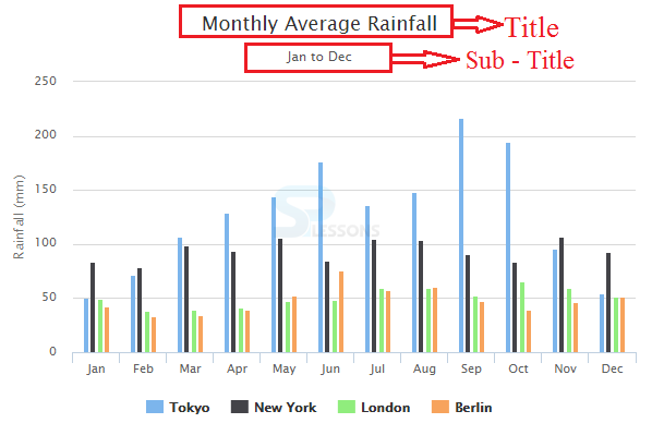
Every chart has a “Title and subtitle”. By default, the title gets displayed at top center of the chart and the subtitle gets displayed under the main title.
Conceptual
figure
Description
As a matter of course, Highcharts utilizes the jQuery system. So, the primary prerequisite for a client before making Highcharts is introducing jQuery library.
jQuery can be utilized in two ways:
- CDN Access Include the following CDN version of jQuery library in the HTML page using jQuery CDN access. [c]<script src=”href=”https://ajax.googleapis.com/ajax,libs/jquery/2.2.0/jquery.min.js”></script>[/c]
- By downloading If downloaded, include the following jQuery script file in the HTML page head section. [c]<script src=”/jquery/jquery.min.js”></script>[/c]
- CDN access Include the following CDN version of Highcharts JavaScript file and add in HTML page for CDN access. [c]<script src=”href=”http://code.highcharts.com/highcharts.js”></script>[/c]
- By downloading Download the Highcharts JavaScript file and add in the section of HTML page. [c]<script src=”/js/highcharts.js”></script>[/c]
Description
Follow the steps below to create a simple bar chart using CDN access for both Highcharts and jQuery.
Step 1
Include the CDN versions for both jQuery and Highcharts in the header section of the HTML page.
[c]
<head>
<script src=”href=”https://ajax.googleapis.com/ajax,libs/jquery/2.2.0/jquery.min.js”></script>
<script src=”href=”http://code.highcharts.com/highcharts.js”></script>
</head>
[/c]
Step 2
Add the following div tag to the page to add height and width of the chart.
[c]<div id=”container” style=”width:100%; height:400px;”></div>[/c]
Step 3
By adding the JavaScript tags, one can initialize the chart anywhere in the webpage with the following jQuery code.
[c]
<!DOCTYPE html>
<html>
<head>
<title>Highcharts</title>
<script src="https://ajax.googleapis.com/ajax/libs/jquery/2.2.0/jquery.min.js"></script>
<script src="http://code.highcharts.com/highcharts.js"></script>
</head>
<body>
<div id="container" style="width: 600px; height: 500px; margin: 0 auto"></div>
<script language="JavaScript">
$(function () {
$('#container').highcharts({
chart: {
type: 'bar'
},
title: {
text: 'Social Media Worldwide Usage'
},
xAxis: {
categories: ['Facebook', 'Twitter', 'Instagram']
},
yAxis: {
title: {
text: 'Usage Percentage'
}
},
series: [{
name: 'Daily',
data: [70, 38, 59]
}, {
name: 'Weekly',
data: [21, 21, 17]
},{
name: 'Less often',
data: [9, 40, 23]
}]
});
});
</script>
</body>
</html>
[/c]
Step 4
Now, run the application on any browser to check the chart output.
Description
Options can be set or defined using JavaScript object structure in Highcharts. The options object is required after initializing the Highcharts.chart.
The following snippet code demonstrates the main scheme or importance of using the Options object:
[c]
chart: {
type: 'bar'
},
title: {
text: 'Social Media Worldwide Usage'
},
xAxis: {
categories: ['Facebook', 'Twitter', 'Instagram']
},
yAxis: {
title: {
text: 'Usage Percentage'
}
},
series: [{
name: 'Daily',
data: [70, 38, 59]
}, {
name: 'Weekly',
data: [21, 21, 17]
},{
name: 'Less often',
data: [9, 40, 23]
}]
}
[/c]
The code contains following Options:
chart.typeUsed to set the chart type configuration i.e. like scatter, bar, column etc.
title.textUsed to set the main title of the chart on the top center of the chart.
xAxisUsed to set the categories on the X axis, the color and alignment of the labels can be customized using different color and text properties.
yAxisUsed to set the title text on the Y axis, similar to x axis, the color and alignment etc. can be customized using different color and text properties.
SeriesUsed to set the data and names to display on the charts.
Description
The axis are the main requirement for creating a chart, the X and Y axis are shown by default in all charts except in pie charts. The axis mainly consists of three properties, which include:
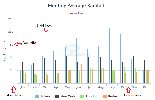
- Labels
- Tick marks
- Gridlines
Description
The labels can be found along the axis displaying the data values of respective axis and can be customized using the function called formatter.
The below snippet code demonstrates the main scheme of giving labels in the chart:
[c]
yAxis:{
labels: {
formatter: function() {
return this.value + ‘%’;
}
},
},
[/c]
Description
The line placed along the axis for showing different measurement units is known as Tick marks, the intervals of the tick mark in an axis is decided by the option-tick interval, which is set to null by default.
Description
A chart is divided into a grid with the help of Grid Lines, which is a collection of some horizontal and vertical lines.
The following snippet code demonstrates the main scheme of grid Lines in a chart:
[c]
xAxis: {
gridLineWidth: 1
},
yAxis: {
gridLineWidth:1
}
[/c]
Description
A set of data is known as series and the data for a chart should be set using the series option. The snippet code below demonstrates the structure of series object:
[c]
series: [{
name: ‘ ‘
data: [ ]
}]
[/c]
Following are a few options that lets you use the data series in Highcharts.
- Animation By default, the animation is enabled in highcharts and used for altering the animation attributes of a series.
- Color Used to change the colors of a series.
- Point Selection Used to highlight the selected point and customize.
- Line Width The width of a line can be adjusted using Line width.
- Stacking The given data points can be placed on each other using the Stacking option.
- Cursor Used to change the appearance of the cursor for indicating clickable series and points.
- Data Labels Used to display the given data labels on the points of a graph.
- Dash Style Used to display the different types of dashed lines.
- Zones By using zones, different sections of a graph can be customized i.e. the different colors can be given for low range data and high range data.
Key Points
- Highcharts Basics - Highcharts are also available as packages through Bower and npm.
- Highcharts Basics - CDN is an easy way for end user to create Highcharts.
Programming
Tips
- Add the JavaScript file to the head section of HTML page to create a chart.
- Ensure that all the chart options or settings are correct before running the application.