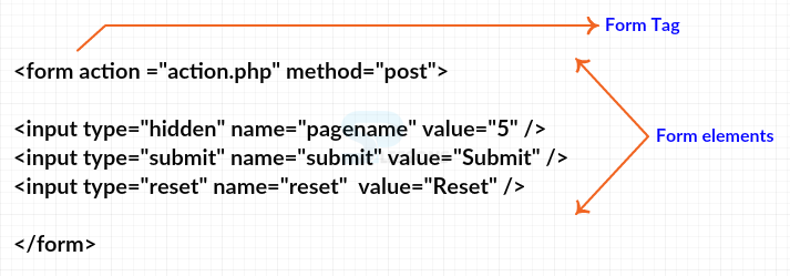
In order to build or control the forms user need to use different types of controls. following are some of the controls listed below with some examples.
- Radio Box Controls
- Check boxes Controls
- Password Input Controls
- Single Line Input Controls
- Hidden From Controls
- File Upload Control
Radio Box Controls
The word
" radio buttons " originates from old radios. In old radios, user should press single button at once to choose radio station which user needed to listen to from ones user had been set. User not able to press two buttons in the meantime of radio, and squeezing one would pop then other should be out. Radio buttons are similar to the checkboxes in which they can be either on state or off state, yet which have two key differences as shown below.
- If user have a gathering of radio button which have the similar name, in which one and only of them can be chosen. When single radio button has been chosen, if the client clickon onemore alternative, the new choice is chosen and the other old choice is deselected.
- User should not utilize radio buttons for a one form control in which the control demonstrates on state or off state, because once a single radio button has chosen it can't be unselected once more.
The code below demonstrates the Radio buttons as shown.
[html]
<!DOCTYPE html>
<html>
<head>
<title>Radio Box Control</title>
</head>
<body>
<form>
<input type="radio" name="subject" value="html"> HTML
<input type="radio" name="subject" value="html5"> HTML5
<input type="radio" name="subject" value="xhtml"> XHTML
</form>
</body>
</html>
[/html]
Result
By running the above code in a preferred browser user can get the following output as shown in below image.
Check boxes Controls
Check boxes are much the same as the small boxes on paper forms in which user can put a cross or tick. Likewise switch box, they can be either on or off. When they are on, the client can just flip amongst on state and off state positions by clicking the checkbox.
Check boxes can show up exclusively, with each and every one having its own particular name, or they can show up as a gathering of check boxes which share a name and allows clients to choose a few qualities for the similar property.
Checkboxes are perfect form of controls if user have to allow a client to
- Give a simple yes or no respons with single control.
- Which select multiple items from a possible options list.
A checkbox is made by utilizing the
< input > element which type property have an value of checkbox . The code below demonstrates the Check boxes as shown below.
[html]
<!DOCTYPE html>
<html>
<head>
<title>Checkbox Control</title>
</head>
<body>
<form>
<input type="checkbox" name="html" value="on"> HTML
<input type="checkbox" name="xhtml5" value="on"> HTML5
<input type="checkbox" name="xhtml" value="on"> XHTML
</form>
</body>
</html>
[/html]
Result
By running the above code in a preferred browser user can get the following output as shown in below image.
Password Input Controls
If user wants to gather a sensitive data, for example,
credit card data and,
passwords, then user can utilize the password input method. Which covers the characters the client typed on screen those can be replaced by
dots or
bullet, so they would not be noticeable to somebody looking on the client.
Password is a single lined text box and display the characters as a dotted lines, the password control is created by html
<input>tag and the attribute is
password. The code below demonstrates the use of password input controls.
[html]
<!DOCTYPE html>
<html>
<head>
<title>Password Input Control</title>
</head>
<body>
<form >
User ID : <input type="text" name="user_id" />
<br>
Password: <input type="password" name="password" />
</form>
</body>
</html>
[/html]
Result
By running the above code in a preferred browser user can get the following output as shown in below image.
Single Line Input Controls
Single - line text input controls which can be made by utilizing a
< input > element whose type attribute have an text value. Single line input controls is used for single line inputs like search boxes and names. The control can be created by using html
<input> tag. The code below demonstrates the use of single line input control.
[html]
<!DOCTYPE html>
<html>
<head>
<title>Text Input Control</title>
</head>
<body>
<form >
Name: <input type="text" name="Name" />
<br>
Father name: <input type="text" name="Father_name" />
</form>
</body>
</html>
[/html]
Result
By running the above code in a preferred browser user can get the following output as shown in below image.
Hidden From Controls
Sometimes user can pass data between pages without the client seeing it; to do these, user can utilize hidden form controls. Which is essential to note, while clients can't see in the web page, if they somehow managed to take a look at the source code for the web page they should have the capacity to look values in the code. Along these lines, hidden controls are not utilized for any sensitive data which user don't need the client to see.
If user use the Hidden from controls then it will hide the actual data of the web page and then data will be pushed by the server. The code below demonstrates the working of hidden from controls.
[html]
<!DOCTYPE html>
<html>
<head>
<title>File Upload Box</title>
</head>
<body>
<form>
<p>This is page 5</p>
<input type="hidden" name="pagename" value="5" />
<input type="submit" name="submit" value="Submit" />
<input type="reset" name="reset" value="Reset" />
</form>
</body>
</html>
[/html]
Result
By running the above code in a preferred browser user can get the following output as shown in below image.
File Upload Control
File Upload Box is used to upload the selected file into web site. To build the box user need to use a file upload box which is built by html
<input> element and the attribute is
file.
[html]
<!DOCTYPE html>
<html>
<head>
<title>File Upload Box</title>
</head>
<body>
<form>
<input type="file" name="fileupload" accept="image/*" />
</form>
</body>
</html>
[/html]
Result
By running the above code in a preferred browser user can get the following output as shown in below image.