


 Introduction
This chapter demnstrates about the W3CSS Tooltips which display the text or other content when user mouse hover over an HTML element and following ae the concepts covered in this chapter.
- Inline Tootips
- Types of Tooltips
Description
Tooltip display the text when user mouse hover over an HTML element. Which is defined by the w3-tooltip class and in order to define the text user need to use w3-text class. The image below demonstrates to create Inline Tooltip as shown.
 The code below demonstrates the inline Tooltip Text.
[html]
<!DOCTYPE html>
<html>
<title>W3.CSS</title>
<meta name="viewport" content="width=device-width, initial-scale=1">
<link rel="stylesheet" href="http://www.w3schools.com/lib/w3.css">
<body>
<div class="w3-container">
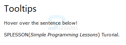
<h2>Tooltips</h2>
<p>Hover over the sentence below!</p>
<p class="w3-tooltip">SPLESSON<span class="w3-text">(<em>Simple Programming Lessons</em>)</span> Turorial.</p>
</div>
</body>
</html>
[/html]
Result
By running the above code in a preferred browser user can get the following output as shown in below image.
The code below demonstrates the inline Tooltip Text.
[html]
<!DOCTYPE html>
<html>
<title>W3.CSS</title>
<meta name="viewport" content="width=device-width, initial-scale=1">
<link rel="stylesheet" href="http://www.w3schools.com/lib/w3.css">
<body>
<div class="w3-container">
<h2>Tooltips</h2>
<p>Hover over the sentence below!</p>
<p class="w3-tooltip">SPLESSON<span class="w3-text">(<em>Simple Programming Lessons</em>)</span> Turorial.</p>
</div>
</body>
</html>
[/html]
Result
By running the above code in a preferred browser user can get the following output as shown in below image.
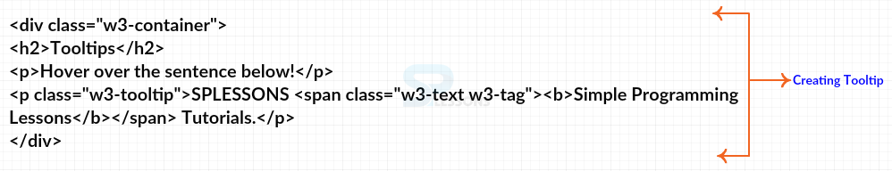
 User can also create the Inline Tooltip Tags by using the w3-tag. The code below demonstrates to creating the Inline Tooltip Tag.
[html]
<!DOCTYPE html>
<html>
<title>W3.CSS</title>
<meta name="viewport" content="width=device-width, initial-scale=1">
<link rel="stylesheet" href="http://www.w3schools.com/lib/w3.css">
<body>
<div class="w3-container">
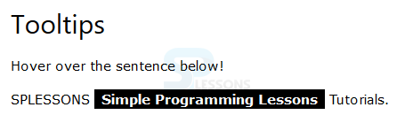
<h2>Tooltips</h2>
<p>Hover over the sentence below!</p>
<p class="w3-tooltip">SPLESSONS <span class="w3-text w3-tag"><b>Simple Programming Lessons</b></span> Tutorials.</p>
</div>
</body>
</html>
[/html]
Result
By running the above code in a preferred browser user can get the following output as shown in below image.
User can also create the Inline Tooltip Tags by using the w3-tag. The code below demonstrates to creating the Inline Tooltip Tag.
[html]
<!DOCTYPE html>
<html>
<title>W3.CSS</title>
<meta name="viewport" content="width=device-width, initial-scale=1">
<link rel="stylesheet" href="http://www.w3schools.com/lib/w3.css">
<body>
<div class="w3-container">
<h2>Tooltips</h2>
<p>Hover over the sentence below!</p>
<p class="w3-tooltip">SPLESSONS <span class="w3-text w3-tag"><b>Simple Programming Lessons</b></span> Tutorials.</p>
</div>
</body>
</html>
[/html]
Result
By running the above code in a preferred browser user can get the following output as shown in below image.
Description
W3.CSS have the different types Tooltips user can use these Tooltips for an HTML element. Following are the some tooltips as listed below.
Image Tooltip
User can also make the image as a Tooltip when user can hover over an image then user will get a text. The code below demonstrates the image Tooltip as shown below.
[html]
<!DOCTYPE html>
<html>
<title>W3.CSS</title>
<meta name="viewport" content="width=device-width, initial-scale=1">
<link rel="stylesheet" href="http://www.w3schools.com/lib/w3.css">
<body>
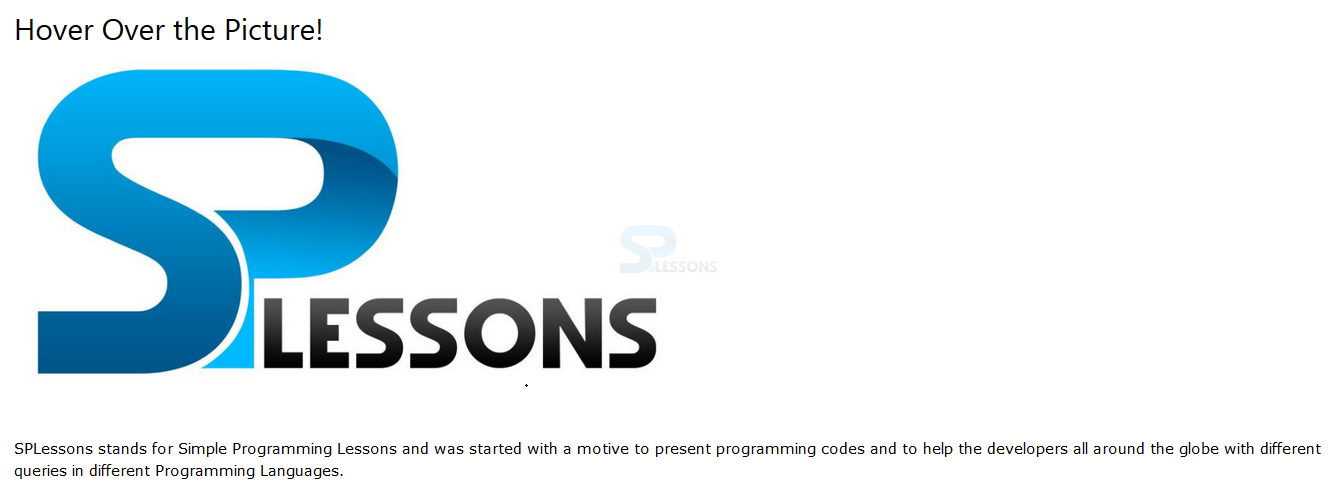
<div class="w3-container">
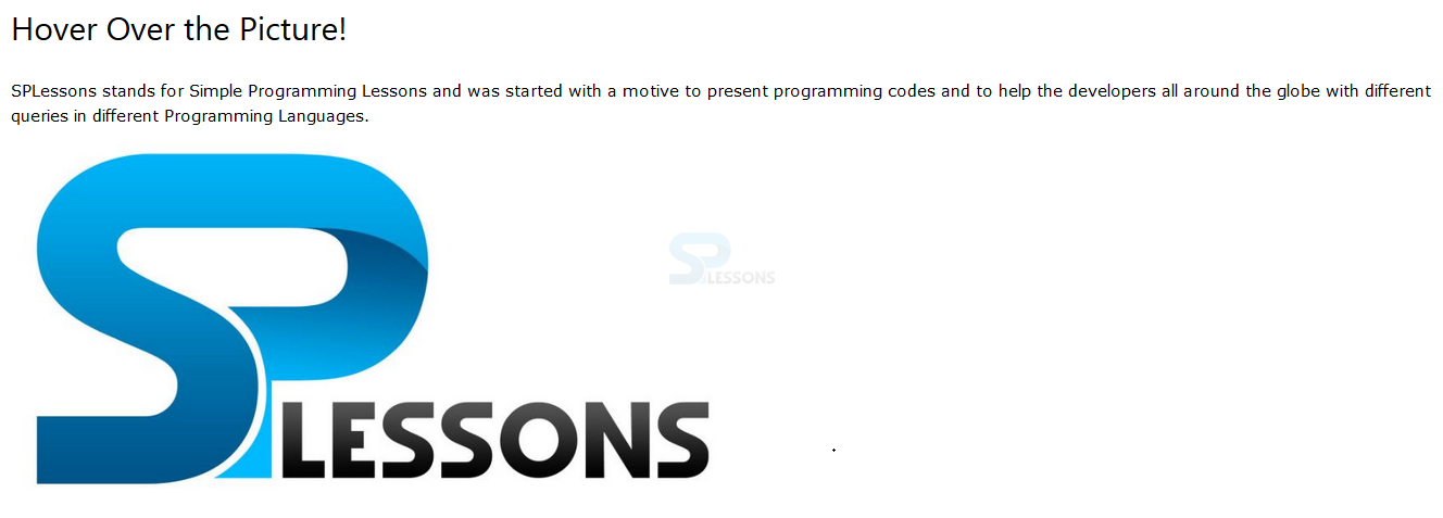
<h2>Hover Over the Picture!</h2>
<div class="w3-tooltip">
<p class="w3-text"> SPLessons stands for Simple Programming Lessons and was started with a motive to present programming codes and to help the developers all around the globe with different queries in different Programming Languages.</p>
<img src="splessons.jpg" alt="splessons" style="width:50%">
</div>
</div>
</body>
</html>
[/html]
Result
By running the above code in a preferred browser user can get the following output as shown in below image.
 In the Image Tooltip user can also get the text after the picture. The code below demonstrates to get the text after the picture.
[html]
<!DOCTYPE html>
<html>
<title>W3.CSS</title>
<meta name="viewport" content="width=device-width, initial-scale=1">
<link rel="stylesheet" href="http://www.w3schools.com/lib/w3.css">
<body>
<div class="w3-container">
<h2>Hover Over the Picture!</h2>
<div class="w3-tooltip">
<img src="splessons.jpg" alt="splessons" style="width:50%">
<p class="w3-text">SPLessons stands for Simple Programming Lessons and was started with a motive to present programming codes and to help the developers all around the globe with different queries in different Programming Languages.</p>
</div>
</div>
</body>
</html>
[/html]
Result
By running the above code in a preferred browser user can get the following output as shown in below image.
In the Image Tooltip user can also get the text after the picture. The code below demonstrates to get the text after the picture.
[html]
<!DOCTYPE html>
<html>
<title>W3.CSS</title>
<meta name="viewport" content="width=device-width, initial-scale=1">
<link rel="stylesheet" href="http://www.w3schools.com/lib/w3.css">
<body>
<div class="w3-container">
<h2>Hover Over the Picture!</h2>
<div class="w3-tooltip">
<img src="splessons.jpg" alt="splessons" style="width:50%">
<p class="w3-text">SPLessons stands for Simple Programming Lessons and was started with a motive to present programming codes and to help the developers all around the globe with different queries in different Programming Languages.</p>
</div>
</div>
</body>
</html>
[/html]
Result
By running the above code in a preferred browser user can get the following output as shown in below image.
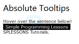
 Positioned Tooltips
User can also place the Tooltips at absolute positions user can position the tooltip text with CSS. The code below demonstrates the positioned Tooltips as shown below.
[html]
<!DOCTYPE html>
<html>
<title>W3.CSS</title>
<meta name="viewport" content="width=device-width, initial-scale=1">
<link rel="stylesheet" href="http://www.w3schools.com/lib/w3.css">
<body>
<div class="w3-container">
<h2>Absolute Tooltips</h2>
<p>Hover over the sentence below!</p>
<p class="w3-tooltip">SPLESSONS <span style="position:absolute;left:0;bottom:18px" class="w3-text w3-tag">Simple Programming Lessons</span> Tutorials.</p>
</div>
</body>
</html>
[/html]
Result
By running the above code in a preferred browser user can get the following output as shown in below image.
Positioned Tooltips
User can also place the Tooltips at absolute positions user can position the tooltip text with CSS. The code below demonstrates the positioned Tooltips as shown below.
[html]
<!DOCTYPE html>
<html>
<title>W3.CSS</title>
<meta name="viewport" content="width=device-width, initial-scale=1">
<link rel="stylesheet" href="http://www.w3schools.com/lib/w3.css">
<body>
<div class="w3-container">
<h2>Absolute Tooltips</h2>
<p>Hover over the sentence below!</p>
<p class="w3-tooltip">SPLESSONS <span style="position:absolute;left:0;bottom:18px" class="w3-text w3-tag">Simple Programming Lessons</span> Tutorials.</p>
</div>
</body>
</html>
[/html]
Result
By running the above code in a preferred browser user can get the following output as shown in below image.
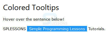
 Colored Tooltips
User can also make the colored tooltip y using w3-color class. The code below demonstrates to get the Colored Tooltip as shown below.
[html]
<!DOCTYPE html>
<html>
<title>W3.CSS</title>
<meta name="viewport" content="width=device-width, initial-scale=1">
<link rel="stylesheet" href="http://www.w3schools.com/lib/w3.css">
<body>
<div class="w3-container">
<h2>Colored Tooltips</h2>
<p>Hover over the sentence below!</p>
<p class="w3-tooltip">SPLESSONS <span class="w3-text w3-tag w3-blue">Simple Programming Lessons</span> Tutorials.</p>
</div>
</body>
</html>
[/html]
Result
By running the above code in a preferred browser user can get the following output as shown in below image.
Colored Tooltips
User can also make the colored tooltip y using w3-color class. The code below demonstrates to get the Colored Tooltip as shown below.
[html]
<!DOCTYPE html>
<html>
<title>W3.CSS</title>
<meta name="viewport" content="width=device-width, initial-scale=1">
<link rel="stylesheet" href="http://www.w3schools.com/lib/w3.css">
<body>
<div class="w3-container">
<h2>Colored Tooltips</h2>
<p>Hover over the sentence below!</p>
<p class="w3-tooltip">SPLESSONS <span class="w3-text w3-tag w3-blue">Simple Programming Lessons</span> Tutorials.</p>
</div>
</body>
</html>
[/html]
Result
By running the above code in a preferred browser user can get the following output as shown in below image.
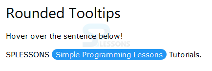
 Rounded Tooltips
User can also get the rounded tooltip which means tooltip with rounded corners which is done by the w3-round class the code below demonstrates the rounded tooltips as shown below.
[html]
<!DOCTYPE html>
<html>
<title>W3.CSS</title>
<meta name="viewport" content="width=device-width, initial-scale=1">
<link rel="stylesheet" href="http://www.w3schools.com/lib/w3.css">
<body>
<div class="w3-container">
<h2>Rounded Tooltips</h2>
<p>Hover over the sentence below!</p>
<p class="w3-tooltip">SPLESSONS <span class="w3-text w3-tag w3-round-xlarge w3-blue">Simple Programming Lessons</span> Tutorials.</p>
</div>
</body>
</html>
[/html]
Result
By running the above code in a preferred browser user can get the following output as shown in below image.
Rounded Tooltips
User can also get the rounded tooltip which means tooltip with rounded corners which is done by the w3-round class the code below demonstrates the rounded tooltips as shown below.
[html]
<!DOCTYPE html>
<html>
<title>W3.CSS</title>
<meta name="viewport" content="width=device-width, initial-scale=1">
<link rel="stylesheet" href="http://www.w3schools.com/lib/w3.css">
<body>
<div class="w3-container">
<h2>Rounded Tooltips</h2>
<p>Hover over the sentence below!</p>
<p class="w3-tooltip">SPLESSONS <span class="w3-text w3-tag w3-round-xlarge w3-blue">Simple Programming Lessons</span> Tutorials.</p>
</div>
</body>
</html>
[/html]
Result
By running the above code in a preferred browser user can get the following output as shown in below image.
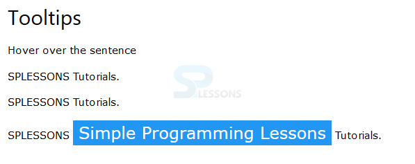
 Different sizes Tooltips
User can get the different sizes of tooltips by using the w3-small, w3-tiny, w3-large classes. The code below demonstrates the different sizes of tooltips as shown below.
[html]
<!DOCTYPE html>
<html>
<title>W3.CSS</title>
<meta name="viewport" content="width=device-width, initial-scale=1">
<link rel="stylesheet" href="http://www.w3schools.com/lib/w3.css">
<body>
<div class="w3-container">
<h2>Tooltips</h2>
<p>Hover over the sentence</p>
<p class="w3-tooltip">SPLESSONS <span class="w3-text w3-tag w3-small w3-blue">Simple Programming Lessons</span> Tutorials.</p>
<p class="w3-tooltip">SPLESSONS <span class="w3-text w3-tag w3-tiny w3-blue">Simple Programming Lessons</span> Tutorials.</p>
<p class="w3-tooltip">SPLESSONS <span class="w3-text w3-tag w3-small w3-xlarge w3-blue">Simple Programming Lessons</span> Tutorials.</p>
</div>
</body>
</html>
[/html]
Result
By running the above code in a preferred browser user can get the following output as shown in below image.
Different sizes Tooltips
User can get the different sizes of tooltips by using the w3-small, w3-tiny, w3-large classes. The code below demonstrates the different sizes of tooltips as shown below.
[html]
<!DOCTYPE html>
<html>
<title>W3.CSS</title>
<meta name="viewport" content="width=device-width, initial-scale=1">
<link rel="stylesheet" href="http://www.w3schools.com/lib/w3.css">
<body>
<div class="w3-container">
<h2>Tooltips</h2>
<p>Hover over the sentence</p>
<p class="w3-tooltip">SPLESSONS <span class="w3-text w3-tag w3-small w3-blue">Simple Programming Lessons</span> Tutorials.</p>
<p class="w3-tooltip">SPLESSONS <span class="w3-text w3-tag w3-tiny w3-blue">Simple Programming Lessons</span> Tutorials.</p>
<p class="w3-tooltip">SPLESSONS <span class="w3-text w3-tag w3-small w3-xlarge w3-blue">Simple Programming Lessons</span> Tutorials.</p>
</div>
</body>
</html>
[/html]
Result
By running the above code in a preferred browser user can get the following output as shown in below image.
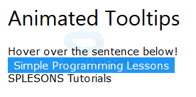
 Animated Tooltips
User can also get the fade in tooltip by using the w3-animated-opacity class. The code below demonstrates to get the animated tooltip as shown below.
[html]
<!DOCTYPE html>
<html>
<title>W3.CSS</title>
<meta name="viewport" content="width=device-width, initial-scale=1">
<link rel="stylesheet" href="http://www.w3schools.com/lib/w3.css">
<body>
<div class="w3-container">
<h2>Animated Tooltips</h2>
<p>Hover over the sentence below!</p>
<p class="w3-tooltip">SPLESONS <span style="position:absolute;left:0;bottom:18px" class="w3-text w3-tag w3-animate-opacity w3-blue">Simple Programming Lessons</span> Tutorials</p>
</div>
</body>
</html>
[/html]
Result
By running the above code in a preferred browser user can get the following output as shown in below image.
Animated Tooltips
User can also get the fade in tooltip by using the w3-animated-opacity class. The code below demonstrates to get the animated tooltip as shown below.
[html]
<!DOCTYPE html>
<html>
<title>W3.CSS</title>
<meta name="viewport" content="width=device-width, initial-scale=1">
<link rel="stylesheet" href="http://www.w3schools.com/lib/w3.css">
<body>
<div class="w3-container">
<h2>Animated Tooltips</h2>
<p>Hover over the sentence below!</p>
<p class="w3-tooltip">SPLESONS <span style="position:absolute;left:0;bottom:18px" class="w3-text w3-tag w3-animate-opacity w3-blue">Simple Programming Lessons</span> Tutorials</p>
</div>
</body>
</html>
[/html]
Result
By running the above code in a preferred browser user can get the following output as shown in below image.
- Image Tooltip
- Positioned Tooltip
- Colored Tootip
- Rounded Tooltip
- Differnt sizes Tooltips
- Animated Tooltip
Key Points
- User can aso get the fade in tooltip.
- User can also get the rounded by using w3-round.
- User can also get the different colored Tooltips by using w3-color.