 Introduction
This chapter demonstrates about the W3.CSS Alerts which can be used to get the different types of alert messages and following are the concepts covered in this chapter.
- Displaying Alerts
- Rounded Alerts
- Closing Alerts
- Alert as a Card
 Description
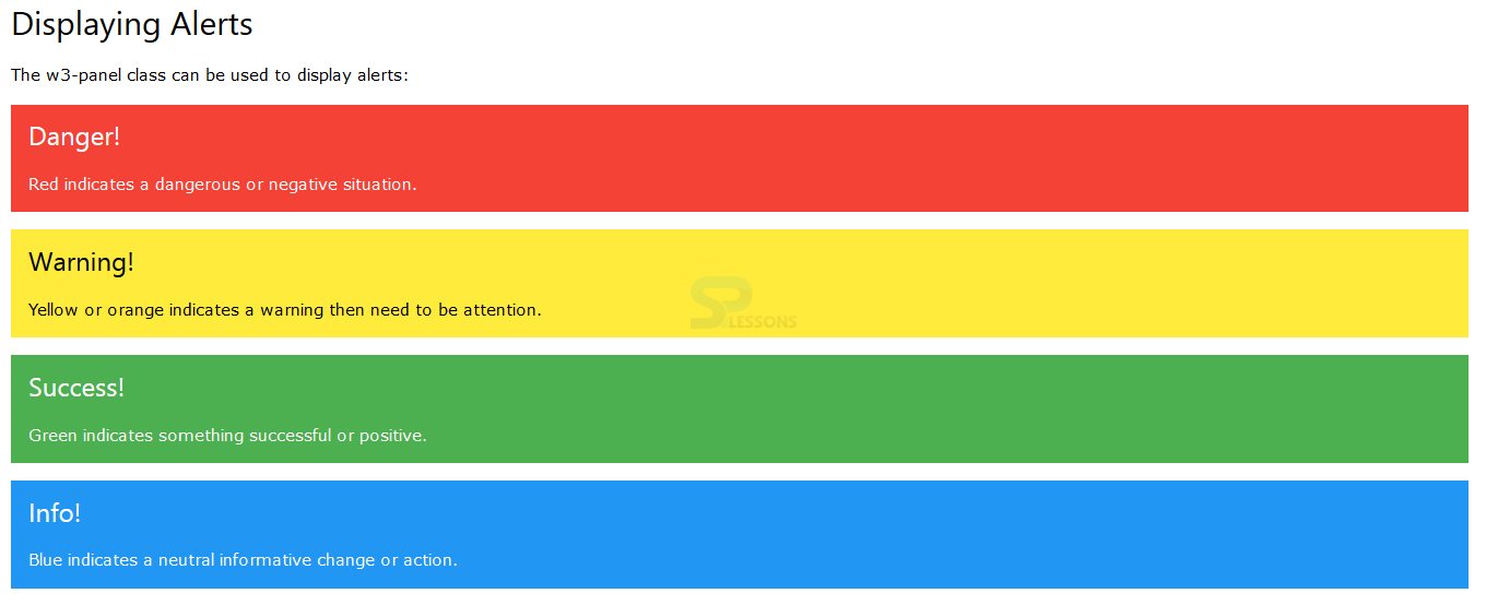
Alerts can be used to get the alert messages which can be displayed with the strong colors The perfect alert can be displayed by using the w3-panel and w3-container. The image below demonstrates the Alerts with strong colors as shown below.
The code below demonstrates to display the alerts with strong colors by using the w3-panel as shown.
[html]
<!DOCTYPE html>
<html>
<title>W3.CSS</title>
<meta name="viewport" content="width=device-width, initial-scale=1">
<link rel="stylesheet" href="http://www.w3schools.com/lib/w3.css">
<body>
<div class="w3-container">
<h2>Displaying Alerts</h2>
<p>The w3-panel class can be used to display alerts:</p>
<div class="w3-panel w3-red">
<h3>Danger!</h3>
<p>Red indicates a dangerous or negative situation.</p>
</div>
<div class="w3-panel w3-yellow">
<h3>Warning!</h3>
<p>Yellow or orange indicates a warning then need to be attention.</p>
</div>
<div class="w3-panel w3-green">
<h3>Success!</h3>
<p>Green indicates something successful or positive.</p>
</div>
<div class="w3-panel w3-blue">
<h3>Info!</h3>
<p>Blue indicates a neutral informative change or action.</p>
</div>
</div>
</body>
</html>
[/html]
Result
By running the above code in a preferred browser user can get the following output as shown in below image.
The code below demonstrated to display the alerts with strong color by using the w3-container as shown.
[html]
<!DOCTYPE html>
<html>
<title>W3.CSS</title>
<meta name="viewport" content="width=device-width, initial-scale=1">
<link rel="stylesheet" href="http://www.w3schools.com/lib/w3.css">
<body>
<div class="w3-container">
<h2>Displaying Alerts</h2>
<p>The w3-container class can also be used to display alerts:</p>
<div class="w3-container w3-red">
<h3>Danger!</h3>
<p>Red indicates a dangerous or potentially negative action.</p>
</div>
<div class="w3-container w3-yellow">
<h3>Warning!</h3>
<p>Yellow or orange indicates a warning then need to be attention.</p>
</div>
<div class="w3-container w3-green">
<h3>Success!</h3>
<p>Green indicates something successful or positive.</p>
</div>
<div class="w3-container w3-blue">
<h3>Info!</h3>
<p>Blue indicates a neutral informative change or action.</p>
</div>
</div>
</body>
</html>
[/html]
Result
By running the above code in a preferred browser user can get the following output as shown in below image.
[/post_flow_step]
User can get the alert messages in required boxes which can be rectangular box either rounded corner boxes by using the w3-round class. The code below demonstrates to get the alert boxes with round corners as shown below.
[html]
<!DOCTYPE html>
<html>
<title>W3.CSS</title>
<meta name="viewport" content="width=device-width, initial-scale=1">
<link rel="stylesheet" href="http://www.w3schools.com/lib/w3.css">
<body>
<div class="w3-container">
<h2>Rounded Alerts</h2>
<p>Use the w3-round classes if you want rounded alerts:</p>
<div class="w3-panel w3-blue w3-round">
<h3>Info!</h3>
<p>Here w3-round is used.</p>
</div>
<div class="w3-panel w3-blue w3-round-large">
<h3>Info!!</h3>
<p>Here w3-round-large is used.</p>
</div>
<div class="w3-panel w3-blue w3-round-xxlarge">
<h3>Info!</h3>
<p>Here w3-round-xxlarge is used.</p>
</div>
</div>
</body>
</html>
[/html]
Result
By running the above code in a preferred browser user can get the following output as shown in below image.
 Description
 Description
User can lso get the Closing Alerts which means the alert box available with the "X" at the top right corner when user clicked on X then the alert box will remain closed which can be generated by using the <span> element with class w3-closebtn and an onclick event. The code below demonstrates closing Alerts as shown.
[html]
<!DOCTYPE html>
<html>
<title>W3.CSS</title>
<meta name="viewport" content="width=device-width, initial-scale=1">
<link rel="stylesheet" href="http://www.w3schools.com/lib/w3.css">
<body>
<div class="w3-container">
<h2>Displaying Alerts</h2>
<p>The w3-panel class can be used to display alerts:</p>
<div class="w3-panel w3-red">
<span onclick="this.parentElement.style.display='none'" class="w3-closebtn w3-hover-text-red">×</span>
<h3>Danger!</h3>
<p>Red indicates a dangerous or negative situation.</p>
</div>
<div class="w3-panel w3-yellow">
<span onclick="this.parentElement.style.display='none'" class="w3-closebtn w3-hover-text-red">×</span>
<h3>Warning!</h3>
<p>Yellow or orange indicates a warning then need to be attention.</p>
</div>
<div class="w3-panel w3-green">
<span onclick="this.parentElement.style.display='none'" class="w3-closebtn w3-hover-text-red">×</span>
<h3>Success!</h3>
<p>Green indicates something successful or positive.</p>
</div>
<div class="w3-panel w3-blue">
<span onclick="this.parentElement.style.display='none'" class="w3-closebtn w3-hover-text-red">×</span>
<h3>Info!</h3>
<p>Blue indicates a neutral informative change or action.</p>
</div>
</div>
</body>
</html>
[/html]
Result
By running the above code in a preferred browser user can get the following output as shown in below image.
 Description
User can also get the alert as a card by using the w-card class which can be get only if user wants to display as a card. The code below demonstrates to get alert as a card as shown below.
[html]
<!DOCTYPE html>
<html>
<title>W3.CSS</title>
<meta name="viewport" content="width=device-width, initial-scale=1">
<link rel="stylesheet" href="http://www.w3schools.com/lib/w3.css">
<body>
<div class="w3-container">
<h2>Alert as a Card</h2>
<p>Use the w3-card classes to display the alert as a card:</p>
<div class="w3-panel w3-blue w3-card-2">
<p>w3-card-2</p>
</div>
<div class="w3-panel w3-blue w3-card-4">
<p>w3-card-4</p>
</div>
<div class="w3-panel w3-blue w3-card-8">
<p>w3-card-8</p>
</div>
<div class="w3-panel w3-blue w3-card-16">
<p>w3-card-16</p>
</div>
<div class="w3-panel w3-blue w3-card-24">
<p>w3-card-24</p>
</div>
</div>
</body>
</html>
[/html]
Result
By running the above code in a preferred browser user can get the following output as shown in below image.
 Key Points
- W3-card is used get the alert as a card.
- Closing alerts are more useful in when these are in wanted.
- Alert can be displayed with the strong colors.


