


 Description
A chart, additionally called a chart, is a graphical portrayal of information, in which the information is spoken to by images.
Charts are regularly used to straightforwardness comprehension of vast amounts of information and the connections between parts of the information. Graphs can ordinarily be perused more rapidly than the crude information. They are utilized as a part of a wide assortment of fields, and can be made by hand or by PC utilizing an outlining application. Certain sorts of graphs are more helpful for displaying a given informational collection than others.
Description
The following are the types of charts.
- Pie Charts
- Bar Charts
- Boxplots
- Line Graphs
Description
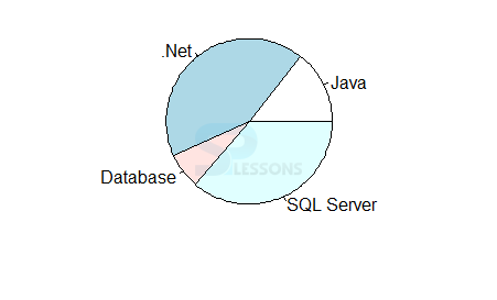
A pie chart is a roundabout measurable realistic which is isolated into cuts to delineate numerical extent. In a pie outline, the circular segment length of each cut, is corresponding to the amount it speaks to. While it is named for its likeness to a pie which has been cut. Pie diagrams are generally utilized as a part of the business world and the broad communications. The following is an example.
[c]# Create data for the graph.
x <- c(21, 62, 10, 53)
labels <- c("Java", ".Net", "Database", "SQL Server")
# Give the chart file a name.
png(file = "technology.jpg")
# Plot the chart.
pie(x,labels)
# Save the file.
dev.off()[/c]
Output: Now the result will be as follows.
Description
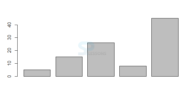
A bar outline is a diagram or chart that presents gathered information with rectangular bars with lengths relative to the qualities that they speak to. The bars can be plotted vertically or on a level plane. A vertical bar outline is once in a while called a Line chart.
A bar outline is an outline that utilizations either level or vertical bars to show correlations among classes. One pivot of the graph demonstrates the particular classes being thought about, and alternate hub speaks to a discrete esteem. Some reference diagrams display bars bunched in gatherings of more than one. The following is an example.
[c]# Create the data for the chart.
H <- c(5,15,26,8,45)
# Give the chart file a name.
png(file = "barchart.png")
# Plot the bar chart.
barplot(H)
# Save the file.
dev.off()[/c]
Output: Now the result will be as follows.
Description
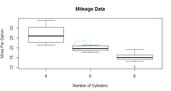
The boxplot is an advantageous method for graphically delineating gatherings of numerical information through their quartiles. The following is an example.
[c]# Give the chart file a name.
png(file = "boxplot.png")
# Plot the chart.
boxplot(mpg ~ cyl, data = mtcars, xlab = "Number of Cylinders",
ylab = "Miles Per Gallon", main = "Mileage Data")
# Save the file.
dev.off()[/c]
Output: Now the result will be as follows.
Description
A line chart or line graph is a type of chart which displays information as a series of data points called 'markers' connected by straight line segments. The following is an example.
[c]# Create the data for the chart.
v <- c(10,15,20,30,41)
# Give the chart file a name.
png(file = "line_chart.jpg")
# Plot the bar chart.
plot(v,type = "o")
# Save the file.
dev.off()[/c]
Output: Now the result will be as follows.

Key Points
- The
plot()is the function to create the line graph. - The
lines()is the function to draw multiple lines.. - The
boxplot()is the function to create boxplot graph.