


 Introduction
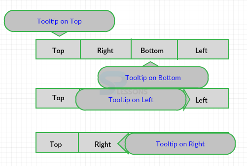
This chapter demonstrates about the CSS Tool Tips which are used to specify the extra information about the element in which mouse pointer moves and following are the concepts are covered in this chapter.
- Basic Tool Tip
- Positioning Tool Tips
- Tool Tip arrows
Description
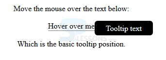
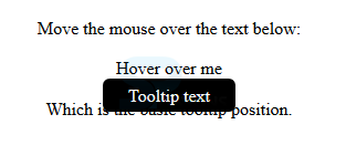
Tool tips are used to specify the extra information about the element when the pointer moves over an element. Tool tip appears when the user moves the mouse over an element. The image below demonstrates the Basic Tooltips as shown.
 The code below demonstrates the Basic tool tip as shown below.
[html]
<!DOCTYPE html>
<html>
<style>
.tooltip {
position: relative;
display: inline-block;
border-bottom: 1px dotted black;
}
.tooltip .tooltiptext {
visibility: hidden;
width: 120px;
background-color: black;
color: #fff;
text-align: center;
border-radius: 6px;
padding: 5px 0;
/* Position the tooltip */
position: absolute;
z-index: 1;
}
.tooltip:hover .tooltiptext {
visibility: visible;
}
</style>
<body style="text-align:center;">
<p>Move the mouse over the text below:</p>
<div class="tooltip">Hover over me
<span class="tooltiptext">Tooltip text</span>
</div>
<p>Which is the basic tooltip position.</p>
</body>
</html>
[/html]
Result
By running the above code in a preferred browser user can get the following output as shown in below image.
The code below demonstrates the Basic tool tip as shown below.
[html]
<!DOCTYPE html>
<html>
<style>
.tooltip {
position: relative;
display: inline-block;
border-bottom: 1px dotted black;
}
.tooltip .tooltiptext {
visibility: hidden;
width: 120px;
background-color: black;
color: #fff;
text-align: center;
border-radius: 6px;
padding: 5px 0;
/* Position the tooltip */
position: absolute;
z-index: 1;
}
.tooltip:hover .tooltiptext {
visibility: visible;
}
</style>
<body style="text-align:center;">
<p>Move the mouse over the text below:</p>
<div class="tooltip">Hover over me
<span class="tooltiptext">Tooltip text</span>
</div>
<p>Which is the basic tooltip position.</p>
</body>
</html>
[/html]
Result
By running the above code in a preferred browser user can get the following output as shown in below image.
 In the above example user can HTML use a container element then user can add "tooltip" class to it when the user mouse over <div> element then it will shows the tooltip text. User need to place the tool tip text inside an element with class="tooltiptext".
position:relative is used positioned the text like position:absolute. In which tooltiptext class contain the tooltip text and which is hidden by default if user hover on the element then it will visible to the user.
In the above example user can HTML use a container element then user can add "tooltip" class to it when the user mouse over <div> element then it will shows the tooltip text. User need to place the tool tip text inside an element with class="tooltiptext".
position:relative is used positioned the text like position:absolute. In which tooltiptext class contain the tooltip text and which is hidden by default if user hover on the element then it will visible to the user.
Description
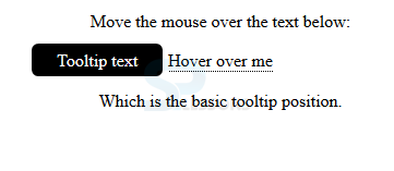
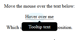
User can place the Tool Tips at desired positions in the below code user placed the tool tip at the right (left 105%) of hoverable text and top 5px is used place at the middle of the container element. If user increase the padding user can also increase the value of the top property to ensure that which stays in middle The code below demonstrates the right Tool Tip as shown below.
[html]
<!DOCTYPE html>
<html>
<style>
.tooltip {
position: relative;
display: inline-block;
border-bottom: 1px dotted black;
}
.tooltip .tooltiptext {
visibility: hidden;
width: 120px;
background-color: black;
color: #fff;
text-align: center;
border-radius: 6px;
padding: 5px 0;
/* Position the tooltip */
position: absolute;
z-index: 1;
top: -5px;
left: 105%;
}
.tooltip:hover .tooltiptext {
visibility: visible;
}
</style>
<body style="text-align:center;">
<p>Move the mouse over the text below:</p>
<div class="tooltip">Hover over me
<span class="tooltiptext">Tooltip text</span>
</div>
<p>Which is the basic tooltip position.</p>
</body>
</html>
[/html]
Result
By running the above code in a preferred browser user can get the following output as shown in below image.
Left Tooltip
User can place Tooltip text at the left side also by changing the top and right values renaming same as the right tool tip. The code below demonstrates the left tool tip as shown below.
[html]
<!DOCTYPE html>
<html>
<style>
.tooltip {
position: relative;
display: inline-block;
border-bottom: 1px dotted black;
}
.tooltip .tooltiptext {
visibility: hidden;
width: 120px;
background-color: black;
color: #fff;
text-align: center;
border-radius: 6px;
padding: 5px 0;
/* Position the tooltip */
position: absolute;
z-index: 1;
top: -5px;
right: 105%;
}
.tooltip:hover .tooltiptext {
visibility: visible;
}
</style>
<body style="text-align:center;">
<p>Move the mouse over the text below:</p>
<div class="tooltip">Hover over me
<span class="tooltiptext">Tooltip text</span>
</div>
<p>Which is the basic tooltip position.</p>
</body>
</html>
[/html]
Result
By running the above code in a preferred browser user can get the following output as shown in below image.
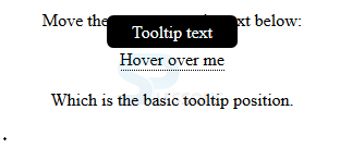
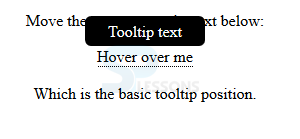
 Top Tooltip
User can place Tooltip text at the Top also by adjusting the values renaming same as the right tool tip. The code below demonstrates the left tool tip as shown below.
[html]
<!DOCTYPE html>
<html>
<style>
.tooltip {
position: relative;
display: inline-block;
border-bottom: 1px dotted black;
}
.tooltip .tooltiptext {
visibility: hidden;
width: 120px;
background-color: black;
color: #fff;
text-align: center;
border-radius: 6px;
padding: 5px 0;
/* Position the tooltip */
position: absolute;
z-index: 1;
bottom: 100%;
left: 50%;
margin-left: -60px;
}
.tooltip:hover .tooltiptext {
visibility: visible;
}
</style>
<body style="text-align:center;">
<p>Move the mouse over the text below:</p>
<div class="tooltip">Hover over me
<span class="tooltiptext">Tooltip text</span>
</div>
<p>Which is the basic tooltip position.</p>
</body>
</html>
[/html]
Result
By running the above code in a preferred browser user can get the following output as shown in below image.
Top Tooltip
User can place Tooltip text at the Top also by adjusting the values renaming same as the right tool tip. The code below demonstrates the left tool tip as shown below.
[html]
<!DOCTYPE html>
<html>
<style>
.tooltip {
position: relative;
display: inline-block;
border-bottom: 1px dotted black;
}
.tooltip .tooltiptext {
visibility: hidden;
width: 120px;
background-color: black;
color: #fff;
text-align: center;
border-radius: 6px;
padding: 5px 0;
/* Position the tooltip */
position: absolute;
z-index: 1;
bottom: 100%;
left: 50%;
margin-left: -60px;
}
.tooltip:hover .tooltiptext {
visibility: visible;
}
</style>
<body style="text-align:center;">
<p>Move the mouse over the text below:</p>
<div class="tooltip">Hover over me
<span class="tooltiptext">Tooltip text</span>
</div>
<p>Which is the basic tooltip position.</p>
</body>
</html>
[/html]
Result
By running the above code in a preferred browser user can get the following output as shown in below image.
 Bottom Tool tip
User can place Tooltip text at the bottom also by adjusting the values renaming same as the right tool tip. The code below demonstrates the left tool tip as shown below.
[html]
<!DOCTYPE html>
<html>
<style>
.tooltip {
position: relative;
display: inline-block;
border-bottom: 1px dotted black;
}
.tooltip .tooltiptext {
visibility: hidden;
width: 120px;
background-color: black;
color: #fff;
text-align: center;
border-radius: 6px;
padding: 5px 0;
/* Position the tooltip */
position: absolute;
z-index: 1;
top: 100%;
left: 50%;
margin-left: -60px;
}
.tooltip:hover .tooltiptext {
visibility: visible;
}
</style>
<body style="text-align:center;">
<p>Move the mouse over the text below:</p>
<div class="tooltip">Hover over me
<span class="tooltiptext">Tooltip text</span>
</div>
<p>Which is the basic tooltip position.</p>
</body>
</html>
[/html]
Result
By running the above code in a preferred browser user can get the following output as shown in below image.
Bottom Tool tip
User can place Tooltip text at the bottom also by adjusting the values renaming same as the right tool tip. The code below demonstrates the left tool tip as shown below.
[html]
<!DOCTYPE html>
<html>
<style>
.tooltip {
position: relative;
display: inline-block;
border-bottom: 1px dotted black;
}
.tooltip .tooltiptext {
visibility: hidden;
width: 120px;
background-color: black;
color: #fff;
text-align: center;
border-radius: 6px;
padding: 5px 0;
/* Position the tooltip */
position: absolute;
z-index: 1;
top: 100%;
left: 50%;
margin-left: -60px;
}
.tooltip:hover .tooltiptext {
visibility: visible;
}
</style>
<body style="text-align:center;">
<p>Move the mouse over the text below:</p>
<div class="tooltip">Hover over me
<span class="tooltiptext">Tooltip text</span>
</div>
<p>Which is the basic tooltip position.</p>
</body>
</html>
[/html]
Result
By running the above code in a preferred browser user can get the following output as shown in below image.
Description
Is used to create an arrow which should appear at the specific side of the Tooltip. User need to add "empty" content after Tooltip with pesudo element ::after class combined with content property. In which arrow created with the border which make tool tip like bubble. The code below demonstrates the arrow to the bottom of the tool tip as shown.
[html]
<!DOCTYPE html>
<html>
<style>
.tooltip {
position: relative;
display: inline-block;
border-bottom: 1px dotted black;
}
.tooltip .tooltiptext {
visibility: hidden;
width: 120px;
background-color: black;
color: #fff;
text-align: center;
border-radius: 6px;
padding: 5px 0;
position: absolute;
z-index: 1;
top: 150%;
left: 50%;
margin-left: -60px;
}
.tooltip .tooltiptext::after {
content: "";
position: absolute;
bottom: 100%;
left: 50%;
margin-left: -5px;
border-width: 5px;
border-style: solid;
border-color: transparent transparent black transparent;
}
.tooltip:hover .tooltiptext {
visibility: visible;
}
</style>
<body style="text-align:center;">
<p>Move the mouse over the text below:</p>
<div class="tooltip">Hover over me
<span class="tooltiptext">Tooltip text</span>
</div>
<p>Which is the basic tooltip position.</p>
</body>
</html>
[/html]
Result
By running the above code in a preferred browser user can get the following output as shown in below image.
 Fade in Tool Tips
User can also Fade out the tool tip text by using the CSS transition property combined with Opacity property in which user can fadeout the element from 0 percent to 100 percent visible. The code below demonstrates the Fade in tool tips as shown below.
[html]
<!DOCTYPE html>
<html>
<style>
.tooltip {
position: relative;
display: inline-block;
border-bottom: 1px dotted black;
}
.tooltip .tooltiptext {
visibility: hidden;
width: 120px;
background-color: black;
color: #fff;
text-align: center;
border-radius: 6px;
padding: 5px 0;
position: absolute;
z-index: 1;
bottom: 100%;
left: 50%;
margin-left: -60px;
/* Fade in tooltip - takes 1 second to go from 0% to 100% opac: */
opacity: 0;
transition: opacity 1s;
}
.tooltip:hover .tooltiptext {
visibility: visible;
opacity: 1;
}
</style>
<body style="text-align:center;">
<p>Move the mouse over the text below:</p>
<div class="tooltip">Hover over me
<span class="tooltiptext">Tooltip text</span>
</div>
<p>Which is the basic tooltip position.</p>
</body>
</html>
[/html]
Result
By running the above code in a preferred browser user can get the following output as shown in below image.
Fade in Tool Tips
User can also Fade out the tool tip text by using the CSS transition property combined with Opacity property in which user can fadeout the element from 0 percent to 100 percent visible. The code below demonstrates the Fade in tool tips as shown below.
[html]
<!DOCTYPE html>
<html>
<style>
.tooltip {
position: relative;
display: inline-block;
border-bottom: 1px dotted black;
}
.tooltip .tooltiptext {
visibility: hidden;
width: 120px;
background-color: black;
color: #fff;
text-align: center;
border-radius: 6px;
padding: 5px 0;
position: absolute;
z-index: 1;
bottom: 100%;
left: 50%;
margin-left: -60px;
/* Fade in tooltip - takes 1 second to go from 0% to 100% opac: */
opacity: 0;
transition: opacity 1s;
}
.tooltip:hover .tooltiptext {
visibility: visible;
opacity: 1;
}
</style>
<body style="text-align:center;">
<p>Move the mouse over the text below:</p>
<div class="tooltip">Hover over me
<span class="tooltiptext">Tooltip text</span>
</div>
<p>Which is the basic tooltip position.</p>
</body>
</html>
[/html]
Result
By running the above code in a preferred browser user can get the following output as shown in below image.
Key Points
- User will get the tool tips at any side of the text.
- User can also tool tips with arrows.
- User can apply styles to tool tips also.