


 Introduction
This chapter demonstrates about the CSS Shadow Text in order to add dimensional effects to text user need to use the CSS Drop shadow effects following are the concepts are covered in this chapter.
- Text Shadow
- Letter Press
- Raised Text
- Glowing Text
Description
User can add the dimensional effects to the text by using the CSS text shadow property by using these property user can make the text effective. The syntax for the text-shadow is shown below.
Syntax
[code]
text-shadow{ x-offset, y-offset, blur-radius, color}
[/code]
The code below demonstrates the text-shadow as shown.
[html]
<!DOCTYPE HTML>
<html>
<head>
<style>
body{font-family:Arial;
color:#0000ff;}
/* text-shadow:( x-offset, y-offset, blur-radius, color); */
h1{text-shadow:5px 5px 5px #666;}
h2{text-shadow:0.5em -0.5em 2px #666;}
</style>
</head>
<body>
<h1>SPLESSONS</h1>
<h2>SPLESSONS Tutorials</h2>
</body>
</html>
[/html]
Result
By running the above code in a preferred browser user can get the following output as shown in below image.
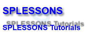
- x-offset Is used to set the horizontal offset of shadow. in which positive value means shadow to the right of the text and negative value means shadow to the left of the text.
- y-offset Is used to set vertical offset of shadow . In which positive value means shadow to the below of the text and negative value means shadow to the top of the text.
- blur-radius Which is used to set the blur-radius. in which negative values is not allowed.
- color Is used to set the color of the shadow. If the color is not specified then the default color is black.
Description
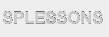
In order to create impressed or stampad text into the background then user need to use multiple text shadow for single element which effect is Letter-Press. To create which effect user need to use four shades of colors i.e dark color for the text, medium color for background, and remaining light and dark colors for shadows a shown in below image.
 The code below demonstrates to create Text shadow Letterpress as shown below.
[html]
<!DOCTYPE HTML>
<html>
<head>
<style>
body{font-family:Arial;
background:#eee;
color:#ccc;
font-size:2em;}
h1{text-shadow:
1px 1px 0px #999999,
1px -1px 0px #6B6B6B;
}
</style>
</head>
<body>
<h1>SPLESSONS</h1>
</body>
</html>
[/html]
Result
By running the above code in a preferred browser user can get the following output as shown in below image.
The code below demonstrates to create Text shadow Letterpress as shown below.
[html]
<!DOCTYPE HTML>
<html>
<head>
<style>
body{font-family:Arial;
background:#eee;
color:#ccc;
font-size:2em;}
h1{text-shadow:
1px 1px 0px #999999,
1px -1px 0px #6B6B6B;
}
</style>
</head>
<body>
<h1>SPLESSONS</h1>
</body>
</html>
[/html]
Result
By running the above code in a preferred browser user can get the following output as shown in below image.
Description
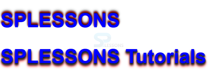
Text shadow effects are not limited to single effect user can create multiple shadow effects to a single node effects. In order to create multiple effects user need to add multiple shadow values which are separated with comma. To create the raised text user need to have the four colors the colors ranges from dark to light in which most light and most dark colors are used for the shadows and remaining are text colors. The code below demonstrates the raised text as shown below.
[html]
<!DOCTYPE HTML>
<html>
<head>
<style>
body{font-family:Arial;
color:#0000ff;
font-size:2em;}
h1{text-shadow:
0px -3px 3px #191919,
0px -5px 4px #ff0000,
0px -7px 6px #323232,
0px -9px 9px #ADADAD;}
/*Multiple text shadows seperated by a comma */
h1.raised{text-shadow:
0px 3px 3px #191919,
0px 5px 4px #474747,
0px 7px 6px #323232,
0px 9px 9px #ff0000;}
</style>
</head>
<body>
<h1>SPLESSONS</h1>
<h1 class="raised">SPLESSONS Tutorials</h2>
</body>
</html>
[/html]
Result
By running the above code in a preferred browser user can get the following output as shown in below image.
Description
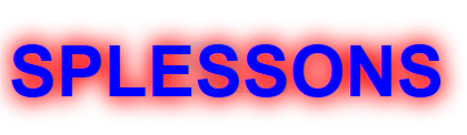
User can create the illusion of glowing text by using the multiple text shadows. In order to create the glowing text user need to use high blur-radius with bright color and the effect can be made more intense if user used multiple text-shadows. The code below demonstrates the Glowing Text as shown.
[html]
<!DOCTYPE HTML>
<html>
<head>
<style>
body{font-family:Arial;
color:#0000ff;
font-size:2em;}
/* text-shadow:( x-offset, y-offset, blur-radius, color); */
h1{text-shadow:
0px 0px 20px #ff0000,
0px 0px 20px #ff0000;
}
</style>
</head>
<body>
<h1>SPLESSONS</h1>
</body>
</html>
[/html]
Result
By running the above code in a preferred browser user can get the following output as shown in below image.
Key Points
- Text shadow property first implemented by safari in the year of 2005.
- Glowing text Effect demands only on blur colors behind the text.
- Letter press used as a stamp pad text.