


 Introduction
This chapter demonstrates about the CSS Pseudo Classes which are apply some CSS styles in view of client Interaction with the document utilizing pseudo-classes following are the concepts are covered in this chapter.
- Different Pseudo Classes
Description
In Pseudo classes there are many types classes selectors are available With CSS pseudo-class selectors user can apply CSS styles to components in view of their position inside the Document or interactive state. The image below demonstrates the Pseudo class selector as shown.
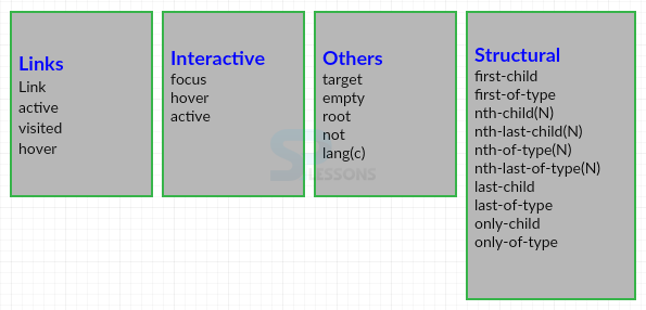 The above shown Pseudo Class selectors are briefly discussed below.
Description
To style links depending on how a client interact with the link, In order to connect user need to use Link and Visited pseudo-classes which are shown below.
The code below demonstrates the example of CSS Pseudo Class Links and visited as shown.
[html]
<!DOCTYPE html>
<html>
<head>
<style>
a:link{border:2px solid #FF0000;
box-shadow:5px 5px 5px #0000FF;
}
a:visited{border:2px solid #FF0000;
box-shadow:5px 5px 5px #0000FF;
}
</style>
</head>
<body>
<a href="http://www.splessons.com/">SPLESSONS</a>
<a href="http://www.splessons.com/lesson/html-tutorials/">HTML</a>
</body>
</html>
[/html]
Result
By running the above code in a preferred browser user can get the following output as shown in below image.
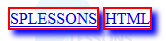 If user clicked on the SPlessons link then it will redirect to the SPlessons home page which is shown in below image.
 If user clicked on the HTML Link then it will redirect to the HTML tutorial page as shown shown in below image.
- Link Is used to choose and style the presence of connection which has not yet been gone by the client.
- Visited Is used To choose and style the presence of the link which are already went to by the client, based on the history of the browser.
Description
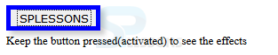
When the client clicked on the elements then active selects and styles component for a period. When the element was activated, The CSS styles are applies just for the period of time. which is typically a brief instant, henceforth it might even go un-took note. The code below demonstrates the active Selector as shown below.
[html]
<!DOCTYPE html>
<html>
<head>
<style>
button:active{
font-family:Verdana;
border:5px solid #0000ff;
box-shadow:5px 5px 5px #ccc;
}
</style>
</head>
<body>
<button>SPLESSONS</button><br>
<small>Keep the button pressed(activated) to see the effects</small>
</body>
</html>
[/html]
Result
By running the above code in a preferred browser user can get the following output as shown in below image.
Description
Which selects and styles any element where the client's mouse pointer floats. If the pointer hovers over and removes styles when the pointer moves out of the element on screen then Browser will apply styles. The code below demonstrates the Hover Selector as shown.
[html]
<!DOCTYPE html>
<html>
<head>
<style>
a:hover{
font-family:Verdana;
border:5px solid #FF0000;
box-shadow:5px 5px 5px #0000FF;
}
</style>
<head>
<body>
<a href="http://www.splessons.com/">SPLESSONS</a>
<a href="http://www.splessons.com/lesson/html-tutorials/">HTML</a>
</body>
</html>
[/html]
Result
By running the above code in a preferred browser user can get the following output as shown in below image.
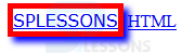 In the above output when a mouse pointer pointer moves over a link then hover is activated.
Description
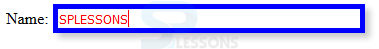
Focus Class is similar to the Hover the only difference is when a mouse pointer pointer moves over a link then hover is activated in the case of focus which is activated when the user perform an action by clicking or tabling to show an attention to a web page. Usually which elements are required the user to focus such as form input fields. The code below demonstrates the focus class as shown.
[html]
<!DOCTYPE HTML>
<html>
<head>
<style>
input:focus{
border:5px solid #0000FF;
box-shadow:5px 5px 5px #ccc;
color:#FF0000;
width:300px;}
</style>
</head>
<body>
<form>
Name: <input type="text" value="SPLESSONS">
</form>
</body>
</html>
[/html]
Result
By running the above code in a preferred browser user can get the following output as shown in below image.
Description
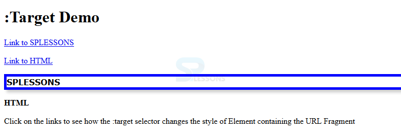
Target is used to style the elements which can be accessed using a link ends with a URL fragment i.e hash sign(#) followed by an anchor-name or ID. If the page using a URL fragment then only the styles will be applied other wise which are ignored. The code below demonstrates the target selector as shown below.
[html]
<!DOCTYPE html>
<html>
<head>
<style>
:target
{
font-family:verdana;
border:5px solid #0000FF;
box-shadow:5px 5px 5px #ccc;
}
</style>
</head>
<body>
<h1>:Target Demo</h1>
<p><a href="#frag1">Link to SPLESSONS</a></p>
<p><a href="#frag2">Link to HTML</a></p>
<p id="frag1"><b>SPLESSONS</b></p>
<p id="frag2"><b>HTML</b></p>
<p>Click on the links to see how the :target selector
changes the style of Element containing the URL Fragment</p>
</body>
</html>
[/html]
Result
By running the above code in a preferred browser user can get the following output as shown in below image.
Description
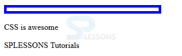
Empty styles elements which are completely elements and which consisit very strict sense i.e no text, child or even a soace with in opening and closing tags. The code below demonstrates the Empty selector as shown.
[html]
<!DOCTYPE HTML>
<html>
<head>
<style>
p:empty
{
width:300px; height:7px;
border:5px solid #0000ff;
}
</style>
</head>
<body>
<p></p>
<p>CSS is awesome</p>
<p lang="fr">SPLESSONS Tutorials</p>
</body>
</html>
[/html]
Result
By running the above code in a preferred browser user can get the following output as shown in below image.
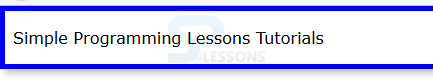
Description
Which is used to select the root of the document. In the html document always root element is the <html> which is mainly useful while working with the XML Document. The code below demonstrates the root selector as shown below.
[html]
<!DOCTYPE html>
<html>
<head>
<style>
:root{
font-family:Verdana;
border:5px solid #0000ff;
box-shadow:5px 5px 5px #ccc;}
</style>
</head>
<body>
<p>Simple Programming Lessons Tutorials</p>
</body>
</html>
[/html]
Result
By running the above code in a preferred browser user can get the following output as shown in below image.
Description
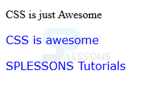
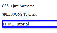
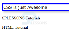
not (<selector>) is also known as inversion of the selection which style the element is not match with the selection. The code below demonstrates the not (<selector>) in which p:not(.demo) will select the every <p> element that does not contain the class "demo".
[html]
<!DOCTYPE HTML>
<html>
<head>
<style>
p:not(.demo)
{
font-family:Verdana;
color:#0000ff;
}
</style>
</head>
<body>
<p class="demo">CSS is just Awesome</p>
<p>CSS is awesome</p>
<p>SPLESSONS Tutorials</p>
</body>
</html>
[/html]
Result
By running the above code in a preferred browser user can get the following output as shown in below image.
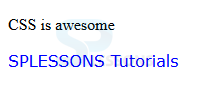
Description
lang is used to style the element based on its language specified by its language property. The code below demonstrates the lang Selector in which p:lang(fr) select element with attribute lang="fr"
[html]
<!DOCTYPE HTML>
<html>
<head>
<style>
p:lang(fr)
{
font-family:Verdana;
color:#0000ff;
}
</style>
</head>
<body>
<p>CSS is awesome</p>
<p lang="fr">SPLESSONS Tutorials</p>
</body>
</html>
[/html]
Result
By running the above code in a preferred browser user can get the following output as shown in below image.
Description
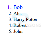
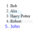
Which is used to apply CSS styles to first however an element may contain many children. For example li:first-child which select first how ever <li> contain many children is demonstrated in the below code as shown.
[html]
<!DOCTYPE HTML>
<html>
<head>
<style>
li:first-child
{
font-family:Verdana;
color:#0000ff;
}
</style>
</head>
<body>
<ol>
<li>Bob</li>
<li>Alis</li>
<li>Harry Potter</li>
<li>Robert</li>
<li>John</li>
</ol>
</body>
</html>
[/html]
Result
By running the above code in a preferred browser user can get the following output as shown in below image.
Description
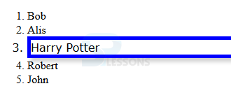
nth child is used to style the elements which are the nth child of their parents. For example in the below code li:nth-child(3) it will select the third element in the list it will select from top to bottom as shown.
[html]
<!DOCTYPE HTML>
<html>
<head>
<style>
li:nth-child(3)
{
font-family:Verdana;
border:5px solid #0000ff;
box-shadow:5px 5px 5px #ccc;
}
</style>
</head>
<body>
<ol>
<li>Bob</li>
<li>Alis</li>
<li>Harry Potter</li>
<li>Robert</li>
<li>John</li>
</ol>
</body>
</html>
[/html]
Result
By running the above code in a preferred browser user can get the following output as shown in below image.
Description
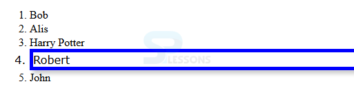
Is used to style the element of nth child of its parent in which counting starting from last child. For example in the below example li:nth-last-child(2) it will select the second item from the list which count from bottom to top as shown.
[html]
<!DOCTYPE HTML>
<html>
<head>
<style>
li:nth-last-child(2)
{
font-family:Verdana;
border:5px solid #0000ff;
box-shadow:5px 5px 5px #ccc;
}
</style>
</head>
<body>
<ol>
<li>Bob</li>
<li>Alis</li>
<li>Harry Potter</li>
<li>Robert</li>
<li>John</li>
</ol>
</body>
</html>
[/html]
Result
By running the above code in a preferred browser user can get the following output as shown in below image.
Description
Is use to style the element that are nth child of particular element of their parents. For example in the below code p:nth-of-type(n) will select <p> element at nth position with ion its parent as shown.
[html]
<!DOCTYPE HTML>
<html>
<head>
<style>
:nth-of-type(3)
{
font-family:Verdana;
border:5px solid #0000ff;
box-shadow:5px 5px 5px #ccc;
}
</style>
</head>
<body>
<p>CSS is just Awesome</p>
<p>SPLESSONS Tutorials</p>
<p>HTML Tutorial</p>
</body>
</html>
[/html]
Result
By running the above code in a preferred browser user can get the following output as shown in below image.
Description
Is used to style the element that are the nth child of their parent element. For example p:nth-of-type(n) will select at nth position of its parent as shown.
[html]
<!DOCTYPE HTML>
<html>
<head>
<style>
:nth-last-of-type(3)
{
font-family:Verdana;
border:5px solid #0000ff;
box-shadow:5px 5px 5px #ccc;
}
</style>
</head>
<body>
<p>CSS is just Awesome</p>
<p>SPLESSONS Tutorials</p>
<p>HTML Tutorial</p>
</body>
</html>
[/html]
Result
By running the above code in a preferred browser user can get the following output as shown in below image.
Description
Which selector is used to apply the changes to the last child of their parent element how ever it may contain many child elements. For example in the below code li:last-child it will apply style last element of its parent element as shown.
[html]
<!DOCTYPE HTML>
<html>
<head>
<style>
li:last-child
{
font-family:Verdana;
color:#0000ff;
}
</style>
</head>
<body>
<ol>
<li>Bob</li>
<li>Alis</li>
<li>Harry Potter</li>
<li>Robert</li>
<li>John</li>
</ol>
</body>
</html>
[/html]
Result
By running the above code in a preferred browser user can get the following output as shown in below image.
Description
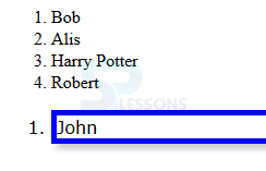
Is used to style the elements which are only child of its parent and has no siblings. For example the code below demonstrates the li:only-child it will select list which have only one child element as shown.
[html]
<!DOCTYPE HTML>
<html>
<head>
<style>
li:only-child
{
font-family:Verdana;
border:5px solid #0000ff;
box-shadow:5px 5px 5px #ccc;
}
</style>
</head>
<body>
<ol>
<li>Bob</li>
<li>Alis</li>
<li>Harry Potter</li>
<li>Robert</li>
</ol>
<ol>
<li>John</li>
</ol>
</body>
</html>
[/html]
Result
By running the above code in a preferred browser user can get the following output as shown in below image.
Description
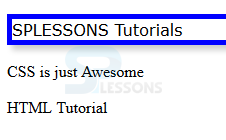
Is used to style the elements which are only child of a type of their parents here which have the siblings but none of them should be the same type as it self. The code below demonstrates the p:only-of-type will select <p> element which have a unique type among their siblings as shown.
[html]
<!DOCTYPE HTML>
<html>
<head>
<style>
p:only-of-type
{
font-family:Verdana;
border:5px solid #0000ff;
box-shadow:5px 5px 5px #ccc;
}
</style>
</head>
<body>
<div><p>SPLESSONS Tutorials</p></div>
<p>CSS is just Awesome</p>
<p>HTML Tutorial</p>
</body>
</html>
[/html]
Result
By running the above code in a preferred browser user can get the following output as shown in below image.
Key Points
- Hove and active are called as dynamic Pseudo classes.
- Interpretation of active selector depends upon the browser.
- focus class is usually combined with active and hover.
- The value in brackets "n" can be a number, keyword or even a function.