


 Introduction
This chapter demonstrates about the CSS Print Styles Is used to specify separate CSS style in order to print the content of the web page.
- About CSS Print Styles
- Setting Media Types
- Page breaks
Description
By using the CSS user can control the looking of the web page while printing by specifying the CSS to the print version of the web page. User can control the page breaks while printing several pages in which user can set the margins, padding, fonts, layouts, tables. Backgrounds can not be printed with mainstreams browsers and when user have the black background with white text the colors are reversed in certain times user can exclude those components while printing the web pages such as navigation bar, search bar etc.
Media Types
CSS can have the capable of displaying the web page but user can specify the separates styles for different devices by setting the media types. The table below demonstrates the different media types.
| Type | Description |
|---|---|
| all | CSS styles are capable for the all the devices |
| embossed | In which CSS style rules for paged btraille printers. |
| braille | Which specify CSS styles to be applied for braille tactle feedback devices. |
| handheld | Which is used with mobile handheld devices with small screen and limited bandwidth. |
| projection | Which is intended to use with projector. |
| Is used to specify the CSS styles while printing the content of the web page. | |
| speech | Which is used for speech synthesizers in order to aid the visually impaired. |
| screen | Which specify the CSS styles for computer screens. |
| tty | Which is the specific CSS style for the devices with a fixed-pitch grid, such as terminals, teletypes etc. |
| tv | Which specify the CSS styles for televeision and similar devices. |
Description
User can set the media types in a different ways and which have the different media styles in which some are shown below.
Using External CSS
By using external CSS is the most common way to set the media type which can be specified by using the <link> tag and user can attach the media file by using the media attribute the syntax below demonstrates the adding external file as shown below.
[code]
<link href="styles/main.css" rel="stylesheet" media="screen">
<!--CSS styles for computer screens -->
<link href="styles/print.css" rel="stylesheet" media="print">
<!--CSS styles for Printers -->
<link href="styles/all-in-one.css" rel="stylesheet" media="screen, print">
<!--CSS styles for both screens and printers -->
[/code]
Media Type using @import Rule
User can link an external the external web page by using the @import rule in which the media type is specified after the file path which is shown below.
[code]
<style>
@import url(styles/screen.css) screen;
@import url(styles/print.css) print;
@import url(styles/all_in_one.css) screen, print, handheld;
</style>
[/code]
Media Type using Embedded Styles
User can applied the media types by using the embedded styles in which the attribute media must be specified in opening of the <style> tag which is shown below.
[code]
<style media="print">
/*Specific CSS rules for the print version of the webpage */
</style>
[/code]
Media Style using the @media rules
In which user can specify the media types by using the @media in an external style sheet or user can also embedded with in <style> element. media type should be specified after the @media rule, and the CSS rule was defined with in the curly braces which is shown below.
[code]
<style>
/*CSS Styles for Screen */
@media screen{
body{
font-family:Verdana, Papyrus, Arial;
background:gold;
font-size:24px;
}
}
/*CSS Styles for Print Version */
@media print{
body{
font-family:Verdana, Papyrus, Arial;
color:#666;
font-size:16px;
}
}
/*CSS Styles for Screen Print and Handheld Devices */
@media screen print handheld{
body{
font-family:Verdana, Papyrus, Arial;
color:#666;
border:5px solid #ccc;
font-size:16px;
}
}
</style>
[/code]
Pseudo class for print CSS
User can print the several pages by given page but user assign separate margins for all web pages using the three pseudo class which are shown below.
- : first Which target to the web page.
- : left Which is used to target even number of pages.
- : right Which is used to target odd number of pages.
Description
In which user can control the way of the page breaks by using the CSS page break properties the table below demonstrates the page breaks.
The table below demonstrates the page-break-before and page-break-after concepts values are shown below.
The image below demonstrates the print styles as shown below.
 The code below demonstrates the printing the specific style sheet for a web page as shown below.
[html]
<!DOCTYPE>
<html>
<head>
<style>
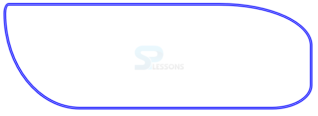
#radiusBox{
border:5px double #0000ff; /*use other border-type as well */
width:600px;
height:200px;
border-radius:10px 30% 5em 4cm/ 20px 40% 3em 5cm;
/*first four are horizontal values next four are vertical values
for each side*/
}
</style>
</head>
<body>
<div id="radiusBox">
</div>
</body>
</html>
[/html]
Result
By running the above code in a preferred browser user can get the following output as shown in below image.
The code below demonstrates the printing the specific style sheet for a web page as shown below.
[html]
<!DOCTYPE>
<html>
<head>
<style>
#radiusBox{
border:5px double #0000ff; /*use other border-type as well */
width:600px;
height:200px;
border-radius:10px 30% 5em 4cm/ 20px 40% 3em 5cm;
/*first four are horizontal values next four are vertical values
for each side*/
}
</style>
</head>
<body>
<div id="radiusBox">
</div>
</body>
</html>
[/html]
Result
By running the above code in a preferred browser user can get the following output as shown in below image.
| Properties | Description |
|---|---|
| page-break-before | Which defines he page begin before an particular element. |
| page-break-inside | Which specify if a page should begin in the middle of an element. |
| page-break-after | Is used to handle page breaks after which current element. |
| orphans | which specify the maximum number of lines which must be left at the bottom of the page, if not the whole text block is moved to the next page . |
| widows | Which specify the minimum number fo lines display at the top of the page if not the entire text block is moved to the previous page. |
- auto in which the browser decided where the page should break and which is the default value.
- always Which enforces the page break before or after the element.
- avoid If possible a page break should be avoided.
- left Which force one or two page breaks after the specified element such that following page formatted as left page.
- right Which force one or two page breaks before the specified element such that following page formatted as right page.
- inherit which enable the child elements to inherit the properties of the child element.
Key Points
- Multiple transitions can be specified using commas.
- user can use the cascading feature to over ride certain specific rules for each version of the web page.
- Devices should apply CSS styles targeted for them and ignore all other.