


 Introduction
This chapter demonstrates about the CSS Over flow which is used to control the way the text is displayed when it over flow the box. Following are the concepts covered in this chapter.
- CSS Overflow Concepts
Description
If the content is larger then the boxes containing them in these situations CSS overflow property is very useful. In which over flowing content spills out of the boxes contains by default which can be altered by using the CSS Over flow property. The properties of CSS Over flow as shown below.
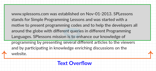
The image below demonstrates the Content Overflow as shown below.
 The values of the CSS Overflow property as shown below.
The code below demonstrates the CSS Overflow as shown.
[html]
<!DOCTYPE html>
<html>
<head>
<style>
body{font-family:verdana;}
div
{
width:100px;
height:100px;
border:5px double #666;
margin: 10px;
}
.hide{overflow:hidden;} /*overflow along both axis is hidden */
.scroll{overflow:scroll;} /*overflow along both axis is scrollable */
.visible{overflow:visible;} /*overflow along both axis is visible*/
.auto{overflow-x:auto;} /*overflow along both axis is set as auto */
.inherit{overflow-x:inherit;} /*overflow along both axis is inherited
from parent element*/
</style>
</head>
<body>
<div class="hide">
<p style="width:100px">
SPLessons stands for Simple Programming Lessons and was started with a motive to present programming codes and to help the developers all around the globe with different queries in different Programming Languages.
</p>
</div>
<div class="scroll">
<p style="width:200px">
SPLessons stands for Simple Programming Lessons and was started with a motive to present programming codes and to help the developers all around the globe with different queries in different Programming Languages.
</p>
</div>
<div class="auto">
<p style="width:200px">
SPLessons stands for Simple Programming Lessons and was started with a motive to present programming codes and to help the developers all around the globe with different queries in different Programming Languages.
</p>
</div>
<div class="visible">
<p style="width:200px">
SPLessons stands for Simple Programming Lessons and was started with a motive to present programming codes and to help the developers all around the globe with different queries in different Programming Languages.
</p>
</div>
<div class="inherit">
<p style="width:200px">
SPLessons stands for Simple Programming Lessons and was started with a motive to present programming codes and to help the developers all around the globe with different queries in different Programming Languages.
</p>
</div>
</body>
</html>
[/html]
Result
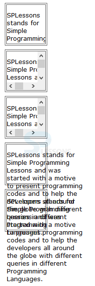
By running the above code in a preferred browser user can get the following output as shown in below image.
The values of the CSS Overflow property as shown below.
The code below demonstrates the CSS Overflow as shown.
[html]
<!DOCTYPE html>
<html>
<head>
<style>
body{font-family:verdana;}
div
{
width:100px;
height:100px;
border:5px double #666;
margin: 10px;
}
.hide{overflow:hidden;} /*overflow along both axis is hidden */
.scroll{overflow:scroll;} /*overflow along both axis is scrollable */
.visible{overflow:visible;} /*overflow along both axis is visible*/
.auto{overflow-x:auto;} /*overflow along both axis is set as auto */
.inherit{overflow-x:inherit;} /*overflow along both axis is inherited
from parent element*/
</style>
</head>
<body>
<div class="hide">
<p style="width:100px">
SPLessons stands for Simple Programming Lessons and was started with a motive to present programming codes and to help the developers all around the globe with different queries in different Programming Languages.
</p>
</div>
<div class="scroll">
<p style="width:200px">
SPLessons stands for Simple Programming Lessons and was started with a motive to present programming codes and to help the developers all around the globe with different queries in different Programming Languages.
</p>
</div>
<div class="auto">
<p style="width:200px">
SPLessons stands for Simple Programming Lessons and was started with a motive to present programming codes and to help the developers all around the globe with different queries in different Programming Languages.
</p>
</div>
<div class="visible">
<p style="width:200px">
SPLessons stands for Simple Programming Lessons and was started with a motive to present programming codes and to help the developers all around the globe with different queries in different Programming Languages.
</p>
</div>
<div class="inherit">
<p style="width:200px">
SPLessons stands for Simple Programming Lessons and was started with a motive to present programming codes and to help the developers all around the globe with different queries in different Programming Languages.
</p>
</div>
</body>
</html>
[/html]
Result
By running the above code in a preferred browser user can get the following output as shown in below image.
 Overflow-x and Overflow-y
Is used to control the overflow direction i.e which displayed along the horizontal(left and right edges) and vertical(top and bottom) axis for which user need to use the overflow-x and overflow-y. The values of these property same as overflow property.
[html]
<!DOCTYPE html>
<html>
<head>
<style>
body{font-family:verdana;}
div
{
width:100px;
height:100px;
border:5px double #666;
margin: 10px;
}
.hide{overflow-x:hidden; /*hide overflow along X and Y axis */
overflow-y:hidden;}
.scroll{overflow-x:scroll; /*scroll overflow along X and Y axis */
overflow-y:scroll;}
.visible{overflow-x:visible;
overflow-y:visible;} /*visible overflow along X and Y axis */
.auto{overflow-x:auto;
overflow-y:auto;} /*overflow along X and Y axis set to auto*/
.inherit{overflow-x:inherit; /*inherit overflow from parent element
along X and Y axis */
overflow-y:inherit;}
</style>
</head>
<body>
<div class="hide">
<p style="width:100px">
SPLessons stands for Simple Programming Lessons and was started with a motive to present programming codes and to help the developers all around the globe with different queries in different Programming Languages.
</p>
</div>
<div class="scroll">
<p style="width:200px">
SPLessons stands for Simple Programming Lessons and was started with a motive to present programming codes and to help the developers all around the globe with different queries in different Programming Languages.
</p>
</div>
<div class="auto">
<p style="width:200px">
SPLessons stands for Simple Programming Lessons and was started with a motive to present programming codes and to help the developers all around the globe with different queries in different Programming Languages.
</p>
</div>
<div class="visible">
<p style="width:200px">
SPLessons stands for Simple Programming Lessons and was started with a motive to present programming codes and to help the developers all around the globe with different queries in different Programming Languages.
</p>
</div>
<div class="inherit">
<p style="width:200px">
SPLessons stands for Simple Programming Lessons and was started with a motive to present programming codes and to help the developers all around the globe with different queries in different Programming Languages.
</p>
</div>
</body>
</html>
[/html]
Result
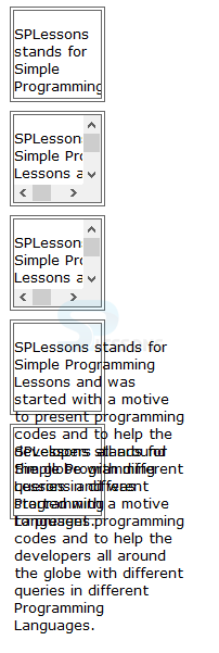
By running the above code in a preferred browser user can get the following output as shown in below image.
Overflow-x and Overflow-y
Is used to control the overflow direction i.e which displayed along the horizontal(left and right edges) and vertical(top and bottom) axis for which user need to use the overflow-x and overflow-y. The values of these property same as overflow property.
[html]
<!DOCTYPE html>
<html>
<head>
<style>
body{font-family:verdana;}
div
{
width:100px;
height:100px;
border:5px double #666;
margin: 10px;
}
.hide{overflow-x:hidden; /*hide overflow along X and Y axis */
overflow-y:hidden;}
.scroll{overflow-x:scroll; /*scroll overflow along X and Y axis */
overflow-y:scroll;}
.visible{overflow-x:visible;
overflow-y:visible;} /*visible overflow along X and Y axis */
.auto{overflow-x:auto;
overflow-y:auto;} /*overflow along X and Y axis set to auto*/
.inherit{overflow-x:inherit; /*inherit overflow from parent element
along X and Y axis */
overflow-y:inherit;}
</style>
</head>
<body>
<div class="hide">
<p style="width:100px">
SPLessons stands for Simple Programming Lessons and was started with a motive to present programming codes and to help the developers all around the globe with different queries in different Programming Languages.
</p>
</div>
<div class="scroll">
<p style="width:200px">
SPLessons stands for Simple Programming Lessons and was started with a motive to present programming codes and to help the developers all around the globe with different queries in different Programming Languages.
</p>
</div>
<div class="auto">
<p style="width:200px">
SPLessons stands for Simple Programming Lessons and was started with a motive to present programming codes and to help the developers all around the globe with different queries in different Programming Languages.
</p>
</div>
<div class="visible">
<p style="width:200px">
SPLessons stands for Simple Programming Lessons and was started with a motive to present programming codes and to help the developers all around the globe with different queries in different Programming Languages.
</p>
</div>
<div class="inherit">
<p style="width:200px">
SPLessons stands for Simple Programming Lessons and was started with a motive to present programming codes and to help the developers all around the globe with different queries in different Programming Languages.
</p>
</div>
</body>
</html>
[/html]
Result
By running the above code in a preferred browser user can get the following output as shown in below image.
| Value | Description |
|---|---|
| overflow-x | Which sets the over flow along the x-axis i.e in horizontal direction. |
| overflow-y | Which sets the over flow along the y-axis i.e in vertical direction. |
| overflow | Which is the shorthand to set multiple overflow properties in a single direction. |
- auto Which leave it for the browser which apply scroll bar if the content get overflows other wise not.
- hidden In which the overflowing content should be hidden.
- visible In which the overflowing should be spills out of the box which is the default value.
- scroll In which browser created scroll bar for the overflowing content. The scroll bar is visible even when the content does not overflow.
- inherit The value of over flow property is inherited from the parent element.
Key Points
- The most suitable value for overflow is auto in which browser will apply scroll when required.
- Overflow can be displayed along the x-axis or y-axis.
- Overflow content spills out of the box.