


 Introduction
This chapter demonstrates about the CSS Navigation is used to create navigation bar to navigate desired page easily and quickly and following are the concepts are covered in this chapter.
- Navigation Bars
Description
Navigation bar is known as the list of links which are arranged in horizontally or vertically. These bars are used to navigate the desired page easily and quickly. Navigation bar is created by using the list pf elements like <ul>, <ol> and <defination> then by using the CSS user can style these links and create horizontal or vertical navigation bars. The image below demonstrates the Navigation bar.
 Creating a Vertical Navigation Bar
User can convert the normal list into vertical navigation bar by using the CSS in which initially user need to create an unordered list without any bullets and then remove the default margins and padding. Now set the display property to block. Then style the links by using margins, paddings, hover, fonts etc. The code below demonstrates the vrating a vertical navigation bar as shown.
[html]
<!DOCTYPE html>
<html>
<head>
<style>
.containerDemo {
font-family:Verdana, Helvetica;
width: 500px;
margin: 40px;
}
.menuDemo {
list-style: none;
margin: 0;
padding: 0;
width:300px;
box-shadow:3px 3px 3px #666;
border-radius:3px
}
.menuDemo li {
border-left: 7px ridge #FF0000;
border-bottom: 1px solid #666;
}
.menuDemo li a:link,
.menuDemo li a:visited {
background-color:#0000FF;
color: #eee;
padding: 10px;
display: block;
text-decoration: none;
border-left: 5px ridge #99CD4E;
}
.menuDemo li a:hover {
background-color: #800080;
color:#fff;
box-shadow:inset 3px 3px 1px #111;
border-left: 5px double #6A9A1F;
transition:0.3s all ease-in-out;
-webkit-transition:0.3s all ease-in-out;
}
</style>
</head>
<body>
<div class="containerDemo">
<ul class="menuDemo">
<li><a href="#">HTML</a></li>
<li><a href="#">HTML5</a></li>
<li><a href="#">SVG</a></li>
<li><a href="#">CSS</a></li>
</ul>
</div>
</body>
</html>
[/html]
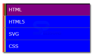
Result
By running the above code in a preferred browser user can get the following output as shown in below image.
Creating a Vertical Navigation Bar
User can convert the normal list into vertical navigation bar by using the CSS in which initially user need to create an unordered list without any bullets and then remove the default margins and padding. Now set the display property to block. Then style the links by using margins, paddings, hover, fonts etc. The code below demonstrates the vrating a vertical navigation bar as shown.
[html]
<!DOCTYPE html>
<html>
<head>
<style>
.containerDemo {
font-family:Verdana, Helvetica;
width: 500px;
margin: 40px;
}
.menuDemo {
list-style: none;
margin: 0;
padding: 0;
width:300px;
box-shadow:3px 3px 3px #666;
border-radius:3px
}
.menuDemo li {
border-left: 7px ridge #FF0000;
border-bottom: 1px solid #666;
}
.menuDemo li a:link,
.menuDemo li a:visited {
background-color:#0000FF;
color: #eee;
padding: 10px;
display: block;
text-decoration: none;
border-left: 5px ridge #99CD4E;
}
.menuDemo li a:hover {
background-color: #800080;
color:#fff;
box-shadow:inset 3px 3px 1px #111;
border-left: 5px double #6A9A1F;
transition:0.3s all ease-in-out;
-webkit-transition:0.3s all ease-in-out;
}
</style>
</head>
<body>
<div class="containerDemo">
<ul class="menuDemo">
<li><a href="#">HTML</a></li>
<li><a href="#">HTML5</a></li>
<li><a href="#">SVG</a></li>
<li><a href="#">CSS</a></li>
</ul>
</div>
</body>
</html>
[/html]
Result
By running the above code in a preferred browser user can get the following output as shown in below image.
 Horizontal Navigation
User can also create the Horizontal bar. The process is both for the horizontal bar navigation and vertical bar navigation but the only difference is the display property is set as the inline by setting these inline links are arranged and displayed in a single line. The code below demonstrate the creating an Horizontal Navigation bar as shown.
[html]
<!DOCTYPE html>
<html>
<head>
<style>
nav li { display: inline; }
nav { background: #0000ff;
border:8px ridge #fa4b2a;
border-radius:10px;
padding:2px;
box-shadow:5px 5px 5px #ccc;
min-width:650px;}
nav a:hover { background:#FFD700;
border-radius:10px;
color:#ff0000;
box-shadow:inset 5px 5px 5px #333,
inset -5px -5px 5px #333;}
nav a { text-decoration: none; color: #2cc555;
padding:10px; margin:5px;border-radius:10px;
font-family: Verdana,helvetica, sans-serif;
font-size:24px;
text-shadow: 1px 1px 1px #999;
-webkit-transition: box-shadow 0.5s ease-in-out;
-moz-transition: color 0.5s ease-in-out;
-o-transition: color 0.5s ease-in-out;
transition: color box-shadow 0.5s ease-in-out;
}
nav a:visited:hover {
background:#0000ff;
}
</style>
</head>
<body>
<nav>
<ul>
<li><a href="#">HTML</a></li>
<li><a href="#">HTML5</a></li>
<li><a href="#">SVG</a></li>
<li><a href="#">CSS</a></li>
<li><a href="#">CSS3</a></li>
</ul>
</nav>
</body>
</html>
[/html]
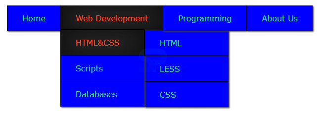
Result
By running the above code in a preferred browser user can get the following output as shown in below image.
Horizontal Navigation
User can also create the Horizontal bar. The process is both for the horizontal bar navigation and vertical bar navigation but the only difference is the display property is set as the inline by setting these inline links are arranged and displayed in a single line. The code below demonstrate the creating an Horizontal Navigation bar as shown.
[html]
<!DOCTYPE html>
<html>
<head>
<style>
nav li { display: inline; }
nav { background: #0000ff;
border:8px ridge #fa4b2a;
border-radius:10px;
padding:2px;
box-shadow:5px 5px 5px #ccc;
min-width:650px;}
nav a:hover { background:#FFD700;
border-radius:10px;
color:#ff0000;
box-shadow:inset 5px 5px 5px #333,
inset -5px -5px 5px #333;}
nav a { text-decoration: none; color: #2cc555;
padding:10px; margin:5px;border-radius:10px;
font-family: Verdana,helvetica, sans-serif;
font-size:24px;
text-shadow: 1px 1px 1px #999;
-webkit-transition: box-shadow 0.5s ease-in-out;
-moz-transition: color 0.5s ease-in-out;
-o-transition: color 0.5s ease-in-out;
transition: color box-shadow 0.5s ease-in-out;
}
nav a:visited:hover {
background:#0000ff;
}
</style>
</head>
<body>
<nav>
<ul>
<li><a href="#">HTML</a></li>
<li><a href="#">HTML5</a></li>
<li><a href="#">SVG</a></li>
<li><a href="#">CSS</a></li>
<li><a href="#">CSS3</a></li>
</ul>
</nav>
</body>
</html>
[/html]
Result
By running the above code in a preferred browser user can get the following output as shown in below image.
 Horizontal Navigation Bar
User can also create the Horizontal Navigation bar which contain drop down list. The code below demonstrates the Drop down menu as shown below.
[html]
<!DOCTYPE html>
<html>
<head>
<style>
#drop-down li {
font-family:Verdana;
list-style-type: none;
margin: 0;
float: left;
position: relative;
box-shadow:2px 2px 2px #444;
z-index:10;
}
#drop-down a {
display: block;
padding: 15px 30px;
margin: 0;
border-left: #000 1px solid;
color: #2ee555;
background-color:#0000ff;
text-decoration: none;
}
#drop-down ul {
display: none;
margin: 0;
padding: 0;
position:absolute;
top: 48px;
width: 170px;
}
#drop-down ul ul {
left: 170px;
top:0px;
}
#drop-down li:hover > ul {
display: block;
}
#drop-down ul li {
float: none;
border-top: 1px solid #000;
border-right:1px solid #000;
}
#drop-down li:hover > a, #drop-down a:focus {
background-color: #333;
color: #fa4b2a;
box-shadow:inset 1px 1px 55px #111,
inset -1px 0px 55px #111;
transition:0.6s all;
}
#drop-down ul a {
background-color: #0000ff;
}
#drop-down ul li:hover > a {
background-color: #333;
}
</style>
</head>
<body>
<ul id="drop-down">
<li><a href="#">Home</a></li>
<li><a href="#">Web Development</a>
<ul>
<li><a href="#">HTML&CSS </a>
<ul>
<li><a href="#">HTML</a></li>
<li><a href="#">LESS</a></li>
<li><a href="#">CSS</a></li>
</ul>
</li>
<li><a href="#">Scripts</a>
<ul>
<li><a href="#">Angular JS</a></li>
<li><a href="#">Desktop</a></li>
<li><a href="#">Php</a></li>
<li><a href="#">Framework</a></li>
</ul>
</li>
<li><a href="#">Databases</a>
<ul>
<li><a href="#">SQL</a></li>
<li><a href="#">MySQL</a></li>
<li><a href="#">Orcle</a></li>
</ul>
</li>
</ul>
</li>
<li><a href="#">Programming</a>
<ul>
<li><a href="#">C#</a></li>
<li><a href="#">C Programming</a></li>
<li><a href="#">Apache</a></li>
</ul>
</li>
<li><a href="#">About Us</a></li>
</ul>
</body>
</html>
[/html]
Result
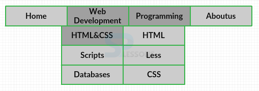
By running the above code in a preferred browser user can get the following output as shown in below image.
Horizontal Navigation Bar
User can also create the Horizontal Navigation bar which contain drop down list. The code below demonstrates the Drop down menu as shown below.
[html]
<!DOCTYPE html>
<html>
<head>
<style>
#drop-down li {
font-family:Verdana;
list-style-type: none;
margin: 0;
float: left;
position: relative;
box-shadow:2px 2px 2px #444;
z-index:10;
}
#drop-down a {
display: block;
padding: 15px 30px;
margin: 0;
border-left: #000 1px solid;
color: #2ee555;
background-color:#0000ff;
text-decoration: none;
}
#drop-down ul {
display: none;
margin: 0;
padding: 0;
position:absolute;
top: 48px;
width: 170px;
}
#drop-down ul ul {
left: 170px;
top:0px;
}
#drop-down li:hover > ul {
display: block;
}
#drop-down ul li {
float: none;
border-top: 1px solid #000;
border-right:1px solid #000;
}
#drop-down li:hover > a, #drop-down a:focus {
background-color: #333;
color: #fa4b2a;
box-shadow:inset 1px 1px 55px #111,
inset -1px 0px 55px #111;
transition:0.6s all;
}
#drop-down ul a {
background-color: #0000ff;
}
#drop-down ul li:hover > a {
background-color: #333;
}
</style>
</head>
<body>
<ul id="drop-down">
<li><a href="#">Home</a></li>
<li><a href="#">Web Development</a>
<ul>
<li><a href="#">HTML&CSS </a>
<ul>
<li><a href="#">HTML</a></li>
<li><a href="#">LESS</a></li>
<li><a href="#">CSS</a></li>
</ul>
</li>
<li><a href="#">Scripts</a>
<ul>
<li><a href="#">Angular JS</a></li>
<li><a href="#">Desktop</a></li>
<li><a href="#">Php</a></li>
<li><a href="#">Framework</a></li>
</ul>
</li>
<li><a href="#">Databases</a>
<ul>
<li><a href="#">SQL</a></li>
<li><a href="#">MySQL</a></li>
<li><a href="#">Orcle</a></li>
</ul>
</li>
</ul>
</li>
<li><a href="#">Programming</a>
<ul>
<li><a href="#">C#</a></li>
<li><a href="#">C Programming</a></li>
<li><a href="#">Apache</a></li>
</ul>
</li>
<li><a href="#">About Us</a></li>
</ul>
</body>
</html>
[/html]
Result
By running the above code in a preferred browser user can get the following output as shown in below image.
Key Points
- For these navigation bar user can also use new features, like border radius, transform, hover effects.
- Drop down lists are more effective and more useful.
- The navigation property supported only on webkit browsers.