


 Introduction
This chapter demonstrates about the CSS Mask is used to create masking effects over an image following are the concepts covered in this chapter.
- Usage of Mask
- Masks Stacking Effect
- CSS Mask using gradients
Description
Which are used to create an overlay over an image which clips some part of image or display the image as transparent or translucent. A mask can be alpha channel with an image or gradient in which alpha values should be in between o to 1 in which 0 means completely transparent and 1 means completely opaque. If mask applied to the then the alpha value should be the "0" (opaque) and the image is completely transparent.
Creating mask on web page
By using alpha channel user can create the mask is an image in which only .png and .svg are the supported image formats. User can pass a value for the mask image is -webit-mask-image or -webkit-mask-box-image.
The code below demonstrates the mask property as shown below.
[html]
<!DOCTYPE html>
<html>
<style>
img{ -webkit-mask-box-image: url(mask.png);}
</style>
<body>
<img src="splesson.png" alt="splessons" class="demo1">
</body>
</html>
[/html]
Result
By running the above code in a preferred browser user can get the following output as shown in below image.

- -webit-mask-image Which is used to apply mask of native size on the underlying element.
- -webkit-mask-box-image Which applies mask scaled down to the size of the image is used to select the most suitable one.
Description
User can have the more mask effects user can also use the masks one above one another which means one mask above the another mask the overall which effect is known as concatenation of all individual masks. The code below demonstrates the CSS mask stacking effect.
[html]
<!DOCTYPE html>
<html>
<style>
.demo1{ -webkit-mask-box-image:linear-gradient(to right, grey , transparent 70%);}
.demo2{ -webkit-mask-box-image:linear-gradient(to left, grey , transparent 70%);}
.demo3{-webkit-mask-box-image:radial-gradient(black, transparent 50%);}
</style>
<body>
<img src="splesson.png" alt="splesson" class="demo1">
<img src="splesson.png" alt="tintin" class="demo2">
<img src="splesson.png" alt="tintin" class="demo3">
</body>
</html>
[/html]
Result
By running the above code in a preferred browser user can get the following output as shown in below image.

Description
User can also make the masked text by using the gradients which can be used a mask for applied text to create a great effects The code below demonstrates the CSS gradients masks on text as shown below.
[html]
<!DOCTYPE html>
<html>
<style>
.mask{font-family:Verdana;
-webkit-mask-box-image:radial-gradient(white, transparent 70%)
}
</style>
<body>
<div class="mask">
<p>
www.splessons.com was established on Nov-01-2013. SPLessons stands for Simple Programming Lessons and was started with a motive to present programming codes and to help the developers all around the globe with different queries in different Programming Languages.To enhance our knowledge of programming by presenting several different articles to the viewers and by participating in knowledge enriching discussions on the website.</p>
</div>
</body>
</html>
[/html]
Result
By running the above code in a preferred browser user can get the following output as shown in below image.
 Clipping Images by using clipping property
User can use the clip property to create a mask through which a section of an image can be seen. The code below demonstrates the CSS Clip property as shown below.
[html]
<!DOCTYPE html>
<html>
<style type="text/css">
body{font-family:Verdana, helvetica,Arial;
}
#window {
height:260px;
width: 420px;
position: absolute;
left: 100px;
clip: rect(90px 155px 185px 80px);
-webkit-transition: linear 1s;
transition: linear 1s;
}
#window:hover {
clip: rect(0 420px 260px 0);
}
</style>
<body>
<div id="window"><img src="splesson.png" width="420" height="260" alt="splesssons"></div>
<p>Hover over the clipped region to see the complete image</p>
</body>
</html>
[/html]
Result
By running the above code in a preferred browser user can get the following output as shown in below image.
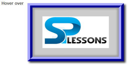
Clipping Images by using clipping property
User can use the clip property to create a mask through which a section of an image can be seen. The code below demonstrates the CSS Clip property as shown below.
[html]
<!DOCTYPE html>
<html>
<style type="text/css">
body{font-family:Verdana, helvetica,Arial;
}
#window {
height:260px;
width: 420px;
position: absolute;
left: 100px;
clip: rect(90px 155px 185px 80px);
-webkit-transition: linear 1s;
transition: linear 1s;
}
#window:hover {
clip: rect(0 420px 260px 0);
}
</style>
<body>
<div id="window"><img src="splesson.png" width="420" height="260" alt="splesssons"></div>
<p>Hover over the clipped region to see the complete image</p>
</body>
</html>
[/html]
Result
By running the above code in a preferred browser user can get the following output as shown in below image.
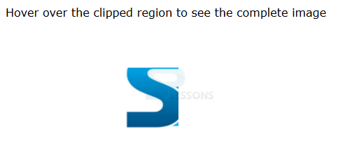 When user moved the mouse above the image then it visible completely as shown in below image.
Key Points
- The mask effects are applied to all elements and its descendants.
- The mask property supported by only on webkit browsers.
- To create mask only .svg and .png files are supportable.