


 Introduction
This Chapter demonstrates about the CSS Image Border to create custom borders with images following are the concepts covered in this chapter.
- CSS Border-Image and Properties
Description
User need not to confine the image borders which are created using border-style property and user can create the custom borders with images by sung the CSS border-image property. Every individual border image aspects are configured using five properties which are tabulated below.
Border Image and its slices
In order to image which is used for the border using the CSS Property i.e border-image-source and the path should be specified by using url() method. By using the border-image-slice user can slicing pattern for the image borders the image below demonstrates the slicing patterns as shown.
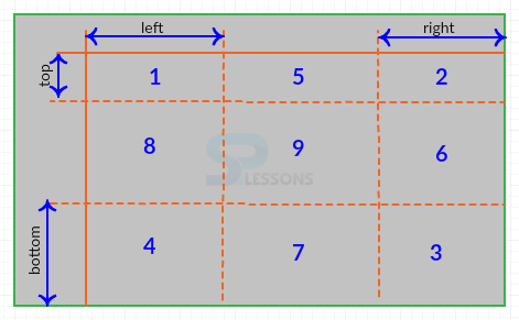 The border-image-slice property slices into 9 parts in which four corners and four edges and middle part. In order to slice the image user should provide insets for all the four edges of the image i.e (top, bottom, right, left) and user need to provide four values, one for each edge, in which if some values are not specified then they are inferred from the other values like other 4value-syntax of CSS. The code below demonstrates the CSS Border image source and slices as shown.
[html]
<!DOCTYPE html>
<html>
<head>
<style>
#quote {
border-image-source: url(border.jpg); /*path of the border image */
border-image-slice: 25% 30% 30% 25%; /* top right bottom left*/
</style>
</head>
<body>
<div id="SPLESSONS">
<p>Simple Programming Lessons CSS Tutorials
</p>
</div>
<br>
<p>Source Image</p>
<img src="border.jpg" alt="border-image"/>
</body>
</html>
[/html]
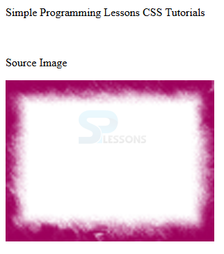
Result
By running the above code in a preferred browser user can get the following output as shown in below image.
The border-image-slice property slices into 9 parts in which four corners and four edges and middle part. In order to slice the image user should provide insets for all the four edges of the image i.e (top, bottom, right, left) and user need to provide four values, one for each edge, in which if some values are not specified then they are inferred from the other values like other 4value-syntax of CSS. The code below demonstrates the CSS Border image source and slices as shown.
[html]
<!DOCTYPE html>
<html>
<head>
<style>
#quote {
border-image-source: url(border.jpg); /*path of the border image */
border-image-slice: 25% 30% 30% 25%; /* top right bottom left*/
</style>
</head>
<body>
<div id="SPLESSONS">
<p>Simple Programming Lessons CSS Tutorials
</p>
</div>
<br>
<p>Source Image</p>
<img src="border.jpg" alt="border-image"/>
</body>
</html>
[/html]
Result
By running the above code in a preferred browser user can get the following output as shown in below image.
 border-image-width-property
By using the border-image-width property user can set the width of the image border slices. In which also user need to take the four values one for each side, if some values are not specified then the value should be inferred from the other values like other 4-value syntax of CSS. The values can be specified in length, numbers and percentages and the code below demonstrates the border-image-width property as shown.
[html]
<!DOCTYPE html>
<html>
<head>
<style>
#quote {
border-image-source: url(border.jpg); /*path of the border image */
border-image-slice: 25% 30% 30% 25%; /* top right bottom left*/
border-image-width: 10px 20px 12px 15px /* top right bottom left */
</style>
</head>
<body>
<div id="quote">
<p>Simple Programming Lessons CSS Tutorials.
</p>
</div>
<br>
<p>Source Image</p>
<img src="border.jpg" alt="border-image"/>
</body>
</html>
[/html]
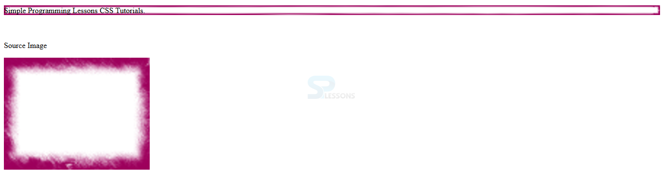
Result
By running the above code in a preferred browser user can get the following output as shown in below image.
border-image-width-property
By using the border-image-width property user can set the width of the image border slices. In which also user need to take the four values one for each side, if some values are not specified then the value should be inferred from the other values like other 4-value syntax of CSS. The values can be specified in length, numbers and percentages and the code below demonstrates the border-image-width property as shown.
[html]
<!DOCTYPE html>
<html>
<head>
<style>
#quote {
border-image-source: url(border.jpg); /*path of the border image */
border-image-slice: 25% 30% 30% 25%; /* top right bottom left*/
border-image-width: 10px 20px 12px 15px /* top right bottom left */
</style>
</head>
<body>
<div id="quote">
<p>Simple Programming Lessons CSS Tutorials.
</p>
</div>
<br>
<p>Source Image</p>
<img src="border.jpg" alt="border-image"/>
</body>
</html>
[/html]
Result
By running the above code in a preferred browser user can get the following output as shown in below image.
 border image repeat
In which border image slice are stretched to fill the gaps in bet ween corners of the frames by using the border-image-repeat property following are the keywords to handle the image slices as shown.
For each four sides user can separate the keywords just like 4 valued properties. The code below demonstrates the CSS-border-image-repeat as shown
[html]
<!DOCTYPE html>
<html>
<head>
<style>
#quote {
border-image-source: url(border.jpg); /*path of the border image */
border-image-slice: 25% 30% 30% 25%; /* top right bottom left*/
border-image-width: 10px 20px 12px 15px; /* top right bottom left */
border-image-repeat: round repeat space stretch;
/*order for value is top right bottom left */
</style>
</head>
<body>
<div id="tutorials">
<p>Simple Programming Lessons CSS Tutorials.
</p>
</div>
<br>
<p>Source Image</p>
<img src="border.jpg" alt="border-image"/>
</body>
</html>
[/html]
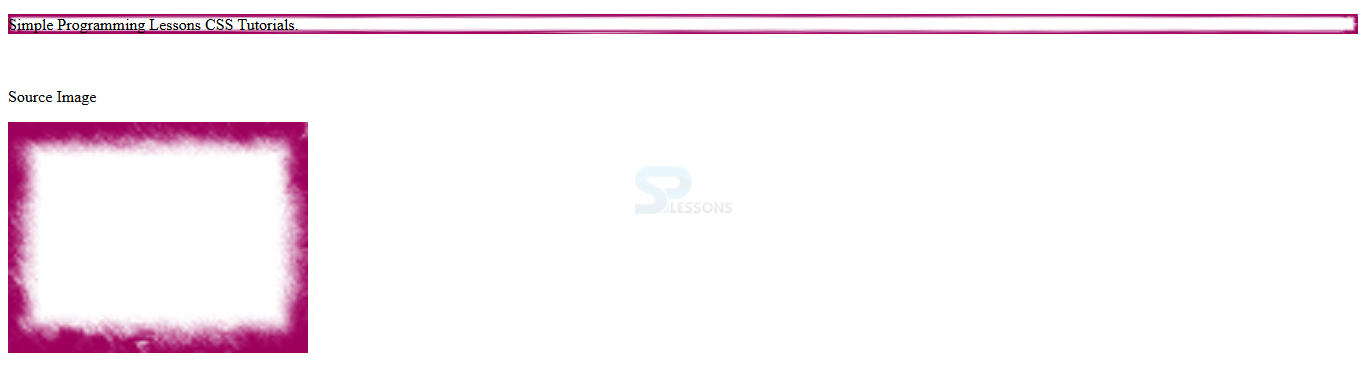
Result
By running the above code in a preferred browser user can get the following output as shown in below image.
border image repeat
In which border image slice are stretched to fill the gaps in bet ween corners of the frames by using the border-image-repeat property following are the keywords to handle the image slices as shown.
For each four sides user can separate the keywords just like 4 valued properties. The code below demonstrates the CSS-border-image-repeat as shown
[html]
<!DOCTYPE html>
<html>
<head>
<style>
#quote {
border-image-source: url(border.jpg); /*path of the border image */
border-image-slice: 25% 30% 30% 25%; /* top right bottom left*/
border-image-width: 10px 20px 12px 15px; /* top right bottom left */
border-image-repeat: round repeat space stretch;
/*order for value is top right bottom left */
</style>
</head>
<body>
<div id="tutorials">
<p>Simple Programming Lessons CSS Tutorials.
</p>
</div>
<br>
<p>Source Image</p>
<img src="border.jpg" alt="border-image"/>
</body>
</html>
[/html]
Result
By running the above code in a preferred browser user can get the following output as shown in below image.
| Property | Description | Value |
|---|---|---|
| border-image-source | Is used to specify the location of the image which is used for borders. | none url(image-location) |
| border-image-slice | Is used to specify the inward offset of each side of the border image. | number percent fill |
| border-image-outset | Is used to specify the area which beyond the border is used to display the border image. | length percent |
| border-image-width | Which specify the element border width. | number percent auto |
| border-image-repeat | Is used to specify how tiles are scaled and tiled for horizontal and vertical edges. | stretch repeat round |
| border-image | Which is the shorthand to set multiple properties in a single declaration. | number percent fill |
- stretch In which the slice get stretched to fill the empty space and it is the default value.
- repeat In which the s;lice get repeated from the center to fill empty space.
- round In which the slice will be stretched and repeated to fill the space.
- space In which in order to fill the gap the slice will be repeated exact number of times and which divided extra space to created gap between the individual tiles.
Key Points
- border-image-width specify the width of slices not the border.
- stretch property is used to fill the gap in between the corners.
- User can also set the width of the image border by using CSS border-image-width.