


 Introduction
This chapter demonstrates about the CSS Gradient which is used to blend multiple colors smoothly to create multiple great effects following are the concepts covered in this chapter.
- CSS Gradients
- Linear Gradients
- Radial Gradient
Description
By using the CSS Gradient user can create smooth transition from one color to another color and which can create grate effects for background without using any images. Using of gradient is easier to scale and user can also change the color scheme, no download time and no bandwidth can be used and some gradient can be made dynamic using javascript. The syntax of the gradient as shown in below image.
 The table below demonstrates the properties of gradient as shown.
linear-gradient()
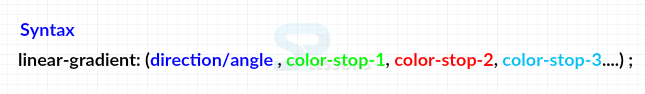
User can create the linear gradient by using linear-gradient() and the argumentof these gradient is shown below.
linear-gradient(direction/angle(optional) , color-stop-1 , color-stop-2 , .....)
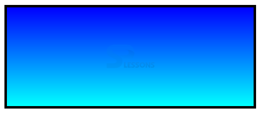
In which direction/angle is an optional argument If nothing is specified then the direction is from top to bottom by default. The code below demonstrates the linear gradient as shown.
[html]
<!DOCTYPE>
<html>
<head>
<style>
div{width:500px;
height:200px;
margin:30px;
border:5px solid #000000;
background-image:linear-gradient(#0000FF,#00FFFF);
}
</style>
</head>
<body>
<div></div>
</body>
</html>
[/html]
Result
By running the above code in a preferred browser user can get the following output as shown in below image.
 linear-gradient () horizontal direction
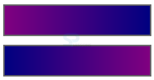
User can create gradient along the horizontal direction in which user can specify the direction as an argument using a keyword denoting the direction which gradient should head for example left to right. The code below demonstrates the CSS linear-gradient horizontal direction as shown.
[html]
<!DOCTYPE>
<html>
<head>
<style>
div{width:500px;
height:100px;
margin:30px;
border:5px solid #666;
}
.grad1{
background-image:linear-gradient(to right, #800080, #000080);
/*direction from left-to-right*/
}
.grad2{
background-image:linear-gradient(to left, #800080, #000080 );
/*direction from right-to-left*/
}
</style>
</head>
<body>
<div class="grad1"></div>
<div class="grad2"></div>
</body>
</html>
[/html]
Result
By running the above code in a preferred browser user can get the following output as shown in below image.
linear-gradient () horizontal direction
User can create gradient along the horizontal direction in which user can specify the direction as an argument using a keyword denoting the direction which gradient should head for example left to right. The code below demonstrates the CSS linear-gradient horizontal direction as shown.
[html]
<!DOCTYPE>
<html>
<head>
<style>
div{width:500px;
height:100px;
margin:30px;
border:5px solid #666;
}
.grad1{
background-image:linear-gradient(to right, #800080, #000080);
/*direction from left-to-right*/
}
.grad2{
background-image:linear-gradient(to left, #800080, #000080 );
/*direction from right-to-left*/
}
</style>
</head>
<body>
<div class="grad1"></div>
<div class="grad2"></div>
</body>
</html>
[/html]
Result
By running the above code in a preferred browser user can get the following output as shown in below image.
 linear-gradient along a angle
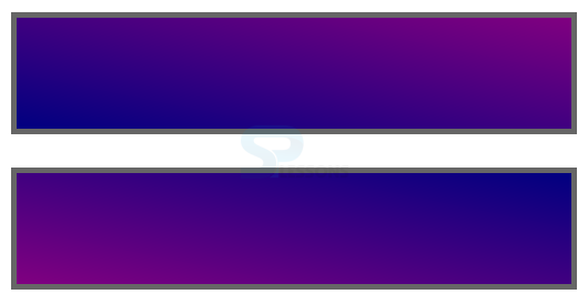
User can create the linear gradient along any angle by specifying the angle along which the gradient must be created in which CSS angles follows the coordinate system of a compass. The angle is created from the center of the the gradient box if user gave positive values which moves clock wise direction and negative value means anti clock wise direction. In which angles are automatically converted by the browser with in range of 0deg to 360deg. The code below demonstrates the linear gradient along a angle as shown.
[html]
<!DOCTYPE>
<html>
<head>
<style>
div{width:500px;
height:100px;
margin:30px;
border:5px solid #666;
}
.grad1{
background-image:linear-gradient(to bottom left, #800080, #000080);
/*direction from top-right to bottom-left*/
}
.grad2{
background-image:linear-gradient(to top right, #800080, #000080);
/*direction from bottom-left to top-right*/
}
</style>
</head>
<body>
<div class="grad1"></div>
<div class="grad2"></div>
</body>
</html>
[/html]
Result
By running the above code in a preferred browser user can get the following output as shown in below image.
linear-gradient along a angle
User can create the linear gradient along any angle by specifying the angle along which the gradient must be created in which CSS angles follows the coordinate system of a compass. The angle is created from the center of the the gradient box if user gave positive values which moves clock wise direction and negative value means anti clock wise direction. In which angles are automatically converted by the browser with in range of 0deg to 360deg. The code below demonstrates the linear gradient along a angle as shown.
[html]
<!DOCTYPE>
<html>
<head>
<style>
div{width:500px;
height:100px;
margin:30px;
border:5px solid #666;
}
.grad1{
background-image:linear-gradient(to bottom left, #800080, #000080);
/*direction from top-right to bottom-left*/
}
.grad2{
background-image:linear-gradient(to top right, #800080, #000080);
/*direction from bottom-left to top-right*/
}
</style>
</head>
<body>
<div class="grad1"></div>
<div class="grad2"></div>
</body>
</html>
[/html]
Result
By running the above code in a preferred browser user can get the following output as shown in below image.
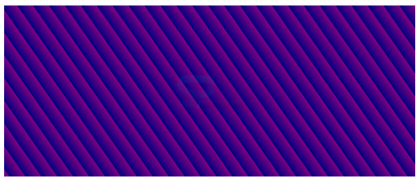
 Repeating-Linear-gradient
User can repeat the linear gradient with stop points after which the gradient repeat it self using CSS repeating-linear-gradient() The code below demonstrates the CSS repeating linear gradient as shown.
[html]
<!DOCTYPE html>
<html>
<head>
<meta charset="utf-8">
<title>Repeating Linear Gradient</title>
<style>
div {
width: 600px;
height: 250px;
margin: 10px;
background-image: repeating-linear-gradient(235deg, purple, Navy 3%);
}
</style>
</head>
<body>
<div></div>
</body>
</html>
[/html]
Result
By running the above code in a preferred browser user can get the following output as shown in below image.
Repeating-Linear-gradient
User can repeat the linear gradient with stop points after which the gradient repeat it self using CSS repeating-linear-gradient() The code below demonstrates the CSS repeating linear gradient as shown.
[html]
<!DOCTYPE html>
<html>
<head>
<meta charset="utf-8">
<title>Repeating Linear Gradient</title>
<style>
div {
width: 600px;
height: 250px;
margin: 10px;
background-image: repeating-linear-gradient(235deg, purple, Navy 3%);
}
</style>
</head>
<body>
<div></div>
</body>
</html>
[/html]
Result
By running the above code in a preferred browser user can get the following output as shown in below image.
| Property | Description |
|---|---|
| linear-gradient() | Which is an horizontal offset in which positive value give shadow to the right side and negative value give shadow to the left side. |
| radial gradient() | Which is an vertical offset in which positive value give shadow to the top and negative value give shadow to the bottom. |
| repeating-linear-gradient() | Which is used to set the blur radius. higher value gives more blur edge of the box and negative values not allowed. |
| repeating-radial-gradient() | Is used to sets the spread radius in which value exapands the shadow in all directions and negative value contracts shadow towards the box. |
Description
User can create radial gradient by using radial-gradient() radial gradient starts at single point and spread in elliptical or circular shape. The syntax fo tghe radial gradient as shownb below.
[code]
background: radial-gradient (center, shape size, color-start, ......, color-stop);
[/code]
In the above syntax properties are described below.
The code below demonstrates the CSS radial-gradient as shown below.
[html]
<!DOCTYPE html>
<html>
<head>
<style>
div
{
height:150px;
width:600px;
margin:20px;
}
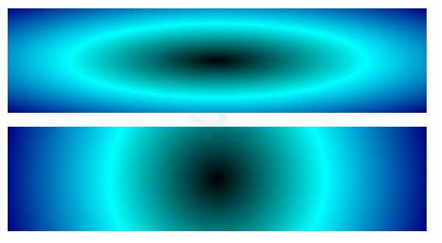
#ellipse-grad{
background: radial-gradient(black, Aqua, Navy); /* Default shape is ellipse */
}
#circle-grad{
background-image: radial-gradient(circle , black, Aqua, Navy);}
/*specify shape as circle */
</style>
</head>
<body>
<div id="ellipse-grad"></div>
<div id="circle-grad"></div>
</body>
</html>
[/html]
Result
By running the above code in a preferred browser user can get the following output as shown in below image.
 Radial Gradient with Specific Color Stops
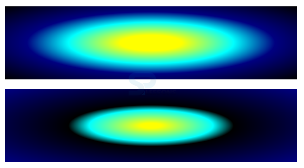
User can place the multiple color stops along the gradient ray like linear gradients in which 0% denotes the start and 100% denotes the color at the end. The code below demonstrates the CSS Radial Gradient as shown.
[html]
<!DOCTYPE html>
<html>
<head>
<style>
div
{
height:150px;
width:600px;
margin:20px;
}
#grad1{
background: radial-gradient(yellow 15%, Aqua 40%, navy 60%, black);
/* color begins at specified location */
}
#grad2{
background-image: radial-gradient( yellow 5%, Aqua 30%, navy 40%,black);}
/*same colors at different points */
</style>
</head>
<body>
<div id="grad1"></div>
<div id="grad2"></div>
</body>
</html>
[/html]
Result
By running the above code in a preferred browser user can get the following output as shown in below image.
Radial Gradient with Specific Color Stops
User can place the multiple color stops along the gradient ray like linear gradients in which 0% denotes the start and 100% denotes the color at the end. The code below demonstrates the CSS Radial Gradient as shown.
[html]
<!DOCTYPE html>
<html>
<head>
<style>
div
{
height:150px;
width:600px;
margin:20px;
}
#grad1{
background: radial-gradient(yellow 15%, Aqua 40%, navy 60%, black);
/* color begins at specified location */
}
#grad2{
background-image: radial-gradient( yellow 5%, Aqua 30%, navy 40%,black);}
/*same colors at different points */
</style>
</head>
<body>
<div id="grad1"></div>
<div id="grad2"></div>
</body>
</html>
[/html]
Result
By running the above code in a preferred browser user can get the following output as shown in below image.
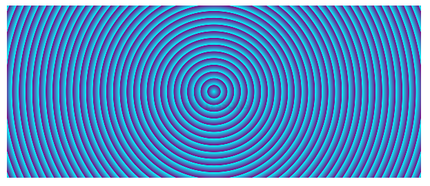
 CSS Repeating Radial Gradients
User can simply repeat radial gradient with stop points after which the gradient repeat itself using CSS repeating-radial-gradient as shown. The code below demonstrates the CSS Repeating gradient as shown.
[html]
<!DOCTYPE html>
<html>
<head>
<meta charset="utf-8">
<title>Repeating Linear Gradient</title>
<style>
div {
width: 600px;
height: 250px;
margin: 10px;
background-image: repeating-radial-gradient(circle at 50% 50%, Aqua, purple 3%);
}
</style>
</head>
<body>
<div></div>
</body>
</html>
[/html]
Result
By running the above code in a preferred browser user can get the following output as shown in below image.
CSS Repeating Radial Gradients
User can simply repeat radial gradient with stop points after which the gradient repeat itself using CSS repeating-radial-gradient as shown. The code below demonstrates the CSS Repeating gradient as shown.
[html]
<!DOCTYPE html>
<html>
<head>
<meta charset="utf-8">
<title>Repeating Linear Gradient</title>
<style>
div {
width: 600px;
height: 250px;
margin: 10px;
background-image: repeating-radial-gradient(circle at 50% 50%, Aqua, purple 3%);
}
</style>
</head>
<body>
<div></div>
</body>
</html>
[/html]
Result
By running the above code in a preferred browser user can get the following output as shown in below image.
- center Which denotes the center of the gradient expressed in length or percentage and the default position is center.
- shape Is used to set the shape of the gradient as circle or an ellipse.
- size
Is used to set the size or extent of the radial gradient possible values are the
- closest-side
- closest-corner
- farthest-side
- farthest-corner
- color start To set the color st the start gradient ray.
- color-stop to set the color at the end of the gradient ray.
Key Points
- Radial Gradient supported by all the latest versions of browsers.
- Linear Gradient also supported by all the latest versions of browsers.
- By using user can create smooth transitions from one color to another color.