


 Introduction
This chapter demonstrates about the CSS Floats which is used to create floating boxes with other elements wrapping around it and following are the concepts covered in this chapter.
- About CSS Float
Description
CSS Float property id used to create floating boxes which are place them as far as possible to the left of right of the containing element. User must define the width of the floating element and the surrounding elements flow will be floated. The float property will be described below.
float
Which makes the elements to float around the surrounding elements.
Values : left, right, none
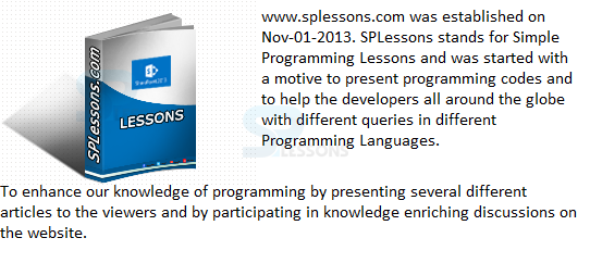
The image below demonstrates the CSS float as shown below.
 The code below demonstrates the using of CSS float as shown.
[html]
<!DOCTYPE HTML>
<html>
<head>
<style>
body{font-family:verdana;}
.demo1{
float:left;
margin:4px;
border:4px solid #ff0000;
width:200px;
padding:5px}
.demo2{
float:right;
margin:4px;
border:4px solid #0000ff;
width:200px;
padding:5px;}
</style>
</head>
<body>
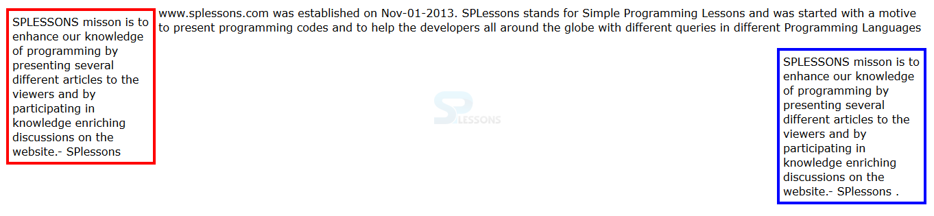
<p class="demo1">SPLESSONS misson is to enhance our knowledge of programming by presenting several different articles to the viewers and by participating in knowledge enriching discussions on the website.- SPlessons
</p>
<p>www.splessons.com was established on Nov-01-2013. SPLessons stands for Simple Programming Lessons and was started with a motive to present programming codes and to help the developers all around the globe with different queries in different Programming Languages
</p>
<p class="demo2">SPLESSONS misson is to enhance our knowledge of programming by presenting several different articles to the viewers and by participating in knowledge enriching discussions on the website.- SPlessons
.</p>
</body>
</html>
[/html]
Result
By running the above code in a preferred browser user can get the following output as shown in below image.
The code below demonstrates the using of CSS float as shown.
[html]
<!DOCTYPE HTML>
<html>
<head>
<style>
body{font-family:verdana;}
.demo1{
float:left;
margin:4px;
border:4px solid #ff0000;
width:200px;
padding:5px}
.demo2{
float:right;
margin:4px;
border:4px solid #0000ff;
width:200px;
padding:5px;}
</style>
</head>
<body>
<p class="demo1">SPLESSONS misson is to enhance our knowledge of programming by presenting several different articles to the viewers and by participating in knowledge enriching discussions on the website.- SPlessons
</p>
<p>www.splessons.com was established on Nov-01-2013. SPLessons stands for Simple Programming Lessons and was started with a motive to present programming codes and to help the developers all around the globe with different queries in different Programming Languages
</p>
<p class="demo2">SPLESSONS misson is to enhance our knowledge of programming by presenting several different articles to the viewers and by participating in knowledge enriching discussions on the website.- SPlessons
.</p>
</body>
</html>
[/html]
Result
By running the above code in a preferred browser user can get the following output as shown in below image.
 CSS Clear Floats
By using the clear property user can clear all the sides of the boxes i.e left, right or both sides. The CSS clear as shown below.
Clear property
Is used to specify the in which side all floating elements are cleared.
value : left, right, both, none.
The code below demonstrates the CSS clear property as shown below.
[html]
<!DOCTYPE html>
<html>
<head>
<title>Using Float to Place Elements Side-by-Side</title>
<style type="text/css">
body {
font-family: Verdana, Helvetica, sans-serif;
}
p {
width: 190px;
float: left;
margin: 5px;
padding: 5px;
background-color:#E6E6FA;
}
.clear{clear:left;}
</style>
</head>
<body>
<h1>SPLESSONS</h1>
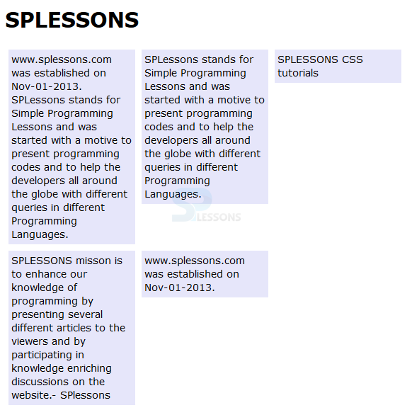
<p>www.splessons.com was established on Nov-01-2013. SPLessons stands for Simple Programming Lessons and was started with a motive to present programming codes and to help the developers all around the globe with different queries in different Programming Languages.</p>
<p>SPLessons stands for Simple Programming Lessons and was started with a motive to present programming codes and to help the developers all around the globe with different queries in different Programming Languages.</p>
<p>SPLESSONS CSS tutorials</p>
<p class="clear">SPLESSONS misson is to enhance our knowledge of programming by presenting several different articles to the viewers and by participating in knowledge enriching discussions on the website.- SPlessons</p>
<p>www.splessons.com was established on Nov-01-2013.</p>
</body>
</html>
[/html]
Result
By running the above code in a preferred browser user can get the following output as shown in below image.
CSS Clear Floats
By using the clear property user can clear all the sides of the boxes i.e left, right or both sides. The CSS clear as shown below.
Clear property
Is used to specify the in which side all floating elements are cleared.
value : left, right, both, none.
The code below demonstrates the CSS clear property as shown below.
[html]
<!DOCTYPE html>
<html>
<head>
<title>Using Float to Place Elements Side-by-Side</title>
<style type="text/css">
body {
font-family: Verdana, Helvetica, sans-serif;
}
p {
width: 190px;
float: left;
margin: 5px;
padding: 5px;
background-color:#E6E6FA;
}
.clear{clear:left;}
</style>
</head>
<body>
<h1>SPLESSONS</h1>
<p>www.splessons.com was established on Nov-01-2013. SPLessons stands for Simple Programming Lessons and was started with a motive to present programming codes and to help the developers all around the globe with different queries in different Programming Languages.</p>
<p>SPLessons stands for Simple Programming Lessons and was started with a motive to present programming codes and to help the developers all around the globe with different queries in different Programming Languages.</p>
<p>SPLESSONS CSS tutorials</p>
<p class="clear">SPLESSONS misson is to enhance our knowledge of programming by presenting several different articles to the viewers and by participating in knowledge enriching discussions on the website.- SPlessons</p>
<p>www.splessons.com was established on Nov-01-2013.</p>
</body>
</html>
[/html]
Result
By running the above code in a preferred browser user can get the following output as shown in below image.
 float boxes side by side
By usning CSS float property User can arrange the stack elements side by side. The code below demonstrates the arranging the elements side by side as shown below.
[html]
<!DOCTYPE html>
<html>
<head>
<title>Using Float to Place Elements Side-by-Side</title>
<style type="text/css">
body {
font-family: Verdana, Helvetica, sans-serif;
}
p {
width: 190px;
float: left;
margin: 5px;
padding: 5px;
background-color:#E6E6FA;}
</style>
</head>
<body>
<h1>SPLESSONS</h1>
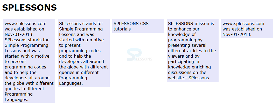
<p>www.splessons.com was established on Nov-01-2013. SPLessons stands for Simple Programming Lessons and was started with a motive to present programming codes and to help the developers all around the globe with different queries in different Programming Languages.</p>
<p>SPLessons stands for Simple Programming Lessons and was started with a motive to present programming codes and to help the developers all around the globe with different queries in different Programming Languages.</p>
<p>SPLESSONS CSS tutorials</p>
<p class="clear">SPLESSONS misson is to enhance our knowledge of programming by presenting several different articles to the viewers and by participating in knowledge enriching discussions on the website.- SPlessons</p>
<p>www.splessons.com was established on Nov-01-2013.</p>
</body>
</html>
[/html]
Result
By running the above code in a preferred browser user can get the following output as shown in below image.
float boxes side by side
By usning CSS float property User can arrange the stack elements side by side. The code below demonstrates the arranging the elements side by side as shown below.
[html]
<!DOCTYPE html>
<html>
<head>
<title>Using Float to Place Elements Side-by-Side</title>
<style type="text/css">
body {
font-family: Verdana, Helvetica, sans-serif;
}
p {
width: 190px;
float: left;
margin: 5px;
padding: 5px;
background-color:#E6E6FA;}
</style>
</head>
<body>
<h1>SPLESSONS</h1>
<p>www.splessons.com was established on Nov-01-2013. SPLessons stands for Simple Programming Lessons and was started with a motive to present programming codes and to help the developers all around the globe with different queries in different Programming Languages.</p>
<p>SPLessons stands for Simple Programming Lessons and was started with a motive to present programming codes and to help the developers all around the globe with different queries in different Programming Languages.</p>
<p>SPLESSONS CSS tutorials</p>
<p class="clear">SPLESSONS misson is to enhance our knowledge of programming by presenting several different articles to the viewers and by participating in knowledge enriching discussions on the website.- SPlessons</p>
<p>www.splessons.com was established on Nov-01-2013.</p>
</body>
</html>
[/html]
Result
By running the above code in a preferred browser user can get the following output as shown in below image.
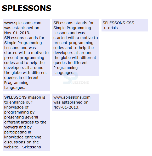
 CSS Multi Columns Layouts
The CSS Float property with div element user can create multiple column layout with element positioned next to one another. In order to create multiple columns user need to define the width, float, margin property and the elements should be floated in similar order. The code below demonstrates the CSS floats multiple columns as shown below.
[html]
<!DOCTYPE html>
<html>
<head>
<title>Using Float to Place Elements Side-by-Side</title>
<style type="text/css">
body {
font-family: Verdana, Helvetica, sans-serif;
}
p {
width: 190px;
float: left;
margin: 5px;
padding: 5px;
background-color:#E6E6FA;
}
.clear{clear:left;}
</style>
</head>
<body>
<h1>SPLESSONS</h1>
<p>www.splessons.com was established on Nov-01-2013. SPLessons stands for Simple Programming Lessons and was started with a motive to present programming codes and to help the developers all around the globe with different queries in different Programming Languages.</p>
<p>SPLessons stands for Simple Programming Lessons and was started with a motive to present programming codes and to help the developers all around the globe with different queries in different Programming Languages.</p>
<p>SPLESSONS CSS tutorials</p>
<p class="clear">SPLESSONS misson is to enhance our knowledge of programming by presenting several different articles to the viewers and by participating in knowledge enriching discussions on the website.- SPlessons</p>
<p>www.splessons.com was established on Nov-01-2013.</p>
</body>
</html>
[/html]
Result
By running the above code in a preferred browser user can get the following output as shown in below image.
CSS Multi Columns Layouts
The CSS Float property with div element user can create multiple column layout with element positioned next to one another. In order to create multiple columns user need to define the width, float, margin property and the elements should be floated in similar order. The code below demonstrates the CSS floats multiple columns as shown below.
[html]
<!DOCTYPE html>
<html>
<head>
<title>Using Float to Place Elements Side-by-Side</title>
<style type="text/css">
body {
font-family: Verdana, Helvetica, sans-serif;
}
p {
width: 190px;
float: left;
margin: 5px;
padding: 5px;
background-color:#E6E6FA;
}
.clear{clear:left;}
</style>
</head>
<body>
<h1>SPLESSONS</h1>
<p>www.splessons.com was established on Nov-01-2013. SPLessons stands for Simple Programming Lessons and was started with a motive to present programming codes and to help the developers all around the globe with different queries in different Programming Languages.</p>
<p>SPLessons stands for Simple Programming Lessons and was started with a motive to present programming codes and to help the developers all around the globe with different queries in different Programming Languages.</p>
<p>SPLESSONS CSS tutorials</p>
<p class="clear">SPLESSONS misson is to enhance our knowledge of programming by presenting several different articles to the viewers and by participating in knowledge enriching discussions on the website.- SPlessons</p>
<p>www.splessons.com was established on Nov-01-2013.</p>
</body>
</html>
[/html]
Result
By running the above code in a preferred browser user can get the following output as shown in below image.
- left In which all left side floating elements are removed.
- right In which all right side floating elements are removed.
- both In which both sides floating elements are removed.
- none All floating elements are in touch.
Key Points
- Multiple column floating is just like an news paper.
- float property enables to create floating boxes.
- Clear property used to clear the edges of the box.