


 Introduction
This chapter demonstrates about the CSS Filter which are used to apply special visual effects for the bitmap images following are the concepts are covered in this chapter.
- Filters and Usage
Description
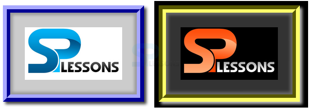
Filters are used to process the bit map images and the remaining content before they appear on the web page. Which basically makes the content to passed through the filters when they are before displaying on the webpage and in which effects are not permanent and original effects are does not effected. in order to apply these effects permanent user need to use the photo editors to apply these filters before applying these features. The code below demonstrates the applying greyscale() filter as shown below.
[html]
<!DOCTYPE html>
<html>
<head>
<style>
.effects{-webkit-filter:grayscale(1);}
</style>
</head>
<body>
<img src="splessons.jpg" alt="splessons" />
<img src="splessons.jpg" alt="splessons" class="effects"/>
</body>
</html>
[/html]
Result
By running the above code in a preferred browser user can get the following output as shown in below image.
 Applying sepia Effects
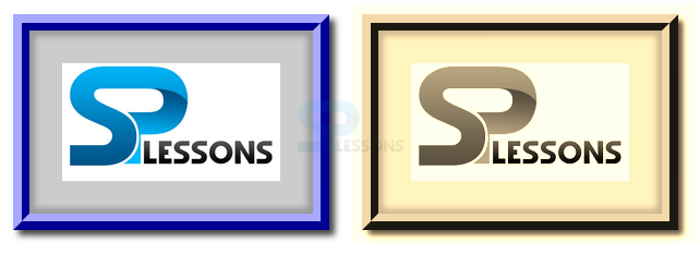
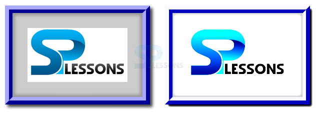
User can also sepia effects to the images which effects is used to used to apply sepia toning effects to color pixels like an old images the code below demonstrates the Filter sepia() property as shown below.
[html]
<!DOCTYPE html>
<html>
<head>
<style>
.effects{-webkit-filter:sepia(1);}
</style>
</head>
<body>
<img src="splesson.png" alt="splessons" />
<img src="splesson.png" alt="splessons" class="effects"/>
</body>
</html>
[/html]
Result
By running the above code in a preferred browser user can get the following output as shown in below image.
Applying sepia Effects
User can also sepia effects to the images which effects is used to used to apply sepia toning effects to color pixels like an old images the code below demonstrates the Filter sepia() property as shown below.
[html]
<!DOCTYPE html>
<html>
<head>
<style>
.effects{-webkit-filter:sepia(1);}
</style>
</head>
<body>
<img src="splesson.png" alt="splessons" />
<img src="splesson.png" alt="splessons" class="effects"/>
</body>
</html>
[/html]
Result
By running the above code in a preferred browser user can get the following output as shown in below image.
 Applying Saturation Effects
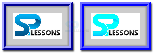
User can also use the saturate effects to the images by using the saturate() function which is used to sets the intensity of colors of an image if the value is high which gives the more intensive is the color. The code below demonstrates the CSS Filter saturate as shown.
[html]
<!DOCTYPE html>
<html>
<head>
<style>
.effects{-webkit-filter:saturate(10);}
</style>
</head>
<body>
<img src="splesson.png" alt="splessons" />
<img src="splesson.png" alt="splessons" class="effects"/>
</body>
</html>
[/html]
Result
By running the above code in a preferred browser user can get the following output as shown in below image.
Applying Saturation Effects
User can also use the saturate effects to the images by using the saturate() function which is used to sets the intensity of colors of an image if the value is high which gives the more intensive is the color. The code below demonstrates the CSS Filter saturate as shown.
[html]
<!DOCTYPE html>
<html>
<head>
<style>
.effects{-webkit-filter:saturate(10);}
</style>
</head>
<body>
<img src="splesson.png" alt="splessons" />
<img src="splesson.png" alt="splessons" class="effects"/>
</body>
</html>
[/html]
Result
By running the above code in a preferred browser user can get the following output as shown in below image.
 Applying hue-rotate Effects
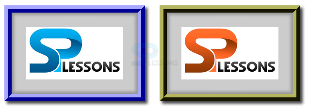
User can also use the hue-rotate effects to the images by using the hue-rotate() function which is used to shift the spectrum colors from 0deg to 360 deg to create greate effects. The code below demonstrates the Applying hue-rotate effects as shown below.
[html]
<!DOCTYPE html>
<html>
<head>
<style>
.effects{-webkit-filter:hue-rotate(180deg);}
</style>
</head>
<body>
<img src="splesson.png" alt="splessons" />
<img src="splesson.png" alt="splessons" class="effects"/>
</body>
</html>
[/html]
Result
By running the above code in a preferred browser user can get the following output as shown in below image.
Applying hue-rotate Effects
User can also use the hue-rotate effects to the images by using the hue-rotate() function which is used to shift the spectrum colors from 0deg to 360 deg to create greate effects. The code below demonstrates the Applying hue-rotate effects as shown below.
[html]
<!DOCTYPE html>
<html>
<head>
<style>
.effects{-webkit-filter:hue-rotate(180deg);}
</style>
</head>
<body>
<img src="splesson.png" alt="splessons" />
<img src="splesson.png" alt="splessons" class="effects"/>
</body>
</html>
[/html]
Result
By running the above code in a preferred browser user can get the following output as shown in below image.
 Inversion Color effect
User can apply the inversion coloe effects to the images by using the invert() function which inverts the color value for each pixel of an image which creates the photo negative of the image.
[html]
<!DOCTYPE html>
<html>
<head>
<style>
.effects{-webkit-filter:invert(1);}
</style>
</head>
<body>
<img src="splesson.png" alt="splessons" />
<img src="splesson.png" alt="splessons" class="effects"/>
</body>
</html>
[/html]
Result
By running the above code in a preferred browser user can get the following output as shown in below image.
Inversion Color effect
User can apply the inversion coloe effects to the images by using the invert() function which inverts the color value for each pixel of an image which creates the photo negative of the image.
[html]
<!DOCTYPE html>
<html>
<head>
<style>
.effects{-webkit-filter:invert(1);}
</style>
</head>
<body>
<img src="splesson.png" alt="splessons" />
<img src="splesson.png" alt="splessons" class="effects"/>
</body>
</html>
[/html]
Result
By running the above code in a preferred browser user can get the following output as shown in below image.
 Contrast Effects
User can apply contrast function to the images by using the contrast() function is used to set the difference bet ween the dark and light colored pixels and the higher value more is the difference. The code below demonstrates the contrast filter as shown below.
[html]
<!DOCTYPE html>
<html>
<head>
<style>
.effects{-webkit-filter:contrast(3);}
</style>
</head>
<body>
<img src="splesson.png" alt="splessons" />
<img src="splesson.png" alt="splessons" class="effects"/>
</body>
</html>
[/html]
Result
By running the above code in a preferred browser user can get the following output as shown in below image.
Contrast Effects
User can apply contrast function to the images by using the contrast() function is used to set the difference bet ween the dark and light colored pixels and the higher value more is the difference. The code below demonstrates the contrast filter as shown below.
[html]
<!DOCTYPE html>
<html>
<head>
<style>
.effects{-webkit-filter:contrast(3);}
</style>
</head>
<body>
<img src="splesson.png" alt="splessons" />
<img src="splesson.png" alt="splessons" class="effects"/>
</body>
</html>
[/html]
Result
By running the above code in a preferred browser user can get the following output as shown in below image.
 blur
User can apply blur function to the images by using the blurt() function is used to give soft edge to the images which is similar to the condition where in the eyes are not focused. The code below demonstrates the contrast filter as shown below.
[html]
<!DOCTYPE html>
<html>
<head>
<style>
.effects{-webkit-filter:blur(2px);}
</style>
</head>
<body>
<img src="splesson.png" alt="splessons" />
<img src="splesson.png" alt="splessons" class="effects"/>
</body>
</html>
[/html]
Result
By running the above code in a preferred browser user can get the following output as shown in below image.
blur
User can apply blur function to the images by using the blurt() function is used to give soft edge to the images which is similar to the condition where in the eyes are not focused. The code below demonstrates the contrast filter as shown below.
[html]
<!DOCTYPE html>
<html>
<head>
<style>
.effects{-webkit-filter:blur(2px);}
</style>
</head>
<body>
<img src="splesson.png" alt="splessons" />
<img src="splesson.png" alt="splessons" class="effects"/>
</body>
</html>
[/html]
Result
By running the above code in a preferred browser user can get the following output as shown in below image.
Key Points
- Filter property supported by only webkit browsers.
- Mask is applied to all elements and its descendants.
- hue-rotate can shift from 0 deg to 360 deg.