


 Introduction
The code below demonstrates the CSS Drop Shadows which is used to create the drop shadows foe an elements which are more effective and good looking and the following are the concepts covered in this chapter.
- CSS Box shadows
Description
CSS Drop shadows are just like text elements for which user may get the drop shadow effects by using the box-shadow property. In order to use the Box shadow property user need to follow the syntax as shown in below image.
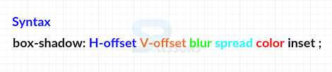 The properties which are shown in above syntax those are described in the table as follows.
box-shadow Property
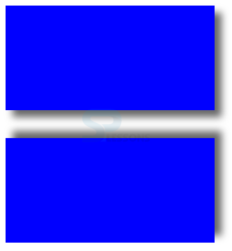
In order to use box-shadow property user simply provide the all values with a space with without any comma's The code below demonstrates the CSS box-shadow property as shown.
[html]
<!DOCTYPE html>
<html>
<head>
<style>
div
{
width:300px;
height:150px;
background-color:#0000ff;
}
.drop-shadow{box-shadow:10px 10px 10px #666;}
/* x-offset y-offset blur(optional) spread(o) color(o) inset(o)*/
.reverse-shadow{box-shadow:10px -10px 10px #666;}
/* x-offset y-offset blur(o) spread(o) color(o) inset(o)*/
</style>
</head>
<body>
<div class="drop-shadow"></div>
<br>
<br>
<div class="reverse-shadow"></div>
</body>
</html>
[/html]
Result
By running the above code in a preferred browser user can get the following output as shown in below image.
 CSS box-shadow inset
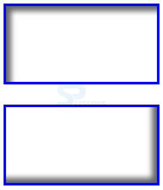
By using the inset keyword user can create inset shadow effects and user can create positive inset by using positive value and negative inset by using the negative value. The code below demonstrates the CSS box-shadow inset as shown.
[html]
<!DOCTYPE html>
<html>
<head>
<style>
div
{
width:300px;
height:150px;
border:5px solid #0000ff;
}
.positive-inset{box-shadow: 10px 10px 10px #666 inset;}
/* x-offset y-offset blur(optional) spread(o) color(o) inset(o)*/
.negative-inset{box-shadow: -10px -10px 10px #666 inset;}
/* x-offset y-offset blur(o) spread(o) color(o) inset(o)*/
</style>
</head>
<body>
<div class="positive-inset"></div>
<br>
<br>
<div class="negative-inset"></div>
</body>
</html>
[/html]
Result
By running the above code in a preferred browser user can get the following output as shown in below image.
CSS box-shadow inset
By using the inset keyword user can create inset shadow effects and user can create positive inset by using positive value and negative inset by using the negative value. The code below demonstrates the CSS box-shadow inset as shown.
[html]
<!DOCTYPE html>
<html>
<head>
<style>
div
{
width:300px;
height:150px;
border:5px solid #0000ff;
}
.positive-inset{box-shadow: 10px 10px 10px #666 inset;}
/* x-offset y-offset blur(optional) spread(o) color(o) inset(o)*/
.negative-inset{box-shadow: -10px -10px 10px #666 inset;}
/* x-offset y-offset blur(o) spread(o) color(o) inset(o)*/
</style>
</head>
<body>
<div class="positive-inset"></div>
<br>
<br>
<div class="negative-inset"></div>
</body>
</html>
[/html]
Result
By running the above code in a preferred browser user can get the following output as shown in below image.
 CSS Box-shadow spread
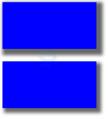
User can spread the box shadow property by setting the value as spread in box-shadow property. The code below demonstrates the CSS box-shadow spread as shown.
[html]
<!DOCTYPE html>
<html>
<head>
<style>
div
{
width:300px;
height:150px;
background-color:#0000ff;
}
.spread1{box-shadow:10px 10px 10px 10px #666;}
/* x-offset y-offset blur(optional) spread(o) color(o) inset(o)*/
.spread2{box-shadow:10px 10px 10px 5px #666;}
/* x-offset y-offset blur(o) spread(o) color(o) inset(o)*/
</style>
</head>
<body>
<div class="spread1"></div>
<br>
<br>
<div class="spread2"></div>
</body>
</html>
[/html]
Result
By running the above code in a preferred browser user can get the following output as shown in below image.
CSS Box-shadow spread
User can spread the box shadow property by setting the value as spread in box-shadow property. The code below demonstrates the CSS box-shadow spread as shown.
[html]
<!DOCTYPE html>
<html>
<head>
<style>
div
{
width:300px;
height:150px;
background-color:#0000ff;
}
.spread1{box-shadow:10px 10px 10px 10px #666;}
/* x-offset y-offset blur(optional) spread(o) color(o) inset(o)*/
.spread2{box-shadow:10px 10px 10px 5px #666;}
/* x-offset y-offset blur(o) spread(o) color(o) inset(o)*/
</style>
</head>
<body>
<div class="spread1"></div>
<br>
<br>
<div class="spread2"></div>
</body>
</html>
[/html]
Result
By running the above code in a preferred browser user can get the following output as shown in below image.
 CSS Multiple Box Shadows
User can also create multiple box-shadow effects to an elements which are separated by comma to create the effects. in order to create these effects user need to spread and reset all the other other offset and blur values as zero. The code below demonstrates the CSS multiple box-shadows as shown.
[html]
<!DOCTYPE html>
<html>
<head>
<style>
div
{
width:300px;
height:150px;
border:5px solid #666;
margin:25px 40px 50px 20px;
}
.border1{box-shadow: 0px 0px 0px 5px #009933,
0px 0px 0px 10px #9966FF,
0px 0px 0px 15px #0000ff,
0px 0px 0px 20px #996633;}
/* x-offset y-offset blur(o) spread(o) color(o) inset(o)*/
.border2{box-shadow: 0px 0px 0px 5px #ff0000,
0px 0px 0px 10px #000,
0px 0px 0px 15px #800080,
0px 0px 0px 20px #FF6666;}
/* x-offset y-offset blur(o) spread(o) color(o) inset(o)*/
</style>
</head>
<body>
<div class="border1"></div>
<div class="border2"></div>
</body>
</html>
[/html]
Result
By running the above code in a preferred browser user can get the following output as shown in below image.
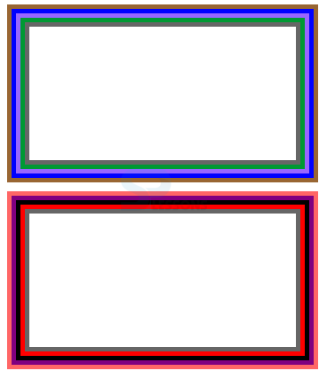
CSS Multiple Box Shadows
User can also create multiple box-shadow effects to an elements which are separated by comma to create the effects. in order to create these effects user need to spread and reset all the other other offset and blur values as zero. The code below demonstrates the CSS multiple box-shadows as shown.
[html]
<!DOCTYPE html>
<html>
<head>
<style>
div
{
width:300px;
height:150px;
border:5px solid #666;
margin:25px 40px 50px 20px;
}
.border1{box-shadow: 0px 0px 0px 5px #009933,
0px 0px 0px 10px #9966FF,
0px 0px 0px 15px #0000ff,
0px 0px 0px 20px #996633;}
/* x-offset y-offset blur(o) spread(o) color(o) inset(o)*/
.border2{box-shadow: 0px 0px 0px 5px #ff0000,
0px 0px 0px 10px #000,
0px 0px 0px 15px #800080,
0px 0px 0px 20px #FF6666;}
/* x-offset y-offset blur(o) spread(o) color(o) inset(o)*/
</style>
</head>
<body>
<div class="border1"></div>
<div class="border2"></div>
</body>
</html>
[/html]
Result
By running the above code in a preferred browser user can get the following output as shown in below image.
| Property | Description | Value |
|---|---|---|
| H-offset | Is known as Horizontal offset in which to get the shadow at right side user need to use poisitive value and for the left side user need to use negative value. | pixels(px) em cm |
| V-offset | Is known as Vertical offset in which to get the shadow at top side user need to use poisitive value and for the bottom side user need to use negative value. | pixels(px) em cm |
| spread | Is used to set the spread radius in which positive value spreads shadows in all directions and negative value contracts the shadow towards the box. | pixels(px) em cm |
| blur | Is used to set the blur radius while increasing the value blur will be increased in which negative values are not allows. | pixels(px) em cm |
| color | Is used to set the shadow color other wise browser will select the default color. | hex(px) rgba hsla |
| inset | which makes the shadow to inset inside the box. | inset |
Key Points
- Multiple border have spread value incremented by specific value.
- Positive Y-offset creates top drop shadows and negative values creates reverse shadows.
- In box shadow property simply provide all values without any coma's.