


 Introduction
This chapter demonstrates about the CSS Border to create boundary around elements of various colors thickness and line styles, following are the concepts covered in this chapter.
- CSS Border Styles
Description
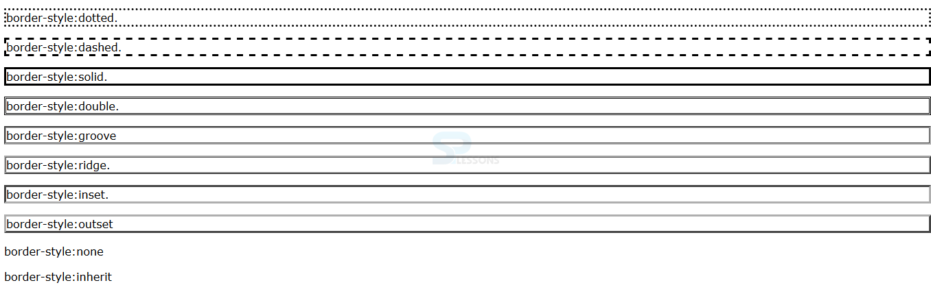
User can give the more effects to the borders and user can control the border styles by using the border-style property. In order to use the CSS Borders which have some values with their description as shown in below table.
The code below demonstrates the border style as shown below.
[html]
<!DOCTYPE html>
<html>
<head>
<style>
body{font-family:Verdana;}
.dotted {border-style:dotted;}
.dashed {border-style:dashed;}
.solid {border-style:solid;}
.double {border-style:double;}
.groove {border-style:groove;}
.ridge {border-style:ridge;}
.inset {border-style:inset;}
.outset {border-style:outset;}
.none {border-style:none;}
.inherit {border-style:inherit;}
</style>
</head>
<body>
<p class="dotted">border-style:dotted.</p>
<p class="dashed">border-style:dashed.</p>
<p class="solid">border-style:solid.</p>
<p class="double">border-style:double.</p>
<p class="groove">border-style:groove</p>
<p class="ridge">border-style:ridge.</p>
<p class="inset">border-style:inset.</p>
<p class="outset">border-style:outset</p>
<p class="none">border-style:none</p>
<p class="inherit">border-style:inherit</p>
</body>
</html>
[/html]
Result
By running the above code in a preferred browser user can get the following output as shown in below image.
 CSS Border Width
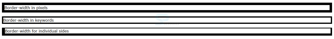
User can control the width of the border by using the border-width property The values for the border width can be expressed in length units(px, em, cm) or by using key words like thin, thick, medium. User can also apply the border width once like padding and margin. The code below demonstrates the CSS Border width as hsown.
[html]
<!DOCTYPE html>
<html>
<head>
<style>
body{font-family:Verdana; }
p{border-style:solid; border-color:#000;}
.demo1 {border-width:10px;}
.demo2{border-width:thick;}
.demo3{border-width:3px 6px 9px 12px;}
</style>
</head>
<body>
<p class="demo1">Border-width in pixels</p>
<p class="demo2">Border-width in keywords</p>
<p class="demo3">Border-width for individual sides</p>
</body>
</html>
[/html]
Result
By running the above code in a preferred browser user can get the following output as shown in below image.
CSS Border Width
User can control the width of the border by using the border-width property The values for the border width can be expressed in length units(px, em, cm) or by using key words like thin, thick, medium. User can also apply the border width once like padding and margin. The code below demonstrates the CSS Border width as hsown.
[html]
<!DOCTYPE html>
<html>
<head>
<style>
body{font-family:Verdana; }
p{border-style:solid; border-color:#000;}
.demo1 {border-width:10px;}
.demo2{border-width:thick;}
.demo3{border-width:3px 6px 9px 12px;}
</style>
</head>
<body>
<p class="demo1">Border-width in pixels</p>
<p class="demo2">Border-width in keywords</p>
<p class="demo3">Border-width for individual sides</p>
</body>
</html>
[/html]
Result
By running the above code in a preferred browser user can get the following output as shown in below image.
 Border Color
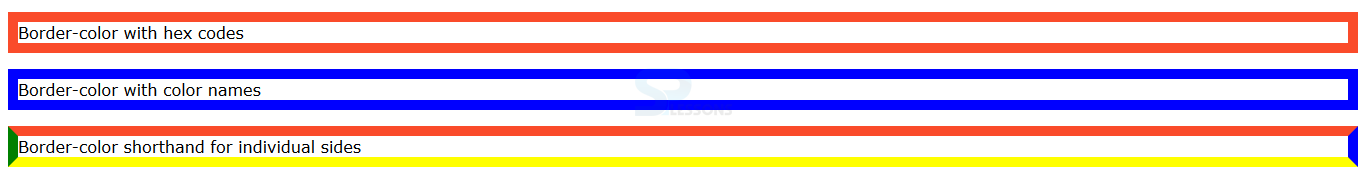
User can specify the border color by using the CSS border property of border-color in which color can be expressed using RGB values Hex, HSL or color names. user can express the color values for individual sides using shorthand The code below demonstrates the border color as shown below.
[html]
<!DOCTYPE html>
<html>
<head>
<style>
body{font-family:Verdana; }
p{border-style:solid; border-width:10px;}
.demo1 {border-color:#fa4b2a;}
.demo2{border-color:blue;}
.demo3{border-color: #fa4b2a blue yellow green;}
</style>
</head>
<body>
<p class="demo1">Border-color with hex codes</p>
<p class="demo2">Border-color with color names</p>
<p class="demo3">Border-color shorthand for individual sides</p>
</body>
</html>
[/html]
Result
By running the above code in a preferred browser user can get the following output as shown in below image.
Border Color
User can specify the border color by using the CSS border property of border-color in which color can be expressed using RGB values Hex, HSL or color names. user can express the color values for individual sides using shorthand The code below demonstrates the border color as shown below.
[html]
<!DOCTYPE html>
<html>
<head>
<style>
body{font-family:Verdana; }
p{border-style:solid; border-width:10px;}
.demo1 {border-color:#fa4b2a;}
.demo2{border-color:blue;}
.demo3{border-color: #fa4b2a blue yellow green;}
</style>
</head>
<body>
<p class="demo1">Border-color with hex codes</p>
<p class="demo2">Border-color with color names</p>
<p class="demo3">Border-color shorthand for individual sides</p>
</body>
</html>
[/html]
Result
By running the above code in a preferred browser user can get the following output as shown in below image.
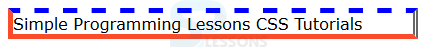
 CSS Border Shorthand
By using the shorthand property user can set the all the border properties in a single declaration. The table below demonstrates the properties of the CSS Borders shorthand as shown below.
CSS Border Shorthand
By using the shorthand property user can set the all the border properties in a single declaration. The table below demonstrates the properties of the CSS Borders shorthand as shown below.
The code below demonstrates the CSS border shorthand as shown below.
[html]
<!DOCTYPE html>
<html>
<head>
<style>
body{font-family:Verdana; }
p{border:5px solid #fa4b2a;/*shorthand:border for all sides */
border-top:5px dashed #0000ff;/* shorthand:border for top sides*/
border-right:5px double #666;/* shorthand:border for right sides*/
width:400px;}
</style>
</head>
<body>
<p>Simple Programming Lessons CSS Tutorials</p>
</body>
</html>
[/html]
Result
By running the above code in a preferred browser user can get the following output as shown in below image.
 CSS Border for Individual Slides
User can also define specific borders for an individual slides the table below demonstrates properties and descriptions and values as shown.
CSS Border for Individual Slides
User can also define specific borders for an individual slides the table below demonstrates properties and descriptions and values as shown.
The code below demonstrates the adding specific borders for individual borders as shown.
[html]
<!DOCTYPE html>
<html>
<head>
<style>
body{font-family:Verdana; }
p{border:5px solid #ADFF2F;/* shorthand border for all edges*/
border-top-width:10px;/* Specfic border width for top edge*/
border-right-style:double;/* Specific border style for right edge*/
border-left-color:#00FFFF;/* Specific border color for left edge*/
border-bottom-style:ridge;/* Specific border style for bottom edge*/
width:400px;}
</style>
</head>
<body>
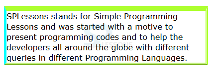
<p>SPLessons stands for Simple Programming Lessons and was started with a motive to present programming codes and to help the developers all around the globe with different queries in different Programming Languages.
</body>
</html>
[/html]
Result
By running the above code in a preferred browser user can get the following output as shown in below image.
| Value | Description | Appearance |
|---|---|---|
| dotted | In Which border makes with series of square dots. |
dotted |
| solid | Which is a plain solid line. |
solid |
| dashed | In Which border makes with series of short lines. |
dashed |
| double | In Which border makes with two solid lines. |
double |
| ridge | In Which border appears to stick out from the page. |
ridge |
| groove | In Which border appears to be curved into the page. |
groove |
| outset | In Which border appears comming out of the screen. |
outset |
| inset | In Which border appears to be embedded into the page. |
inset |
| inherit | In Which inherit style from tha parent element |
inherit |
| none | In Which no border shown |
none |
| Properties | Description | Appearance |
|---|---|---|
| border | In Which set the borders for all edges at once. | (width, style, color) |
| border-top border-right border-bottom border-left | Which set border for individual edges. | (width, style, color) |
| Properties | Description | Description |
|---|---|---|
| border-top-width border-top-style border-top-color |
Which is used set the top borders. | These are same as genereic properties. |
| border-bottom-width border-bottom-style border-bottom-color |
Which is used set the bottom borders. | These are same as genereic properties. |
| border-right-width border-right-style border-right-color |
Which is used set the right borders. | These are same as genereic properties. |
| border-left-width border-left-style border-left-color |
Which is used set the left borders. | These are same as genereic properties. |
Key Points
- If conflicts between the styles then the latest one is applicable.
- border-width property can be expressed in percentages.
- The appearance of the border-style depends upon the color used.