


 Introduction
This chapter demonstrates about the CSS Background which are used to create great backgrounds for users web pages with different variations and following are the concepts covered in this chapter.
- CSS Background Properties
Description
In order to create CSS Backgrounds for the web pages there are nine properties to control the web pages which are tabulated below.
| Property | Description | Value |
|---|---|---|
| background-color | Is used to demonstrates background color of an element. | color(hex,RGBa,HSL) transparent(default) |
| background-image | Is used to set background images to an element. | Url(image) none(default) |
| background-size | Is used to demonstrates background image size. | contain, cover, auto(default) |
| background-repeat | Is used to set repeat style background of an element. | repeat-x, repeat-y, repeat, space, round, no-repeat. |
| background-position | Is used to the background image position. | top, bottom, left,right, center. |
| background-attachment | Is used to set attachment style of background image which is scrolled or fixed. | local, scrolled, fixed |
| background-origin | Is used to define the point from which background position is measured. | border-box, padding-box, content-box |
| background-clip | Is used to define the background image clipping style. | border-box, padding-box, content-box |
| background | Which is an shorthand to define all background setting in a single declaration. |
Description
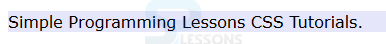
User can give the background colors to the web pages by using CSS background color property. In which by default the background is transparent and the background of the parent element is visible. The code below demonstrates the CSS background color as shown below.
[html]
<!DOCTYPE HTML>
<html>
<head>
<style type="text/css">
p {
border: 5px double blue;
font-family:Verdana;
color:#000000;}
.demo1{background:#E6E6FA bottom left no-repeat padding-box content-box local url(splesson.png);}
.demo2{background:#E6E6FA top right repeat border-box border-box scroll url(splesson.png);}
.demo3{background:#E6E6FA bottom left no-repeat padding-box padding-box local url(splesson.png);}
</style>
</head>
<body>
<p class="demo1">SPLessons stands for Simple Programming Lessons and was started with a motive to present programming codes and to help the developers all around the globe with different queries in different Programming Languages.
</p>
<p class="demo2">SPLessons stands for Simple Programming Lessons and was started with a motive to present programming codes and to help the developers all around the globe with different queries in different Programming Languages.
</p>
<p class="demo3">SPLessons stands for Simple Programming Lessons and was started with a motive to present programming codes and to help the developers all around the globe with different queries in different Programming Languages.
</p>
</body>
</html>
[/html]
Result
By running the above code in a preferred browser user can get the following output as shown in below image.
Description
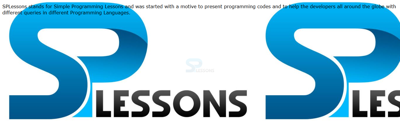
User can set any images to the elements backgrounds by using the CSS Background-image property which have the two values these are shown below.
The code below demonstrates to the CSS background image as shown below.
[html]
<!DOCTYPE HTML>
<html>
<head>
<style>
body{font-family:Verdana;}
.background{
background-image:url(splessons.jpg)}
</style>
</head>
<body class="background">
<p>SPLessons stands for Simple Programming Lessons and was started with a motive to present programming codes and to help the developers all around the globe with different queries in different Programming Languages.</p>
</body>
</html>
[/html]
Result
By running the above code in a preferred browser user can get the following output as shown in below image.
- url() Which specify the path of the background image user need to specify in parentheses.
- none Which means no background. its the default value.
Description
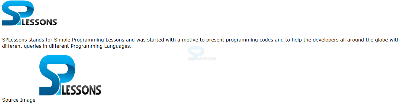
While using the background images for the web page user can control the images size by using the background-size property. There are some values which are possible by background size as shown below.
The code below demonstrates the CSS background size as shown.
[html]
<!DOCTYPE html>
<html>
<head>
<style>
body
{
font-family:Verdana;
background:url("splessons.jpg");
background-size:200px 100px; /* Exercise: try all the possible values*/
background-repeat:no-repeat;
padding-top:100px;
}
</style>
</head>
<body>
<p>SPLessons stands for Simple Programming Lessons and was started with a motive to present programming codes and to help the developers all around the globe with different queries in different Programming Languages.</p>
<p>Source Image <img src="splessons.jpg" alt="Flowers" width="224" height="162" /></p>
</body>
</html>
[/html]
Result
By running the above code in a preferred browser user can get the following output as shown in below image.
- auto Is used to display the image in full size which is the default value.
- cover In which it scales the image to fit the complete image in specified area.
- contain Images fits to the height and width of the web page.
- length values Which specify the background size in length units. The order is the first width and second is the height.
- percentages value which specify the background in percentages. Which are based on the parent element and the order is the first width and second height.
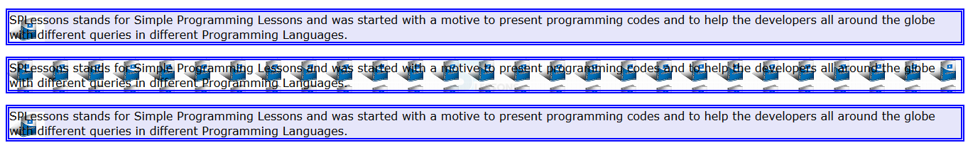
Description
If the images are smaller then the background then the images are repeat to fill the background. The pattern of the tilling can be defined by using background-repeat property. The values for the background property as shown below.
The code below demonstrates the CSS background repeat as shown.
[html]
<!DOCTYPE html>
<html>
<head>
<style type="text/css">
div {
width: 190px;
float: left;
height:200px;
margin: 5px;
border:5px solid #0000ff;
background-image:url(splesson.png);
}
.repeat-x{background-repeat: repeat-x;} /*Background Repeat along X axis */
.repeat-y{background-repeat: repeat-y;}/*Background Repeat along Y axis */
.repeat{background-repeat: repeat;}/*Background Repeat along both X and Y axis */
.no-repeat{background-repeat: no-repeat;}/* No Background Repeat */
</style>
</head>
<body>
<div class="repeat-x" ></div>
<div class="repeat-y" ></div>
<div class="repeat"></div>
<div class="no-repeat"></div>
</body>
</html>
[/html]
Result
By running the above code in a preferred browser user can get the following output as shown in below image.
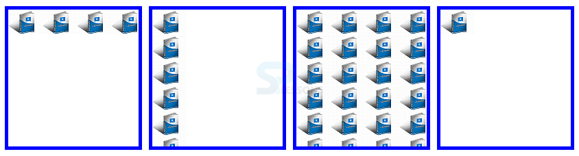
- repeat In which background is repeat both horizontal and vertical direction. which is an default.
- repeat-x The images are repeated in horizontal only along with x-axis.
- repeat-y the images are repeated in vertical only along with y-axis.
- no-repeat Which Display the images only.
Description
User can set the exact position of the background image by using the background-position. In which position of the position of the image is specified in one or two values and single value is specified as "center" The values of the background -position as shown below.
The code below demonstrates the background position as shown.
[html]
<!DOCTYPE html>
<html>
<head>
<style>
body
{
background-image:url('splessons-logo.png');
background-repeat:no-repeat;
background-position:120px 80px;
}
</style>
</head>
<body>
<p>SPLessons stands for Simple Programming Lessons and was started with a motive to present programming codes and to help the developers all around the globe with different queries in different Programming Languages.</p>
</body>
</html>
[/html]
Result
By running the above code in a preferred browser user can get the following output as shown in below image.
- top The image position should be at the top.
- left The image position should be at the left.
- bottom The image position should be at the bottom.
- right The image position should be at the right.
- center The image position should be at the center.
Description
User can attach the background image to the content by using the background-attachment property. Which is useful when element has a view port and it can be scrolled the values for these property as shown below.
The code below demonstrates the background attachment as shown.
[html]
<!DOCTYPE html>
<html>
<head>
<title>Using Float to Place Elements Side-by-Side</title>
<style type="text/css">
body {
font-family: Verdana, Helvetica, sans-serif;
}
p {border:5px ridge #0000ff;
background-image:url(splessons-logo.png);
background-repeat:no-repeat;
height:130px;
width:400px;
overflow-y:scroll;
background-attachment: fixed; /* test with scroll and local too*/
}
</style>
</head>
<body>
<p>SPLessons stands for Simple Programming Lessons and was started with a motive to present programming codes and to help the developers all around the globe with different queries in different Programming Languages.www.splessons.com was established on Nov-01-2013. SPLessons stands for Simple Programming Lessons and was started with a motive to present programming codes and to help the developers all around the globe with different queries in different Programming Languages.
</p>
</body>
</html>
[/html]
Result
By running the above code in a preferred browser user can get the following output as shown in below image.
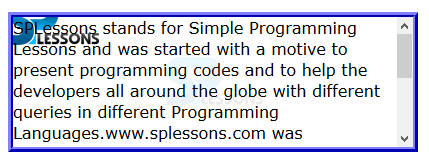
- fixed In which background image is fixed with the view port.
- scroll In which background image is fixed with the content and it scrolled with the content./li>
- local In which background image is fixed with the content and it moves with the content when it scrolled.
Description
Is used to specify the background origin color or image by using background-orgin property. The values for these background orgin as shown below.
The code below demonstrates the background-orgin as shown.
[html]
<!DOCTYPE HTML>
<html>
<head>
<style type="text/css">
p {
border: 10px double blue;
font-family:Verdana;
padding:10px;
background-image: url(splesson.png);
background-repeat: no-repeat;
}
.border{background-origin:border-box;}
.padding{background-origin:padding-box;}
.content{background-origin:content-box;}
</style>
</head>
<body>
<p class="border">SPLessons stands for Simple Programming Lessons and was started with a motive to present programming codes and to help the developers all around the globe with different queries in different Programming Languages.
</p>
<p class="padding">SPLessons stands for Simple Programming Lessons and was started with a motive to present programming codes and to help the developers all around the globe with different queries in different Programming Languages.
</p>
<p class="content">SPLessons stands for Simple Programming Lessons and was started with a motive to present programming codes and to help the developers all around the globe with different queries in different Programming Languages.
</p>
</body>
</html>
[/html]
Result
By running the above code in a preferred browser user can get the following output as shown in below image.
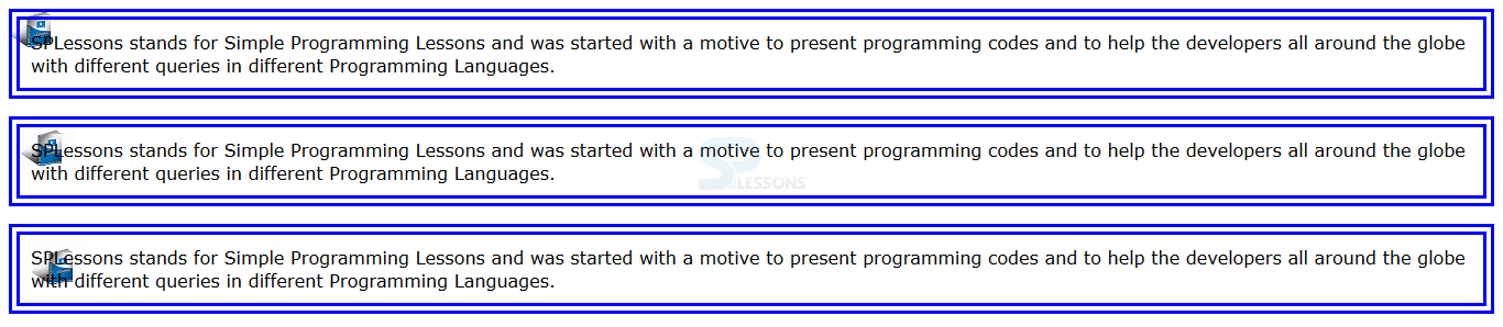
- border-box In which background color or image drawn with in the border box.
- padding-box In which background color or image drawn with in the padding box.
- content-image In which background color or image drawn with in the content box.
Description
background shorthand is used to define the multiple background properties in a single syntax. The order of the property must appear for background as follows.
<background-color> <background-position> <background-size> <background-repeat> <background-origin> <background-clip> <background-attachment> <background-image>.
The code below demonstrates the CSS background shorthand as shown.
[html]
<!DOCTYPE HTML>
<html>
<head>
<style type="text/css">
p {
border: 5px double blue;
font-family:Verdana;
color:#000000;}
.demo1{background:#E6E6FA bottom left no-repeat padding-box content-box local url(splesson.png);}
.demo2{background:#E6E6FA top right repeat border-box border-box scroll url(splesson.png);}
.demo3{background:#E6E6FA bottom left no-repeat padding-box padding-box local url(splesson.png);}
</style>
</head>
<body>
<p class="demo1">SPLessons stands for Simple Programming Lessons and was started with a motive to present programming codes and to help the developers all around the globe with different queries in different Programming Languages.
</p>
<p class="demo2">SPLessons stands for Simple Programming Lessons and was started with a motive to present programming codes and to help the developers all around the globe with different queries in different Programming Languages.
</p>
<p class="demo3">SPLessons stands for Simple Programming Lessons and was started with a motive to present programming codes and to help the developers all around the globe with different queries in different Programming Languages.
</p>
</body>
</html>
[/html]
Result
By running the above code in a preferred browser user can get the following output as shown in below image.
Key Points
- The default state for background property is null.
- The browser will draw background image or color with in the defined box.
- The background-repeat property can be used to create horizontal and vertical gradients with images.