


 Introduction
This chapter demonstrates about the CSS 3D Matrix which is used to create the transforms in 3D plane and the following are the concepts covered in this chapter.
- 3D Transform and its Properties
Description
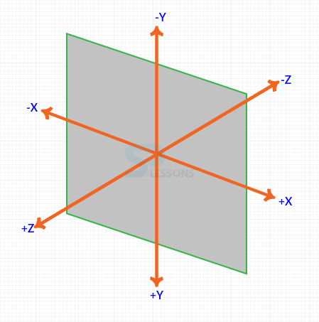
By using the transform-style attribute user can see the object in 3D space The values for the 3D space are described below.
In which value is inherit by elements child elements and not the element it self.
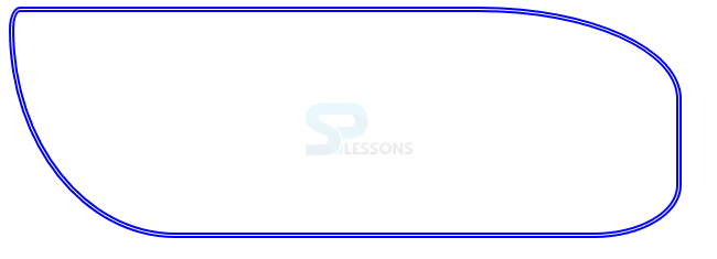
The Image below demonstrates the CSS 3D view as shown below.
 The code below demonstrates the transform-property as shown,
[html]
<!DOCTYPE>
<html>
<head>
<style>
div{width:200px; height:200px;
background:#0000ff; color:#fff;
border-radius:30px;font-family:Verdana;
padding:30px; float:left;
margin:10px; transition-duration:1s;
-webkit-transition-duration:1s;}
#rotateZ{transform:rotateZ(60deg);
-webkit-transform:rotateZ(60deg);}
</style>
</head>
<body>
<div>
Original State
</div>
<div id="rotateZ">
transform:rotateZ(60deg)
</div>
</body>
</html>
[/html]
Result
By running the above code in a preferred browser user can get the following output as shown in below image.
The code below demonstrates the transform-property as shown,
[html]
<!DOCTYPE>
<html>
<head>
<style>
div{width:200px; height:200px;
background:#0000ff; color:#fff;
border-radius:30px;font-family:Verdana;
padding:30px; float:left;
margin:10px; transition-duration:1s;
-webkit-transition-duration:1s;}
#rotateZ{transform:rotateZ(60deg);
-webkit-transform:rotateZ(60deg);}
</style>
</head>
<body>
<div>
Original State
</div>
<div id="rotateZ">
transform:rotateZ(60deg)
</div>
</body>
</html>
[/html]
Result
By running the above code in a preferred browser user can get the following output as shown in below image.
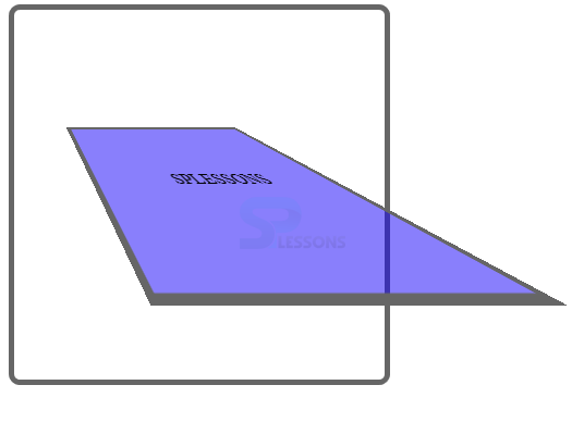
 Perspective and Perspective Origin
User can create illusion depth for an element by using the CSS perspective property or else the element appears flattened. Which basically distort the image by making nearer things are very large and away things are very shorter in size. in which values are specified in lengths unis(px, em, cm). A sister property of perspective origin which defines the origin from where transform seen. The code below demonstrates the transition-timing-function as shown.
[html]
<!DOCTYPE html>
<html>
<head>
<style>
#box1
{
position: relative;
height: 200px;
width: 200px;
margin: 10px;
padding:70px;
border: 5px solid #666;
border-radius:10px;
perspective:100px;
-webkit-perspective:100px; /* Prefix for Safari and Chrome */
/*Perspective Origin */
perspective-origin:center left;
-webkit-perspective-origin:center left; /* Prefix for Safari and Chrome */
}
#box2
{
width:70px;
padding:70px;s
position: absolute;
border: 5px solid #666;
background-color:rgba(20, 0, 250, 0.5);
transform: rotateX(30deg);
-webkit-transform: rotateX(30deg); /* Prefix for Safari and Chrome */
}
</style>
</head>
<body>
<div id="box1">
<div id="box2">SPLESSONS</div>
</div>
</body>
</html>
[/html]
Result
By running the above code in a preferred browser user can get the following output as shown in below image.
Perspective and Perspective Origin
User can create illusion depth for an element by using the CSS perspective property or else the element appears flattened. Which basically distort the image by making nearer things are very large and away things are very shorter in size. in which values are specified in lengths unis(px, em, cm). A sister property of perspective origin which defines the origin from where transform seen. The code below demonstrates the transition-timing-function as shown.
[html]
<!DOCTYPE html>
<html>
<head>
<style>
#box1
{
position: relative;
height: 200px;
width: 200px;
margin: 10px;
padding:70px;
border: 5px solid #666;
border-radius:10px;
perspective:100px;
-webkit-perspective:100px; /* Prefix for Safari and Chrome */
/*Perspective Origin */
perspective-origin:center left;
-webkit-perspective-origin:center left; /* Prefix for Safari and Chrome */
}
#box2
{
width:70px;
padding:70px;s
position: absolute;
border: 5px solid #666;
background-color:rgba(20, 0, 250, 0.5);
transform: rotateX(30deg);
-webkit-transform: rotateX(30deg); /* Prefix for Safari and Chrome */
}
</style>
</head>
<body>
<div id="box1">
<div id="box2">SPLESSONS</div>
</div>
</body>
</html>
[/html]
Result
By running the above code in a preferred browser user can get the following output as shown in below image.
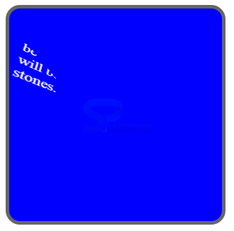
 Translate X()
User can translate the elements along the X-axis by using the translate X() in which all the values are specified in length units (px, cm) The code below demonstrates the transform translateX() as shown.
[html]
<!DOCTYPE>
<html>
<head>
<style>
img{border:7px solid #666;
margin:10px;
border-radius:10px;
transition-duration:1s;
-webkit-transition-duration:1s;}
img:hover{transform:translateX(90px); /* Translate along X axis by 90px */
-webkit-transform:translateX(90px);}
</style>
</head>
<body>
<img src="splesson.png" alt="pizza"/>
<p>Hover to see the demo</p>
</body>
</html>
[/html]
Result
By running the above code in a preferred browser user can get the following output as shown in below image.
Translate X()
User can translate the elements along the X-axis by using the translate X() in which all the values are specified in length units (px, cm) The code below demonstrates the transform translateX() as shown.
[html]
<!DOCTYPE>
<html>
<head>
<style>
img{border:7px solid #666;
margin:10px;
border-radius:10px;
transition-duration:1s;
-webkit-transition-duration:1s;}
img:hover{transform:translateX(90px); /* Translate along X axis by 90px */
-webkit-transform:translateX(90px);}
</style>
</head>
<body>
<img src="splesson.png" alt="pizza"/>
<p>Hover to see the demo</p>
</body>
</html>
[/html]
Result
By running the above code in a preferred browser user can get the following output as shown in below image.
 Translate Y()
User can translate the elements along the Y-axis by using the translate Y() in which all the values are specified in length units (px, cm) The code below demonstrates the transform translateY() as shown.
[html]
<!DOCTYPE>
<html>
<head>
<style>
#radiusBox{
border:5px double #0000ff; /*use other border-type as well */
width:600px;
height:200px;
border-radius:10px 30% 5em 4cm/ 20px 40% 3em 5cm;
/*first four are horizontal values next four are vertical values
for each side*/
}
</style>
</head>
<body>
<div id="radiusBox">
</div>
</body>
</html>
[/html]
Result
By running the above code in a preferred browser user can get the following output as shown in below image.
Translate Y()
User can translate the elements along the Y-axis by using the translate Y() in which all the values are specified in length units (px, cm) The code below demonstrates the transform translateY() as shown.
[html]
<!DOCTYPE>
<html>
<head>
<style>
#radiusBox{
border:5px double #0000ff; /*use other border-type as well */
width:600px;
height:200px;
border-radius:10px 30% 5em 4cm/ 20px 40% 3em 5cm;
/*first four are horizontal values next four are vertical values
for each side*/
}
</style>
</head>
<body>
<div id="radiusBox">
</div>
</body>
</html>
[/html]
Result
By running the above code in a preferred browser user can get the following output as shown in below image.
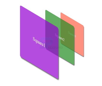
 Translate Z()
User can translate the elements along the Z-axis by using the translate Z() in which all the values are specified in length units (px, cm) The code below demonstrates the transform translateZ() as shown.
[html]
<!DOCTYPE html>
<html>
<head>
<style>
#wrapper
{
position: relative;
width: 400px;
height:400px;
margin: 70px;
}
#sq1, #sq2, #sq3
{
position: absolute;
width: 300px;
height: 300px;
font-size: 30px;
text-align: center;
line-height: 300px;
color: #fff;
background-color:rgba(148,0,211,0.7);
box-shadow:5px 5px 5px #666;
border-radius:10px;
}
#sq2 { background-color: rgba(34,139,34,0.7); }
#sq3 { background-color: rgba(255,99,71, 0.7); }
#wrapper
{-webkit-transform-style: preserve-3d;
transform-style: preserve-3d;
-webkit-transform: rotateX(-30deg) rotateY(-50deg) perspective(500px);
transform: rotateX(-30deg) rotateY(-50deg) perspective(500px);
}
#sq1
{
-webkit-transform: translateZ(20px); /*translate on Z axis by 20px */
transform: translateZ(-100px);
}
#sq2
{
-webkit-transform: translateZ(-100px); /*translate on Z axis by -100px */
transform: translateZ(-300px);
}
#sq3
{
-webkit-transform: translateZ(-200px); /*translate on Z axis by -200px */
transform: translateZ(-500px);
}
</style>
</head>
<body>
<div id="wrapper">
<div id="sq1">Square1</div>
<div id="sq2">Square2</div>
<div id="sq3">Square3</div>
</div>
</body>
</html>
[/html]
Result
By running the above code in a preferred browser user can get the following output as shown in below image.
Translate Z()
User can translate the elements along the Z-axis by using the translate Z() in which all the values are specified in length units (px, cm) The code below demonstrates the transform translateZ() as shown.
[html]
<!DOCTYPE html>
<html>
<head>
<style>
#wrapper
{
position: relative;
width: 400px;
height:400px;
margin: 70px;
}
#sq1, #sq2, #sq3
{
position: absolute;
width: 300px;
height: 300px;
font-size: 30px;
text-align: center;
line-height: 300px;
color: #fff;
background-color:rgba(148,0,211,0.7);
box-shadow:5px 5px 5px #666;
border-radius:10px;
}
#sq2 { background-color: rgba(34,139,34,0.7); }
#sq3 { background-color: rgba(255,99,71, 0.7); }
#wrapper
{-webkit-transform-style: preserve-3d;
transform-style: preserve-3d;
-webkit-transform: rotateX(-30deg) rotateY(-50deg) perspective(500px);
transform: rotateX(-30deg) rotateY(-50deg) perspective(500px);
}
#sq1
{
-webkit-transform: translateZ(20px); /*translate on Z axis by 20px */
transform: translateZ(-100px);
}
#sq2
{
-webkit-transform: translateZ(-100px); /*translate on Z axis by -100px */
transform: translateZ(-300px);
}
#sq3
{
-webkit-transform: translateZ(-200px); /*translate on Z axis by -200px */
transform: translateZ(-500px);
}
</style>
</head>
<body>
<div id="wrapper">
<div id="sq1">Square1</div>
<div id="sq2">Square2</div>
<div id="sq3">Square3</div>
</div>
</body>
</html>
[/html]
Result
By running the above code in a preferred browser user can get the following output as shown in below image.
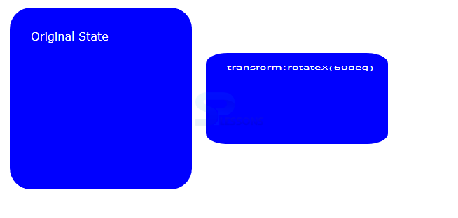
 Rotate X
User can rotate elements along its X-axis by using the by using the rotate X() function. In which all the values can be specified in degrees, gradians, radians, and turns. The code below demonstrates the CSS 3D Transform Rotate X() as shown.
[html]
<!DOCTYPE>
<html>
<head>
<style>
div{width:200px; height:200px;
background:#0000ff; color:#fff;
border-radius:30px;font-family:Verdana;
padding:30px; float:left;
margin:10px; transition-duration:1s;
-webkit-transition-duration:1s;}
#rotateX{transform:rotateX(60deg);
-webkit-transform:rotateX(60deg);}
</style>
</head>
<body>
<div>
Original State
</div>
<div id="rotateX">
transform:rotateX(60deg)
</div>
</body>
</html>
[/html]
Result
By running the above code in a preferred browser user can get the following output as shown in below image.
Rotate X
User can rotate elements along its X-axis by using the by using the rotate X() function. In which all the values can be specified in degrees, gradians, radians, and turns. The code below demonstrates the CSS 3D Transform Rotate X() as shown.
[html]
<!DOCTYPE>
<html>
<head>
<style>
div{width:200px; height:200px;
background:#0000ff; color:#fff;
border-radius:30px;font-family:Verdana;
padding:30px; float:left;
margin:10px; transition-duration:1s;
-webkit-transition-duration:1s;}
#rotateX{transform:rotateX(60deg);
-webkit-transform:rotateX(60deg);}
</style>
</head>
<body>
<div>
Original State
</div>
<div id="rotateX">
transform:rotateX(60deg)
</div>
</body>
</html>
[/html]
Result
By running the above code in a preferred browser user can get the following output as shown in below image.
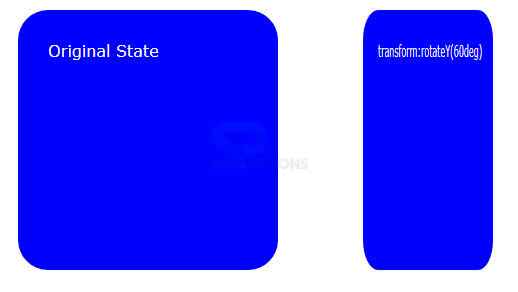
 Rotate Y
User can rotate elements along its Y-axis by using the by using the rotate Y() function. In which all the values can be specified in degrees, gradians, radians, and turns. The code below demonstrates the CSS 3D Transform Rotate Y() as shown.
[html]
<!DOCTYPE>
<html>
<head>
<style>
div{width:200px; height:200px;
background:#0000ff; color:#fff;
border-radius:30px;font-family:Verdana;
padding:30px; float:left;
margin:10px; transition-duration:1s;
-webkit-transition-duration:1s;}
#rotateY{transform:rotateY(60deg);
-webkit-transform:rotateY(60deg);}
</style>
</head>
<body>
<div>
Original State
</div>
<div id="rotateY">
transform:rotateY(60deg)
</div>
</body>
</html>
[/html]
Result
By running the above code in a preferred browser user can get the following output as shown in below image.
Rotate Y
User can rotate elements along its Y-axis by using the by using the rotate Y() function. In which all the values can be specified in degrees, gradians, radians, and turns. The code below demonstrates the CSS 3D Transform Rotate Y() as shown.
[html]
<!DOCTYPE>
<html>
<head>
<style>
div{width:200px; height:200px;
background:#0000ff; color:#fff;
border-radius:30px;font-family:Verdana;
padding:30px; float:left;
margin:10px; transition-duration:1s;
-webkit-transition-duration:1s;}
#rotateY{transform:rotateY(60deg);
-webkit-transform:rotateY(60deg);}
</style>
</head>
<body>
<div>
Original State
</div>
<div id="rotateY">
transform:rotateY(60deg)
</div>
</body>
</html>
[/html]
Result
By running the above code in a preferred browser user can get the following output as shown in below image.
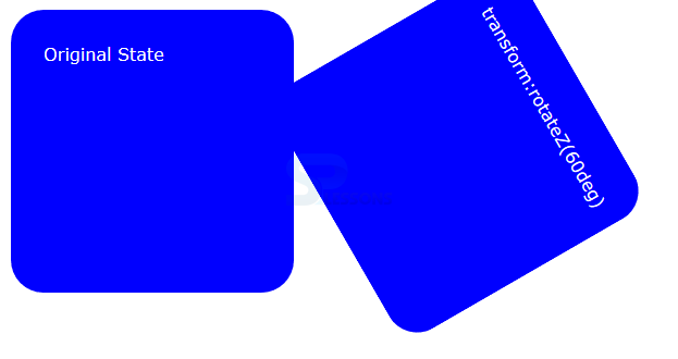
 Rotate Z
User can rotate elements along its Z-axis by using the by using the rotate Z() function. In which all the values can be specified in degrees, gradians, radians, and turns. The code below demonstrates the CSS 3D Transform Rotate Z() as shown.
[html]
<!DOCTYPE>
<html>
<head>
<style>
div{width:200px; height:200px;
background:#0000ff; color:#fff;
border-radius:30px;font-family:Verdana;
padding:30px; float:left;
margin:10px; transition-duration:1s;
-webkit-transition-duration:1s;}
#rotateZ{transform:rotateZ(60deg);
-webkit-transform:rotateZ(60deg);}
</style>
</head>
<body>
<div>
Original State
</div>
<div id="rotateZ">
transform:rotateZ(60deg)
</div>
</body>
</html>
[/html]
Result
By running the above code in a preferred browser user can get the following output as shown in below image.
Rotate Z
User can rotate elements along its Z-axis by using the by using the rotate Z() function. In which all the values can be specified in degrees, gradians, radians, and turns. The code below demonstrates the CSS 3D Transform Rotate Z() as shown.
[html]
<!DOCTYPE>
<html>
<head>
<style>
div{width:200px; height:200px;
background:#0000ff; color:#fff;
border-radius:30px;font-family:Verdana;
padding:30px; float:left;
margin:10px; transition-duration:1s;
-webkit-transition-duration:1s;}
#rotateZ{transform:rotateZ(60deg);
-webkit-transform:rotateZ(60deg);}
</style>
</head>
<body>
<div>
Original State
</div>
<div id="rotateZ">
transform:rotateZ(60deg)
</div>
</body>
</html>
[/html]
Result
By running the above code in a preferred browser user can get the following output as shown in below image.
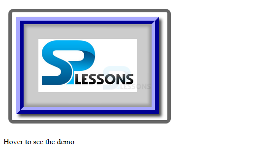
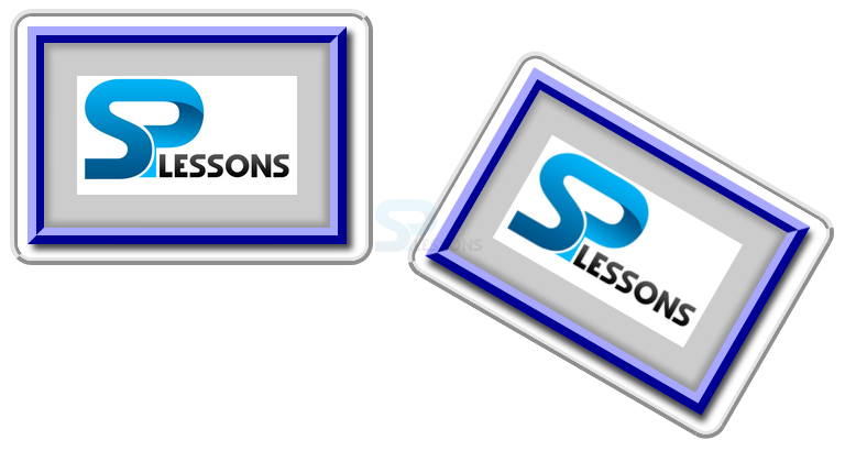
 Transform Origin
Origin is known as the where all the three coordinates are intersects which point can be shifted by using transform-origin() in which values can be specified as keywords percent and length units.
[html]
<!DOCTYPE html>
<html>
<head>
<style>
img
{border:7px ridge #ccc;
border-radius:20px;
margin:10px; transition-duration:1s;
-webkit-transition-duration:1s; }
#img1:hover{
transform: rotate(30deg);
transform-origin:top right 30px;
-ms-transform: rotate(30deg); /* IE 9 */
-ms-transform-origin:top right 30px; /* IE 9 */
-webkit-transform: rotate(30deg); /* Safari and Chrome */
-webkit-transform-origin:top right 30px; /* Safari and Chrome */}
#img2:hover{
transform: rotate(30deg);
transform-origin:bottom left 20px;
-ms-transform: rotate(30deg); /* IE 9 */
-ms-transform-origin:bottom left 20px; /* IE 9 */
-webkit-transform: rotate(30deg); /* Safari and Chrome */
-webkit-transform-origin:bottom left 20px; /* Safari and Chrome */
}
</style>
</head>
<body>
<img src="splesson.png" alt="splessons" id="img1"/>
<img src="splesson.png" alt="splessons" id="img2"/>
</body>
</html>
[/html]
Result
By running the above code in a preferred browser user can get the following output as shown in below image.
Transform Origin
Origin is known as the where all the three coordinates are intersects which point can be shifted by using transform-origin() in which values can be specified as keywords percent and length units.
[html]
<!DOCTYPE html>
<html>
<head>
<style>
img
{border:7px ridge #ccc;
border-radius:20px;
margin:10px; transition-duration:1s;
-webkit-transition-duration:1s; }
#img1:hover{
transform: rotate(30deg);
transform-origin:top right 30px;
-ms-transform: rotate(30deg); /* IE 9 */
-ms-transform-origin:top right 30px; /* IE 9 */
-webkit-transform: rotate(30deg); /* Safari and Chrome */
-webkit-transform-origin:top right 30px; /* Safari and Chrome */}
#img2:hover{
transform: rotate(30deg);
transform-origin:bottom left 20px;
-ms-transform: rotate(30deg); /* IE 9 */
-ms-transform-origin:bottom left 20px; /* IE 9 */
-webkit-transform: rotate(30deg); /* Safari and Chrome */
-webkit-transform-origin:bottom left 20px; /* Safari and Chrome */
}
</style>
</head>
<body>
<img src="splesson.png" alt="splessons" id="img1"/>
<img src="splesson.png" alt="splessons" id="img2"/>
</body>
</html>
[/html]
Result
By running the above code in a preferred browser user can get the following output as shown in below image.
- flat Which applies 3D transform only on 2d plane and which is the default value.
- preserve 3D Which applied 3D transform in 3D plane by creating an illusion of depth
Key Points
- In transform origin all distances are with reference to the top left corner.
- multiple transaction can be specified using commas.
- Seperate transition delay for different properties.