


 Introduction
This chapter demonstrates about the CSS 2D Transforms which function is used to move, rotate, scale and skew elements and following are the concepts are covered in this chapter.
- About 2D Transform & Properties
Description
User can rotate, position, scale and skew elements by using the CSS 2D Transform in 2D space. Which transform property applied to the element at the center i.e point of origin. In which origin can be changed using the CSS Property of transform-origin to any desired point. By using the transform properties the elements can be displayed with the desired transform but which have no bearing the original position of the elements in the document flow. Here CSS 2D Transform properties are listed below.
The table below demonstrates the CSS 2D Transform Functions as shown below.
translateX()
By using CSS translateX() function user can translate the elements along with the X-axis in both value like positive and negative and surrounded elements does not effected. The code below demonstrates the translateX() function as shown.
[html]
<!DOCTYPE html>
<html>
<head>
<style>
img{box-shadow:5px 5px 5px #666;
transition-duration:2s;
-webkit-transition-duration:2s;}
img:hover{
transform:translateX(150px);
-ms-transform:translateX(150px); /* prefix for IE 9 */
-webkit-transform:translateX(150px); /* prefix for Safari and Chrome */
}
</style>
</head>
<body>
<img src="splesson.png" alt="splessons"/>
<p>Note: Hover Over the Image to see effects</p>
</body>
</html>
[/html]
Result
By running the above code in a preferred browser user can get the following output as shown in below image.
 translateY()
In the same User can translate user can translate elements along with the Y-axis by using translateY() function and the values should both positive and negative specified in length or percentages. The code below dmeonstrates the translateY() as shown.
[html]
<!DOCTYPE html>
<!DOCTYPE html>
<html>
<head>
<style>
img{box-shadow:5px 5px 5px #666;
transition-duration:2s;
-webkit-transition-duration:2s;}
img:hover{
transform:translateY(80px);
-ms-transform:translateY(80px); /* prefix for IE 9 */
-webkit-transform:translateY(80px); /* prefix for Safari and Chrome */
}
</style>
</head>
<body>
<img src="splesson.png" alt="splessons"/>
<p>Note: Hover Over the Image to see effects</p>
</body>
</html>
[/html]
Result
By running the above code in a preferred browser user can get the following output as shown in below image.
translateY()
In the same User can translate user can translate elements along with the Y-axis by using translateY() function and the values should both positive and negative specified in length or percentages. The code below dmeonstrates the translateY() as shown.
[html]
<!DOCTYPE html>
<!DOCTYPE html>
<html>
<head>
<style>
img{box-shadow:5px 5px 5px #666;
transition-duration:2s;
-webkit-transition-duration:2s;}
img:hover{
transform:translateY(80px);
-ms-transform:translateY(80px); /* prefix for IE 9 */
-webkit-transform:translateY(80px); /* prefix for Safari and Chrome */
}
</style>
</head>
<body>
<img src="splesson.png" alt="splessons"/>
<p>Note: Hover Over the Image to see effects</p>
</body>
</html>
[/html]
Result
By running the above code in a preferred browser user can get the following output as shown in below image.
 Translate()
In the same User can translate user can translate elements along with the X-axis and Y-axis by using translate() function and the values should both positive and negative specified in length or percentages. The code below dmeonstrates the translateY() as shown.
[html]
<!DOCTYPE html>
<html>
<head>
<style>
img{box-shadow:5px 5px 5px #666;
transition-duration:2s;
-webkit-transition-duration:2s;}
img:hover{
transform:translate(100px, 80px);
-ms-transform:translate(100px, 80px); /* prefix for IE 9 */
-webkit-transform:translate(100px, 80px); /* prefix for Safari and Chrome */
}
</style>
</head>
<body>
<img src="splesson.png" alt="splessons"/>
<p>Note: Hover Over the Image to see effects</p>
</body>
</html>
[/html]
Result
By running the above code in a preferred browser user can get the following output as shown in below image.
Translate()
In the same User can translate user can translate elements along with the X-axis and Y-axis by using translate() function and the values should both positive and negative specified in length or percentages. The code below dmeonstrates the translateY() as shown.
[html]
<!DOCTYPE html>
<html>
<head>
<style>
img{box-shadow:5px 5px 5px #666;
transition-duration:2s;
-webkit-transition-duration:2s;}
img:hover{
transform:translate(100px, 80px);
-ms-transform:translate(100px, 80px); /* prefix for IE 9 */
-webkit-transform:translate(100px, 80px); /* prefix for Safari and Chrome */
}
</style>
</head>
<body>
<img src="splesson.png" alt="splessons"/>
<p>Note: Hover Over the Image to see effects</p>
</body>
</html>
[/html]
Result
By running the above code in a preferred browser user can get the following output as shown in below image.
 Rotate()
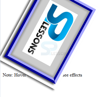
User can rotate the elements in 2D plane around its center by using rotate() function in which angles should be specified in degree, gradians, radinas, or turns. The code below demonstrates the CSS rotate at an angle as shown.
[html]
<!DOCTYPE html>
<html>
<head>
<style>
img{box-shadow:5px 5px 5px #666;
transition-duration:2s;
-webkit-transition-duration:2s;}
img:hover{
transform:rotate(180deg);
-ms-transform:rotate(180deg); /* prefix for IE 9 */
-webkit-transform:rotate(180deg); /* prefix for Safari and Chrome */
}
</style>
</head>
<body>
<img src="splesson.png" alt="splessons"/>
<p>Note: Hover Over the Image to see effects</p>
</body>
</html>
[/html]
Result
By running the above code in a preferred browser user can get the following output as shown in below image.
Rotate()
User can rotate the elements in 2D plane around its center by using rotate() function in which angles should be specified in degree, gradians, radinas, or turns. The code below demonstrates the CSS rotate at an angle as shown.
[html]
<!DOCTYPE html>
<html>
<head>
<style>
img{box-shadow:5px 5px 5px #666;
transition-duration:2s;
-webkit-transition-duration:2s;}
img:hover{
transform:rotate(180deg);
-ms-transform:rotate(180deg); /* prefix for IE 9 */
-webkit-transform:rotate(180deg); /* prefix for Safari and Chrome */
}
</style>
</head>
<body>
<img src="splesson.png" alt="splessons"/>
<p>Note: Hover Over the Image to see effects</p>
</body>
</html>
[/html]
Result
By running the above code in a preferred browser user can get the following output as shown in below image.
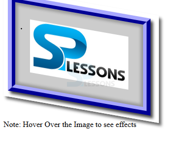
 scaleX()
User can display the elements larger or smaller along the x axis by using the CSS Transform function along the scaleX() function and the values can be specified the scaling factor to be applied which can be positive or negative and decimal. The code below demonstrates the scalex() function as shown.
[html]
<!DOCTYPE html>
<html>
<head>
<style>
img{box-shadow:5px 5px 5px #666;
transition-duration:2s;
-webkit-transition-duration:2s;}
img:hover{
transform:scaleX(1.5);
-ms-transform:scaleX(1.5); /* prefix for IE 9 */
-webkit-transform:scaleX(1.5); /* prefix for Safari and Chrome */
}
</style>
</head>
<body>
<img src="splesson.png" alt="splessons"/>
<p>Note: Hover Over the Image to see effects</p>
</body>
</html>
[/html]
Result
By running the above code in a preferred browser user can get the following output as shown in below image.
scaleX()
User can display the elements larger or smaller along the x axis by using the CSS Transform function along the scaleX() function and the values can be specified the scaling factor to be applied which can be positive or negative and decimal. The code below demonstrates the scalex() function as shown.
[html]
<!DOCTYPE html>
<html>
<head>
<style>
img{box-shadow:5px 5px 5px #666;
transition-duration:2s;
-webkit-transition-duration:2s;}
img:hover{
transform:scaleX(1.5);
-ms-transform:scaleX(1.5); /* prefix for IE 9 */
-webkit-transform:scaleX(1.5); /* prefix for Safari and Chrome */
}
</style>
</head>
<body>
<img src="splesson.png" alt="splessons"/>
<p>Note: Hover Over the Image to see effects</p>
</body>
</html>
[/html]
Result
By running the above code in a preferred browser user can get the following output as shown in below image.
 scaleY()
User can display the elements larger or smaller along the Y axis by using the CSS Transform function along the scaleY() function and the values can be specified the scaling factor to be applied which can be positive or negative and decimal. The code below demonstrates the scaleY() function as shown.
[html]
<!DOCTYPE html>
<html>
<head>
<style>
img{box-shadow:5px 5px 5px #666;
transition-duration:2s;
-webkit-transition-duration:2s;}
img:hover{
transform:skewY(10deg);
-ms-transform:skewY(10deg); /* prefix for IE 9 */
-webkit-transform:skewY(10deg); /* prefix for Safari and Chrome */
}
</style>
</head>
<body>
<img src="splesson.png" alt="splessons"/>
<p>Note: Hover Over the Image to see effects</p>
</body>
</html>
[/html]
Result
By running the above code in a preferred browser user can get the following output as shown in below image.
scaleY()
User can display the elements larger or smaller along the Y axis by using the CSS Transform function along the scaleY() function and the values can be specified the scaling factor to be applied which can be positive or negative and decimal. The code below demonstrates the scaleY() function as shown.
[html]
<!DOCTYPE html>
<html>
<head>
<style>
img{box-shadow:5px 5px 5px #666;
transition-duration:2s;
-webkit-transition-duration:2s;}
img:hover{
transform:skewY(10deg);
-ms-transform:skewY(10deg); /* prefix for IE 9 */
-webkit-transform:skewY(10deg); /* prefix for Safari and Chrome */
}
</style>
</head>
<body>
<img src="splesson.png" alt="splessons"/>
<p>Note: Hover Over the Image to see effects</p>
</body>
</html>
[/html]
Result
By running the above code in a preferred browser user can get the following output as shown in below image.
 scale()
User can display the elements larger or smaller along the both X and Y axis by using the CSS Transform function along the scale() function and the values can be specified the scaling factor to be applied which can be positive or negative and decimal. The code below demonstrates the scale() function as shown.
[html]
<!DOCTYPE html>
<html>
<head>
<style>
img{box-shadow:5px 5px 5px #666;
transition-duration:2s;
-webkit-transition-duration:2s;}
img:hover{
transform:scale(1.5,2.5);
-ms-transform:scale(1.5, 2.5); /* prefix for IE 9 */
-webkit-transform:scale(1.5, 2.5); /* prefix for Safari and Chrome */
}
</style>
</head>
<body>
<img src="splesson.png" alt="splessons"/>
<p>Note: Hover Over the Image to see effects</p>
</body>
</html>
[/html]
Result
By running the above code in a preferred browser user can get the following output as shown in below image.
scale()
User can display the elements larger or smaller along the both X and Y axis by using the CSS Transform function along the scale() function and the values can be specified the scaling factor to be applied which can be positive or negative and decimal. The code below demonstrates the scale() function as shown.
[html]
<!DOCTYPE html>
<html>
<head>
<style>
img{box-shadow:5px 5px 5px #666;
transition-duration:2s;
-webkit-transition-duration:2s;}
img:hover{
transform:scale(1.5,2.5);
-ms-transform:scale(1.5, 2.5); /* prefix for IE 9 */
-webkit-transform:scale(1.5, 2.5); /* prefix for Safari and Chrome */
}
</style>
</head>
<body>
<img src="splesson.png" alt="splessons"/>
<p>Note: Hover Over the Image to see effects</p>
</body>
</html>
[/html]
Result
By running the above code in a preferred browser user can get the following output as shown in below image.
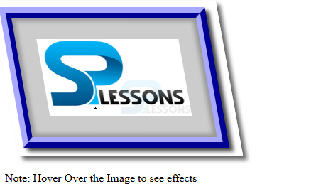
 skewX()
User can alter the angle of the X axis of the element by using the CSS 2D transform skewX() function in which angles can be specified in gradian, degrees, radians and turns. The code below demonstrates the CSS skewX() as shown.
[html]
<!DOCTYPE html>
<html>
<head>
<style>
img{box-shadow:5px 5px 5px #666;
transition-duration:2s;
-webkit-transition-duration:2s;}
img:hover{
transform:skewX(10deg);
-ms-transform:skewX(10deg); /* prefix for IE 9 */
-webkit-transform:skewX(10deg); /* prefix for Safari and Chrome */
}
</style>
</head>
<body>
<img src="splesson.png" alt="splessons"/>
<p>Note: Hover Over the Image to see effects</p>
</body>
</html>
[/html]
Result
By running the above code in a preferred browser user can get the following output as shown in below image.
skewX()
User can alter the angle of the X axis of the element by using the CSS 2D transform skewX() function in which angles can be specified in gradian, degrees, radians and turns. The code below demonstrates the CSS skewX() as shown.
[html]
<!DOCTYPE html>
<html>
<head>
<style>
img{box-shadow:5px 5px 5px #666;
transition-duration:2s;
-webkit-transition-duration:2s;}
img:hover{
transform:skewX(10deg);
-ms-transform:skewX(10deg); /* prefix for IE 9 */
-webkit-transform:skewX(10deg); /* prefix for Safari and Chrome */
}
</style>
</head>
<body>
<img src="splesson.png" alt="splessons"/>
<p>Note: Hover Over the Image to see effects</p>
</body>
</html>
[/html]
Result
By running the above code in a preferred browser user can get the following output as shown in below image.
 skewY()
User can alter the angle of the Y axis of the element by using the CSS 2D transform skewY() function in which angles can be specified in gradian, degrees, radians and turns. The code below demonstrates the CSS skewY() as shown.
[html]
<!DOCTYPE html>
<html>
<head>
<style>
img{box-shadow:5px 5px 5px #666;
transition-duration:2s;
-webkit-transition-duration:2s;}
img:hover{
transform:skewY(10deg);
-ms-transform:skewY(10deg); /* prefix for IE 9 */
-webkit-transform:skewY(10deg); /* prefix for Safari and Chrome */
}
</style>
</head>
<body>
<img src="splesson.png" alt="splessons"/>
<p>Note: Hover Over the Image to see effects</p>
</body>
</html>
[/html]
Result
By running the above code in a preferred browser user can get the following output as shown in below image.
skewY()
User can alter the angle of the Y axis of the element by using the CSS 2D transform skewY() function in which angles can be specified in gradian, degrees, radians and turns. The code below demonstrates the CSS skewY() as shown.
[html]
<!DOCTYPE html>
<html>
<head>
<style>
img{box-shadow:5px 5px 5px #666;
transition-duration:2s;
-webkit-transition-duration:2s;}
img:hover{
transform:skewY(10deg);
-ms-transform:skewY(10deg); /* prefix for IE 9 */
-webkit-transform:skewY(10deg); /* prefix for Safari and Chrome */
}
</style>
</head>
<body>
<img src="splesson.png" alt="splessons"/>
<p>Note: Hover Over the Image to see effects</p>
</body>
</html>
[/html]
Result
By running the above code in a preferred browser user can get the following output as shown in below image.
 skew()
User can alter the angle of the X and Y axis of the element by using the CSS 2D transform skew() function in which angles can be specified in gradian, degrees, radians and turns. The code below demonstrates the CSS skew() as shown.
[html]
<!DOCTYPE html>
<html>
<head>
<style>
img{box-shadow:5px 5px 5px #666;
transition-duration:2s;
-webkit-transition-duration:2s;}
img:hover{
transform:skew(10deg, 20deg);
-ms-transform:skew(10deg, 20deg); /* prefix for IE 9 */
-webkit-transform:skew(10deg, 20deg); /* prefix for Safari and Chrome */
}
</style>
</head>
<body>
<img src="splesson.png" alt="splessons"/>
<p>Note: Hover Over the Image to see effects</p>
</body>
</html>
[/html]
Result
By running the above code in a preferred browser user can get the following output as shown in below image.
skew()
User can alter the angle of the X and Y axis of the element by using the CSS 2D transform skew() function in which angles can be specified in gradian, degrees, radians and turns. The code below demonstrates the CSS skew() as shown.
[html]
<!DOCTYPE html>
<html>
<head>
<style>
img{box-shadow:5px 5px 5px #666;
transition-duration:2s;
-webkit-transition-duration:2s;}
img:hover{
transform:skew(10deg, 20deg);
-ms-transform:skew(10deg, 20deg); /* prefix for IE 9 */
-webkit-transform:skew(10deg, 20deg); /* prefix for Safari and Chrome */
}
</style>
</head>
<body>
<img src="splesson.png" alt="splessons"/>
<p>Note: Hover Over the Image to see effects</p>
</body>
</html>
[/html]
Result
By running the above code in a preferred browser user can get the following output as shown in below image.
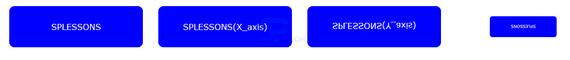
 Flipping Elements using scale()
By setting elements should be scaleX() and scaleY() functions and the value should be "-1" then the element mirror image should be created along with the X and Y axis The code below demonstrates the 2D transform flipping Effect as shown.
[html]
<!DOCTYPE html>
<html>
<head>
<style>
div {
background-color:#0000ff;
color: #FFF;
font-family:Verdana, sans-serif;
width: 200px;
padding: 30px;
margin: 15px;
text-align: center;
float: left;
border-radius:10px;
}
#XFlip{
-moz-transform: scaleX(-1);
-ms-transform: scaleX(-1);
-o-transform: scaleX(-1);
-webkit-transform: scaleX(-1);}
#YFlip{transform: scaleY(-1);
-moz-transform: scaleY(-1);
-ms-transform: scaleY(-1);
-o-transform: scaleY(-1);
-webkit-transform: scaleY(-1);}
#small{-moz-transform: scale(-.5,-.5);
-ms-transform: scale(-.5,-.5);
-o-transform: scale(-.5,-.5);
-webkit-transform: scale(-.5,-.5);
transform: scale(-.5,-.5);}
</style>
</head>
<body>
<div>SPLESSONS</div>
<div id="Xflip">SPLESSONS(X_axis)</div>
<div id="YFlip">SPLESSONS(Y_axis)</div>
<div id="small">SPLESSONS</div>
</body>
</html>
[/html]
Result
By running the above code in a preferred browser user can get the following output as shown in below image.
Flipping Elements using scale()
By setting elements should be scaleX() and scaleY() functions and the value should be "-1" then the element mirror image should be created along with the X and Y axis The code below demonstrates the 2D transform flipping Effect as shown.
[html]
<!DOCTYPE html>
<html>
<head>
<style>
div {
background-color:#0000ff;
color: #FFF;
font-family:Verdana, sans-serif;
width: 200px;
padding: 30px;
margin: 15px;
text-align: center;
float: left;
border-radius:10px;
}
#XFlip{
-moz-transform: scaleX(-1);
-ms-transform: scaleX(-1);
-o-transform: scaleX(-1);
-webkit-transform: scaleX(-1);}
#YFlip{transform: scaleY(-1);
-moz-transform: scaleY(-1);
-ms-transform: scaleY(-1);
-o-transform: scaleY(-1);
-webkit-transform: scaleY(-1);}
#small{-moz-transform: scale(-.5,-.5);
-ms-transform: scale(-.5,-.5);
-o-transform: scale(-.5,-.5);
-webkit-transform: scale(-.5,-.5);
transform: scale(-.5,-.5);}
</style>
</head>
<body>
<div>SPLESSONS</div>
<div id="Xflip">SPLESSONS(X_axis)</div>
<div id="YFlip">SPLESSONS(Y_axis)</div>
<div id="small">SPLESSONS</div>
</body>
</html>
[/html]
Result
By running the above code in a preferred browser user can get the following output as shown in below image.
- Property Which specify the transform function which applied to the elements. The initial value should be none.
- transform-origin Is specify the origin along which the transform function should be applied. The initial value should be 50% 50%.
| Property | Description |
|---|---|
| Translate() | Which moves along with X or Y axis based on two values seperated with comma. |
| TranslateX() | Which moves along with X axis by specified percentage or length. |
| TranslateY() | Which moves along with Y axis by specified percentage or length. |
| rotate() | Which rotates along its anchor point by the user specified angle. |
| scaleX() | Which scales along its X axis by specified scaling factor. |
| scaleY() | Which scales along its Y axis by specified scaling factor. |
| scale() | Which scales along its X or Y axis by specified scaling factor. |
| skeY | Which skews along its Y axis by specified angle. |
| skewX() | Which skews along its X axis by specified angle. |
Key Points
- User can take many positive,negative or decimal values.
- User can rotate elements should be in 2aD plane only.
- User may get many effects by using the 2D transform.