 Introduction
In order to build user interface application in angular, templates with HTML are created. Templates are very similar to templates in Angular 1, though there are several little syntactical changes that make it more clear what's happening. Following are the major concepts covered.
- Template
- Building a template
 Description
One can build inline template for the App component by using the template property to define the template directly in the component’s metadata as shown in the below code.
[c]
import { Component } from '@angular/core';
@Component({
selector: 'pm-app',
template: `<div><h1>{{pageTitle}}</h1>
<div>My First Component</div>
</div>`
})
export class AppComponent {
pageTitle: string = 'SPLessons Product Management';
}
[/c]
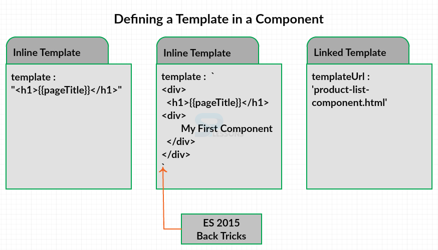
But this is not the only way for building the template for the components. The figure below explain the types for building a template for a component.
Inline template -
One can use the template property and define an inline template using a simple quoted string with single or double quotes. Or can define an inline template with a multi-line string by enclosing the HTML in ES 2015 back ticks.
The back ticks allow composing a string over several lines, making the HTML more readable. There are some advantages to defining an inline template using one of these two techniques. The template is directly defined within the component, keeping the view and the code for that view in one file. It is then easy to match up our data bindings with the class properties such as the page title. However, there are disadvantages as well. When defining the HTML in a string, most development tools don't provide IntelliSense, automatic formatting, and syntax checking. Especially when one define more HTML in the template, these issues become challenges.
Linked template -
In many cases the better option is to define a linked template with the HTML in its own file. One can then use the template URL property in the component metadata to define the URL of our HTML file.
 Description
Choose any sample angular application or create using the twitter Bootstrap styling framework which is very easy for building an application and gives a good look for the page. This chapter explains creating a template for product list view for a sample application in the created directory i.e. SPLessons.
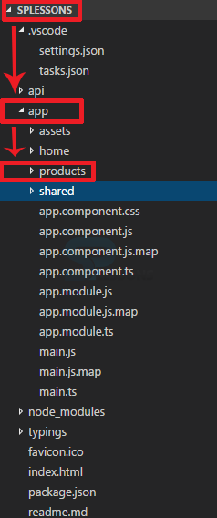
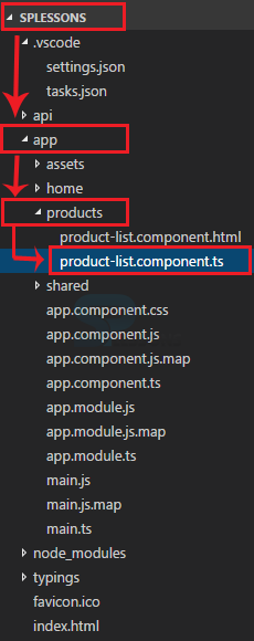
If one want to add an external template for the Product List Component. By convention each feature of the application has its own folder under the app folder. So, create a new folder under the app folder and name it as product as shown in the image below.
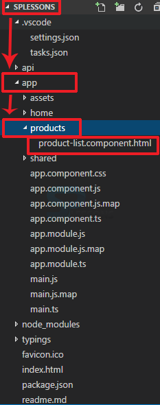
In that folder, create the template for our Product List Component. By convention, the name of the template is the same name as the component with an HTML extension. So, call the Product List Component as product-list.component.html. as shown in the image below.
Create building the template using HTML in the file as shown in the below code.
product-list.component.html
[html]
<div class='panel panel-primary'>
<div class='panel-heading'>
Product List
</div>
<div class='panel-body'>
<div class='row'>
<div class='col-md-2'>Filter by:</div>
<div class='col-md-4'>
<input type='text' />
</div>
</div>
<div class ='row'>
<div class='col-md-6'>
<h3>Filtered by: </h3>
</div>
</div>
<div class='table-responsive'>
<table class='table'>
<thead>
<tr>
<th>
<button class='btn btn-success'>
Show Image
</button>
</th>
<th>Product</th>
<th>Code</th>
<th>Available</th>
<th>Price</th>
<th>5 Star Rating</th>
</tr>
</thead>
<tbody>
</tbody>
</table>
</div>
</div>
[/html]
In the above code the Twitter Bootstrap style classes are used to display the content in a panel and the product list is displayed in the heading and is displayed as the panel heading.
Next is the filter by. An input box for entry of the filter string is defined. And added text that displays the user entered filter. And is done using the Twitter Bootstrap style classes to lay out the input box and text into rows.
Now the table. Used Twitter Bootstrap's table style classes. Which contain a table header. The first column header is a button to show the product image.
 Description
Create a component for the above build template, in order to build a simple component one should remember the following thing.
- First define a class
- Add a component decorator to define the metadata and specify the template.
- Import from Angular core.
 Description
When a component has a selector defined, one can use the component as a directive. This means that one can insert the component's template into any other component's template by using the selector as an HTML tag. So, use the ProductListComponent selector pm-products as a directive in the App Component.
Open app.component.ts file and place the pm-products as shown in the below code.
app.component.ts
[c]
import { Component } from '@angular/core';
@Component({
selector: 'pm-app',
template: `<div><h1>{ {pageTitle} }</h1>
<pm-products></pm-products>
</div>`
})
export class AppComponent {
pageTitle: string = 'SPLessons Product Management';
}
[/c]
Now open the app.module.ts and add ProductListComponent to the declaration array.
app.module.ts
[c]
import { NgModule } from '@angular/core';
import { BrowserModule } from '@angular/platform-browser';
import { AppComponent } from './app.component';
import { ProductListComponent } from './products/product-list.component';
@NgModule({
imports: [ BrowserModule ],
declarations: [
AppComponent,
ProductListComponent ],
bootstrap: [ AppComponent ]
})
export class AppModule { }
[/c]
One should remember that everything declared must be imported, so add the import statement for ProductListComponent at the top of the file as shown in the code above.
 Output
 Key Points
- Inline template is for Short templates.
- Inline template Specify the template Property.
- Inline template Use the ES 2015 back ticks for multiple lines.
- Linked template is for longer templates.
- Linked template Specify the templateUrl property.
- Linked template Define the path to the HTML file.
