 Introduction
Everything is a component in Angular 2. Components are the main approach that developer build and specify elements and logic on the page, through both custom elements and attributes that add functionality to our existing parts. Following are the major concepts covered.
- Components
- Creating the App Component
- Bootstrapping the App Component
 Description
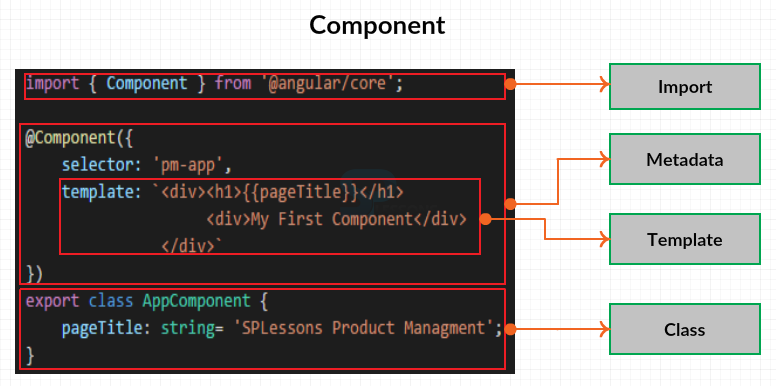
A component is something that's visible to the end user and which might be reused many times among an application. The figure below demonstrate the structure of an Angular 2 component.
Template -
An Angular component includes a template which lays out the user interface fragment to finding a view for the application. It is created with HTML and defines what is rendered on the page. Using Angular binding and directives in the HTML will power up the view.
Class-
The class is created with TypeScript. The class contains the properties or data elements available for use in the view. For example, if one want to display a title in the view, can define a class property for that title.
The class also contains methods which are the functions for the logic needed by the view. For example, if one want to show and hide an image, should write the logic in a class method.
Metadata -
A component also has metadata which provides additional information about the component to Angular. It is this metadata that defines this class as an Angular component. The metadata is defined with a decorator. A decorator is a function that adds metadata to a class, its members or its method arguments. So a component is a view defined in a template. Its associated code defined with a class and metadata defined with a decorator.
The image below explain the component look in TypeScript. The complex code in the image is divided into chunks for simple understanding.
From the above image the class defines the properties and methods needed by the view. The @component decorator defines the metadata and the metadata includes the templates that lays out the view managed by this component. And imported the required members.
 Description
App component is the root of application, create a file assume the file name as app.component.ts and this would be the root application component, so by convention, it is called app. Then a dot, then the type of ES module defined in file, in order to identify the ES module as a component, another dot and the extension is required, if using TypeScript use ts as extension. Now start coding in the created file i.e. in app.component.ts
First create a class and the order of building the code is doesn’t matter. So, type export keyword to ensure that other parts of the application can use this class. Next type the class keyword and then the name of the class. Suppose the class name as AppComponent as shown below.
[c]export class AppComponent { }[/c]
Inside this class define one property, the page title. Type the property name followed by a colon and the property data type, which for the pageTitle is a string. For this property we want to define a default value for the pageTitle as shown below.
[c]
export class AppComponent {
pageTitle: string = 'SPLessons Product Management';
}
[/c]
Next define the component decorator above the created class, the component decorator always begins with an @ sign then the name of the decorator. And assume the same name as component decorator. The component decorator is a function, so type parentheses. And pass in an object, in curly braces as shown below.
[c]@component({})[/c]
Now one need to import the component decorator from Angular core, so in order to do this type the below line above the @component as shown below.
[c]import { Component } from '@angular/core';
@component({})[/c]
Now complete building metadata, in the component metadata specify a selector for the name of the component when used as a directive in the HTML. Set the selector to pm-app, pm for product management and the app represents the component as shown below.
[c]@Component({
selector: 'pm-app',
})[/c]
Next define the template. The properties are Separated by a comma, type the name of the other property after the comma. Assume the property as template and any valid HTML can be specified in the template as shown below.
[c]@Component({
selector: 'pm-app',
template: `<div><h1>{ {pageTitle} }</h1>
<div>My First Component</div>
</div>`
})[/c]
Finally, the created file would look as shown below.
app.component.ts
[c]
import { Component } from '@angular/core';
@Component({
selector: 'pm-app',
template: `<div><h1>{{pageTitle}}</h1>
<div>My First Component</div>
</div>`
})
export class AppComponent {
pageTitle: string = 'SPLessons Product Management';
}
[/c]
 Description
Bootstrapping is the process to tell Angular to load the root component for this one need to setup index.html file to host the application. Most of the angular applications have an index.html file that contains the main page for the application. The index.html file is often the one true web page of the application, hence an application is often called a single-page application or SPA.
Now open the index.html file which contain the following code.
index.html
[html]
<!DOCTYPE html>
<html>
<head lang="en">
<title>Product Management</title>
<meta charset="UTF-8">
<meta name="viewport" content="width=device-width, initial-scale=1">
<link href="node_modules/bootstrap/dist/css/bootstrap.css" rel="stylesheet" />
<link href="app/app.component.css" rel="stylesheet" />
<!-- Polyfill(s) for older browsers -->
<script src="node_modules/core-js/client/shim.min.js"></script>
<script src="node_modules/zone.js/dist/zone.js"></script>
<script src="node_modules/reflect-metadata/Reflect.js"></script>
<script src="node_modules/systemjs/dist/system.src.js"></script>
<!-- Configure SystemJS -->
<script src="systemjs.config.js"></script>
<script>
System.import('app').catch(function(err){ console.error(err); });
</script>
</head>
<body>
<pm-app></pm-app>
</body>
</html>
[/html]
From the above code, to host the application, used the component selector as a directive within the body element as shown below.
[html]
<body>
<pm-app></pm-app>
</body>
[/html]
To display a message on the page while the application is loading, just add some text between the component tags as shown below.
[html]
<body>
<pm-app>Loading App...</pm-app>
</body>
[/html]
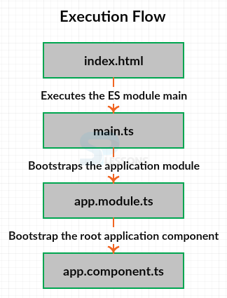
The index.html loads and executes the ES module main, the main bootstraps the application module Appmodule, which in turn bootstraps the root application component, AppComponent, the image below show the work flow of executing a simple Angular2 component.
Now run the application by typing the below command in command line.
[c]npm start[/c]
After successful execution the browser display the output as shown in the image below.
 Key Points
- Components can be reused many times among an application.
- Components are the major approach for creating and identifying the elements.
- View and logic are the two main things for building a component.


