 Introduction
Components are one of the key building blocks of the application. The cleaner, stronger, and more durable we make these blocks, the better are the application. In Angular one component can be nested within the other component and can establish communication between the nested component and it’s container, just like nesting dolls one can nest the components. Following are the major concepts covered in this chapter.
- Defining Interfaces
- Encapsulating Component Styles
- Using Lifecycle Hooks
- Building The Nested Component
 Description
One of the benefits of using TypeScript is that strong typing. Every property has a type, every method has a return type, and every method parameter has a type. This strong typing helps minimize errors through better syntax checking and tooling. In some cases however, users will have a property or method that does not have a pre-defined type, such as the products array in the below sample code.
[c]
export class ProductListComponent {
pageTitle: string = 'Product List!';
showImage: boolean = false;
listFilter: string = 'angular';
message: string;
products: any[] = [...];
toggleImage(): void {
this.showImage = !this.showImage;
}
onRatingClicked(message: string): void {
this.message = message;
}
[/c]
The products array is defined as any in the above code, which negates the benefits of strong typing. To specify custom types, one can define an interface.
An interface is a specification identifying a related set of properties and methods. A class commits to supporting the specification by implementing the interface. That means the class includes code for each property and method identified in the interface. One can then use the interface as a data type. ES 5 and ES 2015 do not support interfaces, but TypeScript does. So interfaces are transpiled out and are not found in the resulting JavaScript. This means that interfaces are development time only. Their purpose is to provide strong typing and better tooling support as one build, debug, and maintain the code.
 Example
The code below gives the example for a TypeScript interface which defines what a product is. Create a new file under the products folder in the demo project, name the file as product.ts and use the following code.
product.ts
[c]
export interface IProduct {
productId: number;
productName: string;
productCode: string;
releaseDate: string;
price: number;
description: string;
starRating: number;
imageUrl: string;
}
[/c]
In the above code an interface is defined using the interface keyword, followed by the interface name IProduct, which is often the name of the business object that the interface describes. By many naming conventions, the interface is prefixed with an I for interface, though some TypeScript developers leave off this prefix. The export keyword at the front exports the interface, thereby making it available for use anywhere in the application. The body of the interface defines the set of properties and methods appropriate for the business object. For each property, the interface includes the property name, a colon, and the property data type. Notice that the release date is typed as a string, the type can be changed to date later when used.
Now, use the above defined interface as data type in the product list component, before using suppose if one made any typographical error into the products array, no error is detected and one won’t even know the made mistake until seeing the application in the browser. So, such errors could cause hard to find bugs.
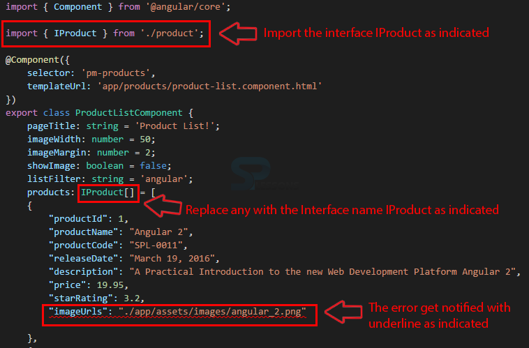
So, first replace any with the IProduct and then import the IProduct in the product list components as shown in the below image.
Now that array of products is strongly typed, and notified with an error in the product array property as shown in the image above, so this is a good demonstration of one of the benefits of strong typing.
 Description
When one build the template for a component, sometimes need styles unique to that template. For example, for building a sidebar navigation component, one may want special li or div elements styles. When nested a component that requires special styles within a container component, one need a way to bring in those unique styles. One option is to define those styles directly in the template's HTML. But that makes it harder to see, reuse, and maintain those styles. Another options is to define the styles in an external stylesheet. That makes them easier to maintain, but that puts the burden on the container component to ensure the external stylesheet is linked in the index.html. That makes the nested component somewhat more difficult to reuse. But there is a better way.
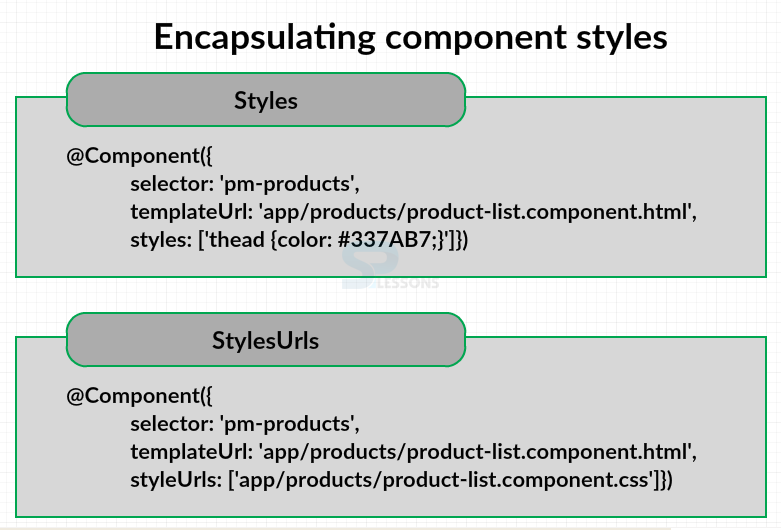
To help out with this issue, the component decorator has properties to encapsulate styles as part of the component definition. These properties are styles and styleUrls as shown in the figure below.
One can add unique styles directly to the component using the styles property. This property is an array so multiple styles can be added and separated by commas. A better solution is to create one or more external stylesheets and identify them with the styleUrls property. This property is an array so one can add multiple stylesheets separated by commas. By encapsulating the styles within the component, any defined selectors or style classes are only applicable to the component's template and won't leak out into any other part of the application.
 Example
In the demo project Product management, under the products folder create a new file for building the external stylesheet for the product list component, name the file as product-list.component.css, and add a table header style in the created file as shown in the code below.
product-list.component.css
[c]
thead {
color: #337AB7;
}
[/c]
One can modify the t head style directly, because the stylesheet is encapsulated in the component. And the styles defined in this file won’t affect any other component in the application, one can add any other styles as needed to jazz up the product list component.
To use the created new stylesheet, one should modify the product list component. In the component decorator specify the unique stylesheet by adding the styleUrls property and pass it in array as shown in the code below.
product-list.component.ts
[c]
import { Component } from '@angular/core';
import { IProduct } from './product';
@Component({
selector: 'pm-products',
templateUrl: 'app/products/product-list.component.html',
styleUrls: ['app/products/product-list.component.css']
})
export class ProductListComponent {
pageTitle: string = 'Product List!';
imageWidth: number = 50;
imageMargin: number = 2;
showImage: boolean = false;
listFilter: string = 'angular';
products: IProduct[] = [
{
"productId": 1,
"productName": "Angular 2",
"productCode": "SPL-0011",
"releaseDate": "March 19, 2016",
"description": "A Practical Introduction to the new Web Development Platform Angular 2",
"price": 19.95,
"starRating": 3.2,
"imageUrl": "./app/assets/images/angular_2.png"
},
{
"productId": 2,
"productName": "WordPress",
"productCode": "SPL-0023",
"releaseDate": "March 18, 2016",
"description": "This ebook allows you to create a WordPress website on your domainfrom scratch.",
"price": 32.99,
"starRating": 4.2,
"imageUrl": "./app/assets/images/wordpress-logo.png"
}
];
toggleImage(): void{
this.showImage = !this.showImage;
}
}
[/c]
From the above code, in first element to the array specify the path to the stylesheet. Note that the style path is relative to the index.html file. More style sheets can be added and separated with commas.
 Output
 Description
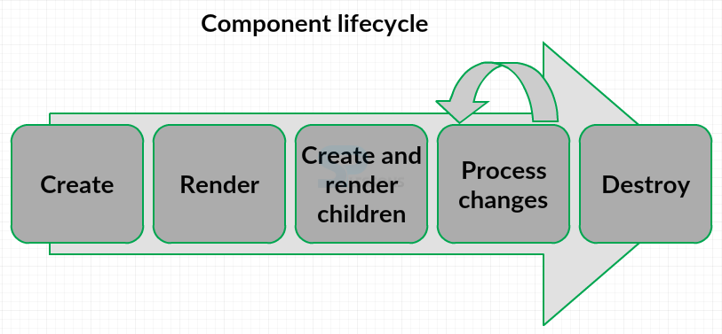
A component has a lifecycle, managed by Angular. Angular creates the component, renders it, creates and renders its children, processes changes when it’s data-bound properties change, and then destroys it before removing its template from the DOM. The figure below give the component lifecycle in Angular.
Angular provides a set of lifecycle hooks, one can use to tap into this lifecycle and perform operations as needed. Following are the most commonly used lifecycle hooks in Angular.
OnInit -
OnInit lifecycle hook to perform any component initialization after Angular has initialized the data-bound properties. This is a good place to retrieve the data for the template from a back-end service.
OnChanges -
OnChanges lifecycle hook to perform any action after Angular sets data-bound input properties.
OnDestroy -
The OnDestroy lifecycle hook to perform any cleanup before Angular destroys the component.
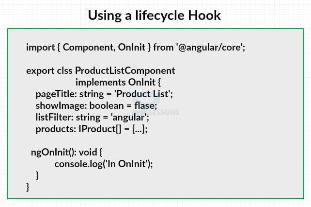
To use a lifecycle hook, one should implement the lifecycle hook interface. Since Angular itself is written in TypeScript, it provides several interfaces that user can implement, including one interface for each lifecycle hook.
In the above image, the interface for the OnInit lifecycle hook is OnInit. Notice that it is not prefixed with an I because using the OnInit interface from Angular, and imported the lifecycle hook interface. One can then write the hook method. Each lifecycle hook interface defines one method whose name is the interface name prefixed with ng for Angular. For example, the OnInit interface hook method is named ngOnInit. Neither ES 5 nor ES 2015 support interfaces. They are features of TypeScript. That means that the interfaces are transpiled out of the resulting JavaScript. So one don't really have to implement the interface to use lifecycle hooks. But can simply write code for the hook method. However, it is good practice, and provides better tooling, when implementing the interface.
 Example
Open product list component file from the demo project product management and add the OnInit lifecycle hook to the component as shown in the code below.
product-list.components.ts
[c]
import { Component, OnInit } from '@angular/core';
import { IProduct } from './product';
@Component({
selector: 'pm-products',
templateUrl: 'app/products/product-list.component.html',
styleUrls: ['app/products/product-list.component.css']
})
export class ProductListComponent implements OnInit{
pageTitle: string = 'Product List!';
imageWidth: number = 50;
imageMargin: number = 2;
showImage: boolean = false;
listFilter: string = 'angular';
products: IProduct[] = [
{
"productId": 1,
"productName": "Angular 2",
"productCode": "SPL-0011",
"releaseDate": "March 19, 2016",
"description": "A Practical Introduction to the new Web Development Platform Angular 2",
"price": 19.95,
"starRating": 3.2,
"imageUrl": "./app/assets/images/angular_2.png"
},
{
"productId": 2,
"productName": "WordPress",
"productCode": "SPL-0023",
"releaseDate": "March 18, 2016",
"description": "This ebook allows you to create a WordPress website on your domainfrom scratch.",
"price": 32.99,
"starRating": 4.2,
"imageUrl": "./app/assets/images/wordpress-logo.png"
}
];
toggleImage(): void{
this.showImage = !this.showImage;
}
ngOnInit(): void {
console.log('In OnInit');
}
}
[/c]
In the above code. First, implement the interface by adding it to the class signature, just type implements and the name of the interface, OnInit. Now, Import the OnInit from the Angular core by simple adding to the first import statement as shown in the code.
Now after implementing the interface one must write the code for every property and method in that interface. The OnInit interface only defines one method ngOnInit. So, write the code for the ngOnInit method at down the code along with other methods as shown in the code.
 Output
 Description
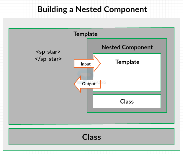
The figure below explains visual representation of a component that is nest-able in another component.
From the above figure the outer component is referred as the container or parent component. And the inner component as the nested or child component. When building an interactive application the nested component often needs to communicate with its container. The nested component receives information from its container using input properties, and the nested component outputs information back to its container by raising events.
 Example
In the sample application in order to display the rating number using a visual representation such as stars makes it quicker and easier for the user to interpret the meaning of the number.
For the Star Component to display the correct number of stars, the container must provide the rating number to the Star Component as an input. And if the user clicks on the stars the event has to be raised to notify the container.
In order to build a star component follow the below steps
 Step 1
Instead of adding the code in the already existing product list component for displaying stars in the demo project build a new component. This keeps the template and logic for that feature encapsulated and makes it reusable. So, create a start component in the project.
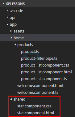
Create a folder called shared and include the template and style sheet files for the component as shown in the image below.
Use the below codes in the template and style sheets respectively.
start.component.html
[html]
<div class="crop"
[style.width.px]="starWidth"
="rating">
<div style="width: 86px">
<span class="glyphicon glyphicon-star"></span>
<span class="glyphicon glyphicon-star"></span>
<span class="glyphicon glyphicon-star"></span>
<span class="glyphicon glyphicon-star"></span>
<span class="glyphicon glyphicon-star"></span>
</div>
</div>
[/html]
star.component.css
[c]
.crop {
overflow: hidden;
}
div {
cursor: pointer;
}
[/c]
 Step 2
Now, build the start component by creating a new file inside the shared folder and name the file as star.component.ts and use the below code.
star.component.ts
[c]
import { Component, OnChanges } from '@angular/core';
@Component({
selector: 'sp-star',
templateUrl: 'app/shared/star.component.html',
styleUrls: ['app/shared/star.component.css']
})
export class StarComponent {
rating: number = 4;
starWidth: number;
ngOnChanges(): void {
this.starWidth = this.rating * 86/5;
}
}
[/c]
Here in the code, a class StarComponent is defined and decorated with the component decorator @Component, and the component is imported from the Angular core.
Define the selector with the preferred prefix, here in this example sp-star is used, for template Url property the html file path is provided and for the style Url property the style sheet path is provided.
The rating property in the code is a number and defined the rating value, and hardcoded to 4 as of now, and the star width property is calculated based on the rating, the star width is calculated using the Onchange lifecycle hook. So import the Onchange interface from Angular core and write a code for the ngOnchange method as shown in the code.
Now the component is ready to nest into another component.
 Description
After building a component one can nest the new component into the another component by using the nested component as a directive, the main goal is to display stars instead of displaying star rating numbers in the sample application. So, the container component uses the nested component by specifying the directive in the product list component.
In this example the product list component wants to use the star component, so add the declaration to the same angular module that declares the product list component. So, in this case app module is the angular module.
Follow the below steps to nest the star component into the product list component.
 Step 1
Open the product list component template file and in the table data element replace the display of the star rating number with star component. So, in order to do this simply replace the binding with the sp-star directive.
product-list.component.html
[html]
<div class='panel panel-primary'>
<div class='panel-heading'>
{ {pageTitle} }
</div>
<div class='panel-body'>
<div class='row'>
<div class='col-md-2'>Filter by:</div>
<div class='col-md-4'>
<input type='text'
[(ngModel)]='listFilter' />
</div>
</div>
<div class ='row'>
<div class='col-md-6'>
<h3>Filtered by: { {listFilter}}</h3>
</div>
</div>
<div class='table-responsive'>
<table class='table'
*ngIf='products && products.length'>
<thead>
<tr>
<th>
<button class='btn btn-success'
(click)='toggleImage()'>
{ {showImage ? 'Hide' : 'Show'}} Image
</button>
</th>
<th>Product</th>
<th>Code</th>
<th>Available</th>
<th>Price</th>
<th>5 Star Rating</th>
</tr>
</thead>
<tbody>
<tr *ngFor='let product of products | productFilter:listFilter'>
<td>
<img *ngIf='showImage'
[src]='product.imageUrl'
='product.productName'
[style.width.px]='imageWidth'
[style.margin.px]='imageMargin'>
</td>
<td>{ { product.productName }}</td>
<td>{ { product.productCode | lowercase }}</td>
<td>{ { product.releaseDate }}</td>
<td>{ { product.price | currency:'USD':true:'1.2-2'}}</td>
<td>
<sp-star></sp-star>
</td>
</tbody>
</table>
</div>
</div>
[/html]
 Step 2
Now, one need to tell angular where to find the give directive. So, in this example app module is the only one angular module so add the declaration for the nested component by simply importing the star component and then adding the star component to the declaration’s array as shown in the code below.
app.module.ts
[c]
import { NgModule } from '@angular/core';
import { BrowserModule } from '@angular/platform-browser';
import { FormsModule } from '@angular/forms';
import { AppComponent } from './app.component';
import { ProductListComponent } from './products/product-list.component';
import { ProductFilterPipe } from './products/product-filter.pipe';
import { StarComponent } from './shared/star.component';
@NgModule({
imports: [
BrowserModule,
FormsModule ],
declarations: [
AppComponent,
ProductListComponent,
ProductFilterPipe,
StarComponent ],
bootstrap: [ AppComponent ]
})
export class AppModule { }
[/c]
 Output
 Description
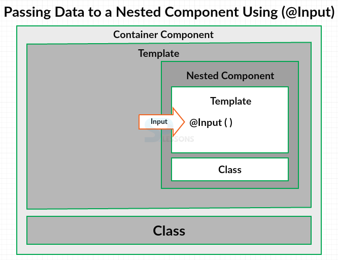
If a nested component wants to receive input from its container, it must expose a property to that container. The nested component exposes a property it can use to receive input from its container using the aptly named "@Input" decorator.
The @Input decorator to decorate any property in the nested component's class. This works with any property type, including an object.
 Example
Open the stat component file in the shared folder and add @input to the import statement as shown in the code below.
start.component.ts
[c]
import { Component, OnChanges, Input } from '@angular/core';
@Component({
selector: 'sp-star',
templateUrl: 'app/shared/star.component.html',
styleUrls: ['app/shared/star.component.css']
})
export class StarComponent {
@Input() rating: number;
starWidth: number;
ngOnChanges(): void {
this.starWidth = this.rating * 86/5;
}
}
[/c]
Here in this example the star component wants to expose the rating property to its container so the container can provide the rating number. Add the @Input decorator then to the rating property. The @Input decorator is a function, so add parenthesis. In this example only one property of the nested component is decorated with the @Input decorator, but it is not limited to one, and can expose multiple input properties as needed.
In the container's template use property binding and define the nested component's input property as the target of the binding. Then set the binding source to the value which is to be passed into the nested component. In this example, the product's star rating is passed as shown in the code below.
product-list.component.html
[html]
<div class='panel panel-primary'>
<div class='panel-heading'>
{ {pageTitle}}
</div>
<div class='panel-body'>
<div class='row'>
<div class='col-md-2'>Filter by:</div>
<div class='col-md-4'>
<input type='text'
[(ngModel)]='listFilter' />
</div>
</div>
<div class ='row'>
<div class='col-md-6'>
<h3>Filtered by: { {listFilter}}</h3>
</div>
</div>
<div class='table-responsive'>
<table class='table'
*ngIf='products && products.length'>
<thead>
<tr>
<th>
<button class='btn btn-success'
(click)='toggleImage()'>
{ {showImage ? 'Hide' : 'Show'}} Image
</button>
</th>
<th>Product</th>
<th>Code</th>
<th>Available</th>
<th>Price</th>
<th>5 Star Rating</th>
</tr>
</thead>
<tbody>
<tr *ngFor='let product of products | productFilter:listFilter'>
<td>
<img *ngIf='showImage'
[src]='product.imageUrl'
='product.productName'
[style.width.px]='imageWidth'
[style.margin.px]='imageMargin'>
</td>
<td>{ { product.productName }}</td>
<td>{ { product.productCode | lowercase }}</td>
<td>{ { product.releaseDate }}</td>
<td>{ { product.price | currency:'USD':true:'1.2-2'}}</td>
<td>
<sp-star [rating]='product.starRating'></sp-star>
</td>
</tbody>
</table>
</div>
</div>
[/html]
That's it, the product's star rating property is now bound to the rating input property of the nested component. Anytime the container data changes, the OnChanges lifecycle event is generated and the star width is recalculated, the appropriate number of stars are then displayed.
 Output
 Description
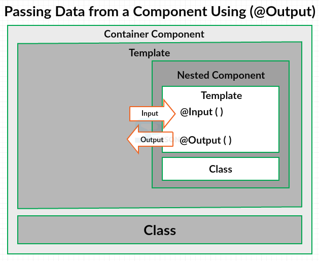
If the nested component wants to send information back to its container, it can raise an event. The nested component exposes an event it can use to pass output to its container using the aptly named "@Output" decorator.
One can use the @Output decorator to decorate any property of the nested component's class. However, the property type must be an event. A nested component can only pass data back to its container is with an event. The data to pass becomes the event payload. In Angular an event is defined with an EventEmitter object.
 Example
Follow the below steps for passing data from a component using the @Output method.
Step 1 -
Open the star component in the sample application and add the @Output and EventEmitter to the import statement as shown in the code below.
star.component.ts
[c]
import { Component, OnChanges, Input,
Output, EventEmitter } from '@angular/core';
@Component({
selector: 'sp-star',
templateUrl: 'app/shared/star.component.html',
styleUrls: ['app/shared/star.component.css']
})
export class StarComponent {
@Input() rating: number;
starWidth: number;
@Output() ratingClicked: EventEmitter<string> =
new EventEmitter<string>();
ngOnChanges(): void {
this.starWidth = this.rating * 86/5;
}
}
[/c]
Here in the code, in order to expose an event to the container, a ratingClicked event property is defined and the property type is defined to be an EventEmitter, and the event payload is a string, so specified "string" as the generic argument. Set the ratingClicked property to new instance of EventEmitter. Decorate this property with the @Output decorator to expose it so that the container can respond to this event. The @Output decorator is a function so add parenthesis. In this example only one property of the nested component is decorated with the @Output decorator but it is not limited to one and can expose multiple output properties as needed.
Step 2 -
Now open the star component template and use event binding to bind the div element’s clicked event to a local onClick method.
star.component.html
[html]
<div class="crop"
[style.width.px]="starWidth"
="rating"
(click)='onClick()'>
<div style="width: 86px">
<span class="glyphicon glyphicon-star"></span>
<span class="glyphicon glyphicon-star"></span>
<span class="glyphicon glyphicon-star"></span>
<span class="glyphicon glyphicon-star"></span>
<span class="glyphicon glyphicon-star"></span>
</div>
</div>
[/html]
Step 3 -
Now implement this onClick method in the star component as shown in the code below.
star.component.ts
[c]
import { Component, OnChanges, Input,
Output, EventEmitter } from '@angular/core';
@Component({
selector: 'sp-star',
templateUrl: 'app/shared/star.component.html',
styleUrls: ['app/shared/star.component.css']
})
export class StarComponent {
@Input() rating: number;
starWidth: number;
@Output() ratingClicked: EventEmitter<string> =
new EventEmitter<string>();
ngOnChanges(): void {
this.starWidth = this.rating * 86/5;
}
onClick(): void {
this.ratingClicked.emit(`The rating ${this.rating} was clicked!`);
}
}
[/c]
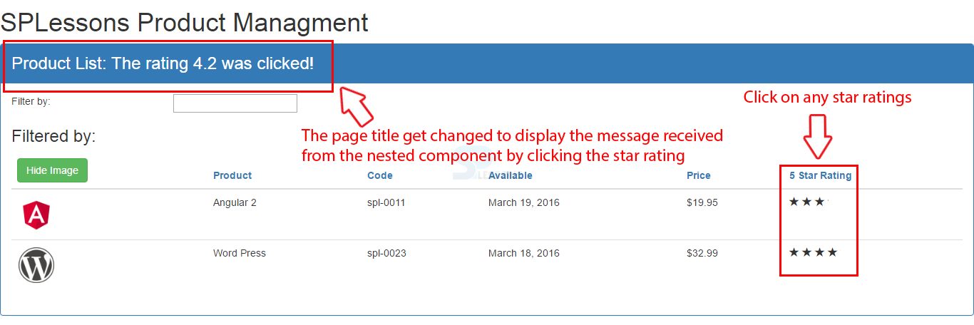
When the star component process the clicked event on the div, it wants to raise an event to the container and pass along a message, an event property is used and call it’s emit method by passing in the desired string, in this example code, the ES2015 back text is used to define a template string which allows users to bind the rating directly into the string using the dollar syntax.
Step 4 -
Now, open the product list component template and in the nested components directive add event binding respond to the ratingClicked event exposed by the star component and one can get the event payload, respond by calling the own local method like onRatingClicked and the event payload is available using the $event, so pass that in to the onRatingClicked method as shown in the code below.
product-list.component.html
[html]
<div class='panel panel-primary'>
<div class='panel-heading'>
{ {pageTitle}}
</div>
<div class='panel-body'>
<div class='row'>
<div class='col-md-2'>Filter by:</div>
<div class='col-md-4'>
<input type='text'
[(ngModel)]='listFilter' />
</div>
</div>
<div class ='row'>
<div class='col-md-6'>
<h3>Filtered by: { {listFilter}}</h3>
</div>
</div>
<div class='table-responsive'>
<table class='table'
*ngIf='products && products.length'>
<thead>
<tr>
<th>
<button class='btn btn-success'
(click)='toggleImage()'>
{ {showImage ? 'Hide' : 'Show'}} Image
</button>
</th>
<th>Product</th>
<th>Code</th>
<th>Available</th>
<th>Price</th>
<th>5 Star Rating</th>
</tr>
</thead>
<tbody>
<tr *ngFor='let product of products | productFilter:listFilter'>
<td>
<img *ngIf='showImage'
[src]='product.imageUrl'
='product.productName'
[style.width.px]='imageWidth'
[style.margin.px]='imageMargin'>
</td>
<td>{ { product.productName }}</td>
<td>{ { product.productCode | lowercase }}</td>
<td>{ { product.releaseDate }}</td>
<td>{ { product.price | currency:'USD':true:'1.2-2'}}</td>
<td>
<sp-star [rating]='product.starRating'
(ratingClicked)='onRatingClicked($event)'>
</sp-star>
</td>
</tbody>
</table>
</div>
</div>
[/html]
Step 5 -
Now, write the code for the new onRatingClicked method in the container’s class. So, open the product list component and define the onRatingClicked method as shown in the below code.
product-list.component.ts
[c]
import { Component, OnInit } from '@angular/core';
import { IProduct } from './product';
@Component({
selector: 'pm-products',
templateUrl: 'app/products/product-list.component.html',
styleUrls: ['app/products/product-list.component.css']
})
export class ProductListComponent implements OnInit{
pageTitle: string = 'Product List!';
imageWidth: number = 50;
imageMargin: number = 2;
showImage: boolean = false;
listFilter: string = 'angular';
products: IProduct[] = [
{
"productId": 1,
"productName": "Angular 2",
"productCode": "SPL-0011",
"releaseDate": "March 19, 2016",
"description": "A Practical Introduction to the new Web Development Platform Angular 2",
"price": 19.95,
"starRating": 3.2,
"imageUrl": "./app/assets/images/angular_2.png"
},
{
"productId": 2,
"productName": "Word Press",
"productCode": "SPL-0023",
"releaseDate": "March 18, 2016",
"description": "This ebook allows you to create a WordPress website on your domainfrom scratch.",
"price": 32.99,
"starRating": 4.2,
"imageUrl": "./app/assets/images/wordpress-logo.png"
}
];
toggleImage(): void{
this.showImage = !this.showImage;
}
ngOnInit(): void {
console.log('In OnInit');
}
onRatingClicked(message: string): void {
this.pageTitle = 'Product List: ' + message;
}
}
[/c]
Here in the code, a message: string parameter is defined for the event payload, the pageTiltle is modified in order to display the “Product List” and the message from the nested component.
 Output
 Key Points
- The main advantage of using the TypeScript is the strong typing.
- In order to use the life Cycle, one should implement the lifecycle hook interface.
- In Angular 2 one component can be nested into another component.
- The nested component is used as a directive.
- @Input decorator is used to receive the input to the component from its container.
- @Output decorator is used to pass the output from the component to its container.


