


 Introduction
This chapter demonstrates about the SVG Gradient which is referred as transition of one color in addition to multiple colors are applied to the same element, following are the concepts covered in this chapter.
- Linear
- Radial
Description
Linear Gradient is defined by the
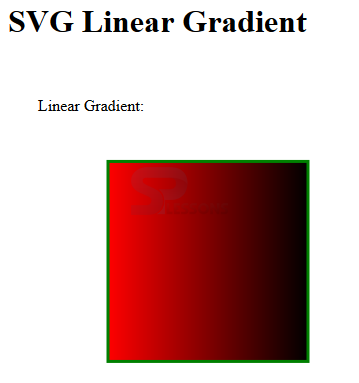
The code below demonstrates the Linear gradients which consist of one color is addition with another color is as shown below.
[html]
<html>
<title>SVG Linear Gradient</title>
<body>
<h1>SVG Linear Gradient</h1>
<svg width="600" height="600">
<defs>
<linearGradient id="sampleGradient">
<stop offset="0%" stop-color="#FF0000" />
<stop offset="100%" stop-color="#00FFF00" />
</linearGradient>
</defs>
<g>
<text x="30" y="50" >Linear Gradient: </text>
<rect x="100" y="100" width="200" height="200" stroke="green" stroke-width="3"
fill="url(#sampleGradient)" />
</g>
</svg>
</body>
</html>
[/html]
Result
By running the above code in a preferred browser then user will get the output as shown below.
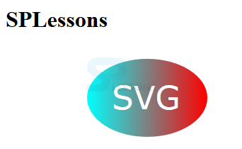
 The code below demonstrates the Linear gradients which consist of one color in addition with another color as shown below.
[html]
<!DOCTYPE html>
<html>
<h1>SPLessons</h1>
<body>
<svg height="300" width="700">
<defs>
<linearGradient id="grad1" x1="0%" y1="0%" x2="100%" y2="0%">
<stop offset="0%" style="stop-color:rgb(0,255,255);stop-opacity:1" />
<stop offset="100%" style="stop-color:rgb(255,0,0);stop-opacity:1" />
</linearGradient>
</defs>
<ellipse cx="200" cy="70" rx="85" ry="55" fill="url(#grad1)" />
<text fill="#ffffff" font-size="45" font-family="Verdana" x="150" y="86">SVG</text>
</svg>
</body>
</html>
[/html]
Result
By running the above code in a preferred browser then user will get the output as shown below.
The code below demonstrates the Linear gradients which consist of one color in addition with another color as shown below.
[html]
<!DOCTYPE html>
<html>
<h1>SPLessons</h1>
<body>
<svg height="300" width="700">
<defs>
<linearGradient id="grad1" x1="0%" y1="0%" x2="100%" y2="0%">
<stop offset="0%" style="stop-color:rgb(0,255,255);stop-opacity:1" />
<stop offset="100%" style="stop-color:rgb(255,0,0);stop-opacity:1" />
</linearGradient>
</defs>
<ellipse cx="200" cy="70" rx="85" ry="55" fill="url(#grad1)" />
<text fill="#ffffff" font-size="45" font-family="Verdana" x="150" y="86">SVG</text>
</svg>
</body>
</html>
[/html]
Result
By running the above code in a preferred browser then user will get the output as shown below.
<linearGradient> element which is used with in the <defs> tags only which contains definitions of the special elements like gradients. Linear Gradients are defined by vertical gradients, horigental gradients and angular gradients.
- Vertical Gradients These are created when x1,x2 are equal and y1,y2 are differ.
- Horizontal Gradients These are created when y1,y2n are equal and x1,x2 are differ.
- Angular Gradients These are created when y1,y2n are differ and x1,x2 are differ.
Description
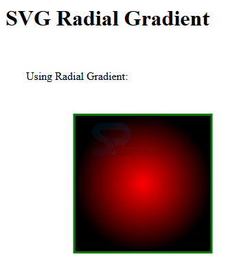
SVG Radial gradient is defined by the
The code below demonstrates the radial gradient with the multiple colors.
[html]
<html>
<title>SVG Radial Gradient</title>
<body>
<h1>SVG Radial Gradient</h1>
<svg width="600" height="600">
<defs>
<radialGradient id="sampleGradient">
<stop offset="0%" stop-color="#FF0000" />
<stop offset="100%" stop-color="#00FFF00" />
</radialGradient>
</defs>
<g>
<text x="30" y="50" >Using Radial Gradient: </text>
<rect x="100" y="100" width="200" height="200" stroke="green" stroke-width="3"
fill="url(#sampleGradient)" />
</g>
</svg>
</body>
</html>
[/html]
Result
By running the above code in a preferred browser then user will get the output as shown below.
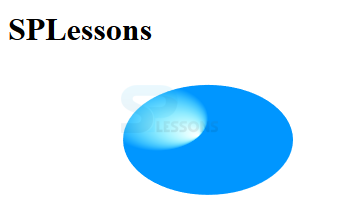
 The code below demonstrates the radial SVG Gradient with the multiple colors.
[html]
<!DOCTYPE html>
<html>
<h1>SPLessons</h1>
<body>
<svg height="150" width="500">
<defs>
<radialGradient id="grad1" cx="20%" cy="30%" r="30%" fx="50%" fy="50%">
<stop offset="0%" style="stop-color:rgb(0,255,255);stop-opacity:0" />
<stop offset="100%" style="stop-color:rgb(0,150,255);stop-opacity:1" />
</radialGradient>
</defs>
<ellipse cx="200" cy="70" rx="85" ry="55" fill="url(#grad1)" />
</svg>
</body>
</html>
[/html]
Result
By running the above code in a preferred browser then user will get the output as shown below.
The code below demonstrates the radial SVG Gradient with the multiple colors.
[html]
<!DOCTYPE html>
<html>
<h1>SPLessons</h1>
<body>
<svg height="150" width="500">
<defs>
<radialGradient id="grad1" cx="20%" cy="30%" r="30%" fx="50%" fy="50%">
<stop offset="0%" style="stop-color:rgb(0,255,255);stop-opacity:0" />
<stop offset="100%" style="stop-color:rgb(0,150,255);stop-opacity:1" />
</radialGradient>
</defs>
<ellipse cx="200" cy="70" rx="85" ry="55" fill="url(#grad1)" />
</svg>
</body>
</html>
[/html]
Result
By running the above code in a preferred browser then user will get the output as shown below.
<radialGradient> element which inserted with in the <defs> tags only which contains definitions of the special elements like gradient. In the radial gradient two offsets are defined with the two colors. Following are the attributes of the radial gradient.
- cx x-axis coordinate of the circle gradient vector the default value is 0.
- cy y-axis coordinate of the circle gradient vector the default value is 0.
- r Radius of largest circle of gradient vector the default value is 0.
- fx Radial gradient focal point the default value is o.
- fy Radial gradient focal point the default value is o.
Key Points
- SVG Gradient are used insert multi colors in many forms.
- Two offset gradients defined with two colors.
- URL of the SVG Gradient is used to fill the colors.