


 Introduction
This chapter demonstrates about the HTML Responsive which is used to fit for all the devices with good looking and easy to use the following are the concepts covered.
- Responsive Web Design
- Responsive using W3.CSS
Description
Responsive is used to resize the web page i.e the design of the web page suits for all the devices and the page get displayed in any of the device like desktop, mobiles and tablets. Responsive is used to shrink, resize, enlarge, hide and move the content. the code below demonstrates the responsive web design.
[html]
<!DOCTYPE html>
<html lang="en-us">
<head>
<style>
.splessons {
float: left;
margin: 10px;
padding: 10px;
width: 300px;
height: 300px;
border: 1px solid black;
}
</style>
</head>
<body>
<h1>Responsive Web Design</h1>
<h2>Simple Programming Lessons!</h2>
<div class="splessons">
<h2>London</h2>
<p>SPLessons stands for Simple Programming Lessons and was started with a motive to present programming codes and to help the developers all around the globe with different queries in different Programming Languages.</p>
</div>
<div class="splessons">
<h2>Paris</h2>
<p>To enhance our knowledge of programming by presenting several different articlesto the viewers and by participating in knowledge enriching discussions on the website.</p>
</div>
</body>
</html>
[/html]
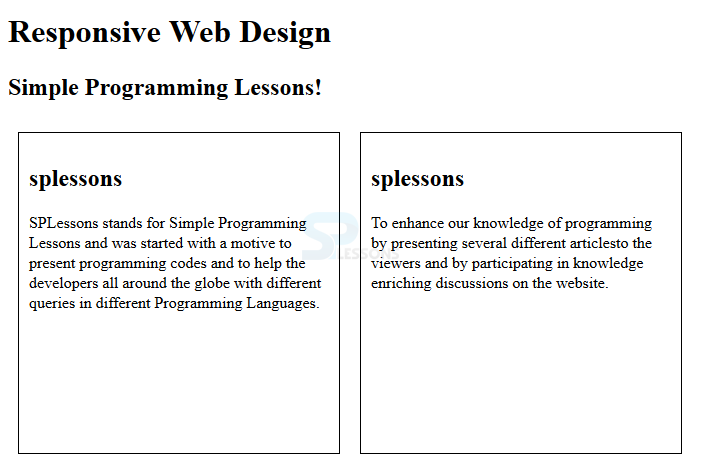
Result
By running the above code in a preferred browser user can get the following output as shown in below image.
Description
W3.CSS is used to create the html responsive in another form by using W3.CSS is an easy process to develop the sites in any size which is suitable for laptops, mobiles, tablets.
The code below demonstrates developing the responsive by using W3.CSS.
[html]
<!DOCTYPE html>
<html>
<meta name="viewport" content="width=device-width, initial-scale=1">
<link rel="stylesheet" href="http://www.w3schools.com/lib/w3.css">
<body>
<div class="w3-container w3-orange">
<h1>SPLESSONS</h1>
<p>Simple Programming Lessons!</p>
</div>
<div class="w3-row-padding">
<div class="w3-third">
<h2>splessons</h2>
<p>SPLessons stands for Simple Programming Lessons and was started with a motive to present programming codes and to help the developers all around the globe with different queries in different Programming Languages.</p>
</div>
<div class="w3-third">
<h2>splessons</h2>
<p>To enhance our knowledge of programming by presenting several different articlesto the viewers and by participating in knowledge enriching discussions on the website.</p>
</div>
</body>
</html>
[/html]
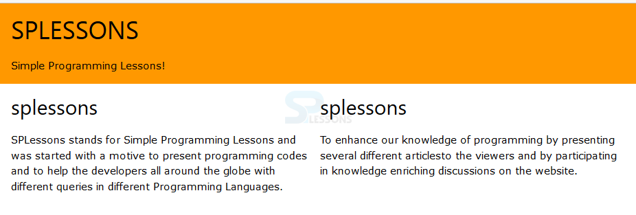
Result
By running the above code in a preferred browser user can get the following output as shown in below image.
Key Points
- Responsive gives good look in any device.
- W3.CSS is a simple way to create the web sites.
- Responsive get displayed in any of the screen.