


 Description
Nav is the base class of the available navigation in Bootstrap Menus that sets styles and markups to active and disabled states.
Whenever Navbars are provided by Navs, make sure to wrap the <nav> components in <ul> element. Navs include style for disable state, but not for active states.Bootstrap Menus chapter explains about Navs, Tabs, and Pills.
Example
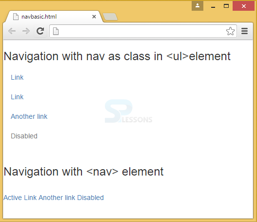
In the below example, the basic use of nav is demonstrated with the use of <ul> element and <nav> element. When <nav> element is used, all the components are wrapped into a single line.
[html]
<!DOCTYPE html>
<html>
<head>
<meta name="viewport" content="width=device-width, initial-scale=1">
<link rel="stylesheet" href="http://maxcdn.bootstrapcdn.com/bootstrap/3.3.6/css/bootstrap.min.css">
<script src="https://ajax.googleapis.com/ajax/libs/jquery/1.12.0/jquery.min.js"></script>
<script src="http://maxcdn.bootstrapcdn.com/bootstrap/3.3.6/js/bootstrap.min.js"></script>
</head>
<body>
<h3>Navigation with nav as class in <ul>element</h3>
<ul class="nav">
<li class="nav-item">
<a class="nav-link" href="#">Link</a>
</li>
<li class="nav-item">
<a class="nav-link" href="#">Link</a>
</li>
<li class="nav-item">
<a class="nav-link" href="#">Another link</a>
</li>
<li class="nav-item disabled">
<a class="nav-link " href="#">Disabled</a>
</li>
</ul>
<br>
<h3>Navigation with <nav> element</h3>
<br>
<nav class="nav">
<a class="nav-link active" href="#">Active</a>
<a class="nav-link" href="#">Link</a>
<a class="nav-link" href="#">Another link</a>
<a class="nav-link disabled" href="#">Disabled</a>
</nav>
</body>
</html>
[/html]
Output:
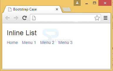
 To avoid the problem of combining all the elements together by <nav> elements, . list-inline is used to space out links in a horizontal band. If there is a longer series of links, it wraps the links to a new line.
The following example demonstrates the use of inline class in ul elements.
[html]<!DOCTYPE html>
<html lang="en">
<head>
<title>Bootstrap Case</title>
<meta charset="utf-8">
<meta name="viewport" content="width=device-width, initial-scale=1">
<link rel="stylesheet" href="http://maxcdn.bootstrapcdn.com/bootstrap/3.3.6/css/bootstrap.min.css">
<script src="https://ajax.googleapis.com/ajax/libs/jquery/1.12.0/jquery.min.js"></script>
<script src="http://maxcdn.bootstrapcdn.com/bootstrap/3.3.6/js/bootstrap.min.js"></script>
</head>
<body>
<div class="container">
<h3>Inline List</h3>
<ul class="list-inline">
<li><a href="#">Home</a></li>
<li><a href="#">Menu 1</a></li>
<li><a href="#">Menu 2</a></li>
<li><a href="#">Menu 3</a></li>
</ul>
</div>
</body>
</html>
[/html]
Output:
To avoid the problem of combining all the elements together by <nav> elements, . list-inline is used to space out links in a horizontal band. If there is a longer series of links, it wraps the links to a new line.
The following example demonstrates the use of inline class in ul elements.
[html]<!DOCTYPE html>
<html lang="en">
<head>
<title>Bootstrap Case</title>
<meta charset="utf-8">
<meta name="viewport" content="width=device-width, initial-scale=1">
<link rel="stylesheet" href="http://maxcdn.bootstrapcdn.com/bootstrap/3.3.6/css/bootstrap.min.css">
<script src="https://ajax.googleapis.com/ajax/libs/jquery/1.12.0/jquery.min.js"></script>
<script src="http://maxcdn.bootstrapcdn.com/bootstrap/3.3.6/js/bootstrap.min.js"></script>
</head>
<body>
<div class="container">
<h3>Inline List</h3>
<ul class="list-inline">
<li><a href="#">Home</a></li>
<li><a href="#">Menu 1</a></li>
<li><a href="#">Menu 2</a></li>
<li><a href="#">Menu 3</a></li>
</ul>
</div>
</body>
</html>
[/html]
Output:
Description
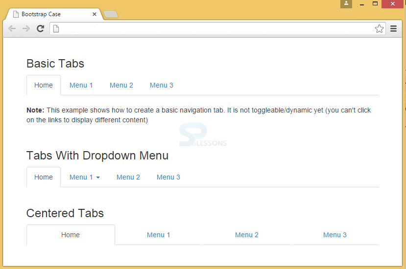
Tabs in Bootstrap header can be created using the class .nav-tabs with base class .nav.
Active tabs shows whether the page is in current page. This can be used by adding class active to <li>.
Dropdown menus can be applied to tabs by adding the class dropdown.
To align the tabs to the center/justify, use .nav-justified class.
Example
In the below example, all the above classes and their usage with tabs is demonstrated.
[html]
<!DOCTYPE html>
<html lang="en">
<head>
<title>Bootstrap Case</title>
<meta charset="utf-8">
<meta name="viewport" content="width=device-width, initial-scale=1">
<link rel="stylesheet" href="http://maxcdn.bootstrapcdn.com/bootstrap/3.3.6/css/bootstrap.min.css">
<script src="https://ajax.googleapis.com/ajax/libs/jquery/1.12.0/jquery.min.js"></script>
<script src="http://maxcdn.bootstrapcdn.com/bootstrap/3.3.6/js/bootstrap.min.js"></script>
</head>
<body>
<br>
<div class="container">
<h3>Basic Tabs</h3>
<ul class="nav nav-tabs">
<li class="active"><a href="#">Home</a></li>
<li><a href="#">Menu 1</a></li>
<li><a href="#">Menu 2</a></li>
<li><a href="#">Menu 3</a></li>
</ul>
<br>
<p><strong>Note:</strong> This example shows how to create a basic navigation tab. It is not toggleable/dynamic yet (you can't click on the links to display different content).</p>
</div>
<br>
<div class="container">
<h3>Tabs With Dropdown Menu</h3>
<ul class="nav nav-tabs">
<li class="active"><a href="#">Home</a></li>
<li class="dropdown">
<a class="dropdown-toggle" data-toggle="dropdown" href="#">Menu 1 <span class="caret"></span></a>
<ul class="dropdown-menu">
<li><a href="#">Submenu 1-1</a></li>
<li><a href="#">Submenu 1-2</a></li>
<li><a href="#">Submenu 1-3</a></li>
</ul>
</li>
<li><a href="#">Menu 2</a></li>
<li><a href="#">Menu 3</a></li>
</ul>
</div>
<br>
<div class="container">
<h3>Centered Tabs</h3>
<ul class="nav nav-tabs nav-justified">
<li class="active"><a href="#">Home</a></li>
<li><a href="#">Menu 1</a></li>
<li><a href="#">Menu 2</a></li>
<li><a href="#">Menu 3</a></li>
</ul>
</div>
</body>
</html>
[/html]
Output:
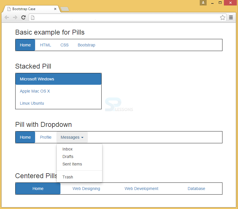
Description
Unlike having a tab horizontal line for markup of navigation elements, pills can add a distinct look of navigation. By default, pills will be shown in a row.
To display pills in a vertical order, .nav-stacked is used with .nav-pills, and base class as .nav.
To use dropdown with pills, add simple dropdown menus to a pill nav.
To align the tabs to the center/justify, use .nav-justified class.
Example
In the below example, all the above classes and their usage of pills is demonstrated.
[html]
<!DOCTYPE html>
<html lang="en">
<head>
<title>Bootstrap Case</title>
<meta charset="utf-8">
<meta name="viewport" content="width=device-width, initial-scale=1">
<link rel="stylesheet" href="http://maxcdn.bootstrapcdn.com/bootstrap/3.3.6/css/bootstrap.min.css">
<script src="https://ajax.googleapis.com/ajax/libs/jquery/1.12.0/jquery.min.js"></script>
<script src="http://maxcdn.bootstrapcdn.com/bootstrap/3.3.6/js/bootstrap.min.js"></script>
<style type="text/css">
.bs-example{
margin: 20px;
}
ul {
border: 1px solid #000000; }
</style>
</head>
<body>
<div class="container">
<h3>Basic example for Pills</h3>
<ul class="nav nav-pills">
<li class="active"><a href="#">Home</a></li>
<li><a href="#">HTML</a></li>
<li><a href="#">CSS</a></li>
<li><a href="#">Bootstrap</a></li>
</ul>
</div>
<br>
<div class="container">
<div class="bootstrap-demo">
<h3>Stacked Pill</h3>
<ul class="nav nav-pills nav-stacked" style="max-width: 300px;"> <!-- class .nav-pills and .nav-stacked -->
<li class="active"><a href="#">Microsoft Windows</a></li>
<li><a href="#">Apple Mac OS X</a></li>
<li><a href="#">Linux Ubuntu</a></li>
</ul>
</div>
<br>
<h3>Pill with Dropdown</h3>
<ul class="nav nav-pills">
<li class="active"><a href="#">Home</a></li>
<li><a href="#">Profile</a></li>
<li class="dropdown">
<a href="#" data-toggle="dropdown" class="dropdown-toggle">Messages <b class="caret"></b></a>
<ul class="dropdown-menu">
<li><a href="#">Inbox</a></li>
<li><a href="#">Drafts</a></li>
<li><a href="#">Sent Items</a></li>
<li class="divider"></li>
<li><a href="#">Trash</a></li>
</ul>
</li>
</ul>
<br><br><br><br>
<h3>Centered Pills</h3>
<ul class="nav nav-pills nav-justified">
<li class="active"><a href="#">Home</a></li>
<li><a href="#">Web Designing</a></li>
<li><a href="#">Web Development</a></li>
<li><a href="#">Database</a></li>
</ul>
</body>
</html>
[/html]
Output:
Description
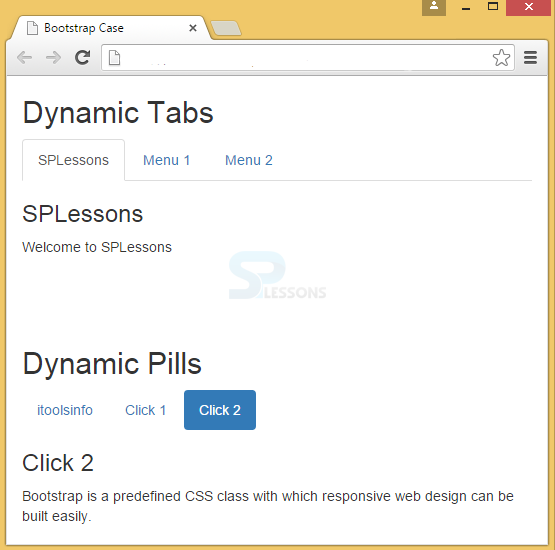
To make tabs toggleable, add "tab" attribute to data-toggle of each link. Next for every tab, add a .tab-pane class with a unique ID and wrap them inside a <div> element with class.tab-content.
To make tabs to fade in and out while clicking on them, add the .fade class to the .tab-pane.
This is same as that of tabs toggleable but only the attribute changes to data-toggle="pill"
Example
[html]
<!DOCTYPE html>
<html lang="en">
<head>
<title>Bootstrap Case</title>
<meta charset="utf-8">
<meta name="viewport" content="width=device-width, initial-scale=1">
<link rel="stylesheet" href="http://maxcdn.bootstrapcdn.com/bootstrap/3.3.6/css/bootstrap.min.css">
<script src="https://ajax.googleapis.com/ajax/libs/jquery/1.12.0/jquery.min.js"></script>
<script src="http://maxcdn.bootstrapcdn.com/bootstrap/3.3.6/js/bootstrap.min.js"></script>
</head>
<body>
<!--Toggleable Tabs-->
<div class="container">
<h2>Dynamic Tabs</h2>
<ul class="nav nav-tabs">
<li class="active"><a data-toggle="tab" href="#splessons">SPLessons</a></li>
<li><a data-toggle="tab" href="#menu1">Menu 1</a></li>
<li><a data-toggle="tab" href="#menu2">Menu 2</a></li>
</ul>
<div class="tab-content">
<div id="splessons" class="tab-pane fade in active">
<h3>SPLessons</h3>
<p>Welcome to SPLessons</p>
</div>
<div id="menu1" class="tab-pane fade">
<h3>Menu 1</h3>
<p>Bootstrap Tutorials</p>
</div>
<div id="menu2" class="tab-pane fade">
<h3>Menu 2</h3>
<p>Bootstrap is a predefined CSS class with which responsive web design can be built easily.</p>
</div>
</div>
</div>
<br><br><br>
<!--Toggleable Pills-->
<div class="container">
<h2>Dynamic Pills</h2>
<ul class="nav nav-pills">
<li class="active"><a data-toggle="pill" href="#itools">itoolsinfo</a></li>
<li><a data-toggle="pill" href="#click1">Click 1</a></li>
<li><a data-toggle="pill" href="#click2">Click 2</a></li>
</ul>
<div class="tab-content">
<div id="home" class="tab-pane fade in active">
<h3>itoolsinfo</h3>
<p>Welcome to itoolsinfo</p>
</div>
<div id="click1" class="tab-pane fade">
<h3>Click 1</h3>
<p>Bootstrap Tutorials</p>
</div>
<div id="click2" class="tab-pane fade">
<h3>Click 2</h3>
<p>Bootstrap is a predefined CSS class with which responsive web design can be built easily.</p>
</div>
</div>
</div>
</body>
</html>
[/html]
Output:
Key Points
- The base class for navigation element is .nav.
- The nav class has to be placed within the unordered list.
- Tabs and pills are the components of nav.
- Stacked class allows to arrange the pills in the vertical order.