


 Introduction
AWT Layout is defined as the order of placement of the components in a container. This arrangement can be done by LayoutManager. AWT Layout chapter covers the following concepts:
- Introduction to LayoutManager
- Interfaces
- List of LayoutManagers
Description
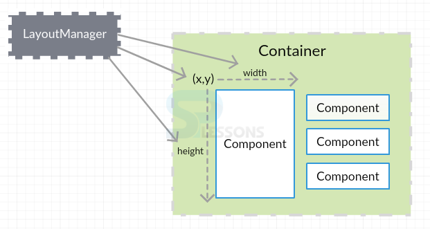
LayoutManager is responsible to arrange the components irrespective of the platform, as per the size and position required in the fixed area.
LayoutManager asks every component about the space required for them in the AWT Layout to avoid the inconvenience when a window is resized. To perform this action, it calls getMinimumSize(), getMaximumSize() and getPreferredSize() methods.
Conceptual
figure
Description
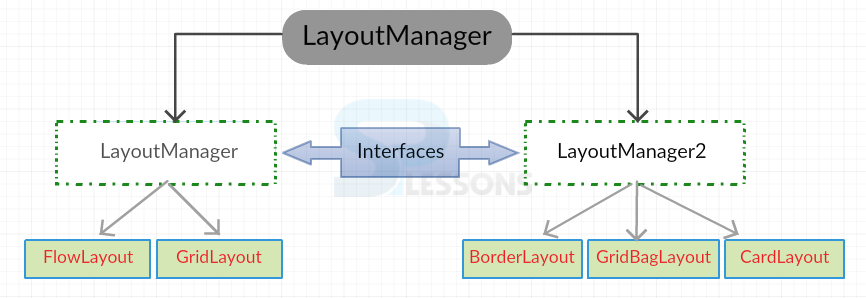
Basically, there are two types of interfaces for LayoutManager.
- LayoutManager : This interface specifies all the methods to be implemented but does not give any idea about the functioning. It has the complete information on how to place the components in a container. It can be declared as follows:
public interface LayoutManager - LayoutManager2: This interface requires a number of constraints to set the position of components in a container. It can be declared as follows:
public interface LayoutManger2 extends LayoutManager
More Info
When a container is created, a default LayoutManager is assigned such that it supports every component of that container. A new LayoutManager can be set by using the method setLayout().
Container approaches the LayoutManager by using doLayout() method to re-arrange its components. This is done after first validation of components.
Conceptual
figure
There are mainly 5 commonly used LayoutManagers as shown in the below figure:
Description
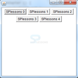
FlowLayout arranges the components from top to bottom and left to right with the preferred sizes on the screen. LEFT, CENTER, RIGHT, LEADING and TRAILING are the five constant alignment classes used by FlowLayout. This arrangement is done in rows. If a row is filled, then the control goes to the next row.
- FlowLayout is made default when used with Panels or Applets.
- By default, the gap between the components is 5 pixels.
- Component position is aligned to CENTER by default.
Constructors:
FlowLayout(): Creates layout of default size.FlowLayout(int align): Creates layout of given size.FlowLayout(int align, int hgap, int vgap): Creates layout of given alignment with horizontal and vertical gap.
Examples
[java]
import java.awt.*;
import java.awt.event.WindowAdapter;
import java.awt.event.WindowEvent;
public class SPlesson extends Frame
{
public SPlesson()
{
setLayout(new FlowLayout());
for(int i = 0; i < 5; i++)
{
add(new Button("SPlessons " + i));
}
setSize(300, 300);
setVisible(true);
}
public static void main(String args[])
{
SPlesson s = new SPlesson();
//Closing the frame
s.addWindowListener ( new WindowAdapter () {
public void windowClosing ( WindowEvent evt )
{
System.exit(0);
}
});
}
}[/java]
Output
Description
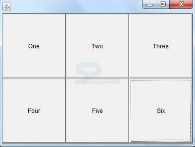
Grid AWT Layout arranges the components in grid cells as rows and columns. The position has to be mentioned.
To have unlimited components in a certain row or column, set its size to zero.
- The arrangement is done automatically in a serial order.
- Every cell or the component is of equal size.
- The gap between the components is 0 pixels by default.
Constructors:
- GridLayout() : Creates AWT Layout with one row and infinite columns.
- GridLayout (int rows, int columns) : Creates layout of given rows and columns.
- GridLayout (int rows, int columns, int hgap, int vgap) : Creates layout of rows and columns with horizontal and vertical gaps.
Examples
[java]import java.awt.*;
import java.awt.event.WindowAdapter;
import java.awt.event.WindowEvent;
public class SPlesson extends Frame{
public static void main(String argv[]){
SPlesson fa=new SPlesson();
//Setup GridLayout with 2 rows and 5 columns
fa.setLayout(new GridLayout(2,3));
fa.setSize(400,300);
fa.setVisible(true);
fa.addWindowListener ( new WindowAdapter () {
public void windowClosing ( WindowEvent evt )
{
System.exit(0);
}
});
}
SPlesson(){
add(new Button("One"));
add(new Button("Two"));
add(new Button("Three"));
add(new Button("Four"));
add(new Button("Five"));
add(new Button("Six"));
}
}[/java]
Output
Description
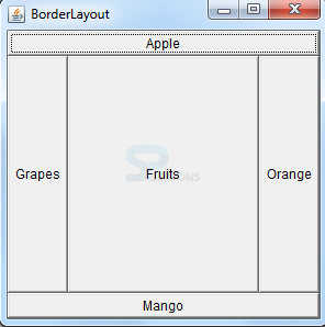
BorderLayout arranges the components as per the given borders(NORTH,SOUTH,EAST,WEST) and Center. This AWT Layout requires name and position to lay the components. These five spaces are expandable and are only possible by BorderLayout.
Multiple components can be made fit by using this AWT Layout.
- Frame, Dialog, FileDialog, Window and Container has BorderLayoutManager as default LayoutManager.
- 0 pixels is the default gap to be maintained between the components.
- Scrolling of the screen can be done using this layout.
Constructors:
- BorderLayout() : Creates layout with default sizes.
- BorderLayout (int hgap, int vgap) : Creates layout with the given horizontal and vertical gaps between components.
Examples
[java]
import java.awt.BorderLayout;
import java.awt.Frame;
import java.awt.Button;
import java.awt.Color;
import java.awt.event.WindowAdapter;
import java.awt.event.WindowEvent;
public class SPlesson extends Frame
{
public SPlesson()
{
// set the layout
setLayout(new BorderLayout());
setBackground(Color.red);
// create the components
Button b1 = new Button("Apple");
Button b2 = new Button("Mango");
Button b3 = new Button("Orange");
Button b4 = new Button("Grapes");
Button b5 = new Button("Fruits");
// place the components, position should be specified
add(b1, "North");
add(b2, "South");
add(b3, "East");
add(b4, "West");
add(b5, "Center");
// frame creation methods
setTitle("BorderLayout");
setSize(300, 300);
setVisible(true);
}
public static void main(String args[])
{
SPlesson s= new SPlesson();
s.addWindowListener ( new WindowAdapter ()
{
public void windowClosing ( WindowEvent evt )
{
System.exit(0);
}
});
}
}[/java]
Output
Description
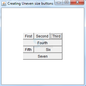
GridBagLayout is very flexible and consists of extendable rows & columns. Using constraints, one can position the components as per the requirement. Here, a single component can occupy multiple cells.
Constraints
GridBagConstraints acts as a helper class to GridBagLayout object and is used to set the component properties. The following are GridBagConstraints:
| Constraints | Description |
|---|---|
| gridx,gridy | Indicates the position of the component in the grid. |
| gridwidth, gridheight | Indicates the size of the cells. |
| weightx, weighty | Indicates the expandable container area. |
| ipadx, ipady | Specifies the padding between the borders and components. |
| fill | Functions when the component coverage area is greater than the component size. |
| anchor | Specifies the position of component when an extra room is allotted within the given space. |
| insets | Indicates the left-out space between the Components and borders. |
Examples
[java]import java.awt.*;
import java.awt.event.*;
import java.awt.event.WindowAdapter;
import java.awt.event.WindowEvent;
public class SPlesson extends Frame
{
public SPlesson()
{
GridBagLayout gbl = new GridBagLayout();
GridBagConstraints gbc = new GridBagConstraints();
setLayout(gbl);
Button b ; // a reference variable of Button which can be instantiated many times if reinstantiated, the earlier object is garbage collected
gbc.gridx = 0; // start setting the constraints
gbc.gridy = 0;
gbc.gridwidth = 1;
gbc.gridheight = 1;
gbc.fill = GridBagConstraints.HORIZONTAL; // grows horizontally
b = new Button("First");
gbl.setConstraints(b, gbc);
add(b);
b = new Button("Second");
gbc.gridx = 1; // gbc.gridy = 0 is taken from the previous button. If ones the the constraint is set, it will remain same in the
gbl.setConstraints(b, gbc); // subsequent code, unless it is changed
add(b);
b = new Button("Third");
gbc.gridx = 2;
gbc.gridwidth = GridBagConstraints.REMAINDER; // REMAINDER indicates to
gbl.setConstraints(b, gbc); // the layout that this component is last one in the row
add(b);
b = new Button("Fourth");
gbc.gridx = 0;
gbc.gridy = 1;
gbl.setConstraints(b, gbc);
add(b);
b = new Button("Fifth");
gbc.gridwidth = 1;
gbc.gridy = 2;
gbl.setConstraints(b, gbc);
add(b);
b = new Button("Six");
gbc.gridx = 1;
gbc.gridwidth = GridBagConstraints.REMAINDER;
gbl.setConstraints(b, gbc);
add(b);
b = new Button("Seven");
gbc.gridx = 0;
gbc.gridy = 3;
gbc.gridwidth = GridBagConstraints.REMAINDER ;
gbl.setConstraints(b, gbc);
add(b);
}
public static void main(String args[])
{
Frame f = new SPlesson();
f.setTitle("Creating Uneven size buttons");
f.setSize(300,300);
f.setVisible(true);
f.addWindowListener ( new WindowAdapter ()
{
public void windowClosing ( WindowEvent evt )
{
System.exit(0);
}
});
}
}[/java]
Output
Description
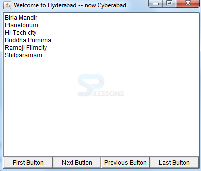
CardLayout is used to display a single component at a time among multiple components. This layout helps in saving the space.
Constructors:
- CardLayout() : Creates a layout object of default size.
- CardLayout(int hgap, int vgap) : Creates a layout of given vertical and horizontal gaps.
Examples
[java]
import java.awt.*;
import java.awt.event.*;
import java.awt.event.WindowAdapter;
import java.awt.event.WindowEvent;
public class SPlesson extends Frame implements ActionListener
{
List tl, gl, ml, al; // 4 lists to add to a container that implements card layout
Button fb, lb, nb, pb; // 4 buttons to navigate the cards of the container
CardLayout cl;
Panel sp, bp; // 2 panels to add lists and buttons
public SPlesson()
{
super("Welcome to Hyderabad -- now Cyberabad"); // title to Frame
tl = new List(4); // instantiate list objects
gl = new List(4);
ml = new List(4);
al = new List(4);
// popular theaters list
tl.add("Sudersan complex");
tl.add("Sandhya complex");
tl.add("Odeon complex");
tl.add("Ramakrishana Estate");
tl.add("IMAX 70MM");
tl.add("Surya 35MM");
tl.add("Shanthi 70MM");
// popular gardens list
gl.add("Indira Park");
gl.add("Lumbibi Park");
gl.add("Sanjivayya Park");
gl.add("Zoo Park");
gl.add("Public Gardens");
// popular monuments list
ml.add("Chiran Palace");
ml.add("Falaknuma Palace");
ml.add("Charminar");
ml.add("QQ Tombs");
ml.add("Golconda Fort");
ml.add("Zuma Majid");
// popular special attractions list
al.add("Birla Mandir");
al.add("Planetorium");
al.add("Hi-Tech city");
al.add("Buddha Purnima");
al.add("Ramoji Filmcity");
al.add("Shilparamam");
cl = new CardLayout(); // create a card layout object
sp = new Panel(); // create a panel to add all the lists
sp.setLayout(cl); // set the layout to panel, sp
sp.add(tl, "t"); // add lists to panel
sp.add(gl, "g");
sp.add(ml, "m"); // the string parameter is for show() later
sp.add(al, "a");
// instantiate buttons
fb = new Button("First Button");
lb = new Button("Last Button");
nb = new Button("Next Button");
pb = new Button("Previous Button");
bp = new Panel() ; // create a panel to add buttons
bp.setLayout(new GridLayout(1, 4)); // set lay out to bp panel
bp.add(fb); // add each button to panel
bp.add(nb);
bp.add(pb);
bp.add(lb);
fb.addActionListener(this); // register the buttons with listener
nb.addActionListener(this);
pb.addActionListener(this);
lb.addActionListener(this);
add(bp, "South"); // add panels to frame
add(sp, "Center");
setSize(300, 300);
setVisible(true) ;
}
public void actionPerformed(ActionEvent e)
{
String str = e.getActionCommand();
if(str.equals("First Button"))
cl.first(sp) ;
else if(str.equals("Next Button"))
cl.next(sp);
else if(str.equals("Previous Button"))
cl.previous(sp);
else if(str.equals("Last Button"))
cl.last(sp);
}
public static void main(String args[])
{
SPlesson t = new SPlesson();
t.addWindowListener ( new WindowAdapter ()
{
public void windowClosing ( WindowEvent evt )
{
System.exit(0);
}
});
}
}[/java]
Output
Key Points
- LayoutManager arranges the components in the form of layouts.
- LayoutManager and LayoutManager2 are the interfaces.
- FlowLayout goes from left to right in the alignment.
- Grid cells with rows and columns are present in the GridLayout.
- BorderLayout is the default LayoutManager for Windows.
- GridBagLayout is a resizable AWT Layout.
- CardLayout outputs only a single card at a time.
Programming
Tips
Absolute positioning of components is not a good practice as it may not work well when used on different platforms that have different minimum sizes. And, the interface portability may not support the changing conditions.